Typography
Typography guidelines ensure that legibility is maximised through consistent application of typeface, size, weight, etc. They help maintain a clean flow across the website by assigning specific functional roles to the different typography styles listed here.
Using fonts

Personality

Universality

Minimalism

Balance
The font usage is defined by the principles of personality, universality, minimalism, and balance. These are the guiding principles that define the usage of fonts. Each font conveys the appropriate sentiment to assist users through each stage of their journey.
Typefaces
Keeping personality, performance, and legibility in mind, the use of a font that is powered by Google Fonts has been chosen for the design system. The use of these typefaces allows a website to load faster, as the servers will automatically send the smallest possible file to every user based on the technologies that their browser supports.
English
Arabic
Typeface fallback
If primary typefaces fail to load, operating system typefaces must get triggered by the server. In order to maintain consistency, ensure to communicate fallback fonts. The correct method to implement a font declaration would be as such:
body {
	font-family: "Roboto", -apple-system, BlinkMacSystemFont,
				system-ui, 'Ubuntu', 'Fira Sans',
				sans-serif;
}
Similarly, apply the following for declarations where RTL is the base theme.
body {
	font-family: "Noto Kufi Arabic", sans-serif;
}
Font size
When it comes to communication, type and text provide essential cues that should never be overlooked. As one of the core elements in presenting information, typography has an immense impact on how messages are interpreted.
The type scale is a combination of 12 sizes that are supported by the Design System.
Headings
Headings follow a scale based on a 1.333 factor. This is known as the Major third, starting from the basic unit of 16 px (1rem, 1rem, 100%).
| Heading | Class | Properties |
|---|---|---|
H1 DISPLAY
|
text-display
|
font-size:4.75rem; /* 76px */
|
H1
|
text-h1
|
font-size:3.875rem; /* 62px */
|
H2
|
text-h2
|
font-size:3rem; /* 48px */
|
H3
|
text-h3
|
font-size:2.5rem; /* 40px */
|
H4
|
text-h4
|
font-size:2rem; /* 32px */
|
H5
|
text-h5
|
font-size:1.625rem; /* 26px */
|
H6
|
text-h6
|
font-size:1.25rem; /* 20px */
|
Content
The typography system has 7 text sizes for maximum readability and accessibility. We recommend a minimum of 16px, unless the context necessitates less. Refer to responsive typography for more details.
| Class | Properties |
|---|---|
text-3xl
|
font-size:1.875rem; /* 30px */
line-height:2.25rem; /* 36px */
|
text-2xl
|
font-size:1.5rem; /* 24px */
line-height:2rem; /* 32px */
|
text-xl
|
font-size:1.25rem; /* 20px */
line-height:1.75rem; /* 28px */
|
text-lg
|
font-size:1.125rem; /* 18px */
line-height:1.75rem; /* 28px */
|
text-base
|
font-size:1rem; /* 16px */
line-height:1.5rem; /* 24px */
|
text-sm
|
font-size:0.875rem; /* 14px */
line-height:1.25rem; /* 20px */
|
text-xs
|
font-size:0.75rem; /* 12px */
line-height:1rem; /* 16px */
|
Sustainability is a part of our ethics and corporate culture. It is why we work tirelessly to provide work environment that supports growth and happiness.
In line with the Telecommunications Law of the UAE, TRDA's objectives now include the execution of its telecommunication services across the country, which in turn, helps develop the quality and variety of the provided services and the adherence to license terms.
TDRA Virtual Academy
TDRA Virtual Academy offers courses for anyone seeking to develop their knowledge and skills in the growing field of ICT and innovation. Thus, it could be of as much benefit to a student as it could be to a fresh graduate, a budding entrepreneur, or the head of an organization. Courses are designed for learners of all skill levels and from all backgrounds.
TDRA Virtual Camp
TDRA Virtual Camp is one of the largest, most dynamic initiatives powered by CoDI. The camp aims at introducing the youth to important future technologies. The camp, which targets school children aged 6-17 years, includes a variety of programs, particularly in the fields of ICT.
The camp focuses on programming, which is included in the three main tracks: digital innovation and entrepreneurship, AI and data science, and Robotics and IoT, in order to allow all students to learn about the latest techniques and methods of programming, to support the UAE progress and prepare the new generation for future jobs.
Responsive typography
The typography system is built on the concept of using a responsive typography size, which improves readability and adapts the font size to the screen size on smaller or large devices.
On smaller screens, headings are resized dynamically based on the viewport size. The easiest way to do this is to follow the One-step decrease rule. Use the following scheme to apply font changes for headings, using the example of the ` <h1>` tag:
To highlight this, we used the same code used to generate the content in the font size example above.
<h1 class="text-h3 lg:text-h2 xl:text-h1 leading-tight">
Visit the UAE's unified digital platform
</h1>
<!-- the use of the leading-tight (line height)
for headings is open based on your design needs -->
You can make changes to the font size as long as it doesn't go below 1 rem as a base font size, unless necessary. Hence, it is important to consider increasing the size of your base font when designing and developing websites for larger screens.
Always aim to create accessibility towards reading conditions. A visitor viewing the website on a mobile device is holding a device in their hand and is most likely reading or interacting with the digital asset, away from their workspace.
Similarly, test the digital asset on a standard screen, which is typically below 1536 px in size, and also on a large screen, where the screen size can range from 1536 px and above, all the way to 2500 px. Refer to the grid system for more on this.
The font weight
A font weight allows you to add emphasis and differentiate specific pieces of text. On a general level, and for optimal performance, the digital asset has to follow only 3 weights as a pattern.
However, creative design and certain elements may need to introduce 2 more weights. It is therefore recommended to limit the total font weights in a given web page to 5. It is also recommended not to load a font weight into a website when it is not required.
The font-size table states to use heavy weights (bold and black) for headings and titles, as these weights grab attention. Use neutral weights (regular and medium) for body and long texts to help users read easily.
Headings
All heading tags are pre-configured to use ` font-extrabold `, which is why it is advised not to use different font weights in headings except based on the design pattern. It is also recommended to use ` font-extralight ` for the H1 Display heading.
| Class | Properties |
|---|---|
font-extralight
|
font-weight:200;
|
font-semibold
|
font-weight:600;
|
font-bold
|
font-weight:700;
|
font-extrabold
|
font-weight:800;
|
Content
Use the regular and neutral font weights as the default for your website content. Hence, ` font-normal `, which relates to the weight of 400 is considered as regular on all font types.
To provide emphasis on certain parts of the content, you may need to use bold, which is also considered acceptable. You may also choose to apply a ` font-semibold ` to content that uses a larger font size.
| Class | Properties |
|---|---|
font-light
|
font-weight:300;
|
font-normal
|
font-weight:400;
|
font-medium
|
font-weight:500;
|
font-semibold
|
font-weight:600;
|
font-bold
|
font-weight:700;
|
Text spacing
Line height should be an important factor to consider while designing content. The font family and size you use will ideally determine the line height.
Body content spacing
For the design system, the body font is Roboto for English with a base size of 16 px. This means using a minimum value of 1.5 for line-height for the main paragraph content. This will help people experiencing low vision conditions, as well as people with cognitive concerns such as Dyslexia.
Understanding Success Criterion 1.4.12 states that the line height must indeed be 1.5x and the margin after the paragraph must be 2x, word spacing to be at least 0.16 times, and letter spacing should be 0.12 of the font size.
The Roboto and Noto Kufi Arabic typefaces is compatible with the letter and word spacing by default. You must, however, make sure that line height and margin after a paragraph is followed. The design system pre-configures line height for content text, but expects paragraph margin to be added manually.
You can add or reduce the line height by a maximum of 20% to stay in the digestible range only if required for aesthetic purposes.
An accurate representation of line height and margin after a paragraph to be used within the content on your website is as follows:
TDRA Virtual Academy
TDRA Virtual Academy offers courses for anyone seeking to develop his/her knowledge and skills in the growing field of ICT and innovation. Thus, it could be of as much benefit to a student as it could be to a fresh graduate, a budding entrepreneur or the head of an organization. Courses are designed for learners of all skill levels and from all backgrounds.
TDRA Virtual Camp
TDRA Virtual Camp is one of the largest, most dynamic initiatives powered by CoDI. The camp aims at introducing the youth to important future technologies. The camp, which targets school children aged 6-17 years, includes a variety of programs, particularly in the fields of ICT.
The camp focuses on programming, which is included in the three main tracks: digital innovation and entrepreneurship, AI and data science, and Robotics and IoT, in order to allow all students to learn about the latest techniques and methods of programming, to support the UAE progress and prepare the new generation for future jobs.
Heading spacing
Headlines or Headings (those that are identified by the HTML <h1> ... <h6> tags) use a different typeface and line height for these are determined by the designed element.
The <h1> to <h4> follows a font size that is much larger in size and bold. For this purpose, you may use a line height that is less than the 1.5x rule. Using a tighter line height is acceptable.
In fact, use a line height in a reducing manner. The larger the font size, the lesser you may apply a line height value, but never less than 1rem.
If you use <h1>, which has a font size of 62 px, then the line height may be set to 1.125rem while if you use <h3>, which has a font size of 40 px, you may opt for a line height of 1.325.
Block spacing
Block spacing refers to the spacing between text blocks on your website. Leaving enough white space between text blocks, through adjusting the margins and padding, helps provide a better aesthetic look and, of course, more digestible content.
It is also important to manage your margins and padding responsively and reducing them on different breakpoints when required. This provides more flexibility to the layout across your website's sections. You can read about this in detail in Approach on Responsive Web Design.
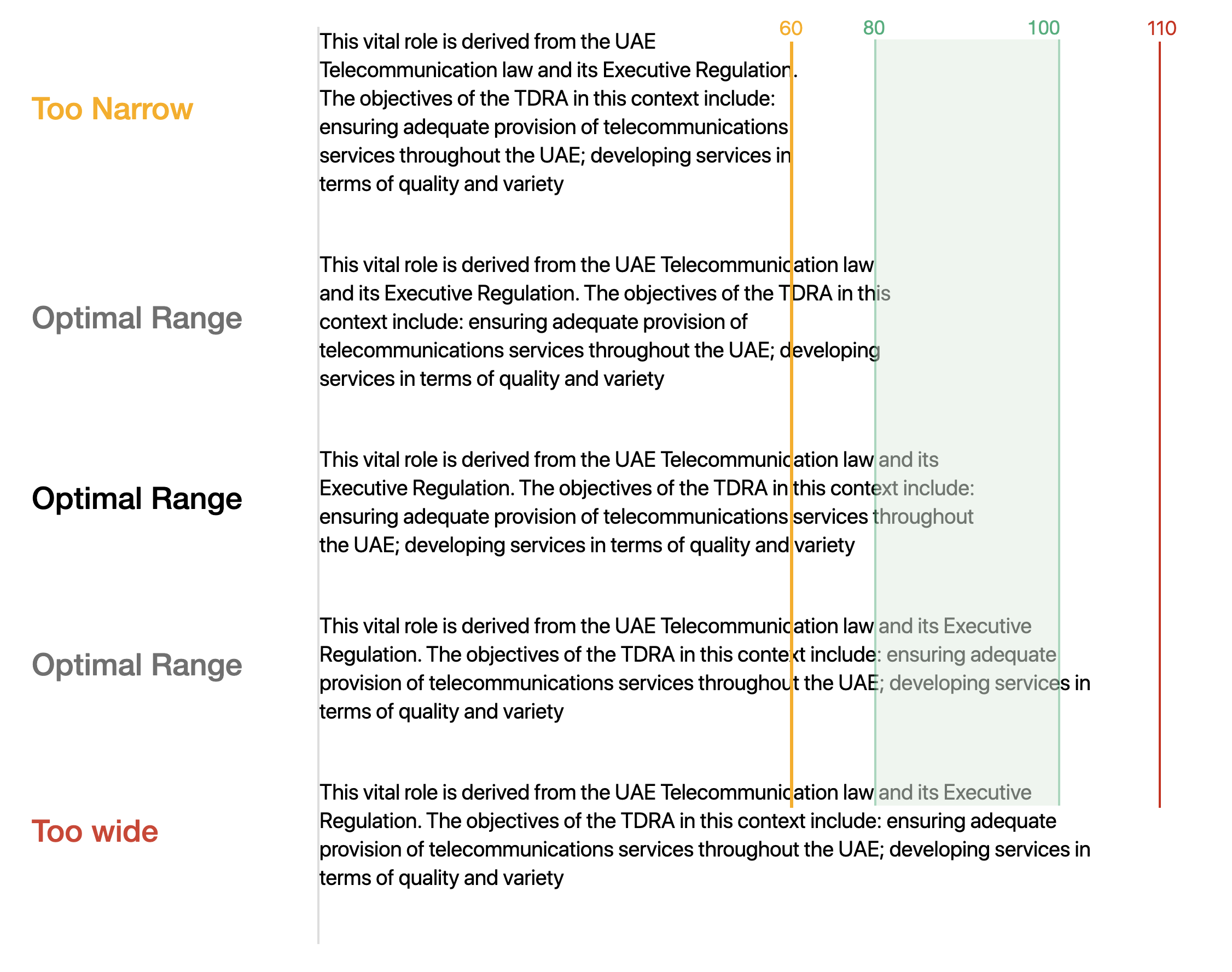
Line length
Readability is an important factor to consider when writing content. While line lengths are subjective and differ depending on the context, we recommend keeping line lengths between 60 and 100 characters with acceptable spacing. Setting this precedent will help writers outline the content in a simple manner that will make the end-user experience more positive.
Readers may also NOT have control over the layout width; meaning that a line length cannot always be specified. So it’s good practice to design for an ideal line length, and use responsive design techniques to anticipate different contexts.
Hence, if your body font size is ` BASE (16 px) ` and you would like to add content as a set of 4 paragraphs, your ideal content container width should be ` 745 px ` if your website container is ` 1240 px ` - essentialy, your content must be within 60% of the container width. This will place each line in the range of 60 to 100 characters.
Hierarchy
This section is very important, and this is where the content style comes together with typography. Using size, weight, colour, and alignment, typographic hierarchy establishes a priority order that allows the user to navigate seamlessly through content.
Sustainability is a part of our ethics and corporate culture as we work tirelessly to ensure our work environment supports growth and happiness.
In line with the UAEʼs Telecommunication Law and its executive regulations, the objectives of the TDRA include ensuring adequate provision of telecommunication services throughout the country, developing service quality and variety and adhering to license terms whilst making sure service quality is maintained.
Providing quality education is part of our sustainability goals and initiatives. We aim to educate individuals, corporates and children on the best practices and ethicial use of digital media and communication.
TDRA Virtual Academy offers courses for anyone seeking to develop his/her knowledge and skills in the growing field of ICT and innovation. Thus, it could be of as much benefit to a student as it could be to a fresh graduate, a budding entrepreneur or the head of an organization. Courses are designed for learners of all skill levels and from all backgrounds.
TDRA Virtual Camp is one of the largest, most dynamic initiatives powered by CoDI. The camp aims at introducing the youth to important future technologies. The camp, which targets school children aged 6-17 years, includes a variety of programs, particularly in the fields of ICT.
The camp focuses on programming, which is included in the three main tracks: digital innovation and entrepreneurship, AI and data science, and Robotics and IoT, in order to allow all students to learn about the latest techniques and methods of programming, to support the UAE progress and prepare the new generation for future jobs.
KidX is an electronic platform launched by the Ministry of Community Development and TDRA. The platform provides an interactive digital environment and uses games and virtual reality technologies to raise children's awareness of the UAE government, its functions and services.
It encourages them to express their views on the services, as well as deal with smart government and smart cities. The platform engages the children in an adventure format, while urging them to be positive and supportive members of the community's happiness.
The platform's concept also takes into consideration the rights of the child, especially the right to access all information that brings knowledge to them.
Basic principles of typography
Create hierarchy
A good structure helps present important information clearly just as it helps users find relevant information easily. Always ensure that your content block as a hierarchy defined and is consistent throughout your website.
Develop the organization of the health sector in a comprehensive and integrated manner to enhance its competitiveness, flexibility, effectiveness and alignment with the directions and priorities of the country.
Do not pair high-contrast text sizes
Keep the pairing sizes logical and avoid using a very large hero display text next to a very small body text.
Govern an integrated preventive and therapeutic healthcare system through the development of world-class policies and legislation, and management of public healthcare programs to ensure proactive, interconnected, comprehensive and innovative health services based on digital data for all segments of the community by qualified and specialized professionals.
Left align your content
Your content in English must be left aligned, except for headlines on hero sections, which may be centre aligned on certain blocks of content. Similarly, make sure that content is right aligned on your Arabic website.
Govern an integrated preventive and therapeutic healthcare system through the development of world-class policies and legislation, and management of public healthcare programs to ensure proactive, interconnected, comprehensive and innovative health services based on digital data for all segments of the community by qualified and specialized professionals.
Do not justify your text
Never justify texts in both English and Arabic as it slows down the reading speed for users.
Govern an integrated preventive and therapeutic healthcare system through the development of world-class policies and legislation, and management of public healthcare programs to ensure proactive, interconnected, comprehensive and innovative health services based on digital data for all segments of the community by qualified and specialized professionals.
Do not use underline for text
Underline text is reserved for hyperlinks and text buttons. When added to content that is not a hyperlink, it will certainly confuse the user and lead to a bad user experience.
A world-class health system for a community with long healthy life expectancy
Do not use indentation
Paragraphs indented with word spaces or tabs are hard to keep consistent. Do not indent paragraphs, however you may add indentation to a bullet or numbered list.
Always ensure that paragraphs and titles are vertically aligned and use spacing to separate paragraphs.
A world-class health system for a community with long healthy life expectancy