Building responsive websites, an approach to responsive web design in 2023

Responsive design is a cornerstone of modern web development. It is an approach that enables websites and web applications to adapt and deliver an optimal experience on any device. Be it a desktop, laptop, tablet, or smartphone, responsive design ensures content is easily readable and interactive.
The concept exists due to the proliferation of various screen sizes and resolutions. With technology advancing rapidly, users began accessing digital content through an array of devices. This necessitated a design approach that could adapt to these differences without compromising the user experience.
The conception of responsive design was a natural evolution in design thinking. In the early days of web development, each device type required a different version of a website. Responsive design emerged as a solution to this fragmentation, reducing the work and maintaining consistency.
The purpose of responsive design is to provide an efficient, consistent, and satisfying user experience across all platforms. It emphasizes flexibility, adapting layout and functionality based on the device's capabilities, thus ensuring accessibility and usability irrespective of the screen size or operating system.
Responsive v/s Adaptive design
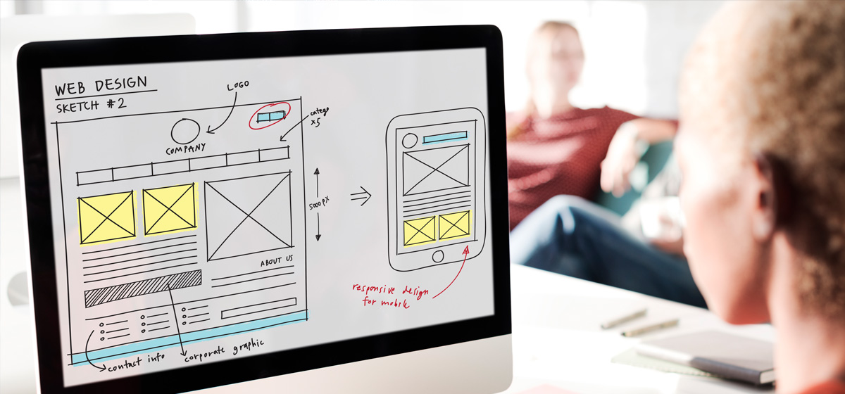
Responsive design is fluid and flexible, adjusting the layout of a website dynamically based on the screen size and orientation of the device being used. CSS media queries are the primary method of controlling the layout and interface. A single responsive design layout can cater to a wide array of devices and screen sizes, from desktops to smartphones, with the same content and codebase.
Adaptive design, on the other hand, uses predefined layouts that have been designed for specific screen resolutions or device types. When a device accesses the website, the server delivers the appropriate version based on the device's characteristics. In essence, adaptive design has multiple fixed layouts that are selected and displayed depending on the device.
While both approaches aim to improve the user experience on different devices, they do so in different ways. Responsive design is more flexible and can cater to a wider range of screen sizes, whereas adaptive design allows for more customization and can potentially provide a more optimized experience for specific devices.
For the purpose of websites created using the Design Language System, we recommend the use of Responsive Design over Adaptive. However, when you are creating products and applications that may need specific UI for devices, then you may consider Adaptive Design as an approach.
| Responsive design is fluid and flexible. It adjusts the layout of a website dynamically based on the screen size. | Adaptive design uses predefined layouts that have been designed for specific screen resolutions or device types |
| Responsive is a preferred method for websites and landing pages | Adaptive can be very useful for closed applications and complex apps that need device support |
| Responsive can adapt to the future possibility of new screen sizes introduced. | Adaptive will require you to upgrade the layouts as new devices are introduced. |
Techniques for responsive design
- CSS Media Queries: These are used to apply different styling rules for different device characteristics, such as screen width, height, resolution, and orientation. This allows for specific adjustments to the design at various screen sizes, also known as breakpoints.
- Mobile First: This is an approach where the design starts from the smallest screen size (mobile) and progressively enhances the design for larger screens. It helps ensure that the user experience is seamless across devices, and it aligns with the reality of increasing mobile usage.
- Flexible Images: Just as layouts need to be flexible, so too do images. Images are often set to automatically resize within their containing element to ensure they don't overflow or break the layout on smaller screens.
- Responsive Typography: Text should be easy to read on all devices. This approach involves using relative units (like REM’s) for font sizes, and adjusting line heights, letter spacing, and margins to ensure readability on various screens.
- Fluid Elements: This approach involves designing the layout of a website using relative units like percentages rather than absolute units like pixels. This ensures the layout can scale smoothly to fit different screen sizes.
All of the above techniques are encouraged by the design system. All components created are designed to respond to CSS media queries and allow for changes to size, typography and more.
The design system is based on TailwindCSS, which means it is a mobile-first approach towards creating front-end UI. We encourage you to learn more about how to manage layouts with TailwindCSS to ensure a consistent user experience across devices.
Responsive design for designers

The approach of responsive design thinking starts during the design and information architecture stage of any project for website development. Here are certain important aspects to keep in mind before starting your design:
- A designer must be aware of what are layout. They must understand and plan along with the development team on the layout breakpoints.
- A designer must take the decision if the layout shall be singular or fluid per section. This means, do you want to box your entire website to a width, or would you prefer sections of your website to be variable in terms of width.
Example: You may be designing for a screen size of 1536px where the layout breakpoint is 1480px. At this stage, as a designer, you must decide if you want the hero banner of your website to extend out of the 1480px width and touch the edge of the screen - hence designing the hero banner to be 1536px while all other sections of your website are confined to 1480px - A designer or information architect must design the sitemap and map all unique template layouts for the website first. They must then identify what common components are present on each template.
- Once an information architecture is ready, the design team must create basic, low-fidelity wireframes with blocks that represent the structure of each template.
- Finally, the designer must employ a mobile-first approach and design the layout for templates using:
- The mobile UI view
- The tablet view for 740px on a screen size of 768px (optional)
- The desktop view for 1280px on a screen size of 1366px
- The desktop view for 1480px on a screen size of 1536px
- Use contextual content. A designer must aim to use real content in the design so that they may visualize the visual appearance of the design.
- The possibility of real content may not always exist. In such a case, a designer must strive to gather more information from the business about the contextual value of the content.
For example, a designer must ask questions such as "how much content is expected on this page" or "will there be a short description of a news article always available" - Content plays an important part in the design. A designer must follow the content guideline while designing the website’s layouts
- A designer must always pay attention to the responsive typography and how text responds on different devices.
For example: The short description on a news card may have 3 lines on a large screen desktop, and that may look visually appealing, however on a small screen desktop that same bit of content turns into 5 lines, and this in turn increases the height of the card which may not be visually pleasing.
- The possibility of real content may not always exist. In such a case, a designer must strive to gather more information from the business about the contextual value of the content.
- Design for a multilingual website. As a designer, you must be aware that every UAE government website must support an LTR and an RTL format. You must test your design elements on an RTL format as well.
Always remember, design and user interface is an important factor that drives the user experience, and therefore leave nothing to assumption.
Responsive design for developers

A developer’s job is to ensure that the design is accurately converted to optimized front-end code that represents the user interface as it was visualized by the designer. Here are certain important factors to consider while creating responsive design interfaces:
- Start by adding classes and CSS for a mobile screen size. Use the mobile-first approach and growth outwards rather than coding the frontend for a desktop first.
For example: If the font size is 16px on a mobile, and a designer has visualized the font to be 18px or 20px on larger screens, you must set the font size for an element to 16px first and increase it in media queries that apply to larger screen than the other way around. This applies to margins, padding, line-height, image sizes etc. - Never assume that the end-user will see the website on a browser window that is maximized. The end-user who will be the visitor to the website may have a browser window open on your desktop that may be smaller than the width of the device.
- JavaScript plays an important role in the interactions on a website. Always consider the result of your JavaScript code for various screen sizes.
- CSS must be the only element to style the UI. If there is any logic that needs to be applied for a device, use appropriate classes of CSS to trigger the UI change.
For example: You may want to add a class called.mobileto the body element of the website when a user is detected to be using a mobile device. You may then use the cascading effect of this class to trigger changes to the UI, such as hiding a section or revealing a section. - Always apply containers on a section level. It is encouraged to think about each page template as a collection of containers rather that applying a single container for the entire page.
- Test all possible screen sizes and device viewports. As a developer, use tools to test your UI based on the landscape and portrait modes of mobile devices. Use the INSPECTOR built into Chrome to emulate a device and make sure to switch to a landscape and portrait orientation. You may also include CSS media queries that target orientation.
- Test various browsers to test the compatibility of CSS. Add either a POLYFILL or a change in the CSS to allow for graceful degradation of UI.
- Have a discussion with the management with analytical proof of browser compatibility and versions of browsers to support.
- Use browser upgrade notices for very old browsers that are not supported by the design system.
- As a developer, you must be aware that every UAE government website’s front end must support an LTR and an RTL format. The design system recommends adding the
<body direction="ltr">and<body direction="rtl">directives to control the frontend elements for both directions. Your CSS code must take into account the direction and account for margins, paddings and directions of icons when creating frontend UI.
The frontend development code plays a vital role in ensuring that the design is accurately converted into a usable interface. Attention to detail in creating code is necessary to achieve a consistent and optimized website.
rtl: and ltr: directives in the CSS to manage the style for these specific layouts.

