Layout
A space’s structural set-up is key to a clean design and great user experience. Layout determines how all the elements of a page support consistency across the website by defining grids, spacing, and sections.
Responsive design
There are 5 breakpoints by default, inspired by common screen resolutions.
| Breakpoint | Minimum width | Properties |
|---|---|---|
sm
|
640 px
|
@media (min-width:640px) { ... }
|
md
|
768 px
|
@media (min-width:768px) { ... }
|
lg
|
1024 px
|
@media (min-width:1024px) { ... }
|
xl
|
1280 px
|
@media (min-width:1280px) { ... }
|
2xl
|
1536 px
|
@media (min-width:1536px) { ... }
|
Learn more about Responsive Design on the documentation of Tailwind CSS.
It is essential to understand responsive design and the available breakpoints as the variations that can be used to control content. Knowing the breakpoints of your layout will help you understand the grid better. The grid is reactive to these breakpoints, which will allow you to adjust columns according to the breakpoints.
The approach to mobile responsive design
Since the dawn of smartphones, creating websites that can adapt to the screen size of a device has become a key factor in the design and development of websites.
It was as early as 1994 when the concept of media queries was first proposed. In the year 2000, W3C started work on media queries and also on another scheme for supporting various devices. [read more]. But it was the breakthrough in the use of smartphones and touch-based devices that accelerated the addition of media queries and in 2012, it was finally introduced as part of CSS.
Today, we cannot imagine building a website without media queries that react to device size. In 2020, Google announced that mobile-first indexing would be the primary way for Google Search to index websites for search results.
Why is this important?
When designing websites, the approach to mobile and device width is a very important factor. The UAE design system takes the approach of a mobile-first approach in its CSS setup.
This means that when you design and program the frontend of your website, you must first consider the layout for a mobile device and gradually add elemental changes to how it will adapt to larger screen sizes.
How to create mobile-first responsive layouts?
You must start by visualising and writing your code that will work on the smallest screen size. You must then adapt by adding conditional CSS of what will change when the screen size increases.
Since the design system is based on TailwindCSS, you may also learn about the mobile-first approach from this article.
In essence, What this means is that unprefixed utilities (like ` uppercase `) take effect on all screen sizes, while prefixed utilities (like ` md:uppercase `) only take effect at the specified breakpoint and above.
The importance of a mobile-first approach
The school of thought, is usually that analytics and usage data would suggest how much traffic to your website is generated from which device type - and this defines the approach.
However, considering a future-based approach towards designing consistent and usable design elements it is a prudent choice to never ignore mobile devices and smaller screens when designing and building the interface for websites and services.
What about larger screen sizes?
Responsive design does not only mean that we must consider smaller screen sizes as what a website must react to. To be truly responsive, the design and development team of the website must consider the impact of the website on larger screen sizes.
This guide will further elaborate on containers, grids and what is set as default sizes. It must be noted that the design system can still be adapted to be used for larger screens when required by adding variants in screen size breakpoints.
Containers
Each breakpoint creates a container class by default. Containers are the most basic layout elements in a layout. They are primarily used to encapsulate the width of a website.
Before using a container, make sure to keep the following in mind:
Do not wrap the complete website.
Do not wrap the complete website template into a single container. A ` <div> ` which has the ` .container ` class must not be the primary holder for your entire website layout.
.container
Use containers on broader sections of the website
Creating containers as sections will give you the ability to manage the width of containers by breaking them out of a certain alignment when required.
If there is a part of a section that needs to be larger than the width of the website width and needs to have a background image that stretches beyond the normal width, use the container inside this section to make sure that the content aligns with other sections.
With that being said, it is also important to know that each breakpoint mentioned in Responsive design creates a container with a default margin on the side. Hence, the inner width of a container is calculated after the margin is applied.
A detailed breakdown of each screen size and their viewport size with the margins applied are listed below. You can always increase the screen size in your config file.
| Breakpoint | Margin | Inner container width |
|---|---|---|
1536 px
|
28 px
|
1480 px
|
1280 px
|
20 px
|
1240 px
|
1024 px
|
22 px
|
980 px
|
768 px
|
14 px
|
740 px
|
640 px
|
10 px
|
100% width
|
What does 100% inner container width mean?
When the viewport reaches a minimum width of 640 px, the container turns 100% fluid, using the width of the device as container width.
This approach will help in creating layouts that adapt to the screen sizes of mobile devices. There are many combinations of screen sizes that may be available on various mobile devices. Moreover, there is the possibility of a website being viewed in a portrait or landscape orientation on a device. Hence, utilising a 100% fluid layout provides the ability to adapt content and elements for any screen size.
Remember;
The design system offers templates as a guide towards creating responsive layouts. However, when you are designing the layouts for specific pages, you must take into consideration the various device sizes that the user may use to view your website.
Hence, the layout has to be mobile first, with a design that starts at 320 px and remains fluid until 640 px.
Fluid containers
Containers also have the ability to be fluid from the start and ignore breakpoints. This means that the container takes the width of the device or viewport and adds a margin to it by default.
This method is not recommended for a complete website width.
When creating campaign websites, creative landing pages, micro sites for initiatives or a graphics intensive website - a fluid container approach is acceptable, only if you use responsive typography for larger screens as well.
However, when building the brand identity corporate website, this approach is not recommended.
You may use a fluid container for a particular section, such as the hero section of a website with a full-screen background image.
However, when you use a fluid container on the entire website, consider users who view the website on screen resolutions such as 2500px or more. At this stage, your website may not provide the necessary aesthetic look that you may have visualised.
If you need to support larger screens, refer to 'Supporting larger screen sizes' for more information.
Grid
The grid system has been part of website design and development for a very long time. Using a grid provides designers and developers with the ability to align content vertically and horizontally.
However, it continues to evolve with the changes and trends in design.
The design system adopts the Tailwind width approach. In this sense, it does not:
- use a fixed width per column but rather calculates width dynamically in percentage.
- emphasise the use of a gap (i.e. space or gutter) between columns
- adapts to CSS Flex or CSS Grid and does now need rows as a seperate class.
The following is a visualisation of the grid system applied using all the possible classes available in the design system, adapted from TailwindCSS that allows you to control the columns of your grid.
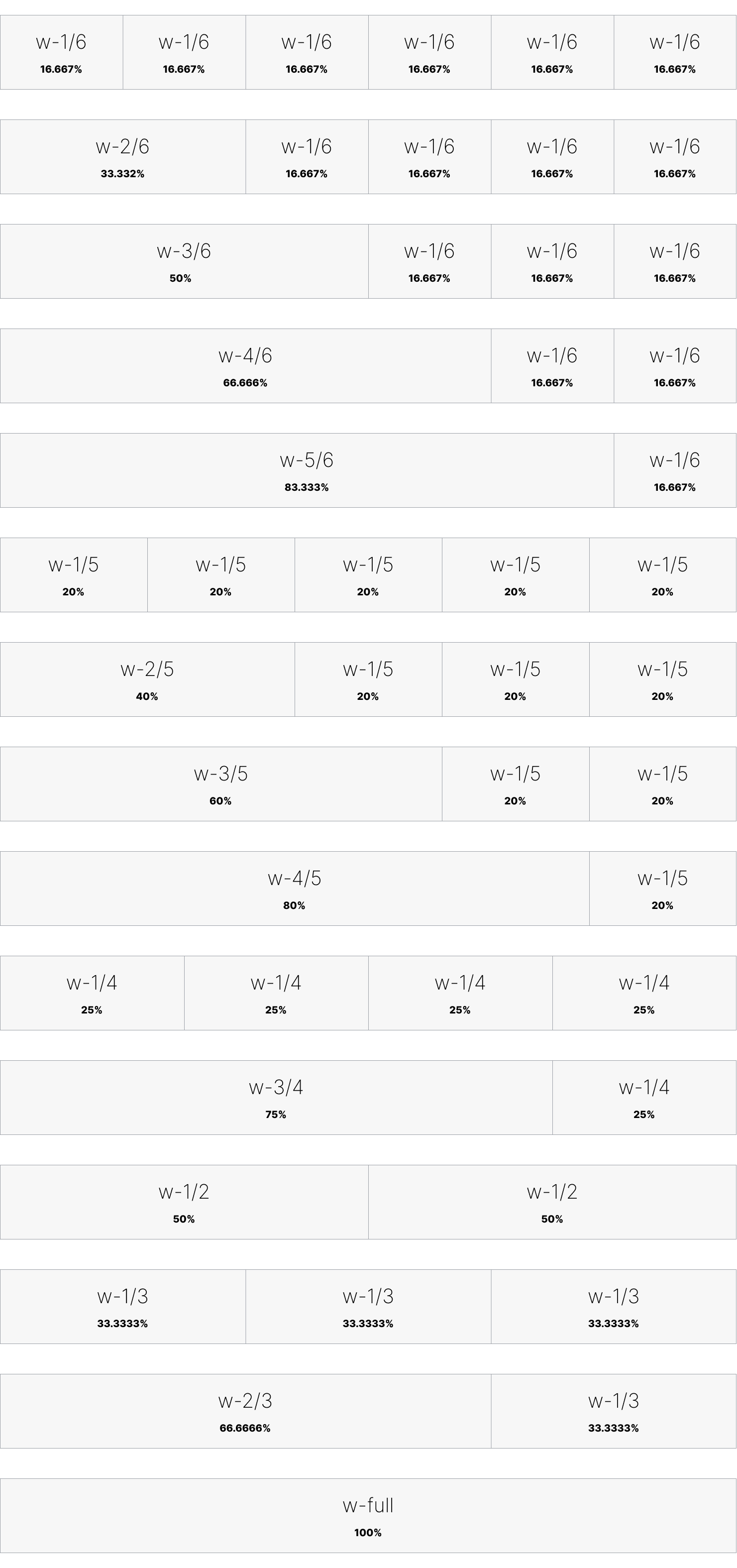
The 6-column approach
By default, the width of each column is ` 1/6th ` of the container. This means the column is created in multiples of 16.33%. The example below shows how a CSS Grid layout can be applied with responsive changes to columns and a column gap of ` 24px `.
The approach with CSS Grid
<div class="grid grid-cols-1 md:grid-cols-2 lg:grid-cols-3 xl:grid-cols-6 gap-6">
	<div>1/6</div>
	<div>1/6</div>
	<div>1/6</div>
	<div>1/6</div>
	<div>1/6</div>
	<div>1/6</div>
</div>
You may combine columns from 1 to 5. Refer to the example below, and also refer to Grid Column Start / End with flexbox and grid on TailwindCSS
<div class="grid grid-cols-1 lg:grid-cols-3 xl:grid-cols-6 gap-6">
	<div>1/6</div>
	<div class="col-auto lg:col-span-2">2/6</div>
	<div class="col-auto lg:col-span-3">3/6</div>
</div>
The approach with CSS Flexbox
The same example above - with a 6 column grid can also be achieved with CSS flexbox where you can control the width dynamically on breakpoints or turn off flexbox support on certain device sizes.
You must understand that flexbox as a property will not adjust the margin's in between. Hence, the example below shows flexbox applied for columns with no margin in between.
<div class="block lg:flex lg:flex-wrap lg:justify-start lg:items-center">
	<div class="w-full lg:w-2/6 xl:w-1/6">1/6</div>
	<div class="w-full lg:w-2/6 xl:w-1/6">1/6</div>
	<div class="w-full lg:w-2/6 xl:w-1/6">1/6</div>
	<div class="w-full lg:w-2/6 xl:w-1/6">1/6</div>
	<div class="w-full lg:w-2/6 xl:w-1/6">1/6</div>
	<div class="w-full lg:w-2/6 xl:w-1/6">1/6</div>
</div>
You can use width's for columns in the most flexible manner to achieve a ` 4-column approach` or a ` 3-column approach`
The 4-column approach creates containers in sizes of 25% each. A combination of these columns will create multiples of 25%. You may combine columns from 1 to 4, which is very useful in the creation of horizontal-stacked elements that consist of 4 items.
The 3 column approach creates containers in sizes of 33.33% each.
What about the traditional 12-column approach?
The 12-column grid approach (i.e. 1/12) has served as the pillar of consistent web design for many years, though without a real or substantial purpose.
Designers have now switched to the one-sixth, one-fourth, and one-third approaches for more realistic column widths. However, a 12-column grid may still be useful on larger screens. When designing a layout for a large screen, you may need to create a layout where there is very less emphasis on the sidebar and more on the content area. Essentially, 2/6 may be too big and 1/6 too small.
For this purpose, the Tailwind width approach does support 1/12 column sizes, as well. This approach may not be necessary in most cases, hence use it only when necessary.
Grid with spacing
By default, the width of a single column does not add space around it. However, traditionally, grid layouts would force a space (also known as a ` space ` or ` gutter `) between columns as opposed to modern-day web design, which may have elements with no spaces.
The use of spaces between columns is encouraged when the content needs to be visually split or to highlight a difference, like creating a set of cards to display the news on a homepage.
The width of the space can be controlled on each particular container or set of columns. Refer to Tailwind Space Between or Grid Column Start / End for details on available spacing.
The design system recommends a ` 24px ` for larger screens and the asthetic layout of the page can allow for adjustments to gaps between columns on smaller screen devices according to what looks best.
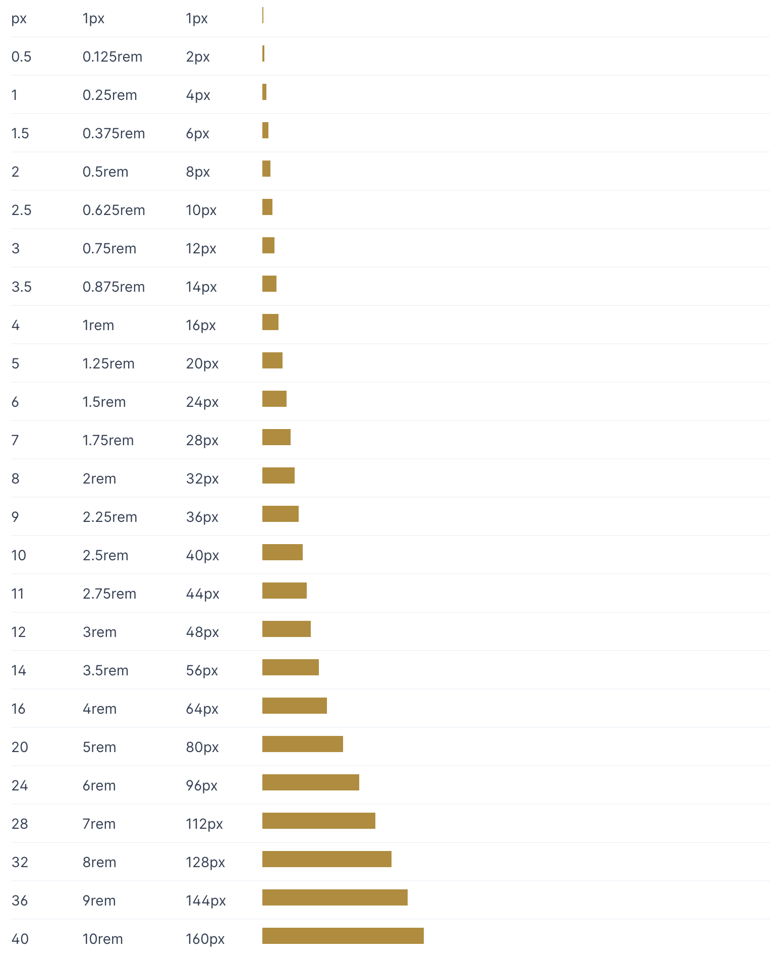
Spacing
Spacing is an important — and often overlooked — part of a design system. It is of paramount importance and must be used intelligently when designing a website. The term "make the website breathable" is often used by designers and it particularly refers to the spacing.
Use the scale
Whether it's a linear scale or a modular scale, adopting a standard is essential. By default, Tailwind includes a comprehensive numeric spacing scale.
Spacing units
Instead of arbitrary values, use standard units of spacing. This could be tied to a baseline grid and the size of a typographic element
Responsive adjustment
As screen sizes change, spacing might need to be adjusted. Account for changes in margins around the content area.
Visual balance
While mathematical consistency is essential, visual balance is equally critical. Always review designs to ensure that they feel right.
In essence, spacing isn't just about putting space between elements; it's a tool that can be used strategically to create clearer, more intuitive interfaces. As with any rule in design, understanding the rationale behind it is crucial because there will always be exceptions based on context.
The design system has increments of ` 2px ` until the base font size. Hence, upto ` 16px (1rem) `. After the base font size, the design system recommends using ` 4px ` as the increment upto ` 48px `.
The screen size and the layout you want to design may be open to spacing, and hence we recommend a proportional ratio, so ` 16 ` is twice as much spacing as ` 8 ` for example.