Imagery
Imagery conveys more than a message; it conveys a feeling ... a vibe. A consistent style of imagery is at the heart of creating your brand identity.
Principles of using images
Great imagery stays true to your brand; it conveys a consistent style, i.e. how busy the images are, colour, framing, mood, etc. A great image is also context-relevant. For example, the hero image on a services page could display positive human interaction, giving and receiving.

Memorable
Images should reflect realism to increase user connection and recognition.

Human
Use of people in imagery is recommended for more resonation with the user.

Future forward
The content outlook should be progressive and optimistic.
Using images
Bearing in mind the principles and the need to be context-relevant, the following approach must be kept in mind.
Photography
A perfect image is contextual. Our approach must be practical: it is recommended to conduct a photo-shoot and use real images that are relevant to the brand; if context-relevant images are not available first hand, source from third-party providers. The objective is to communicate real, relevant content visually.
Simplicity in background.
Use images with minimal content in the background. The subject should be in focus and concentration on the subject is more relevant. Do not use images with too much detail that can be communicated with simplicity.
The example here aims to communicate the use of a VR headset, and the simple approach makes it more memorable.

A simple approach with a focus on the subject.

Busy image with colours of the subject and background blending togeather.
Colour reduction.
Reduce the use of colours, or use natural colour.
Do not use too many colours or manipulate colours with an unrealistic hue, saturation, brightness, or contrast.

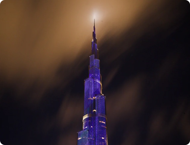
Natural lighting.
Capture photos with natural lighting. Balance the lighting, even if it means you need to take an image at night.
Do not take images where the lighting is not accurate and there are shadows on the object in focus.
Natural colour.
Use natural colour of the image, but adjust white balance for better colour balance. Do not use colour filters and fill un-natual colour to objects.
When selecting natural photos, put the following attributes in mind:
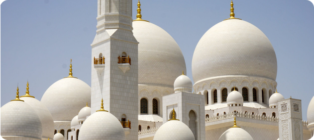
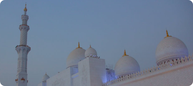
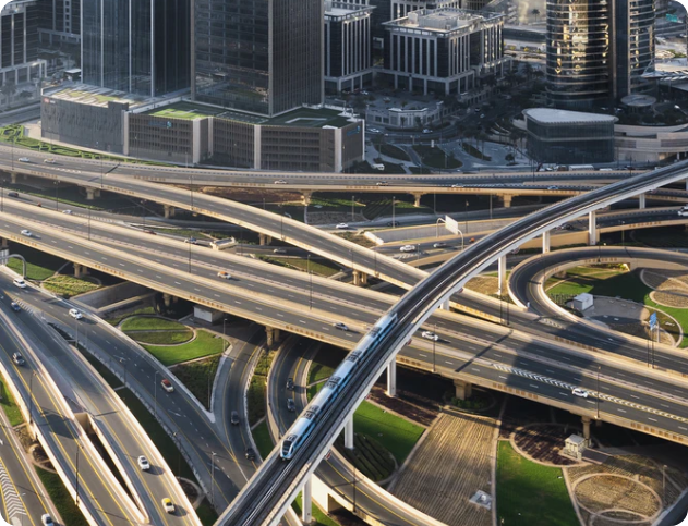
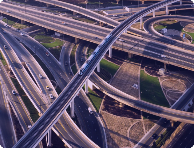
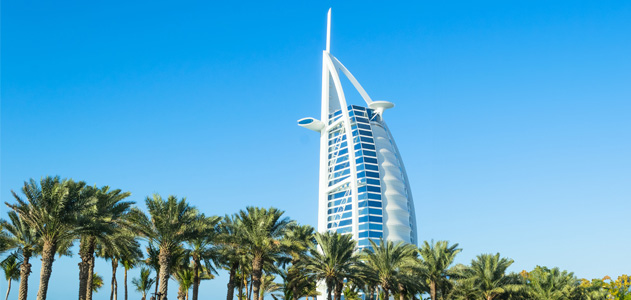
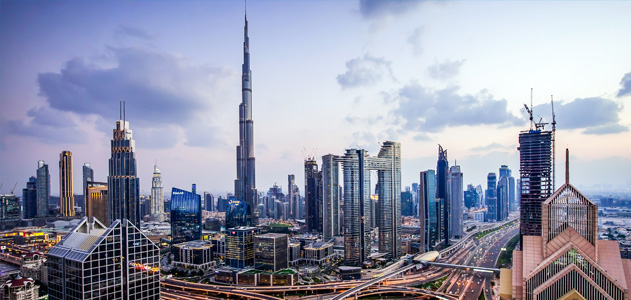
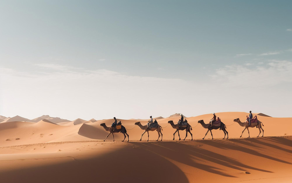
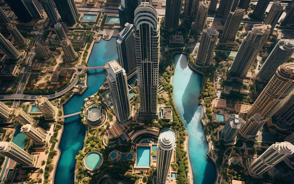
- Use landscapes, cityscapes, natural beauty, construction wonders, etc.
- Use people, reflect diversity, and show equality.
Framing
The rule of thirds in photography helps control the weight of objects in an image. Images with a single subject and solid background should follow the rule of thirds. Single and group objects with solid backgrounds should be centre-weighted.
Use the rule of third to control the weight of an image. Single and group objects with solid backgrounds should be centre-weight. Image with one foreground and background should follow the rule of thirds.
But, be careful when using this rule. The need to balance an image on the left or right is applicable when it comes to hero images, not for small-size containers.
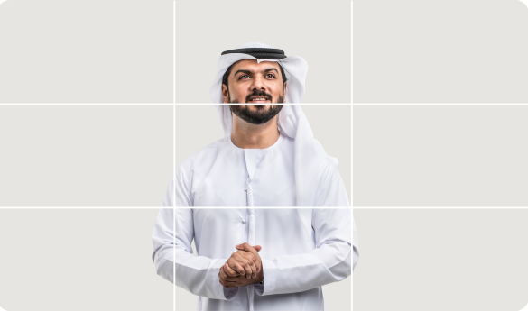
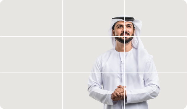
Apply this only for hero images (website headers), not for small size containers.
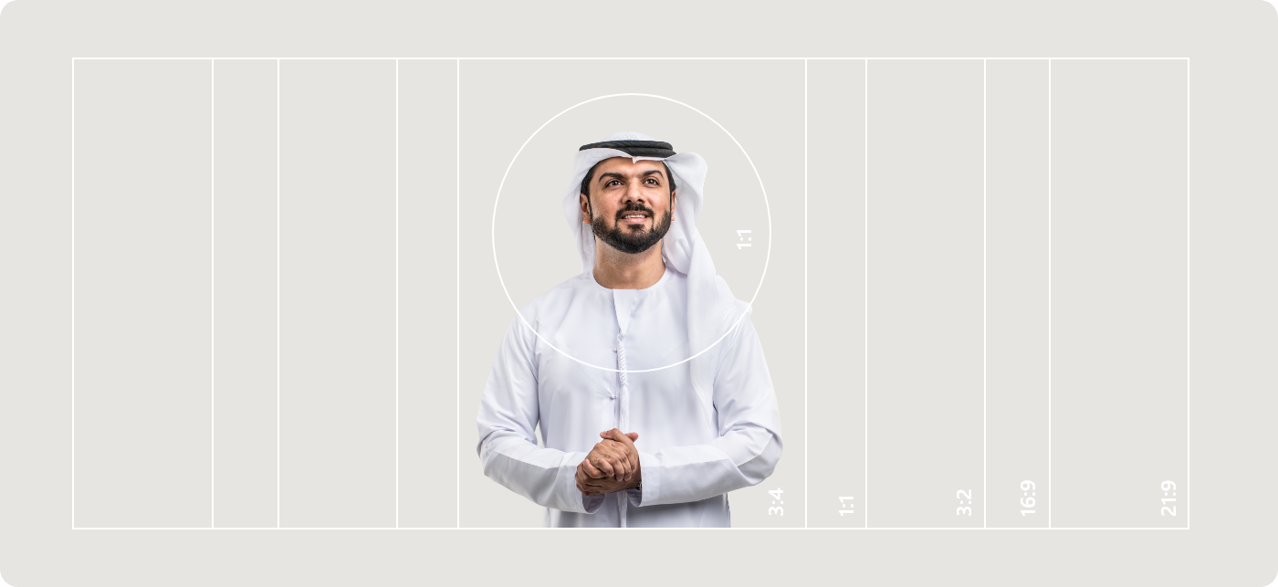
Cropping
Cropping an image follows the foreground and the focal point of the image. An image should be cropped in a way that emphasises the subject and declutters the photo, so there is greater focus on the focal point of the image.
Aspect ratio is part of a plugin in TailwindCSS as well - and is bundled with the design system by default. Learn more about the aspect ratio and how to use it on images.


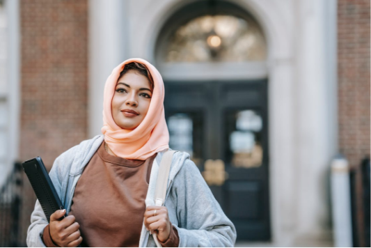
People
Use photographs that reflect diversity, happiness, and the quality of life that this nation provides to its citizens and residents.


Team photography
A team is a group of people on a singular mission. It is important that this unity is conveyed in a highly consistent visual style. The team section is a block available in the design system.
- Images should be uniform in weight, i.e. each subject occupies a consistent amount of space on their respective image.
- Photos should be taken in natural light at a similar time of day and at the same location for consistent brightness and shadows.


Do not take photographs of team members in different enviornments, seperate background colours and different positions.
Visual complexity
Visual complexity, also known as the 'busyness' of an image, is a topic that requires consideration when using images on a website. This is a reference to the number of elements, colours, and contrast in an image.
Foreground and background
For images featuring several objects, primarily featuring events or the outdoors, separate the foreground from the background. Always concentrate on the subject.
Use images that have a prominent subject. The focal point should occupy approximately 50% of the image in the foreground. Do not, blur the background artificially to create focus on the object.
Where the use of a photograph that is unavoidable or deemed necessary has visual complexity, ensure there is natural blue or the image is cropped.

Position the main object in the foreground and the environment in the background.

Use a natural blur. The above image is not natural.

Notice the subject is sharp, while the background is blurred using natural aperture levels.
Colour, tone, and contrast
If you’re looking for a specific colour palette to be visible in your images, it is important to ensure that photoshoots are set up to capture the intended colour tones. Do not add colour overlays during post-production; only edit for location-based temperature correction.
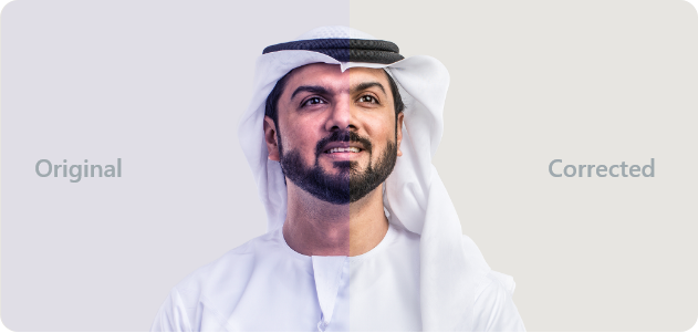
Correct the colour temperature.
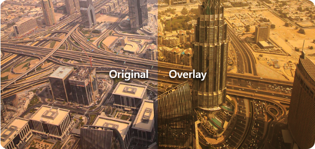
Do not add overlays or a tint when there is no text on the image.
Use clean photographs
Do not use heavily edited images.
Text on images
Ideally, use an image that has space to add text. If you have to use images with limited or no space, add an overlay to create contrast.

Use images with solid background and add text in the space adjacent to the image.

Try not to overlap the image with text, and when it is not avoidable, use an overlay.

Place the text behind the image only if it preserves readability.

Do not place text behind the object when it compromises text readability.

Add a 30% black colour overlay on semi-complicated images before adding text on it.

Do not add any other colour as an overlay apart from black.

Increase the black colour overlay to 60% black to very bright or crowded images when required.

Never add coloured text on a bright or crowded image without an overlay.

Always aim to seperate the image and text to provide the best readability experience.
Image quality
Resolution, sharpness, and size determine the quality of an image. Always use correct dimensions of your image and resize them propotionately as per the aspect ratio of the image.

Do no use incorrect dimensions or increase dimensions in code as it deteriorates sharpness.
Using image source sets
Source sets ( or as described as an HTML attribute as ` srcset `) is the attribute that specifies the list of images to use in different browser situations. The browser will pick the most optimal image version, based on the screen size and resolution. This concept is known as responsive images.
Larger images have larger file sizes. There’s no point in loading, for example, a 2400-pixel wide, 20 MB image on a simple mobile phone. So srcset is saving bandwidth and reducing the page load speed. Load speed is a direct ranking factor for searches.
<img
srcset="gov-image-480w.jpg 480w, gov-image-800w.jpg 800w"
sizes="(max-width: 600px) 480px, 800px"
src="gov-image-800w.jpg"
alt="The image to be used">
Using the picture element for images
The <picture> element also allows browsers to display different images based on device characteristics. But with this element, you can define totally different images, not just their size versions.
In the example below, the image titled ` setup-001_primary.jpg ` or ` setup-001_primary-2x.jpg ` will be displayed on devices where the screem size is more than 768 px. The default image will be what is within the image tag and will be the smallest resolution to load.
<picture>
	<source media="(min-width:768px)" srcset="setup-001_primary.jpg, setup-001_primary-2x.jpg 2x">
	<source media="(min-width:465px)" srcset="setup-001_tablet.jpg">
	<img src="setup-001_mobile.jpg" alt="The default image" >
</picture>
The need for a CDN
A content delivery network, or content distribution network, is a geographically distributed network of proxy servers and their data centres.
It is strongly recommended to use a CDN to distribute assets such as images and video content. The use of a CDN brings:
- speed
- efficiency
- the ability to serve images per device
Using image extensions
WebP was first announced back in 2010 and has since been upgraded and improved until its current version. WebP images are usually smaller than their counterparts, but with the same quality, thanks to their superior compression capabilities.
WebP typically achieves an average of 30% more compression than JPEG and JPEG 2000 do, without loss of image quality.
- Use a converter to serve images in WebP and not in JPEG (JPG).
- The original JPEG (JPG) file should also be preserved within the server to use with browsers that do not support WebP.
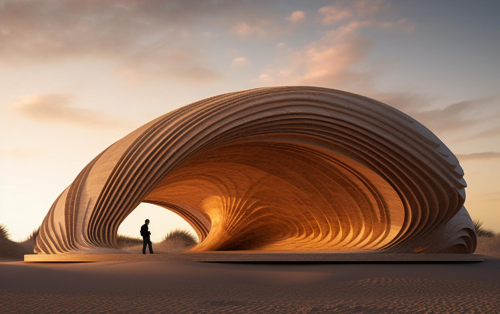
Using computer-generated imagery
If taking photographs or searching for relevant stock images is not feasible, CGI is our recommended approach. These images are developed using specialist software; there are a lot of possibilities. You can control the complete process of shaping up the content, from lighting to layout.
However, it must be highlighted that the use of CGI for images must be minimal and used only when required.
The responsible use of AI-generated imagery
With the use of assisted prompt-based artificial intelligence, the use of generating computer-generated imagery has become easy. The use of such images generated by this technology must be carefully used.
Using artificial intelligence (AI) assisted images can be used to create objects and further edit them or use part of the generated images to achieve the final image to be used on the website.
- Do not generate images that are against the values, principles, ethnic beliefs, and culture
- Do not generate and use images that are unrealistic in nature.
- Do not generate images that convey information that is not relevant.
Application of CGI images
It is recommended to use CGI images in hero images only. If CGI is required with other images for cards and tiles, a validation should be provided as to why natural photography was not used.
Using illustrations
Illustrations are used to tell a story, convey a mood, or utilise a metaphor to make a complex idea clear and relevant. They are one of many ways to represent values that users can engage and connect with. Think of illustrations along the same lines as photography and videography—they are visual storytelling tools.
The use of illustrations has to be part of a theme or a pattern. A particular illustration style needs to be selected, and this needs to be used consistently across all communication.

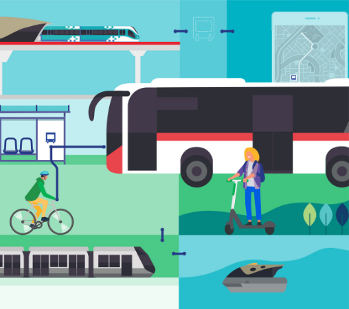
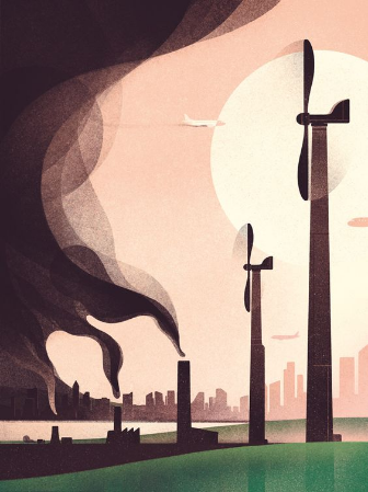

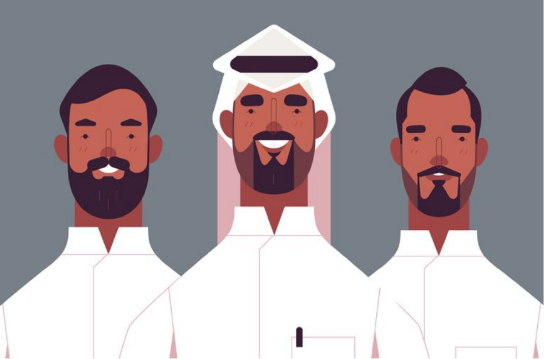
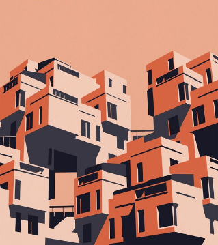

Illustration principles
Less is more
Create simple styles that are easy to recognize.
Geometric
Create illustrations using basic geometric shapes.
Solid colours
Don’t use gradients, contouring, or soft transitions for illustrations.
Hierarchy
Position the subject in the foreground and place supporting objects in the background.
High contrast
Strong contrast helps the important elements of an illustration stand out.
Where to use illustrations
You may use illustrations on websites in the following components and blocks:
- Hero section
- Blog content primary image
- Spot illustration on content blobs
- Cards
- Error pages
- Empty states
Remember;
- Illustrations are a strong storytelling method. Use them only where required.
- Mixing illustration and photography should follow an 80–20 rule. If the theme of the website is to use illustrations, then the use of real-world photography should occupy 20% of the design, while illustrations should occupy 80%. Reverse this rule if the primary theme of the website is to use photography.
- Icons are recommended to use over illustrations if the object is less than 100 px in width.
