Mobile applications
This guideline focuses on establishing consistent navigation patterns, authentication flows, and information architecture for UAE Federal Government mobile apps, leveraging current design trends to enhance user experience. The goal is to create a unified and intuitive digital experience across all government services.
Core principles
User-Centric
Every design decision must prioritise the user's needs and expectations. Extensive user research and testing are crucial throughout the development process.
Simplicity
Avoid jargon and complex terminology. Use clear, concise language and intuitive icons which is further described in the Content Guideline.
Accessibility
Adhere to accessibility guidelines (WCAG) to ensure inclusivity for all users. Consider font sizes, colour contrast, and screen reader compatibility and more.
Consistency
Maintain a consistent design system across all government apps, including branding, typography, colour palettes, and interaction patterns.
Security
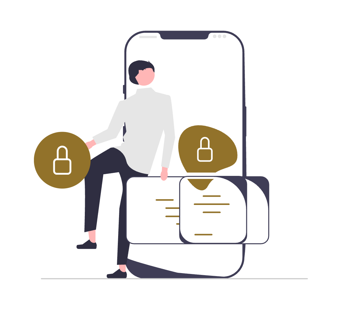
Integrate robust security measures throughout the app, particularly for authentication and data handling. Transparency about data privacy is essential.
Performance
Optimise the app for speed and responsiveness. Minimise loading times and ensure smooth transitions between screens.
Mobile App Consistency Framework
The UAE Design System currently has a set of components and blocks designed to be used for websites and web applications. These components may also be used creatively for native mobile apps as well.
Components designed as part of the UAE Design System are tested for use on web and mobile. The need to maintain consistency requires that the experience of a user on the web and mobile must be consistent.
The following components in the design system are clearly usable for mobile applications as well:
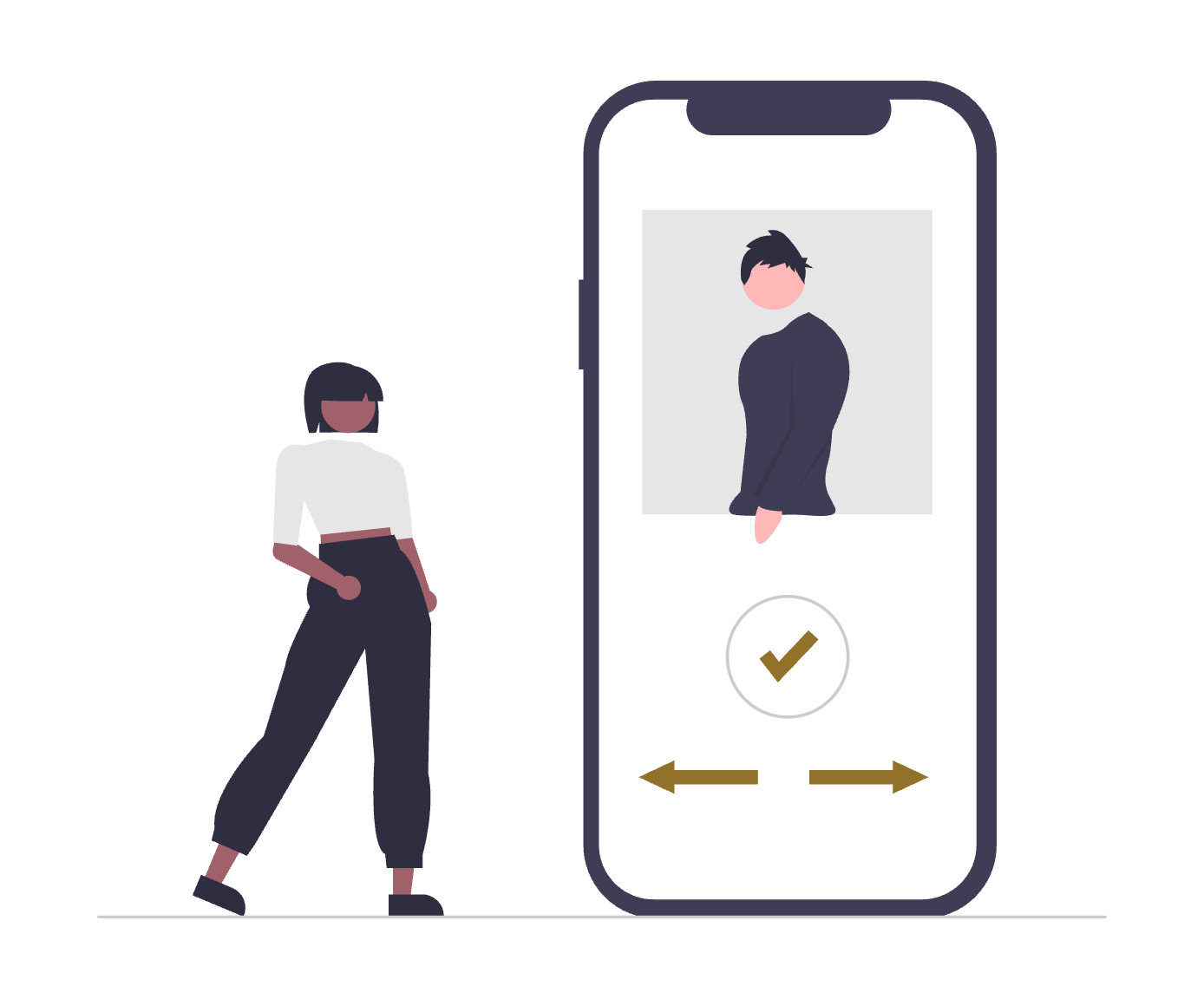
The authentication method: Using UAE PASS
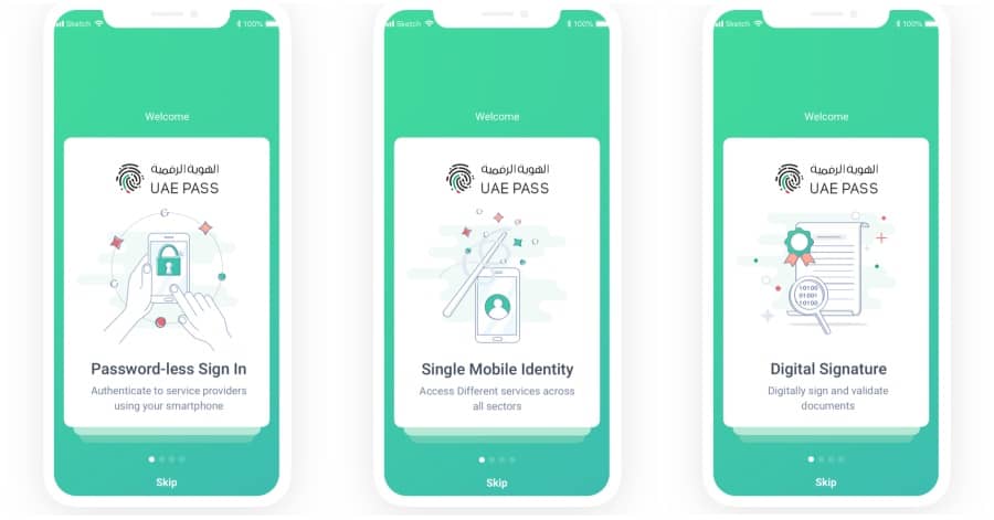
What is UAE PASS?
UAE Pass is the United Arab Emirates' national digital identity and signature solution. It's a secure platform that allows users to access various government and private sector services using a single, unified login. This means residents and citizens can use the platform to access services, sign documents, and verify their identity across different platforms.
Steps for authentication in mobile apps
- Make UAE PASS the primary authentication method, as it's the national digital identity system. Your mobile application’s primary authentication method must be UAE PASS. Offering a secondary method of authentication must require prior approval from the UAE PASS team.
- Implement biometric login (fingerprint/face recognition) as a secondary quick access method. It is a common and user-friendly option to maintain a user session and re-authenticate a user based on biometrics.
- Allow for PIN/Passcode backup authentication. This must be the 3rd solution implemented for authentication and must still be available when biometric authentication is not possible or rejected by the user. The PIN/Passcode method must also be used in place of biometric authentication when critical change or update is required.
- Design a clear first-time user onboarding that guides users through UAE PASS registration. If there is a user who is using the app for the first time, or goes through a registration process, you must have at least a 3 step onboarding journey. This must get further actions processed from the user - such as setting preferences, allow for notifications and more.
Splash screen and onboarding
Splash screens
A splash screen is an introductory screen that appears when an app is launched. The main purpose of a splash screen is to create a branded experience while the app loads, providing a smooth transition into the app’s main interface.
The key take away is that the purpose of a splash screen is to show it "while the app loads". You may add creative elements to the splash screen, including animations or video - however the splash screen must disappear and transition into the application interface as soon as the app loads.
In fact, you must make an effort and plan for the app to load instantly, hence the splash screen must be visible to a user for the least amount of time.
Onboarding journey
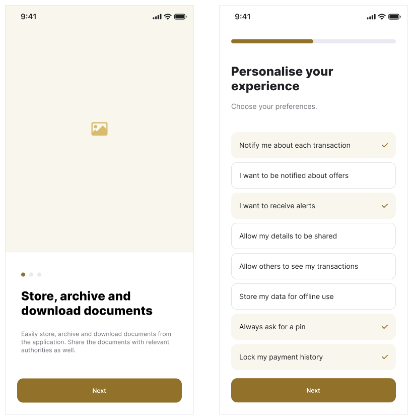
When a user downloads the application for the first time, provide an onboarding journey or an experience to educate the user about the features of the app.
If you provide only a set of screen's that highlight features, you must not exceed 4 screens. If you are asking the user for inputs that configures the app for the user, you must ask relevant questions and make the setup process easy. You may also combine both - a screen to highlight features and an ability to set prefereces.
In any case, you must only show the onboarding process to a user who has downloaded the app for the first time.
Navigation pattern
This section outlines specific instructions for implementing navigation within UAE Federal Government mobile apps, prioritising clarity and ease of use.
Bottom fixed navigation
For most transactional government apps, bottom navigation is the preferred method. It provides direct access to the app's core functions and is highly user-friendly.
Implementation
Design a bottom navigation bar that persists across all screens of the app. Limit the number of items in this bar to 3-5 key sections. Use clear, universally understood icons paired with concise text labels for each section. Ensure sufficient spacing between icons for easy tapping.
Fixed bottom icon navbar
This involves placing equally spaced and consistently sized icons. These icon-based navigation buttons must be the most relevant parts of the app that capture the user journey. The last icon of the app must lead to a "More" menu.
You may have a minimum of 3 (three) and a maximum of 5 (five) navigation elements on your fixed nav bar.
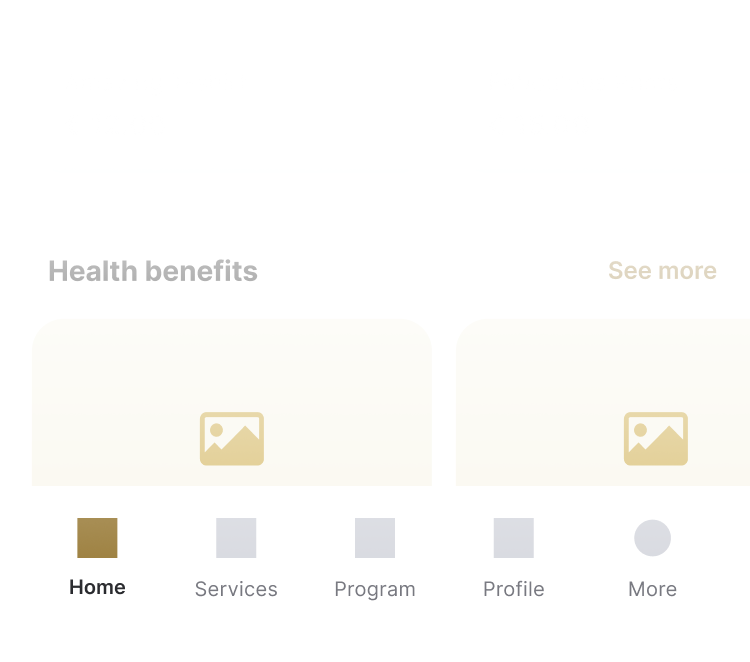
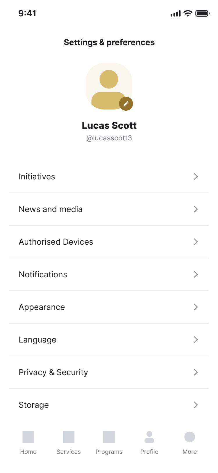
The "More" menu screen
The "More" or "Menu" option should be added to the bottom navigation bar as the last element. This opens a secondary menu containing less frequently used features or sections.
The "More" icon should be easily recognisable (e.g., three dots or a "More" label). Tapping this icon should reveal a slide-up or overlay menu, clearly listing the additional sections.
This section may be designed creatively or as a simple list with groups. The objective of this screen is to allow the user to reach all parts of the app with ease.
It is advisable to arrange this menu into groups - however do not collapse menu elements that requires them to be expanded.
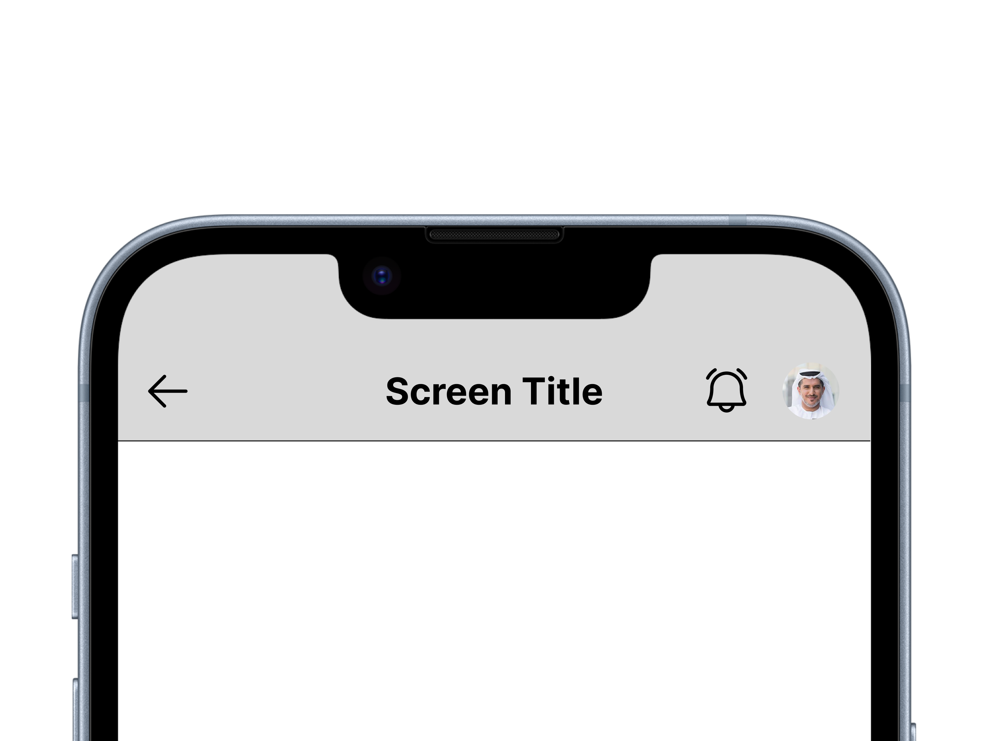
Title / Header bar pattern
The title/header bar is a crucial element for providing context and quick access to essential user actions. Consistency in its design and functionality across all government apps is vital.
The title/header bar should be positioned at the top of every screen - with the exception of the primary landing screen. It is advisable to keep it persistent and remain visible even when scrolling.
By adhering to these guidelines for the header/title bar design, UAE Federal Government mobile apps can provide a consistent and user-friendly experience, enabling citizens and residents to easily navigate, access notifications, and manage their profiles. This contributes to a unified and professional digital presence for government services.
Elements of a title bar should include:
- Page Title: There must exist, the ability to showcase the title of the current page when the page is navigated to. Keep titles concise and descriptive. Use clear and legible typography. Avoid overly long titles that might get truncated.
There can be an exception for this on the primary landing screen. As an example, you may not need a title called “Dashboard”. Instead use this space to welcome the user and use inclusive text such as “Welcome {user}” or greet the user. However, when the user is on a screen regarding a service such as “Pay for parking” or “My documents”, the title must be clearly defined. - Notifications Icon: On the right side of the header, include a notifications icon (e.g., a bell icon). This icon should indicate the presence of unread notifications, perhaps with a badge displaying the number of new notifications. Tapping the icon should take the user to the notifications screen.
- User Profile/Avatar: To the far right of the header, include a user profile icon or avatar. This provides quick access to the user's profile settings, account information, and potentially a logout option. If the user has set a profile picture, display it as a small circular avatar. If not, a default placeholder icon should be used.
The use of a contextual back button
As mentioned, the back button should only appear when the user has navigated from another screen.
Maintain a consistent style for the header across all screens and apps, including the position of the back button, however, you may need to consider the need to adhere to the policy of language and layout for such placements.
Pattern for English:
[Back Button (if applicable)] [Page Title] [Notifications Icon] [User Profile/Avatar]
Pattern for Arabic:
[User Profile/Avatar] [Notifications Icon] [Page Title] [Back Button (if applicable)]
Other navigation elements
Internal navigation
Within each screen of the mobile app, there may be a need to organise navigation. For this purpose, you may use components such as a tab layout (with pills, tabbed pane or more) or an accordion.
You may further have a secondary list of links that lead the user to other screens and sections of your mobile app
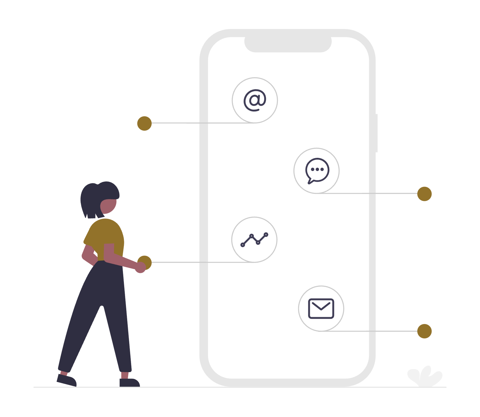
Information architecture
A mobile app is fundamentally different from a website. A website may attract an audience that may be still in a "discovery" mode. This means that there is still a need to research, understand and discover what needs to be done.
Research shows that when a user has downloaded a mobile application, and authenticated themselves, their purpose is not to discover but rather to "take action" or "get feedback".
Hence, information architecture and the arrangement of content as well the user flow can be different to that of a website. Here are the most important sections that you must keep in mind regarding the information architecture of a mobile application.
- Logical Structure: Organise information in a clear and logical hierarchy. Group related content together and use consistent labelling. This is perhaps the most important part of a mobile app design UX - and must be considered based on prior analytics or user research. The structure of how you present information must be carefully thought out.
- Clear Hierarchy: Use visual cues (font size, colour, spacing) to indicate the hierarchy of information. Ensure important information is easily accessible.
- Micro-interactions: Use subtle animations and feedback to guide users and provide visual confirmation of actions. This enhances the user experience and makes the app more engaging. Ensure to follow accessibility guidelines in terms of animations and the ability to detect motion settings from the device’s settings - thereby adapting the animations in the app.
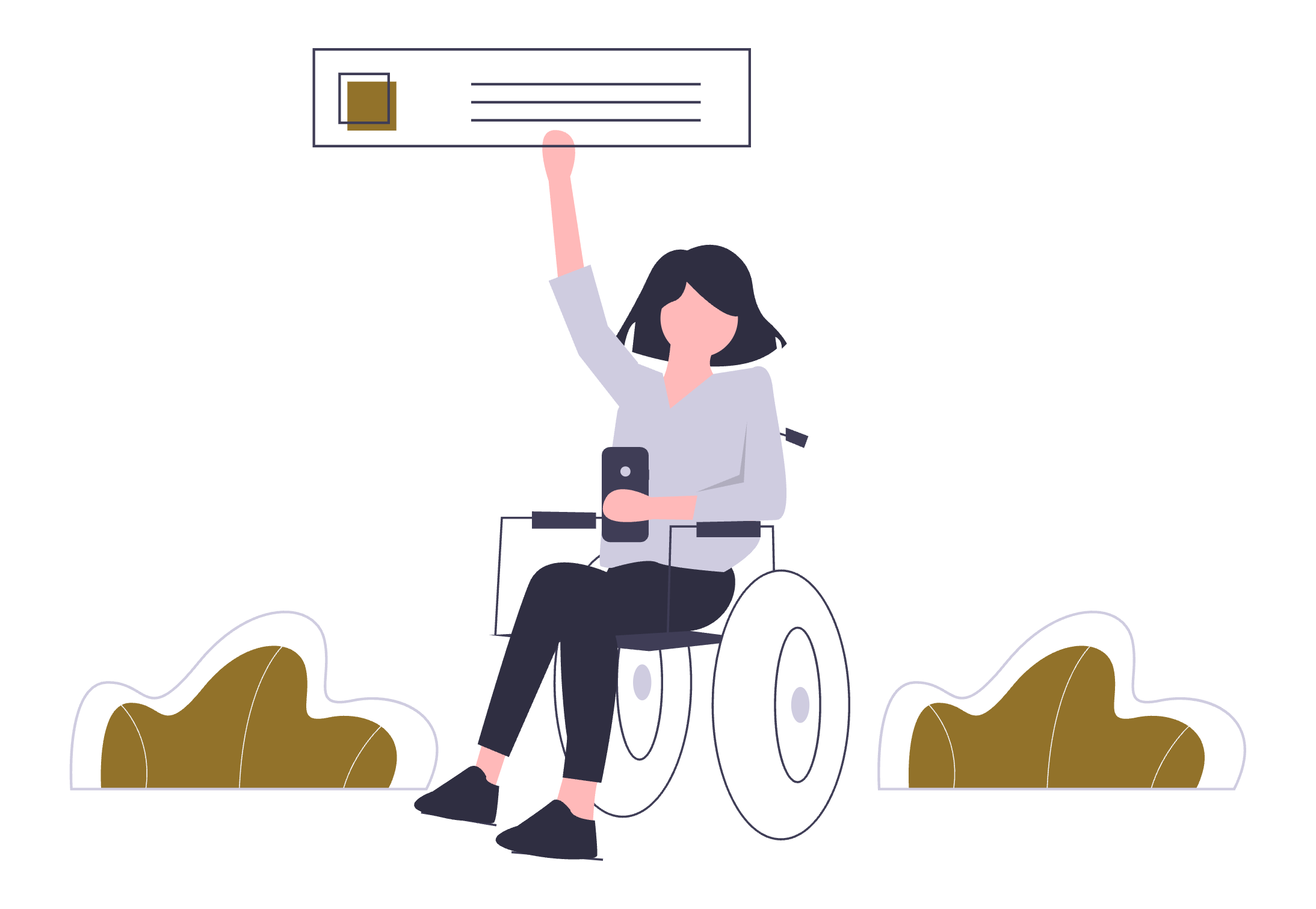
- Personalisation: Consider personalising the app experience based on user preferences and demographics. This can include recommending relevant services or displaying personalised notifications.
- Feedback Mechanism: Provide users with easy ways to provide feedback on the app. This can include in-app surveys, feedback forms, or contact information.
From the above list, let us discuss "Personalisation" and "Feedback Mechanism" in a bit more detail.
The use of Customer Pulse
Pursuant to the Customer Happiness Charter for Federal Government Services, the UAE Government launched several efforts to apply the charter and ensure customer happiness. Efforts include Emirates Government Services Excellence Programme, Customer Happiness Culture, the Global Star Rating System, innovation to improve customer experience, Customer Happiness Studies, Happiness Meter and Mystery Shopper studies.
Customer Pulse is an initiative under which all government customers are asked for feedback about their experience in executing a transaction with the government or getting a service from the government, through a survey. Feedback is gathered in the form of suggestion, complaint or compliment.
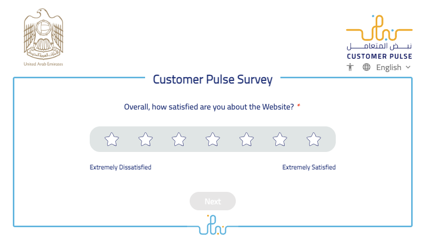
Implementing Customer Pulse in your mobile application for the purpose of feedback is mandatory. It is recommended to trigger this action, every time a user has successfully completed the application of a service.
Smart use of Personalisation
There are several factors that can help personalise the experience of the applicaiton. As soon as a user has authenticated themselves using UAE PASS, you have several details about the user. Moreover, you may have existing data about the user and their past interactions as well.
Use this data to provide the user with the most appropriate information upfront. Here are some example senarios:
- The residency status of an individual can determine many aspects of the services that may be most useful to the individual. Tailor the list of services based on this factor to help the individual minimise their search.
- Use the data about the individual's employment status - to determine if they re emmployeed, not employed, and investor, a business owner or more to tailor the experience of what would be relevant services for them.
- Use the data of past interactions, such as recently applied services or services that are still in progress to promtly share with the user some feedback about the services or recommend next actions.
- Change the information on the dashboard to provide the most relevant alerts, notices, messages etc. For example, if an expiry date is nearing - inform the user upfront about an upcoming expiry.
- Use data about the individual's family status to determine if there are more services that may be useful to the individual. For example, if the logged in individual is a sponsor and has a family under his/her sponsorship, you may want to tailor services that are relevant to such a status.
Personalisation creates an experience that helps the user feel connected with the application and allows them to interact with what is important.
The above details are only examples of how Personalisation can improve the user experience. You are encouraged to use data to create many more such scenarios.
Design trends to consider
Staying current with design trends is crucial for creating modern and engaging user experiences. However, it's important to apply trends judiciously, prioritising usability and accessibility over fleeting fads.
Flat UI / Soft UI
In recent years, Flat UI has emerged as a dominant trend in mobile app design — and for good reason. Flat UI strips away excessive visual flourishes like shadows, gradients, and 3D effects in favor of clean, minimalist, and highly functional design.
This design approach aligns perfectly with the UAE Design System’s core principles of clarity, accessibility, and speed. Flat UI prioritizes content and usability, ensuring that users can focus on tasks without distraction.
Dark mode
Offering a dark mode option is increasingly popular and beneficial. It reduces eye strain, especially in low-light environments, and can also improve battery life on devices with OLED screens.
Dark mode involves switching the app's colour scheme to primarily dark backgrounds with light text. It's crucial to maintain sufficient contrast between text and background elements to ensure readability. Intelligently, utilise the settings on the user’s device to detect if dark mode has been used at an operating system level. If this is enabled, the app should automatically switch to Dark Mode.
Test the dark mode implementation thoroughly to ensure accessibility and a consistent user experience. Allow users to easily switch between light and dark modes - overriding their system preference.
Micro-interactions and Animations
Micro-interactions are small, subtle animations and transitions that provide feedback to user actions and guide them through the app. They enhance the user experience by making the app feel more engaging and intuitive.
Examples of micro-interactions include popping effects on modals, loading animations, and smooth transitions between screens. These animations should be subtle and purposeful, not distracting or excessive. They should provide clear feedback to user actions, such as confirming a button press or indicating that a process is loading.
Minimalism
Embracing a clean and uncluttered design is essential for mobile apps. Focus on essential elements and avoid unnecessary distractions. A minimalist approach improves usability and makes the app easier to navigate. Minimalism involves removing unnecessary UI elements and focusing on core functionality.
Use whitespace effectively to create visual breathing room and improve readability. Prioritise straightforward typography and intuitive iconography. Avoid clutter and prioritise content.
Offline data cache
Mobile applications reside on individual users' devices, and users can access a mobile application without an active internet connection.
It is quite possible that as soon as a user opens the application, they need to validate their session. This is a recommended method when saving user session data on the device so that the user does not have to log in each time they open the application.
However, running this check requires an active internet connection.
Offline data caches are great for general information that may not require authentication to be verified to provide an update. Caching general content, news, or service information and content is acceptable. You may also allow a user to access content and information on the application until the user needs to authenticate themselves.
When the user does reach such a step:
- ❌ Do not display a blank screen. If a user clicks on the "Login with UAE PASS" button and a blank screen appears, the appropriate method would be to disable the button and show a message that no internet connection has been detected.
- ❌ Do not show a constant loading icon only.
- ❌ Do not use the word " Error ".
- ❌ Do not use messages such as " Failed to get information ".
You may have a clear notification pop-up or a screen designed that highlights to the user that internet connection was not detected.
- ✅ Design a UI that indicates that the connection to the internet was not detected.
- ✅ Display this message at the relevant section if you are using an offline data cache
- ✅ Remove this message and allow the user to continue using the application as soon as the connection to the internet is detected. Do not expect the user to restart their application.
