Colour system
The colour system is a carefully curated combination of palettes that represent strength and softness. It helps you define your digital and webspace, allowing you to highlight and communicate your strengths.
All the colours listed below went through several rounds of testing in actual designs, where their aesthetic appearance and range of accessibility were observed and documented.
The core palette
The core palette represents strength.
Representing the United Arab Emirates and the Federal Ministry’s identity, the selection of colours for the core palette will help communicate the entity’s role clearly, allowing for better representation of the nation locally and globally. This core palette of colours has been approved for use across all federal government entities by the UAE Cabinet Office.
Black plays a critical role in determining the overall aesthetics of the layout (look and feel). For more information, see the environment colour section.
What can you do
For ministries
The core palette is considered a primary colour range. Your digital and web space must use these colours without the possibility of changing the colour swatch.
There are no exceptions to this criteria.
For authorities
The core palette is considered a primary colour range. It is recommended to use the core palette for your digital and web space.
However, you may opt to change the primary colour and adapt it to your primary brand colour.
The supporting palette
These colours represent softness. These will allow readers to relate to the content better, given its contrast to the core palette colour scheme and will add a human touch to the overall feel of the website, improving readability.
Use it to select and/or design content (i.e. imagery, illustrations, iconography, data, etc.) that is consistent with the core palette.
Creating a custom palette
If an Authority, other government entity, or any other organisation operating under the government of the United Arab Emirates wants to use the design system and override the colours, they may do so.
- Use the colour swatch generator to create a palette with shades ranging from 50 to 950.
- Always add your colour as a new colour and do not replace an existing colour.
It is imperative to note that by making a change in the colour palette, all components and blocks utilizing these colours will have an immediate effect. Make sure the design tokens are updated to reflect your colour.
How to add a colour configuration
- With Tailwind CSS v4, all colour tokens are now added directly in your CSS file using the
@themedirective. This replaces the oldtailwind.config.jsapproach. -
To replace the primary and secondary colours, add your colour swatch using CSS custom properties in the
@themeblock. Here is an example of how you can do this. Let us assume that your primary brand colour isrgb(23, 28, 143) (#171c8f).You must create your colour swatch using your primary brand colour at the value of 600./* In your CSS file (e.g., src/styles.css) */ @layer base; @import "tailwindcss"; @plugin "@tailwindcss/forms"; @plugin "@tailwindcss/typography"; @plugin "@aegov/design-system"; @theme { /* Replace primary color */ --color-primary-50: #E0E2FA; --color-primary-100: #C8CAF6; --color-primary-200: #989CEE; --color-primary-300: #686DE7; --color-primary-400: #373EDF; --color-primary-500: #1F25BF; --color-primary-600: #171C8F; --color-primary-700: #121670; --color-primary-800: #0D1051; --color-primary-900: #080A33; --color-primary-950: #060723; }You may use a tool such as Tailwind Shades or UI Colors. Both can be used to customize exactly what colour value needs to be at which level. UI Colour will also provide accessiblity testing on your swatch.
This link will direct you to an external website in a new tab which may have a different content and privacy policy than this website. - Remember that by replacing the primary or secondary colour, you are essentially affecting every component and block in the design system for your project. All components will adapt to the colour system token defined.
-
If you need to add a new colour swatch and use it additionally in your project, you can add it in the same
@themeblock by giving the colour a custom name. By adding a new colour swatch, all additional CSS utilities will adapt to the colour defined./* In your CSS file (e.g., src/styles.css) */ @layer base; @import "tailwindcss"; @plugin "@tailwindcss/forms"; @plugin "@tailwindcss/typography"; @plugin "@aegov/design-system"; @theme { /* Add custom color swatch */ --color-kulture-50: #E0E2FA; --color-kulture-100: #C8CAF6; --color-kulture-200: #989CEE; --color-kulture-300: #686DE7; --color-kulture-400: #373EDF; --color-kulture-500: #1F25BF; --color-kulture-600: #171C8F; --color-kulture-700: #121670; --color-kulture-800: #0D1051; --color-kulture-900: #080A33; --color-kulture-950: #060723; }You can now use your custom color with utilities like
bg-kulture-600,text-kulture-500, etc.For more information on how to configure colours in Tailwind CSS v4, you can refer to the documentation on TailwindCSS theme configuration.
This link will direct you to an external website in a new tab which may have a different content and privacy policy than this website.
Enviornment colours
The function of the Environment Colours is to determine the atmosphere and layouts of the web pages. Each colour has its own language, and these neutral shades work silently in the background to enhance the look and feel of the page’s content.
The purpose of a defining environment is to create contrast.
The neutral palettes
By specifying neutral colours for backgrounds and content, we provide an additional layer that can further ensure readability and accessibility. Neutral tones serve as the default settings for the UI of the project, acting as a baseline for accessibility and aesthetic cohesiveness.
Hence, when it comes to the background colour, the following tones are acceptable from the defined colour in the palette.
Shades of White
Shades of Slate
Shades of AEBlack
Background patterns
In certain visual design elements, you may choose to include a background repeating image as a pattern for a section. The design system has no objection to the use of a background pattern. However, for the purpose of content usability, the following rules must be observed.
- You may not use a background on the homepage of your website unless it is for a section that is before the footer of the website.
- You may use a background pattern on sections of any inner page, only when:
- The contrast ratio of the pattern colour and the content on it is higher than 4.5. Use tools similar to https://www.getstark.co in your design process to check the background image-to-text contrast ratio.
This link will direct you to an external website in a new tab which may have a different content and privacy policy than this website.
- It is prudent to use a background repeating pattern that is 8% darker than the background of the section it is placed on. For example, if the background colour is white (#FFFFFF) then it would be ideal to have a background repeating pattern that is not darker than #EBEBEB. Use a tool such as https://mdigi.tools/darken-color to determine the darkening percentage of a particular colour.
This link will direct you to an external website in a new tab which may have a different content and privacy policy than this website.
- The contrast ratio of the pattern colour and the content on it is higher than 4.5. Use tools similar to https://www.getstark.co in your design process to check the background image-to-text contrast ratio.
Creating contrast
One of the best ways to create a user-friendly webpage is to start the design process using neutral palettes to determine low-fidelity wireframes and other details. Once this is complete, it is easier to apply colours to the most important elements (such as buttons) to achieve the perfect contrast that allows for smooth navigation and enhanced user experience.

Low fidelity wireframing using a neutral colour palette.
High fidelity wireframing using a neutral colour palette. Use actual content to determine spacing and usage.
Apply core palette colours to the elements. Create a complete visual design using final usable elements.
Gradient colour
Gradients add life through a change in texture or background, allowing the design elements and content to stand out.
Create gradients with colours from the same tonality. This means the gradient for a certain colour may be between the shared use of 950 to 50. There are 3 recommended gradient shades that can be used.
Subtle
Light
Dark
You may create cross-palette colour gradients with colours that still fall within a contrasting tonality. For example, you may choose to create a gradient between Pure White and UAE Gold. However, you must not create a gradient between UAE Green and UAE Gold.
You must use the contrast ratio tool to determine the use of gradient. You can also learn more about the application of gradient on TailwindCSS's Gradient Color Stops
Controlled shading
Cross palette #1
Cross palette #2
Text colour
We recommend using black (AEBlack) for text in order to achieve the highest ratio of contrast and improved readability. Also, core colours can be used for text or coloured backgrounds.
UAE Black on White
White on UAE Black
White on UAE Gold
UAE Gold Version
Functional text colour
The user associates specific content with particular colours from memory — the recall power is quite strong. Therefore, you should choose the correct colours to direct the intended user action. Functional colours and elements related to these are divided into 2 parts: primary functions and secondary functions.
Primary actions
A primary function message is triggered after a user has taken an action. A success message and an error message are examples of a primary function. For more information, see the alert component on the accurate use functional colours.
We were unable to save your account details
There was an error in saving your account details. Your Emirates ID has expired and we are unable to validate the details with UAE Pass.
Your payment was successful
Your payment of AED 240.00 was successfully processed. You will shortly receive the receipt of the payment in your email.
Secondary actions
A secondary function message can be used proactively or triggered before a user has taken an action. An information message or a warning message may be displayed to a user proactively, even when they have not taken a certain action. Also, you may show a warning message when a user has taken a certain action to provide feedback related to this action.
Your subscription will expire soon
Your account will expire in 3 days. Your access will be restricted if not renewed.
The event will start in 2 days
The live stream of the event will start in 2 days. You may use the link sent in your email to access the stream.
Accessibility in colour
Colour combinations should meet the contrast ratios specified by the Web Content Accessibility Guidelines (WCAG) 2.1. In order to ensure that users with colour blindness and reduced vision can easily navigate the website, we should also take into account user characteristics such as their visual impairment when designing a website.
This design system is built keeping the colour contrast ratio as a basis, and adequate testing has been done to measure the use of colours while creating the components
Make sure that the contrast ratio of text and interactive elements in your website and service portal meets level AA of the Web Content Accessibility Guidelines (WCAG 2.1). Learn more about minimum contrast requirements by understanding Success Criterion 1.4.3 Contrast (Minimum)
Testing the UAE Gold - primary colour
The brand colour - ` #B68A35 `, when used as a background colour with a foreground colour of white or a lower saturation of itself, does not qualify as an accessible colour contrast.
For this purpose, the brand colour of #B68A35 is not to be used as the background colour for components. Instead, the primary colour for components must be ` #92722A `.
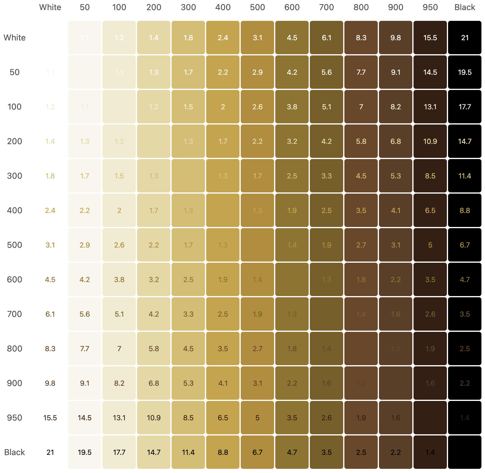
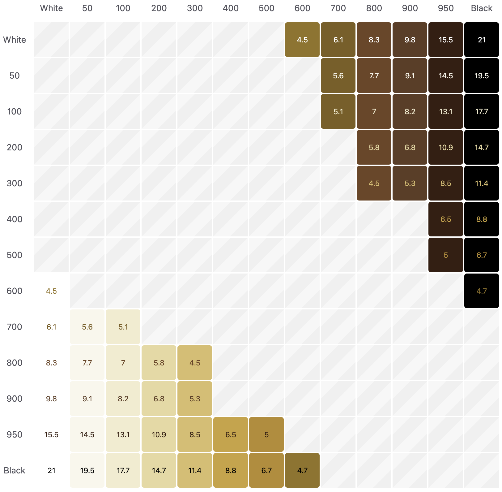
In order to acheive a WCAG 2.1 AA rating, the colour contrast ratio must be 4.5 or above. The following chart shows the combinations of text over background colour that are above 4.5.
Basic principles of colour
Maintaining a sufficient level of contrast between text and its background is a vital aspect of web design that significantly impacts both readability and user accessibility.
When the contrast is adequate, it facilitates a smoother reading experience, making it easier for all users to consume content. This not only aligns with accessibility standards but also broadens the reach of your content, ensuring that it is inclusive and user-friendly for a diverse audience, including those with vision impairments.
Do not reduce contrast ratio
WCAG 2.0 level AA requires a contrast ratio of at least 4.5:1 for normal text and 3:1 for large text. WCAG 2.1 requires a contrast ratio of at least 3:1 for graphics and other elements.
Black on Gray
Gray on White
Do not use incorrect colour combinations
Branding is an important element when creating websites. Do not use incorrect colour combinations that are not consistent with brand guidelines.
AEBlack on AEGold
AEGold on AERed
Do not pair multiple colours
You may use colours from the primary or secondary palette, however pairing colours that a completely the opposite of each other would create a very incorrect aesthetic experience.
Develop the organization of the health sector in a comprehensive and integrated manner to enhance its competitiveness, flexibility, effectiveness and alignment with the directions and priorities of the country.
