Advanced CSS Practices for UAE Government Websites
When building interfaces using the UAE Design System, developers are expected to work with TailwindCSS as a utility-first framework. While Tailwind provides a strong foundation, experienced developers should go beyond basic utility use and adopt nuanced CSS techniques that optimise accessibility, responsiveness, performance, and maintainability.
This guide focuses on advanced CSS practices that are commonly overlooked but are critical to delivering high-quality, production-ready government services. It pairs TailwindCSS examples with standard CSS equivalents to help teams write modern, resilient, and inclusive styles.
Using @supports for Feature Detection
CSS feature queries, introduced with the @supports rule in the CSS Conditional Rules Module Level 3 (initially implemented in browsers around 2013), allow developers to detect if a browser supports a specific CSS property and value before applying it. This technique is critical for achieving progressive enhancement — enriching experiences on modern browsers — while enabling graceful degradation for older or less capable environments.
Using @supports ensures that users on older platforms still receive a functional experience without being exposed to broken or unsupported styles. It lets developers implement cutting-edge features without sacrificing core usability.
A good use case is deploying CSS Grid layout. While modern browsers support Grid, older ones might not. Wrapping Grid styles within an @supports block ensures that the layout is only applied if it's supported:
    @supports (display: grid) {
      .layout {
        display: grid;
        grid-template-columns: repeat(3, 1fr);
      }
    }
Graceful degradation here means falling back to a simpler layout (e.g. display: block) for browsers that don’t support Grid. This approach ensures robust functionality across all user contexts, aligning perfectly with public sector accessibility and inclusivity requirements.
TailwindCSS
    <div class="supports-[display:grid]:grid supports-[display:grid]:gap-4">
      <!-- grid layout applied only if supported -->
    </div>
Vanilla CSS
    @supports (display: grid) {
      .layout {
        display: grid;
        gap: 1rem;
      }
    }
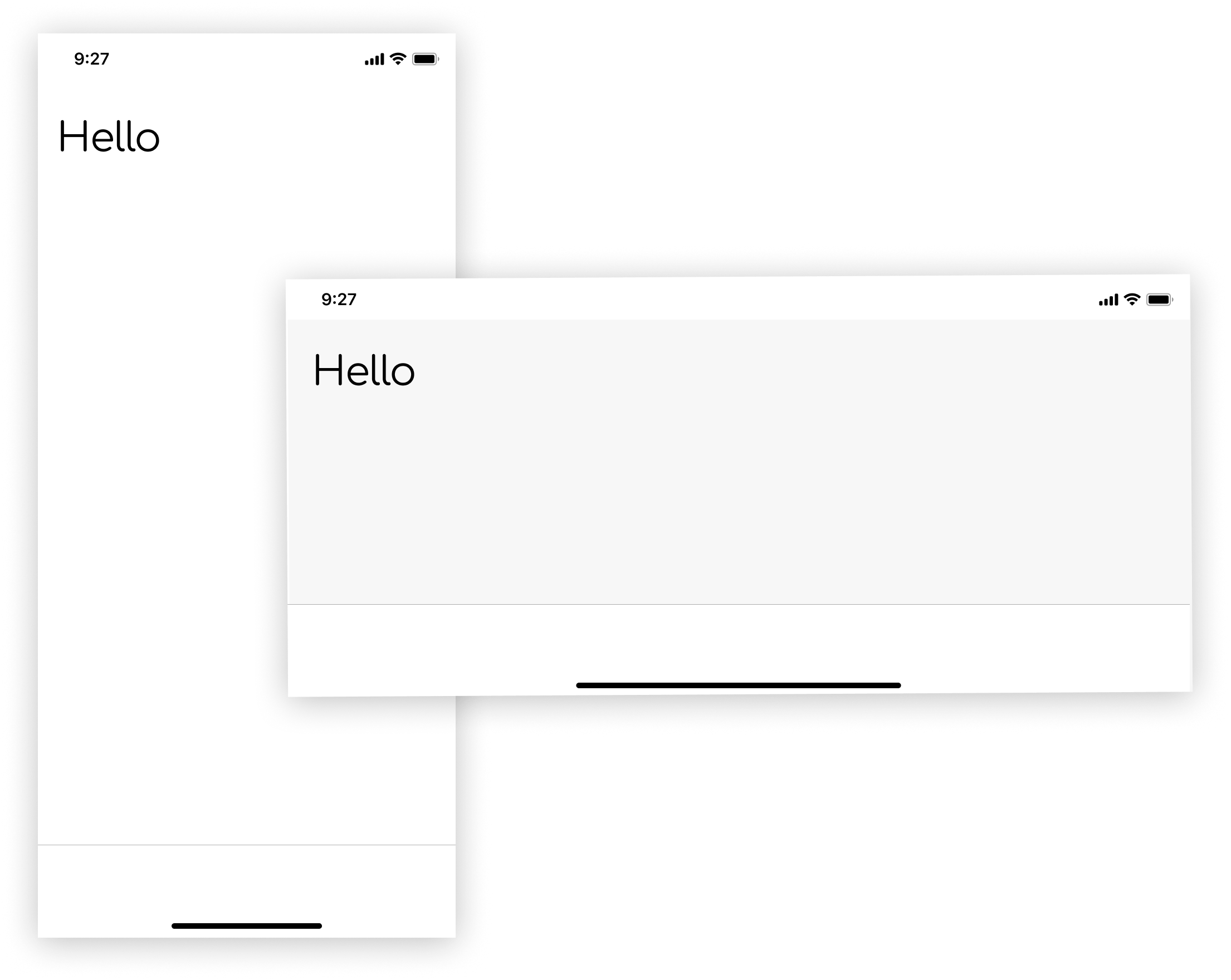
Handling Orientation: Portrait vs Landscape
Designs may need to adapt to screen orientation, especially on tablets or kiosks, where users frequently shift between portrait and landscape modes. This flexibility is important not just for aesthetics, but for usability — especially in government kiosks, mobile service apps, and public access interfaces where layout clarity and touch target alignment are critical.
Orientation-aware styles ensure optimal use of space, content readability, and consistent UI behaviour. For instance, a form might use a multi-column layout in landscape mode but revert to a single-column, scrollable format in portrait to enhance legibility.
Developers can achieve this using orientation media queries to tailor presentation logic accordingly. Being orientation-aware is part of responsive design maturity — a step beyond simple screen width breakpoints.
TailwindCSS
    <div class="portrait:bg-white landscape:bg-gray-100">
      <!-- Different background depending on orientation -->
    </div>
Vanilla CSS
    @media (orientation: portrait) {
      .container {
        background-color: white;
      }
    }
    @media (orientation: landscape) {
      .container {
        background-color: #f7f7f7;
      }
    }
Hiding Content from Visual UI but Exposing to Screen Readers
This is essential for accessibility — e.g., when describing context for screen readers without showing it to sighted users.
It is important to understand that a developer's technique may differ based on the component's use case. You may use ARIA labels at times, while you may need to provide context to text in paragraphs via CSS.
Invisible to eyes
This card contains a form example where additional context is hidden visually but exposed to screen readers.
visible to assistive tech
This card contains a form example where additional context is hidden visually but exposed to screen readers.
TailwindCSS
<span class="sr-only">Additional context for screen reader</span>
Vanilla CSS
    .sr-only {
      position: absolute;
      width: 1px;
      height: 1px;
      padding: 0;
      margin: -1px;
      overflow: hidden;
      clip: rect(0, 0, 0, 0);
      white-space: nowrap;
      border: 0;
    }
Conditional Display Using Media Queries
Make components responsive not only by width, but based on environmental conditions such as media type, print settings, display resolution, and user preferences. While breakpoints based on viewport width are essential, relying solely on them can overlook contextual rendering needs — like differentiating between screen and print modes or high-contrast accessibility settings.
Tailoring styles based on environmental conditions improves the user experience by adapting layouts to specific use cases. For example, hiding non-essential UI components in print mode prevents unnecessary clutter, and adapting styling for dark mode enhances readability for users with light sensitivity.
Using media queries that target print or screen types, resolution, and display preferences ensures your application is not just responsive but contextually intelligent — aligning with modern design thinking and accessibility best practices.
TailwindCSS
    <div class="hidden md:block print:hidden">
      <!-- Visible on medium screens and above, hidden in print -->
    </div>
Vanilla CSS
    @media screen and (min-width: 768px) {
      .block-md {
        display: block;
      }
    }
    @media print {
      .no-print {
        display: none;
      }
    }
Targeting Input Modalities (Hover vs Touch)
Use media features to customise interaction based on device capabilities.
Not all users interact with web pages the same way — some use a mouse and keyboard, others rely on touchscreens or voice controls. By detecting whether the user’s device supports hover or has a fine pointer, developers can tailor interactive behaviours to avoid frustration or broken experiences.
For instance, hover states should only be applied where hover is supported. Touch devices might not trigger hover effects, so designing them carefully improves both accessibility and usability. This ensures that visual cues, buttons, and transitions behave intuitively, no matter the platform or input method.
TailwindCSS
You can create custom utilities for hover and pointer detection using the @utility directive:
        @utility hover-enabled {
          @media (hover: hover) and (pointer: fine) {
            &:hover {
              background-color: black;
            }
          }
        }
Vanilla CSS
Remove the @layer condition from the above example.
        @media (hover: hover) and (pointer: fine) {
          .hover-enabled:hover {
            background-color: black;
          }
        }
RTL Considerations with Logical Properties
Use logical properties to avoid manually flipping styles for right-to-left interfaces.
This is especially important in bilingual environments like the UAE, where digital services are expected to support both Arabic and English seamlessly.
Traditionally, developers used margin-left, padding-right, or text-align: left, which are fixed to a direction and require explicit overrides for RTL. This not only increases CSS complexity but also introduces potential for bugs and visual inconsistencies.
Logical properties like padding-inline-start and margin-inline-end adapt automatically based on the text direction, allowing developers to write cleaner, more robust code that dynamically respects the content’s language orientation. This reduces maintenance overhead and improves accessibility and localisation.
TailwindCSS
        <div class="ps-4 pe-6"> <!-- padding-start / padding-end -->
          <!-- Works for both LTR and RTL -->
        </div>
Vanilla CSS
        .element {
          padding-inline-start: 1rem;
          padding-inline-end: 6rem;
        }
CSS remains one of the most powerful — and misunderstood — tools in a developer's toolkit. Mastering the subtleties of modern CSS and combining them with the power of Tailwind utility classes allows UAE government developers to build responsive, accessible, and maintainable experiences.
These techniques ensure digital services not only look good, but function well across devices, languages, and assistive technologies. Make every line of CSS count — and ensure it respects the diversity of users relying on UAE digital platforms.
