Modal
The Modal component is a crucial UI element that appears as a popup, overlay, or dialog box on top of the main content to focus the user's attention on specific information, tasks, or interactions. The primary purpose of a modal is to display additional content without navigating to a new page or to capture user input in a confined space, such as a form or confirmation dialogue.
Introduction
The modal component is a powerful tool for improving the user experience by providing context-related information and enabling interactions without disrupting the overall flow of the application. When the modal is active, it typically darkens or blurs the background, preventing users from interacting with the content behind it until they address the modal's purpose.
Visual representation
The following is a visual representation of the Modal component in use along with it's code usage.
To create a modal you can simply add the following data attributes to your HTML:
data-modal-target="Modal-ID"- where "Modal-ID" is the ID of the modal you want to target.data-modal-toggle="Modal-ID"- to toggle the modal (show/hide).data-modal-show="Modal-ID"- to explicitly show the modal.data-modal-hide="Modal-ID"- to close the modal.
These data attributes will handle the visibility and behavior of the modal for you.
Code structure
The component is structured as follows:
<!-- Modal toggle Button -->
<button data-modal-target="modal-simple" data-modal-toggle="modal-simple" class="aegov-btn" type="button">
... Button Text ...
</button>
<!-- Main modal -->
<div id="modal-simple" tabindex="-1" aria-hidden="true" class="aegov-modal hidden z-50" role="dialog" aria-labelledby="modal-simple-title">
<div class="relative sm:w-full lg:max-w-xl max-h-full">
<div class="aegov-modal-wrapper bg-whitely-100 p-4 md:p-5 xl:p-6">
<div>
<div>
<h2 class="text-2xl font-semibold mb-4 sm:mb-6" id="modal-simple-title">Hello</h2>
<div> ... Modal Body Text ... </div>
</div>
<div class="mt-6 md:mt-7 xl:mt-8 sm:flex sm:flex-row-reverse sm:gap-3">
<!-- Button to close modal -->
<button data-modal-hide="modal-simple" type="button" class="aegov-btn w-full sm:w-auto">Close</button>
</div>
</div>
</div>
</div>
</div>
This component depends on the use of JavaScript. The structure of code defined will work out-of-box if the bundled JavaScript library of AEGov-Design-System is utilized.
Using this JavaScript library is not mandatory. You may choose your preferred library as well, however you are required to style the component as per the example provided.
Code structure for React
The Modal component in React provides a focused overlay for displaying information or prompting user interaction. It typically requires a trigger element, passed via the trigger prop, which controls the modal's visibility. The content to be displayed within the modal, along with an optional title, are passed as children to the Modal component, allowing for flexible and interactive user experiences, often including mechanisms like a close button or interaction with elements within the modal to dismiss it.
<Modal
  title="Hello"
  trigger={<Button variant="solid">Open Modal</Button>}
>
  <div className="space-y-4">
    <p className="text-gray-600">
      To close the modal, you can use any of the following methods:
    </p>
    <ul className="list-decimal space-y-2 ml-4 text-gray-600">
      <li>Press the "ESC" key on your keyboard</li>
      <li>Click the close button</li>
      <li>Click outside the modal</li>
    </ul>
  </div>
</Modal>
Variations
Language selection modal
This is a variation of the modal component that is the recommended method of showing the selection of languages on any website for the federal governement entities. This modal method has been tested to be the most convinient and useful method, along with the ability to add additional language capabilities.
<button data-modal-target="modal-lang" data-modal-toggle="modal-lang" class="aegov-btn" type="button">
	Choose Language
</button>
<div id="modal-lang" tabindex="-1" aria-hidden="true" class="aegov-modal hidden z-50" role="dialog" aria-labelledby="modal-lang-title">
	<div class="relative w-full sm:max-w-sm max-h-full">
		<div class="aegov-modal-wrapper p-4 md:p-5 xl:p-6">
			<button type="button" class="aegov-modal-close top-2 end-2" data-modal-hide="modal-lang">
				<svg aria-hidden="true" class="w-5 h-5" fill="currentColor" viewBox="0 0 20 20" xmlns="http://www.w3.org/2000/svg">
					<path fill-rule="evenodd" d="M4.293 4.293a1 1 0 011.414 0L10 8.586l4.293-4.293a1 1 0 111.414 1.414L11.414 10l4.293 4.293a1 1 0 01-1.414 1.414L10 11.414l-4.293 4.293a1 1 0 01-1.414-1.414L8.586 10 4.293 5.707a1 1 0 010-1.414z" clip-rule="evenodd"></path>
				</svg>
				<span class="sr-only">Close modal</span>
			</button>
			<div>
				<h2 id="modal-lang-title" class="sr-only">Language Selection</h2>
				<div class="lang-header">
					<a href="#" class="lang-primary">English</a>
					<span class="lang-primary-divider"></span>
					<a href="#" class="lang-primary font-notokufi">عربي</a>
				</div>
				<div class="lang-other px-3 md:px-4 xl:px-5">
					<div class="px-3 md:px-4 xl:px-5">
						<p class="lang-other-title">Other languages</p>
						<ul class="divide-y divide-aeblack-100/10">
							<li><a href="#" class="lang-other-link">French</a></li>
							<li><a href="#" class="lang-other-link">Spanish</a></li>
							<li><a href="#" class="lang-other-link">German</a></li>
							<li><a href="#" class="lang-other-link">Portuguese</a></li>
							<li><a href="#" class="lang-other-link">Russian</a></li>
						</ul>
					</div>
				</div>
				<div class="mt-6 md:mt-8 lg:mt-10 xl:mt-12">
					<p class="lang-bottom-text">The list of “Other languages” listed above use Google Translate to create an automated translation of content for the purpose of display. Accuracy of automated content translation is not guaranteed.</p>
				</div>
			</div>
		</div>
	</div>
</div>
Gold Star Rating modal
All federal government entities (FGE's) are required to add the Gold Star Rating (GSR) logo in their header to identify the rating received.
It is recommended to provide more contextual information to the logo placed. By making the logo clickable, and opening the following modal, it will provide the end user with more context about the use of the rating.

<button class="inline-block" data-modal-target="modal-gold-star" data-modal-toggle="modal-gold-star">
	<img class="inline-block w-10 md:w-12 lg:w-16 xl:w-20 2xl:w-24" src="https://designsystem.gov.ae/img/global-star.png" alt="Gold Star Rating" width="90" height="90">
</button>
<div id="modal-gold-star" tabindex="-1" aria-hidden="true" class="aegov-modal hidden z-50" role="dialog" aria-labelledby="modal-gold-star-title">
	<div class="relative w-full sm:max-w-sm max-h-full">
		<div class="aegov-modal-wrapper p-4 md:p-5 xl:p-6">
			<button type="button" class="aegov-modal-close top-2 end-2" data-modal-hide="modal-gold-star">
				<svg aria-hidden="true" class="w-5 h-5" fill="currentColor" viewBox="0 0 20 20" xmlns="http://www.w3.org/2000/svg">
					<path fill-rule="evenodd" d="M4.293 4.293a1 1 0 011.414 0L10 8.586l4.293-4.293a1 1 0 111.414 1.414L11.414 10l4.293 4.293a1 1 0 01-1.414 1.414L10 11.414l-4.293 4.293a1 1 0 01-1.414-1.414L8.586 10 4.293 5.707a1 1 0 010-1.414z" clip-rule="evenodd"></path>
				</svg>
				<span class="sr-only">Close modal</span>
			</button>
			<div>
				<h2 id="modal-gold-star-title" class="sr-only">Gold Star Rating Information</h2>
				<div class="text-center">
					<img class="inline-block w-28 md:w-32 lg:w-36 xl:w-40 2xl:w-44 mb-4 xl:mb-6" src="https://designsystem.gov.ae/img/global-star.png" alt="Gold Star Rating" width="180" height="180">
				</div>
				<div class="text-center">
					<p class="text-base text-aeblack-800 font-normal mb-0">The Federal Authority for Identity, Citizenship, Customs & Port Security was awarded a <a href="#" class="text-aegold-600 font-bold no-underline">4 star rating</a> by the Global Star Rating System for Services on 14/04/2022</p>
					<a href="#" class="aegov-btn mt-6 md:mt-7 xl:mt-8">Learn more</a>
				</div>
				<div class="text-center mt-4 md:mt-5 xl:mt-6">
					<a href="#" class="text-xs font-light truncate max-w-full no-underline">http://portal.gsr.ae/verify</a>
				</div>
			</div>
		</div>
	</div>
</div>
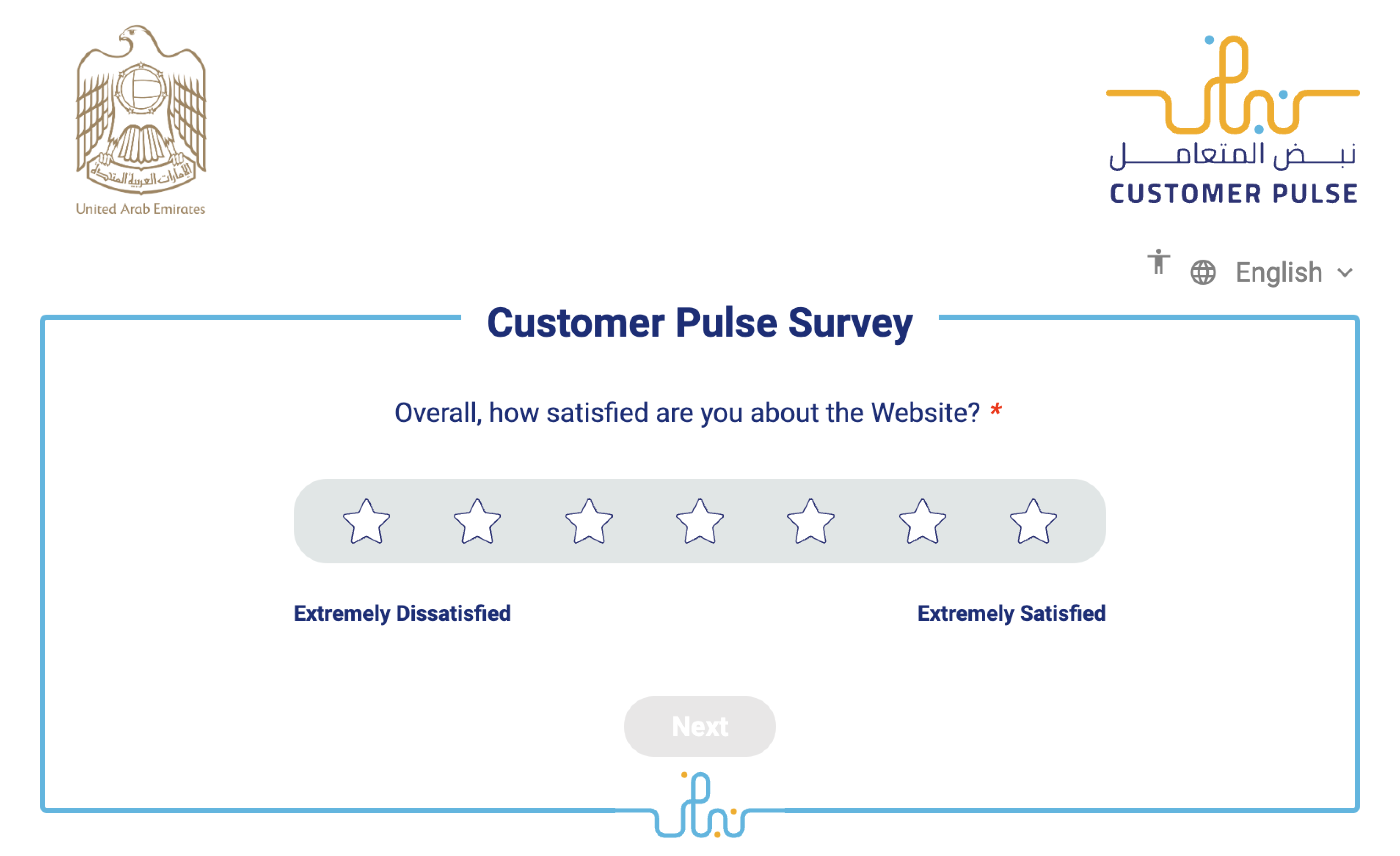
Customer Pulse modal
Customer Pulse is an initiative under which all government customers are asked for feedback about their experience in executing a transaction with the government or getting a service from the government, through a survey.
Feedback is gathered in the form of suggestion, complaint or compliment.
The design system recommends adding the Customer Pulse to all websites, and trigger the modal element to display the Customer Pulse to users.
<button data-modal-target="modal-customer-pulse" data-modal-toggle="modal-customer-pulse" type="button" class="border border-2 border-primary-200 rounded-full p-2 hover:bg-primary-50">
    <svg width="400" height="400" class="w-16 h-16" viewBox="0 0 400 400" fill="none" xmlns="http://www.w3.org/2000/svg">
        <path d="M165.939 129C162.318 129 159.383 131.935 159.383 135.556C159.383 139.178 162.318 142.112 165.939 142.112C169.561 142.112 172.495 139.178 172.495 135.556C172.495 131.935 169.561 129 165.939 129Z" fill="#6C4527" />
        <path d="M243.626 264.025C243.626 260.404 240.691 257.469 237.07 257.469C233.448 257.469 230.514 260.404 230.514 264.025C230.514 267.646 233.448 270.581 237.07 270.581C240.691 270.581 243.626 267.646 243.626 264.025Z" fill="#6C4527" />
        <path d="M271.889 207.457C268.268 207.457 265.333 210.392 265.333 214.013C265.333 217.635 268.268 220.569 271.889 220.569C275.511 220.569 278.445 217.635 278.445 214.013C278.445 210.392 275.511 207.457 271.889 207.457Z" fill="#6C4527" />
        <path d="M189.271 188.275H200.787C207.137 188.275 212.304 183.108 212.304 176.758V150.282C212.304 143.931 207.137 138.765 200.787 138.765C194.437 138.765 189.271 143.931 189.271 150.282V188.275ZM274.3 270.812H269.941C258.428 270.812 249.061 261.446 249.061 249.932V227.838C249.061 221.487 243.895 216.32 237.544 216.32H236.299C229.948 216.32 224.781 221.487 224.781 227.838V249.932C224.781 261.446 215.415 270.812 203.901 270.812H200.787C189.273 270.812 179.908 261.446 179.908 249.932V197.638H179.3C172.949 197.638 167.783 202.804 167.783 209.155V249.932C167.783 261.446 158.416 270.812 146.903 270.812H123.605C112.092 270.812 102.725 261.446 102.725 249.932V227.838C102.725 221.487 97.5587 216.32 91.208 216.32H22.6813C20.096 216.32 18 214.225 18 211.639C18 209.054 20.096 206.958 22.6813 206.958H91.208C102.721 206.958 112.088 216.324 112.088 227.838V249.932C112.088 256.283 117.255 261.45 123.605 261.45H146.903C153.253 261.45 158.42 256.283 158.42 249.932V209.155C158.42 197.642 167.787 188.275 179.3 188.275H179.908V150.282C179.908 138.768 189.273 129.402 200.787 129.402C212.301 129.402 221.668 138.768 221.668 150.282V176.758C221.668 188.272 212.301 197.638 200.787 197.638H189.271V249.932C189.271 256.283 194.437 261.45 200.787 261.45H203.901C210.252 261.45 215.419 256.283 215.419 249.932V227.838C215.419 216.324 224.785 206.958 236.299 206.958H237.544C249.057 206.958 258.424 216.324 258.424 227.838V249.932C258.424 256.283 263.591 261.45 269.941 261.45H274.3C280.651 261.45 285.817 256.283 285.817 249.932V227.838C285.817 216.324 295.184 206.958 306.697 206.958H377.565C380.152 206.958 382.248 209.054 382.248 211.639C382.248 214.225 380.152 216.32 377.565 216.32H306.697C300.347 216.32 295.18 221.487 295.18 227.838V249.932C295.18 261.446 285.815 270.812 274.3 270.812Z" fill="#B68A35" />
    </svg>
</button>

<div id="modal-customer-pulse" tabindex="-1" aria-hidden="true" class="aegov-modal hidden z-50" role="dialog" aria-labelledby="modal-customer-pulse-title">
    <div class="relative w-full sm:max-w-4xl max-h-full">
        <div class="aegov-modal-wrapper p-4 md:p-5 xl:p-6">
            <button type="button" class="aegov-modal-close top-2 end-2" data-modal-hide="modal-customer-pulse">
                <svg aria-hidden="true" class="w-5 h-5" fill="currentColor" viewBox="0 0 20 20" xmlns="http://www.w3.org/2000/svg">
                    <path fill-rule="evenodd" d="M4.293 4.293a1 1 0 011.414 0L10 8.586l4.293-4.293a1 1 0 111.414 1.414L11.414 10l4.293 4.293a1 1 0 01-1.414 1.414L10 11.414l-4.293 4.293a1 1 0 01-1.414-1.414L8.586 10 4.293 5.707a1 1 0 010-1.414z" clip-rule="evenodd"></path>
                </svg>
                <span class="sr-only">Close modal</span>
            </button>
            <div>
                <h2 id="modal-customer-pulse-title" class="sr-only">Customer Pulse</h2>
                <img src="https://designsystem.gov.ae/img/customer-pulse-ss.png" alt="customer pulse" class="block">
            </div>
        </div>
    </div>
</div>
Single action
<button data-modal-target="modal-single-action" data-modal-toggle="modal-single-action" class="aegov-btn" type="button">
    Single Action
</button>
<div id="modal-single-action" tabindex="-1" aria-hidden="true" class="aegov-modal hidden z-50" role="dialog" aria-labelledby="modal-single-action-title">
    <div class="relative w-full sm:max-w-sm max-h-full">
        <div class="aegov-modal-wrapper p-4 md:p-5 xl:p-6">
            <button type="button" class="aegov-modal-close top-2 end-2" data-modal-hide="modal-single-action">
                <svg aria-hidden="true" class="w-5 h-5" fill="currentColor" viewBox="0 0 20 20" xmlns="http://www.w3.org/2000/svg">
                    <path fill-rule="evenodd" d="M4.293 4.293a1 1 0 011.414 0L10 8.586l4.293-4.293a1 1 0 111.414 1.414L11.414 10l4.293 4.293a1 1 0 01-1.414 1.414L10 11.414l-4.293 4.293a1 1 0 01-1.414-1.414L8.586 10 4.293 5.707a1 1 0 010-1.414z" clip-rule="evenodd"></path>
                </svg>
                <span class="sr-only">Close modal</span>
            </button>
            <div>
                <div>
                    <div class="bg-aegreen-100 mx-auto flex h-12 w-12 shrink-0 items-center justify-center rounded-full">
                        <svg class="h-8 w-8 text-aegreen-600" xmlns="http://www.w3.org/2000/svg" viewBox="0 0 256 256">
                            <rect width="256" height="256" fill="none" />
                            <polyline points="40 144 96 200 224 72" fill="none" stroke="currentColor" stroke-linecap="round" stroke-linejoin="round" stroke-width="16" />
                        </svg>
                    </div>
                    <div class="mt-3 text-center sm:mt-6">
                        <h3 class="text-lg font-bold text-aeblack-900" id="modal-single-action-title">Payment successful</h3>
                        <div class="mt-4">
                            <p class="text-base text-aeblack-500">Lorem ipsum dolor sit amet consectetur adipisicing elit. Consequatur amet labore.</p>
                        </div>
                    </div>
                </div>
                <div class="mt-6 md:mt-7 xl:mt-8">
                    <button type="button" class="aegov-btn btn-block">Button</button>
                </div>
            </div>
        </div>
    </div>
</div>
Single action, without an icon
<button data-modal-target="modal-single-action-no-icon" data-modal-toggle="modal-single-action-no-icon" class="aegov-btn" type="button">
    Single Action
</button>
<div id="modal-single-action-no-icon" tabindex="-1" aria-hidden="true" class="aegov-modal hidden z-50" role="dialog" aria-labelledby="modal-single-action-no-icon-title">
    <div class="relative w-full sm:max-w-sm max-h-full">
        <div class="aegov-modal-wrapper p-4 md:p-5 xl:p-6">
            <button type="button" class="aegov-modal-close top-2 end-2" data-modal-hide="modal-single-action-no-icon">
                <svg aria-hidden="true" class="w-5 h-5" fill="currentColor" viewBox="0 0 20 20" xmlns="http://www.w3.org/2000/svg">
                    <path fill-rule="evenodd" d="M4.293 4.293a1 1 0 011.414 0L10 8.586l4.293-4.293a1 1 0 111.414 1.414L11.414 10l4.293 4.293a1 1 0 01-1.414 1.414L10 11.414l-4.293 4.293a1 1 0 01-1.414-1.414L8.586 10 4.293 5.707a1 1 0 010-1.414z" clip-rule="evenodd"></path>
                </svg>
                <span class="sr-only">Close modal</span>
            </button>
            <div>
                <div>
                    <div class="text-center">
                        <h3 class="text-lg font-bold text-aeblack-900" id="modal-single-action-no-icon-title">Payment successful</h3>
                        <div class="mt-4">
                            <p class="text-base text-aeblack-500">Lorem ipsum dolor sit amet consectetur adipisicing elit. Consequatur amet labore.</p>
                        </div>
                    </div>
                </div>
                <div class="mt-6 md:mt-7 xl:mt-8">
                    <button type="button" class="aegov-btn btn-block">Button</button>
                </div>
            </div>
        </div>
    </div>
</div>
Multiple actions
<button data-modal-target="modal-mutiple-action" data-modal-toggle="modal-mutiple-action" class="aegov-btn" type="button">
    Action Buttons
</button>
<div id="modal-mutiple-action" tabindex="-1" aria-hidden="true" class="aegov-modal hidden z-50" role="dialog" aria-labelledby="modal-multiple-action-title">
    <div class="relative w-full sm:max-w-sm max-h-full">
        <div class="aegov-modal-wrapper p-4 md:p-5 xl:p-6">
            <button type="button" class="aegov-modal-close top-2 end-2" data-modal-hide="modal-mutiple-action">
                <svg aria-hidden="true" class="w-5 h-5" fill="currentColor" viewBox="0 0 20 20" xmlns="http://www.w3.org/2000/svg">
					<path fill-rule="evenodd" d="M4.293 4.293a1 1 0 011.414 0L10 8.586l4.293-4.293a1 1 0 111.414 1.414L11.414 10l4.293 4.293a1 1 0 01-1.414 1.414L10 11.414l-4.293 4.293a1 1 0 01-1.414-1.414L8.586 10 4.293 5.707a1 1 0 010-1.414z" clip-rule="evenodd"></path>
				</svg>
                <span class="sr-only">Close modal</span>
            </button>
            <div>
                <div>
                    <div class="text-center">
                        <h3 class="text-lg font-bold text-aeblack-900" id="modal-multiple-action-title">Payment successful</h3>
                        <div class="mt-4">
                            <p class="text-base text-aeblack-500">Lorem ipsum dolor sit amet consectetur adipisicing elit. Consequatur amet labore.</p>
                        </div>
                    </div>
                </div>
                <div class="mt-6 md:mt-7 xl:mt-8 sm:grid sm:grid-flow-row-dense sm:grid-cols-2 sm:gap-3">
                    <button type="button" class="aegov-btn w-full sm:w-auto sm:col-start-2">Button</button>
                    <button data-modal-hide="modal-mutiple-action" type="button" class="aegov-btn btn-soft mt-3 sm:mt-0 w-full sm:w-auto sm:col-start-1">Button</button>
                </div>
            </div>
        </div>
    </div>
</div>
Simple alert
<button data-modal-target="modal-simple-alert" data-modal-toggle="modal-simple-alert" class="aegov-btn" type="button">
    Simple Alert
</button>
<div id="modal-simple-alert" tabindex="-1" aria-hidden="true" class="aegov-modal hidden z-50" role="dialog" aria-labelledby="modal-simple-alert-title">
    <div class="relative w-full sm:max-w-lg max-h-full">
        <div class="aegov-modal-wrapper p-4 md:p-5 xl:p-6">
            <div>
                <div class="sm:flex sm:items-start">
                    <div class="bg-primary-100 mx-auto flex h-12 w-12 shrink-0 items-center justify-center rounded-full sm:mx-0">
                        <svg class="h-8 w-8 text-primary-600 fill-current" xmlns="http://www.w3.org/2000/svg" viewBox="0 0 256 256">
                            <rect width="256" height="256" fill="none" />
                            <path d="M236.8,188.09,149.35,36.22h0a24.76,24.76,0,0,0-42.7,0L19.2,188.09a23.51,23.51,0,0,0,0,23.72A24.35,24.35,0,0,0,40.55,224h174.9a24.35,24.35,0,0,0,21.33-12.19A23.51,23.51,0,0,0,236.8,188.09ZM120,104a8,8,0,0,1,16,0v40a8,8,0,0,1-16,0Zm8,88a12,12,0,1,1,12-12A12,12,0,0,1,128,192Z" />
                        </svg>
                    </div>
                    <div class="mt-4 text-center sm:ms-8 sm:mt-0 sm:text-left">
                        <h3 class="text-lg font-bold text-aeblack-950" id="modal-simple-alert-title">Deactivate account</h3>
                        <div class="mt-4">
                            <p class="text-base font-normal text-aeblack-500 mb-0">Are you sure you want to deactivate your account? All of your data will be permanently removed from our servers forever. This action cannot be undone.</p>
                        </div>
                    </div>
                </div>
                <div class="mt-6 md:mt-7 xl:mt-8 sm:flex sm:flex-row-reverse sm:gap-3">
                    <button type="button" class="aegov-btn w-full sm:w-auto">Confirm</button>
                    <button data-modal-hide="modal-simple-alert" type="button" class="aegov-btn btn-soft mt-3 sm:mt-0 w-full sm:w-auto">Cancel</button>
                </div>
            </div>
        </div>
    </div>
</div>
Simple alert with Bottom-Right placement
Leverage the ` data-modal-placement ` attribute within the modal element to specify its position relative to the document body, utilizing the available options from ` {top|center|bottom}-{left|center|right} ` (for example, ` top-left ` or ` bottom-right `). This enables you to control the alignment and placement of the modal with respect to the viewport.
<button data-modal-target="modal-simple-alert-placement" data-modal-toggle="modal-simple-alert-placement" class="aegov-btn" type="button">
    Placement Modal
</button>
<div data-modal-backdrop="static" data-modal-placement="bottom-right" id="modal-simple-alert-placement" tabindex="-1" aria-hidden="true" class="aegov-modal hidden z-50" role="dialog" aria-labelledby="modal-simple-alert-placement-title">
    <div class="relative sm:w-full lg:max-w-xl xl:max-w-2xl 2xl:max-w-3xl max-h-full">
        <div class="aegov-modal-wrapper bg-primary-50 p-4 md:p-5 xl:p-6">
            <div>
                <div class="sm:flex sm:items-start">
                    <div class="bg-primary-100 mx-auto flex h-12 w-12 shrink-0 items-center justify-center rounded-full sm:mx-0">
                        <svg class="h-8 w-8 text-primary-600 fill-current" xmlns="http://www.w3.org/2000/svg" viewBox="0 0 256 256">
                            <rect width="256" height="256" fill="none" />
                            <path d="M208,40H48A16,16,0,0,0,32,56v58.77c0,89.61,75.82,119.34,91,124.39a15.53,15.53,0,0,0,10,0c15.2-5.05,91-34.78,91-124.39V56A16,16,0,0,0,208,40Zm-34.34,69.66-56,56a8,8,0,0,1-11.32,0l-24-24a8,8,0,0,1,11.32-11.32L112,148.68l50.34-50.34a8,8,0,0,1,11.32,11.32Z" />
                        </svg>
                    </div>
                    <div class="mt-3 text-center sm:ms-8 sm:mt-0 sm:text-left">
                        <h3 class="text-lg font-bold text-primary-800" id="modal-simple-alert-placement-title">Deactivate account</h3>
                        <div class="mt-4 text-base font-normal text-primary-600">
                            <p>Are you sure you want to deactivate your account? Our site enables scripts (e.g. cookies) that are able to read, store, and write information on your browser and device. The information processed by this script includes data relating to you, which may include personal identifiers.</p>
                            <p class="mb-0">We use this information for various purposes - e.g. to deliver content, maintain security, enable user choice, improve our sites, and for marketing purposes. You may choose to accept or deny using our website accordingly. Learn more by visiting our Privacy Policy.</p>
                        </div>
                    </div>
                </div>
                <div class="mt-6 md:mt-7 xl:mt-8 sm:flex sm:flex-row-reverse sm:gap-3">
                    <button type="button" class="aegov-btn btn-primary w-full sm:w-auto">Allow all and accept</button>
                    <button data-modal-hide="modal-simple-alert-placement" type="button" class="aegov-btn btn-primary btn-outline mt-3 sm:mt-0 w-full sm:w-auto">Deny and quit</button>
                </div>
            </div>
        </div>
    </div>
</div>
Scrollable content
This code represents a modal with scrollable content and a backdrop. To ensure the content is scrollable, the ` .max-h-80 ` class is used for smaller screens and ` md:max-h-[450px] ` for medium-sized screens and above. You may adjust the height parameter to suit your layout.
<button data-modal-target="modal-scroll" data-modal-toggle="modal-scroll" class="aegov-btn" type="button">
    Scrollable Content
</button>
<div data-modal-backdrop="static" id="modal-scroll" tabindex="-1" aria-hidden="true" class="aegov-modal hidden z-50" role="dialog" aria-labelledby="modal-scroll-title">
    <div class="relative sm:w-full lg:max-w-xl xl:max-w-2xl 2xl:max-w-3xl max-h-full">
        <div class="aegov-modal-wrapper bg-whitely-100 p-4 md:p-5 xl:p-6">
            <div>
                <div class="sm:flex sm:items-start">
                    <div class="bg-primary-100 mx-auto flex h-12 w-12 shrink-0 items-center justify-center rounded-full sm:mx-0">
                        <svg class="h-8 w-8 text-primary-700 fill-current" xmlns="http://www.w3.org/2000/svg" width="32" height="32" fill="#000000" viewBox="0 0 256 256">
                            <path d="M213.66,66.34l-40-40A8,8,0,0,0,168,24H88A16,16,0,0,0,72,40V56H56A16,16,0,0,0,40,72V216a16,16,0,0,0,16,16H168a16,16,0,0,0,16-16V200h16a16,16,0,0,0,16-16V72A8,8,0,0,0,213.66,66.34ZM168,216H56V72h76.69L168,107.31v84.53c0,.06,0,.11,0,.16s0,.1,0,.16V216Zm32-32H184V104a8,8,0,0,0-2.34-5.66l-40-40A8,8,0,0,0,136,56H88V40h76.69L200,75.31Zm-56-32a8,8,0,0,1-8,8H88a8,8,0,0,1,0-16h48A8,8,0,0,1,144,152Zm0,32a8,8,0,0,1-8,8H88a8,8,0,0,1,0-16h48A8,8,0,0,1,144,184Z"></path>
                        </svg>
                    </div>
                    <div class="mt-3 text-center sm:ms-8 sm:mt-0 sm:text-left">
                        <div>
                            <h3 class="text-lg font-bold text-aeblack-800" id="modal-scroll-title">Our terms and conditions have been updated</h3>
                            <div class="mt-6 text-base font-normal text-aeblack-800 max-h-80 sm:max-h-48 md:max-h-[450px] overflow-auto">
                                <p>There has been an update to our terms and conditions, and in order to proceed, you must be aware of the following changes:</p>
                                <ul class="list-disc space-y-8 mb-14">
                                    <li>Lorem ipsum dolor sit amet, consectetur adipiscing elit. Praesent non posuere odio. Etiam mattis porta commodo. Nulla sagittis congue mi id vehicula.</li>
                                    <li>Lorem ipsum dolor sit amet, consectetur adipiscing elit. Praesent non posuere odio. Etiam mattis porta commodo. Nulla sagittis congue mi id vehicula.</li>
                                </ul>
                                <p>Further to these changes, we have also received updates about changes in third-party software used to manage this portal. Information regarding changes in the terms and conditions of third-party software use is as follows:</p>
                                <ul class="list-disc space-y-8 mb-14">
                                    <li>Lorem ipsum dolor sit amet, consectetur adipiscing elit. Praesent non posuere odio. Etiam mattis porta commodo. Nulla sagittis congue mi id vehicula.</li>
                                    <li>Lorem ipsum dolor sit amet, consectetur adipiscing elit. Praesent non posuere odio. Etiam mattis porta commodo. Nulla sagittis congue mi id vehicula.</li>
                                    <li>Lorem ipsum dolor sit amet, consectetur adipiscing elit. Praesent non posuere odio. Etiam mattis porta commodo. Nulla sagittis congue mi id vehicula.</li>
                                </ul>
                            </div>
                        </div>
                    </div>
                </div>
                <div class="mt-6 md:mt-7 xl:mt-8 sm:flex sm:flex-row-reverse sm:gap-3">
                    <button data-modal-hide="modal-scroll" type="button" class="aegov-btn btn-primary w-full sm:w-auto">I have understood these updates</button>
                </div>
            </div>
        </div>
    </div>
</div>
Confirmation standard modal
<button data-modal-target="modal-confirm-standard" data-modal-toggle="modal-confirm-standard" class="aegov-btn" type="button">
    Confirm Standard
</button>
<div id="modal-confirm-standard" tabindex="-1" aria-hidden="true" class="aegov-modal hidden z-50" role="dialog" aria-labelledby="modal-confirm-standard-title">
    <div class="relative w-full md:max-w-2xl max-h-full">
        <div class="aegov-modal-wrapper p-4 md:p-5 xl:p-6">
            <div>
                <div class="sm:flex sm:items-start">
                    <div class="bg-aegreen-100 mx-auto flex h-12 w-12 shrink-0 items-center justify-center rounded-full sm:mx-0">
                        <svg class="h-8 w-8 text-aegreen-600 fill-current" xmlns="http://www.w3.org/2000/svg" width="32" height="32" fill="#000000" viewBox="0 0 256 256">
                            <path d="M173.66,98.34a8,8,0,0,1,0,11.32l-56,56a8,8,0,0,1-11.32,0l-24-24a8,8,0,0,1,11.32-11.32L112,148.69l50.34-50.35A8,8,0,0,1,173.66,98.34ZM232,128A104,104,0,1,1,128,24,104.11,104.11,0,0,1,232,128Zm-16,0a88,88,0,1,0-88,88A88.1,88.1,0,0,0,216,128Z"></path>
                        </svg>
                    </div>
                    <div class="mt-4 text-center sm:ms-8 sm:mt-0 sm:text-left">
                        <h3 class="text-lg font-bold text-aeblack-950" id="modal-confirm-standard-title">Are you sure you want to submit this application?</h3>
                        <div class="mt-4">
                            <p class="text-base font-normal text-aeblack-800 mb-0">You are about to submit the application to process a medical fitness examination at the Nadd Al Sheeba Medical Centre, Dubai. Are you sure you want to proceed?</p>
                        </div>
                    </div>
                </div>
                <div class="mt-6 md:mt-7 xl:mt-8 sm:flex items-center">
                    <div class="aegov-check-item sm:pl-20 mb-4 sm:mb-0 justify-center sm:justify-start">
                        <input id="modal-standard-checkbox" type="checkbox" value="0">
                        <label for="modal-standard-checkbox" class="text-aeblack-400">Don’t show me this message again</label>
                    </div>
                    <div class="sm:flex sm:flex-row-reverse sm:gap-3 sm:ml-auto">
                        <button type="button" class="aegov-btn w-full sm:w-auto">Confirm</button>
                        <button data-modal-hide="modal-confirm-standard" type="button" class="aegov-btn btn-soft mt-3 sm:mt-0 w-full sm:w-auto">Cancel</button>
                    </div>
                </div>
            </div>
        </div>
    </div>
</div>
Confirmation serious modal
The ` .aegov-modal ` class represents the modal component with the ` .modal-serious ` class indicating it's serious modal type.
<button data-modal-target="modal-confirm-serious" data-modal-toggle="modal-confirm-serious" class="aegov-btn" type="button">
    Serious
</button>
<div id="modal-confirm-serious" tabindex="-1" aria-hidden="true" class="aegov-modal modal-serious hidden z-50" role="dialog" aria-labelledby="modal-confirm-serious-title">
    <div class="relative w-full md:max-w-3xl max-h-full">
        <div class="aegov-modal-wrapper p-4 md:p-5 xl:p-6">
            <div>
                <div class="sm:flex sm:items-start">
                    <div class="bg-aered-100 mx-auto flex h-12 w-12 shrink-0 items-center justify-center rounded-full sm:mx-0">
                        <svg class="h-8 w-8 text-aered-600 fill-current" xmlns="http://www.w3.org/2000/svg" width="32" height="32" fill="#000000" viewBox="0 0 256 256">
                            <path d="M188,48a27.75,27.75,0,0,0-12,2.71V44a28,28,0,0,0-54.65-8.6A28,28,0,0,0,80,60v64l-3.82-6.13a28,28,0,0,0-48.6,27.82c16,33.77,28.93,57.72,43.72,72.69C86.24,233.54,103.2,240,128,240a88.1,88.1,0,0,0,88-88V76A28,28,0,0,0,188,48Zm12,104a72.08,72.08,0,0,1-72,72c-20.38,0-33.51-4.88-45.33-16.85C69.44,193.74,57.26,171,41.9,138.58a6.36,6.36,0,0,0-.3-.58,12,12,0,0,1,20.79-12,1.76,1.76,0,0,0,.14.23l18.67,30A8,8,0,0,0,96,152V60a12,12,0,0,1,24,0v60a8,8,0,0,0,16,0V44a12,12,0,0,1,24,0v76a8,8,0,0,0,16,0V76a12,12,0,0,1,24,0Z"></path>
                        </svg>
                    </div>
                    <div class="mt-4 text-center sm:ms-8 sm:mt-0 sm:text-left">
                        <h3 class="text-lg font-bold text-aeblack-950" id="modal-confirm-serious-title">Deactivate account</h3>
                        <div class="mt-4">
                            <p class="text-base font-normal text-aeblack-800 mb-0">Are you sure you want to deactivate your account? All of your data will be permanently removed from our servers forever. This action cannot be undone.</p>
                        </div>
                    </div>
                </div>
                <div class="mt-6 md:mt-7 xl:mt-8 sm:flex items-center">
                    <div class="aegov-check-item sm:pl-20 mb-4 sm:mb-0 justify-center sm:justify-start">
                        <input id="modal-serious-checkbox" type="checkbox" value="0">
                        <label for="modal-serious-checkbox" class="text-aeblack-400">Don’t show me this message again</label>
                    </div>
                    <div class="sm:flex sm:flex-row-reverse sm:gap-3 sm:ml-auto">
                        <button type="button" class="aegov-btn w-full sm:w-auto">Deactivate my account</button>
                        <button data-modal-hide="modal-confirm-serious" type="button" class="aegov-btn btn-link mt-3 sm:mt-0 w-full sm:w-auto">Cancel</button>
                    </div>
                </div>
            </div>
        </div>
    </div>
</div>
Behaviour
-
Opening the Modal:To open the modal, use the
` data-modal-show `attribute on an element with a unique ID (e.g., a button). When this element is clicked, it triggers the modal to appear with the specified placement based on the` data-modal-placement `attribute. -
Closing the Modal: There are three ways to close the modal:
-
Click on the backdrop: When the backdrop outside the modal is clicked, and
` data-modal-backdrop="static" `attribute is not used, the modal will be closed. -
Click on a close button: Place a button inside the modal with the attribute
` data-modal-hide `set to the unique ID of the modal. When this button is clicked, it hides the modal.
-
-
Toggle the Modal: To toggle the visibility of the modal, you can use the
` data-modal-toggle `attribute on an element with the unique ID of the modal. When this element is clicked, it will toggle the visibility of the modal, showing it if it's hidden and hiding it if it's already visible.
Accessibility
To ensure accessibility for the Modal component, follow these guidelines:
-
Focus Management:Ensure that when the modal is opened, the focus is shifted to the first interactive element inside the modal, such as a close button or any form input. This helps users navigate through the modal content without needing to use the mouse.
-
ARIA Roles and Attributes: Add appropriate ARIA roles and attributes to the modal to enhance accessibility. For example, set
` role="dialog" `to indicate that the element is a modal dialog, and add` aria-labelledby `to reference the ID of the element that provides the modal's title. -
Screen Reader Accessibility:Make sure the modal's content is readable and accessible to screen readers. Use semantic HTML elements and descriptive text to convey the purpose and content of the modal.
-
Keyboard Navigation: Ensure that users can navigate and close the modal using only the keyboard. Users should be able to close the modal by pressing the "ESC" key, and they should be able to navigate through interactive elements inside the modal using the "Tab" key.
By implementing these behaviors and accessibility considerations, you can create a modal component that is both user-friendly and accessible to all users.
