Creating an Empathy Map: The first step in design thinking

An Empathy Map is a collaborative tool teams use to gain a deeper insight into their customers. Much like a user persona, an Empathy Map can represent a group of users, such as a customer segment.
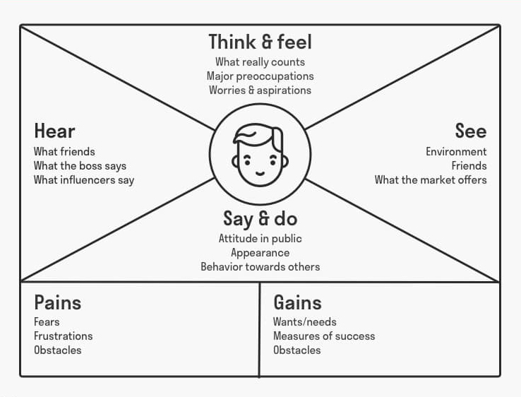
The Empathy Map is divided into sections, with each section used to represent a specific aspect of the user's experience.
These sections are typically:
1. Think & Feel
This section captures what the user might be thinking or feeling while interacting with the website or application. It can include their beliefs, anxieties, and preoccupations.
It delves deeply into the user's inner psyche to understand their emotions and thoughts while interacting with a service. This segment uncovers the user's expectations, apprehensions, preconceived notions, and emotional responses.
By exploring questions like, "What occupies the user’s thoughts?" and "What are their emotional reactions?", designers can grasp the motivations and concerns driving user behaviour. This insight is pivotal for creating user-centric solutions, ensuring that the design resonates emotionally and intellectually with the target audience.
2. Hear
This focuses on what the user hears from their surroundings, including the people around them and their environment. It is instrumental in gauging the external influences on a user.
It seeks to comprehend what the user is hearing from their surroundings and peers, focusing on prevailing opinions, societal pressures, or insights that might shape their perception and interaction with a service.
This understanding aids designers in addressing external expectations and aligning the design with the broader communicative environment experienced by the user.
3. See
Here, the focus is on what the user sees in their environment, including their interactions with friends, colleagues, and family, as well as what they are exposed to in other forms of media.
Therefore, we delve into the user’s visual interactions, observing what the individual encounters within their environment and how it influences their behaviour and perception. This helps the design process to visually align the design of a website or application towards the user’s experiences and expectations, ensuring a coherent and engaging interface.
4. Say and Do
This section represents what the user might say or do in a given situation, capturing their attitudes, behaviours, and actions. It encapsulates the observable actions and statements of a user, offering valuable insights into their external behaviour, verbal expressions, and interactions, which are integral for crafting user-centric designs and solutions.

5. Pains and Gains
Pains will help you highlight a user's fears, frustrations, and challenges, providing insight into their pain points. Create a user group to understand how different users face challenges while interacting with your design.
In the Gains section, the design team must list down user's wants and needs, and what they stand to gain, such as success and goals.
Why is an Empathy Map important?
An empathy map is useful in the design and UX process as it bridges the gap between user needs and design solutions.
By illustrating how users think, feel, see, say, do, and hear, it provides a deeper understanding of their experiences and motivations. This holistic view enables designers to create more user-centric, intuitive, and accessible solutions, fostering positive user engagement and satisfaction.
It aids in aligning the team's perspective, ensuring that the final product resonates with the target audience and addresses their pain points effectively.


