The Color Psychology of Government Trust: Why Blue Isn't Always Best
We've all encountered it — that reassuring shade of blue on government websites. It's become so ubiquitous that we barely question it anymore. Banks use blue. Healthcare providers use blue. And yes, government portals around the world default to blue. The reasoning seems straightforward: Blue represents trust, stability, and authority.
But here's a question worth asking: Does blue actually build trust with everyone?
The UAE Design System's colour palette represents the strength and diversity of the nation. The core palette — featuring UAE Gold, UAE Green, UAE Red, and supporting colours — was carefully selected and approved by the UAE Cabinet Office for use across federal government entities. These colours weren't chosen arbitrarily. They represent the UAE's identity and values while serving a critical functional purpose: building trust with citizens.
Yet colour psychology is far more complex than simply picking "trustworthy" colours. When your population includes over 200 nationalities, each bringing their own cultural associations with colour, the relationship between colour and trust becomes fascinating—and crucial to understand.
The cultural dimensions of colour perception
In certain design thinking groups, blue equals trust. Financial institutions, tech companies, and governments have reinforced this association for decades. But step outside this cultural framework, and the picture changes dramatically.
Take RED, for instance. In many Western contexts, red signals danger, stop, error etc. — essentially, things to avoid. But in the culture of China, red represents prosperity, good fortune, and celebration. It's the colour of lucky money envelopes and wedding ceremonies. A government portal using red for important calls-to-action might create anxiety for some users while feeling perfectly appropriate to others.

White presents an even more striking example. In many cultures, white symbolizes purity and cleanliness — think wedding dresses and hospital corridors. In the Emarati culture, men's attire most often includes White as the most preferred colour. But in several East Asian cultures, white is associated with mourning and funerals. The choice of background colour isn't merely aesthetic; it carries emotional weight.

The UAE's multicultural reality means these considerations aren't academic — they're practical design challenges we face daily. A colour scheme that feels authoritative and trustworthy to Emirati citizens might read differently to Indian, Pakistani, Filipino, or European residents. We're not designing for a single cultural lens; we're designing for a spectrum of cultural colour perception.
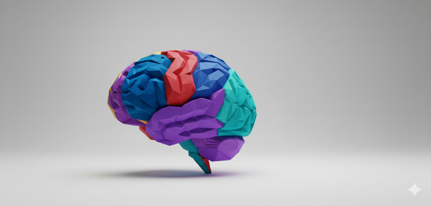
How the brain processes colour and emotion
Before we dive into solutions, it's worth understanding what's actually happening when someone encounters colour in a digital interface. The relationship between colour and emotion isn't mystical — it's neurological.
When light hits the retina, it triggers a cascade of neural activity. Colour information travels through the optic nerve to the visual cortex, but it doesn't stop there. The limbic system—our brain's emotional processing center—also lights up. This happens in milliseconds, before conscious thought kicks in.
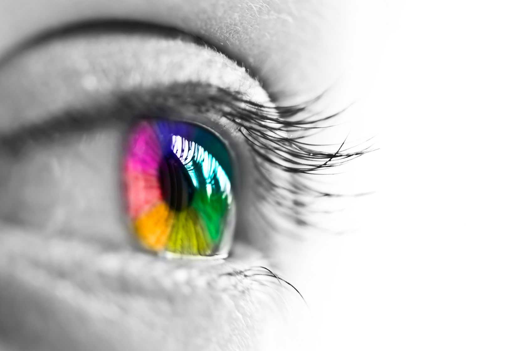
This explains why colour reactions feel instinctive. You don't consciously think "this red button feels aggressive", you just feel it. These responses are shaped by both biological factors and learned cultural associations. Some colour responses appear to be somewhat universal (bright yellows grab attention, darker colours feel heavier), but cultural learning significantly shapes our emotional responses to specific hues.
Research in cross-cultural psychology has shown that colour associations are learned through repeated cultural exposure. If you've grown up seeing red used for warnings and stop signs, your brain develops strong neural pathways connecting red with "caution." But if you've grown up seeing red at celebrations and festivals, different neural pathways form.
The UAE Design System's approach to cultural colour intelligence
The UAE Design System doesn't ignore these complexities—it addresses them head-on through a thoughtfully structured colour framework.
The core palette reflects the UAE's national identity: UAE Gold (#ca9a2c), UAE Green (#006b48), UAE Red (#c8102e), UAE Black (#232528) and supporting colours which are neutral (#FFFFFF) to (#F2F2F2). These aren't arbitrary choices. They're rooted in the UAE flag and national identity, carrying immediate recognition and authority for UAE citizens.
But the system goes further. It includes a comprehensive secondary palette with carefully calibrated shades. These aren't just pretty colours. Each shade has been tested for both aesthetic appearance and accessibility. Every colour combination meets WCAG 2.2 level AA contrast requirements, ensuring readability regardless of visual ability.
What makes this approach particularly intelligent is its flexibility within structure. Federal Ministries must use the core palette, ensuring consistency and national brand recognition. But Federal Authorities have more flexibility—they can adapt the primary colour to suit their specific context while maintaining the system's structural integrity.
This balance matters because different government services carry different emotional contexts. A portal for business registration might benefit from UAE Gold's associations with prosperity. A health services portal might lean toward UAE Green's calming, healing associations. An emergency services interface might appropriately use UAE Red's urgency and importance.
Colour contrast and functional trust
Here's something many designers miss: colour's role in building trust goes beyond emotional associations. Functional trust, the trust that comes from a system working well, depends heavily on colour contrast and visibility.
The UAE Design System mandates contrast ratios of at least 4.5:1 for normal text and 3:1 for large text and graphics. These aren't arbitrary numbers. They're based on extensive research into visual perception and readability.
Poor contrast doesn't just make text hard to read—it erodes trust. When citizens struggle to read instructions, when form labels blur into backgrounds, when error messages become invisible, the service feels unreliable. And unreliable services don't inspire trust, regardless of how carefully you've chosen your colour palette.
This becomes especially critical for citizens with visual impairments or colour vision deficiencies. Approximately 8% of men and 0.5% of women have some form of colour blindness. If your interface relies solely on colour to convey information—red for errors, green for success—you've just made your service inaccessible to millions of users.
The design system addresses this by requiring that colour never be the only method of conveying information. Error states include text descriptions and icons. Success confirmations use multiple visual cues. Form validation provides clear messaging beyond colour changes.
Practical implementation: culturally adaptive colour strategies
So how do we actually implement culturally intelligent colour choices in government services? Let's get practical.
Start with universal foundations
Begin with the core palette approved for federal government use. These colours carry immediate recognition for UAE citizens and establish visual consistency across government services.
Layer contextual meaning
Use the secondary palette strategically to add contextual information. The key is consistency within context. If you use Emerald tones for positive outcomes in one part of your service, maintain that association throughout the user journey. Random colour changes confuse users and erode the trust you're trying to build.
Test across cultural groups
Test your colour choices with users from different cultural backgrounds. What feels trustworthy and professional to one group might feel cold or aggressive to another.
During testing, pay attention to more than just preference. Watch for behavioral indicators, for example - do users hesitate before clicking certain coloured buttons? Do they express confusion about what certain colours mean?
These subtle signals reveal underlying cultural colour associations.
Provide colour customization thoughtfully
Some design systems offer dark mode or high-contrast themes. These aren't just accessibility features — they're cultural accommodations too. Some users simply prefer darker interfaces, and cultural familiarity plays a role in these preferences.
Document your colour decisions
This might seem administrative, but it matters. When you choose UAE Green for a particular service, document why. When you avoid certain colour combinations, note the reasoning. This documentation helps maintain consistency as teams change and services evolve.
The future of colour in government digital services
Colour psychology in government design isn't static. Cultural associations evolve. New technologies bring new possibilities. Understanding emerging trends helps us design for tomorrow, not just today.
Dynamic colour adaptation
Technology is moving toward more personalized interfaces. We can imagine government portals that adapt their colour schemes based on user preferences, accessibility needs, or even time of day. Dark mode is just the beginning.
Colour accessibility beyond contrast
Current accessibility standards focus heavily on contrast ratios. Future standards will likely address colour perception more holistically—accounting for colour blindness types, age-related vision changes, and environmental factors like screen glare or ambient lighting.
The UAE Design System already exceeds minimum requirements by adhering to WCAG 2.2 level AA. Staying ahead of evolving standards means continuing to test with diverse user groups and updating palettes as research advances.
Cultural colour databases
Imagine a reference database documenting colour associations across cultures. Designers could query: "How is green perceived in Pakistani culture?" or "What colours signal trust in Filipino contexts?" While no database can capture the full complexity of cultural colour perception, even rough guidance would help designers make more informed choices.
AI and colour testing
Machine learning tools are emerging that can predict emotional responses to colour combinations based on cultural background and context. These tools aren't replacements for human testing, but they could help identify potential issues early in the design process.
Conclusion
The relationship between colour and trust in government services goes far deeper than choosing "professional" colours. It's about understanding cultural psychology, respecting diverse perspectives, and building interfaces that work for everyone.
The UAE Design System provides a strong foundation with its carefully curated core palette and comprehensive secondary colours. But the system is a tool, not a rulebook. It provides structure while allowing contextual adaptation.
The real work lies in understanding your users—all of them. It means testing across cultural groups, measuring what matters, and being willing to challenge assumptions about what colours "should" mean.
When we get it right, colour becomes invisible in the best way. Users don't consciously think about colour choices—they simply feel confident, guided, and trusted by their government's digital services. That's when colour transcends aesthetics and becomes a genuine trust-building tool.
Are you building services for the Federal Government Entities of the United Arab Emirates? Learn more about the UAE Design System's colour guidelines Check your colour contrast using the WCAG Color Contrast Checker or download the Free Colour Content Analyst tool for comprehensive analysis.