
Clarity by design. Bringing the Pyramid Principle into government services

Effective government communication helps people understand their situation, make an informed decision, and take the next step. Combining structured thinking with the UAE Design System gives teams a practical way to deliver that clarity consistently: establish the message, organise its supporting information, and make the relationship clear in the interface.
Consider a resident checking an application on their mobile phone. The page carries the correct branding. The typography is familiar. The buttons look consistent with other government services.
The heading says 'Application update'. Beneath it sits a paragraph explaining the review process. Only at the end does the resident discover that a document needs to be uploaded before the application can proceed.
Every element may look appropriate, yet the resident still has to work out what matters.
That is where structured communication and a design system can work together. The first establishes the meaning and its order. The second gives teams shared ways to express that meaning through words, layout, and interaction.
Be the answer that people need
Barbara Minto’s Pyramid Principle organises ideas beneath a central thought.
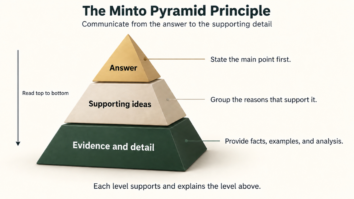
The main point comes first, followed by logically grouped supporting ideas and the detail beneath them.
Each level helps explain the level above it.
The Minto Pyramid concept also describes how thinking develops through grouping facts and drawing insights before communicating the result from the top down.
This requires more than moving the final sentence to the beginning. The writer must identify the reader’s question, decide what the evidence supports, and establish how the ideas belong together. For a government service team, that question might be: "What does this citizen or resident need to understand at this point in the service?"
On an application status page, the answer may be that action is required. On a service introduction page, it may be what the service enables someone to do and who can use it. On a confirmation page, it may be that an application has been received and what happens next.
Applying this thinking to interfaces is a practical adaptation of Minto’s framework. The following approach proposes how teams could use it alongside the UAE Design System.
Give the message a clear form
The UAE Design System already brings together guidance on content, typography, layout, actions, and accessibility. These are all part of how a service communicates.
A heading establishes the subject. Spacing shows which information belongs together. A button label explains an action. A status message tells someone what has changed.
When these elements follow the same information priorities, people have a clearer route through a service.
| Communication | Purpose | Expression |
|---|---|---|
| Main message | Answer the person’s immediate question | A specific page heading or status message |
| Supporting information | Explain what the answer means for them | Clearly grouped reasons, requirements, or next steps |
| Further detail | Provide the information needed to understand or complete the task | Field guidance, document specifications, or links to relevant guidance |
The table offers a way to plan content. Teams should select components according to their documented purpose and the needs of the task. A pyramid of ideas does not require three screens, three cards, or a particular page layout.
Make the next step unmistakable
Return back to the example about the citizen or resident checking an application. Imagine that the submitted document is unreadable. The following wording is illustrative, rather than a description of an existing service.
The wrong kind of message may say:
Application updateFollowing a review of the documentation associated with your application, further action is required to enable the assessment process to continue. Please provide an additional copy of the requested document.
Now, if we follow the concept of Minto, and apply a structured version, the same message may say the following:
Upload a clearer copy of your documentWe cannot read the document you uploaded. We need a clear copy to continue reviewing your application. Make sure all pages are included and the text is readable.
What would be better in a live service, would be to name the affected document and show the accepted file types and size limit beside the upload control. Include any applicable deadline where the person will see it before acting.
The message:
- establishes the action
- explains why it is needed
- supplies guidance for completing it.
The interface should support the same sequence, keeping the explanation and upload control together. This builds on the UAE Design System’s guidance to use specific language, explain problems, and provide direction.
The same discipline matters after submission. 'Application received' and 'Application approved' communicate different states. The heading, supporting text, and visual treatment should accurately express the state the service has reached.
Preserve clarity as the context changes
The value of a shared approach becomes clearer when a service moves between devices, languages, and channels.
Our article on designing government services for mobile use highlights the need to organise information for smaller screens and divided attention. A clear main message gives the person an immediate starting point. Supporting details can then appear where they become relevant.
Teams should keep information that materially affects a decision visible before someone commits. Eligibility restrictions, fees, deadlines, and consequences deserve appropriate prominence. Optional background can sit behind a clearly labelled link or expandable section. Good structure preserves the information people need to make an informed choice.
The same care must carry into Arabic and English. Agree the meaning, priority, and official terminology together. Review both versions with proficient speakers, and test the layout in each reading direction. A literal translation can retain the words while weakening the instruction.
Visual hierarchy also needs an accessible equivalent. Use meaningful heading structure, a logical reading order, and clear labels. Communicate status through text as well as colour. These practices support the design system’s emphasis on access for people of determination.
Tone needs equal attention. As The Empathy Engine discusses, people may approach government services with uncertainty or distress. Leading with the answer should remain respectful. A decision message needs an understandable reason and the available next steps. Reassurance should describe what the service can actually do.
Make clear communication reusable
The larger opportunity is to capture communication decisions in reusable service patterns.
For example, a team could document the information an application confirmation needs: the actual outcome, reference details, what happens next, and any action required from the applicant. The pattern would explain the order, provide reviewed examples, and show how to assemble suitable design system components.
This gives content writers, designers, developers, and service owners a shared starting point. Each service still supplies its own accurate information. Across the website, email, and SMS, the message should preserve the same status and next step, with detail adapted to the channel.
The design system’s own documentation can apply the same discipline. Start component guidance with its purpose and when to use it. Follow with selection guidance, then implementation details and examples. For a change announcement, explain what changed, who is affected, and what action teams need to take before presenting the technical detail.
Our article on narrowing the gap between design and code describes how AI can bring working prototypes into testing earlier. Clear communication patterns could make those prototypes more useful by giving tools an explicit content structure. Service owners would still need to verify the wording, conditions, and outcomes before release.
Conclusion
Every successful implementation must end with a test.
Test whether people understand
Start with one service moment where uncertainty is common: an upload error, a payment confirmation, or an application status update.
- Identify the question. Use service enquiries and research to establish what people need to know.
- Confirm the answer. Agree the facts, conditions, and next steps with the service owner.
- Organise the information. Write the main message, group its support, and place detail where it is needed.
- Build the experience. Use suitable UAE Design System components and review Arabic and English together.
- Test understanding. Ask people to explain what happened and what they would do next. Observe whether they can complete the task.
Compare the revised experience with the existing one. Look for fewer misunderstandings, repeated errors, and avoidable clarification enquiries. Measure successful completion alongside speed, and include people using mobile devices and assistive technologies.
Use what the testing reveals to refine the pattern, then share it with other service teams for review and reuse. Begin with the UAE Design System content guidelines and one real question your service needs to answer clearly.