Stable release of version 2.2
Something that we beleive in is "continues improvement", and therefore, the UAE design system continues to evolve and get better. Today we will talk about - Version 2.2. Let's explore the most important changes.
- Introducing, primary and secondary support color for focus state on buttons, form elements and links
- Changes to the Button component, fixing focus and updates to the soft and outline button states.
- A new range of Alert component state for Success, Error, Info and Warning
- Introducing responsive cards for the service card templates
- Introducing - the creative card variation
- Improvements in terms of consistent responsive types for media cards
- 2 new types of Hero blocks
... and that are just the improvements to the package. The other 2 updates that we think will make a big difference are:
If you have ensured that you have set the package to auto upgrade in your package.json file, things should be a smooth sail for you. Simply run the npm update command to upgrade the package. You can also use
npm install @aegov/design-system@latestLet's explore the features in detail
Primary and secondary support color
Introducing, the ability to control the focus state colour for all form elements, buttons and links on your website.
The default focus state was based on the use of the primary colour swatch. In the initial release of the design system, we considered a certain swatch color fixed that reacts to focus state for the elements. Having tested this with various custom colour codes, and with enhacements required for accessibility - the need for a custom colour swatch for focus state was necessary.
Your tailwind.config.js file can not include a custom colour swatch for the primary and secondary colour that specefically reacts to focus states. We are calling these *-support colour swatches.
If you are using a custom primary colour, you would not define the following in your config file:
module.exports = {
	theme: {
		colors: {
			'primary':{
				'50':'',
				'100':''
				'200':''
				...
			},
			'primary-support':{
				'50':'',
				'100':''
				'200':''
				...
			}
		}
	}
}
The default primary colour is aegovColors.aegold. The default support color has been set up as aegovColors.camel-yellow. This will result in the focus state for Buttons to look like the following:
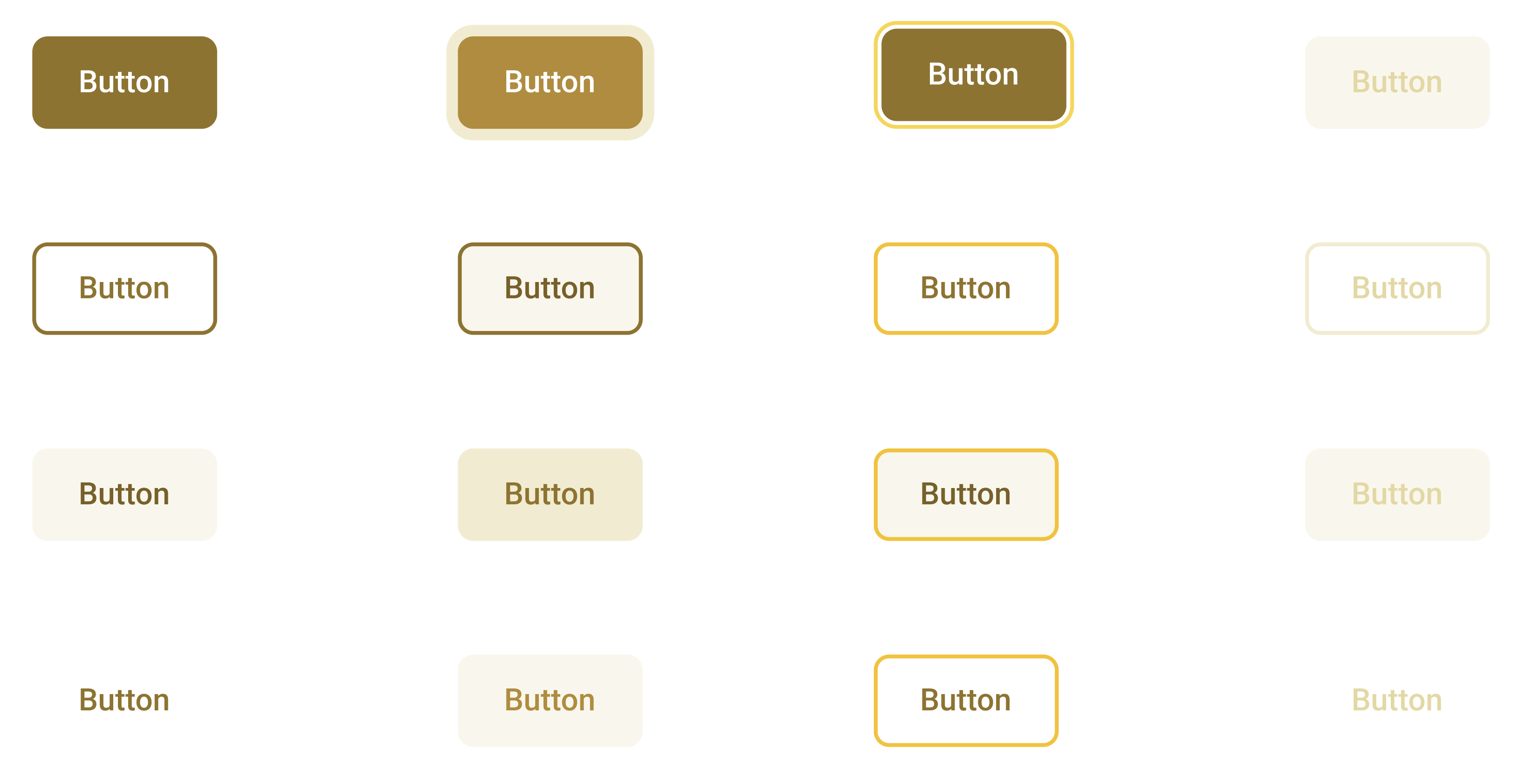
Changes to the Button component
Further accessibility testing and expected results based on custom colour swatches has led to changes in the use of colours from the primary swatch for the Button component.
This change primarly affects the hover states of the outline and soft button types. The hover colours have been moved up to be darker than before.
The new colour implemented on the focus state also is applied to all button elements - including primary and secondary buttons.
A new range of Alert component state
The initial launch of the design system allowed for the alert component to based on a visual colour heirachy that was also tested for accessibility in terms of colour contrast. However, all alert states followed a singular colour scheme.
Today, we are launching new states for alerts. All existing alert will default to the "soft" state, while a new state named the "hard" state can also be utilised by explicitly adding the alert-hard class to the component.
To compare the alert states, here is an example of the soft and hard states of an error message.
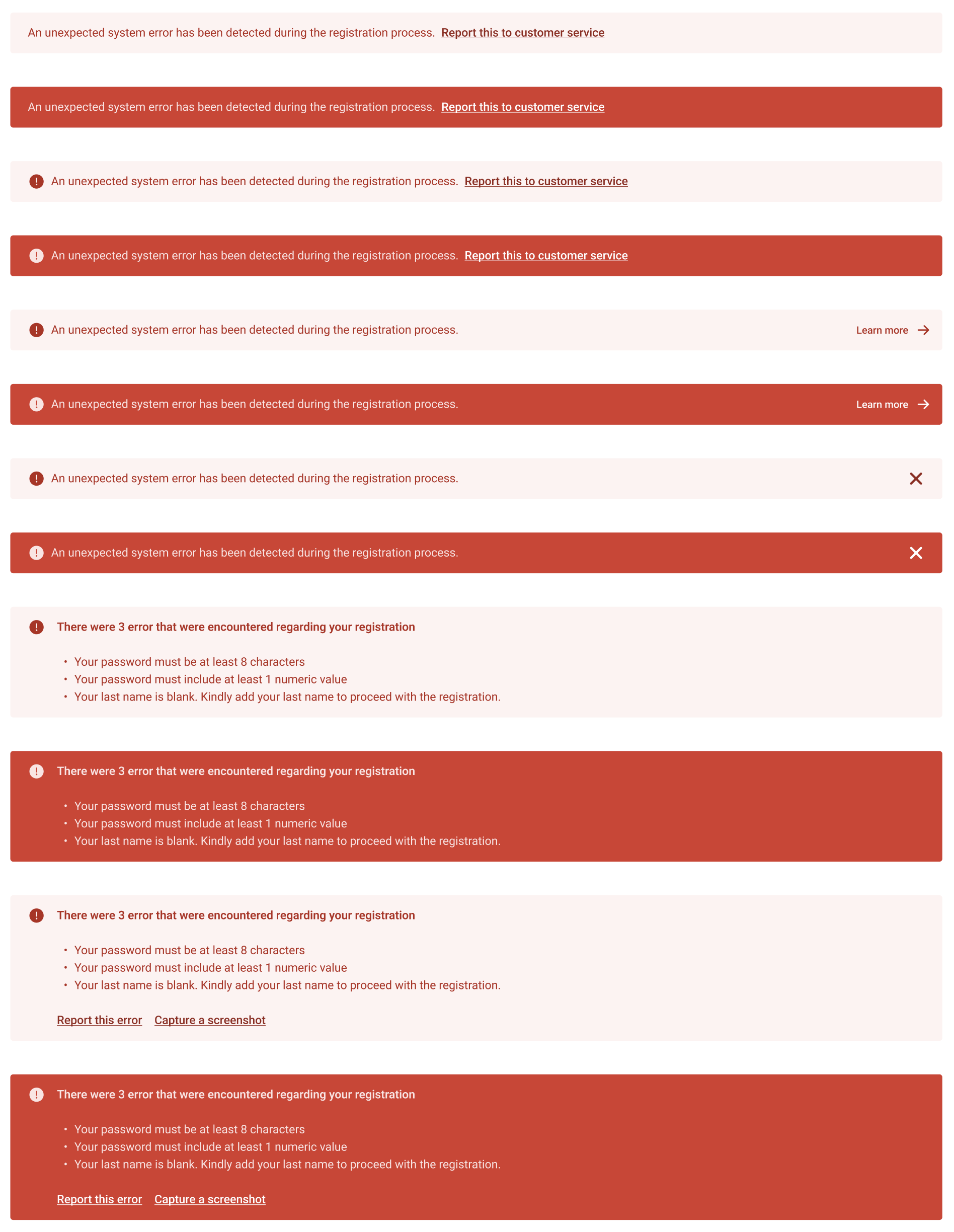
The new state class is now applicable to Errors, Success, Warning and Info alerts. It is, however, worth to note that this is applicable to alerts only and not to the banner component. If you are using the banner components, you must still use the states defined banner component.
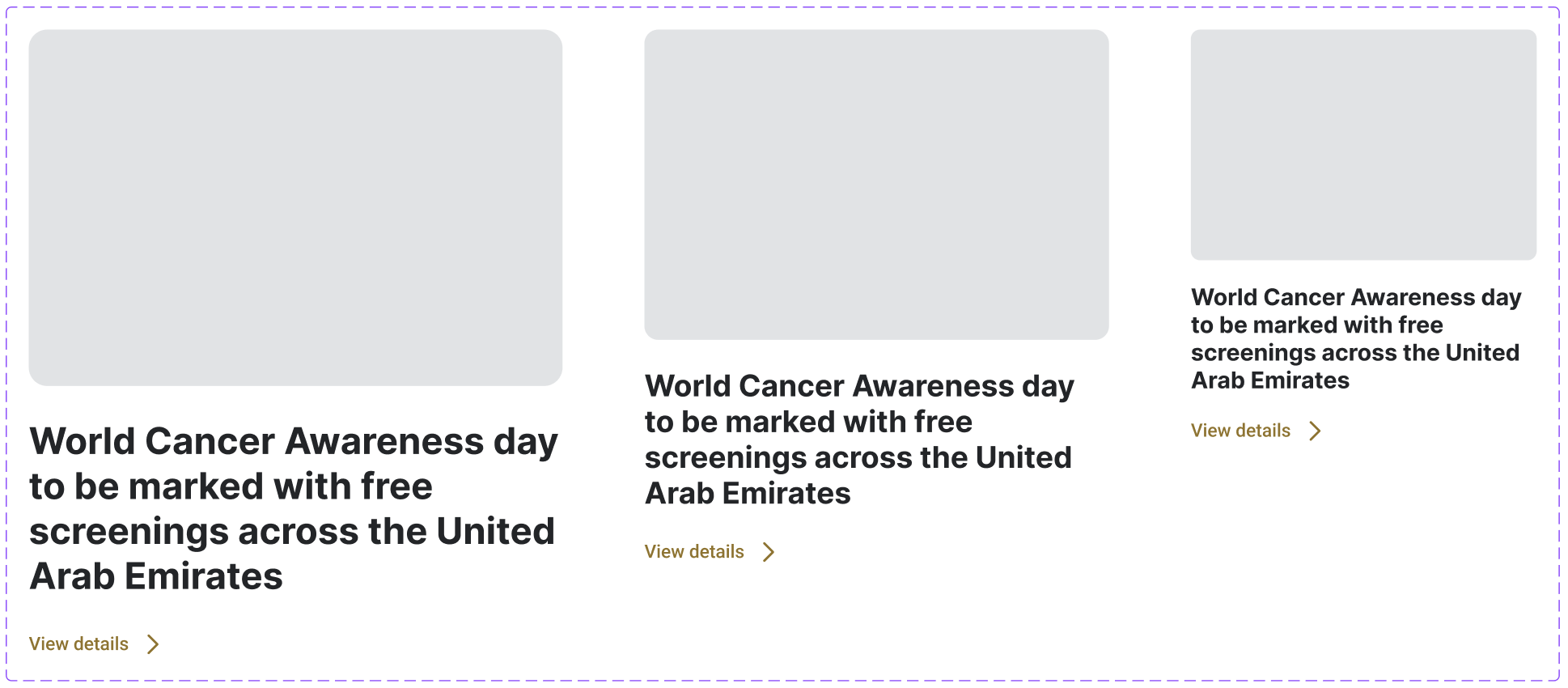
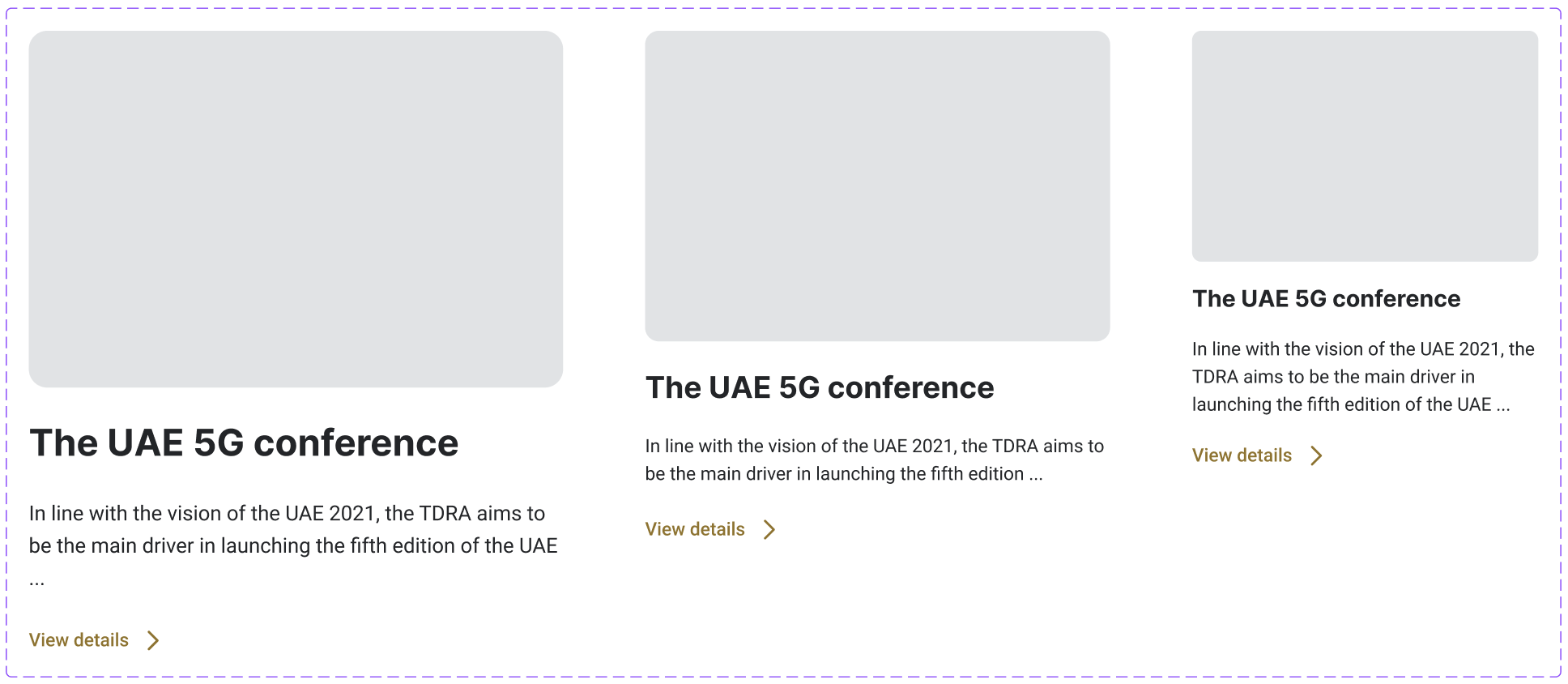
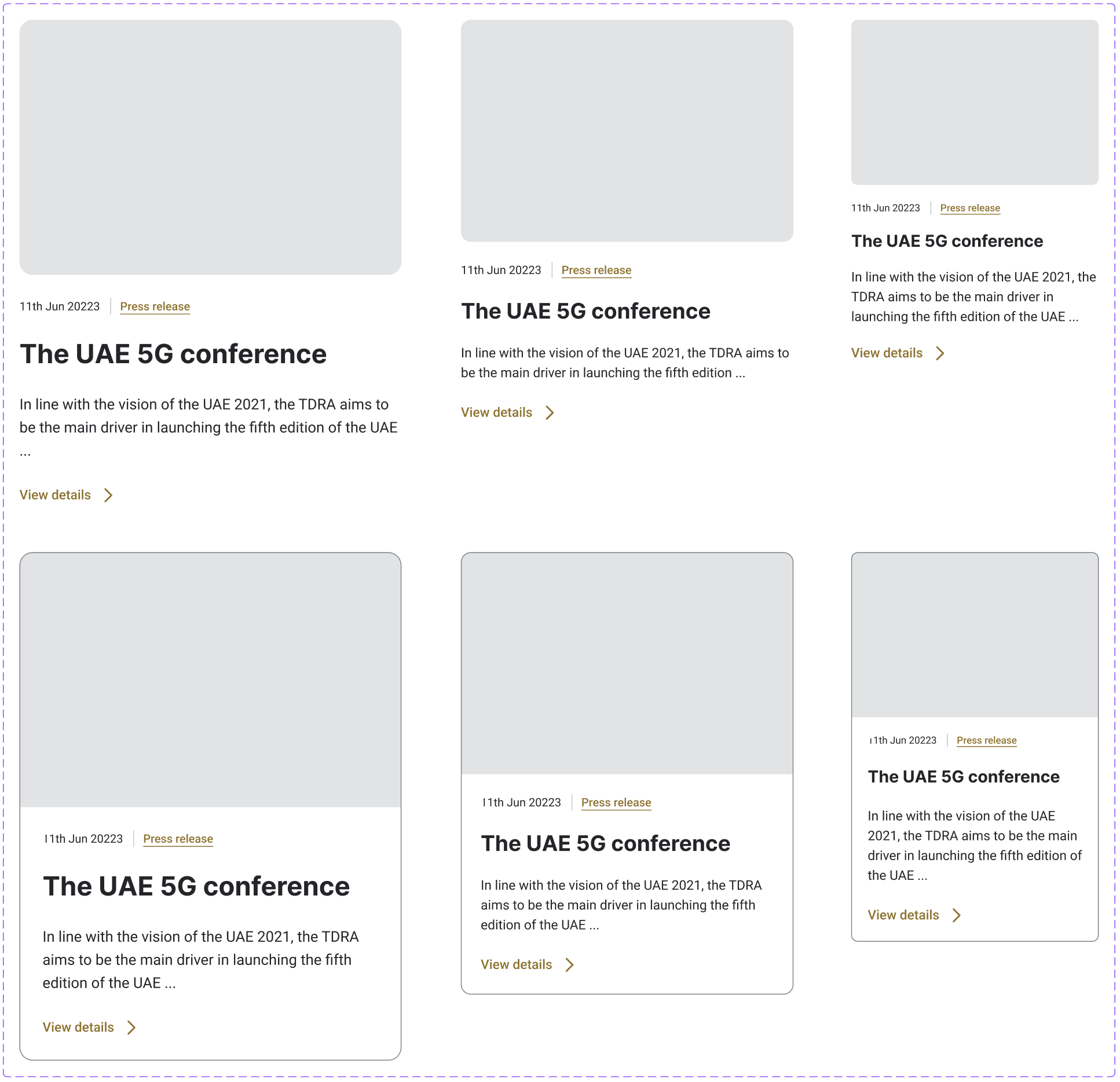
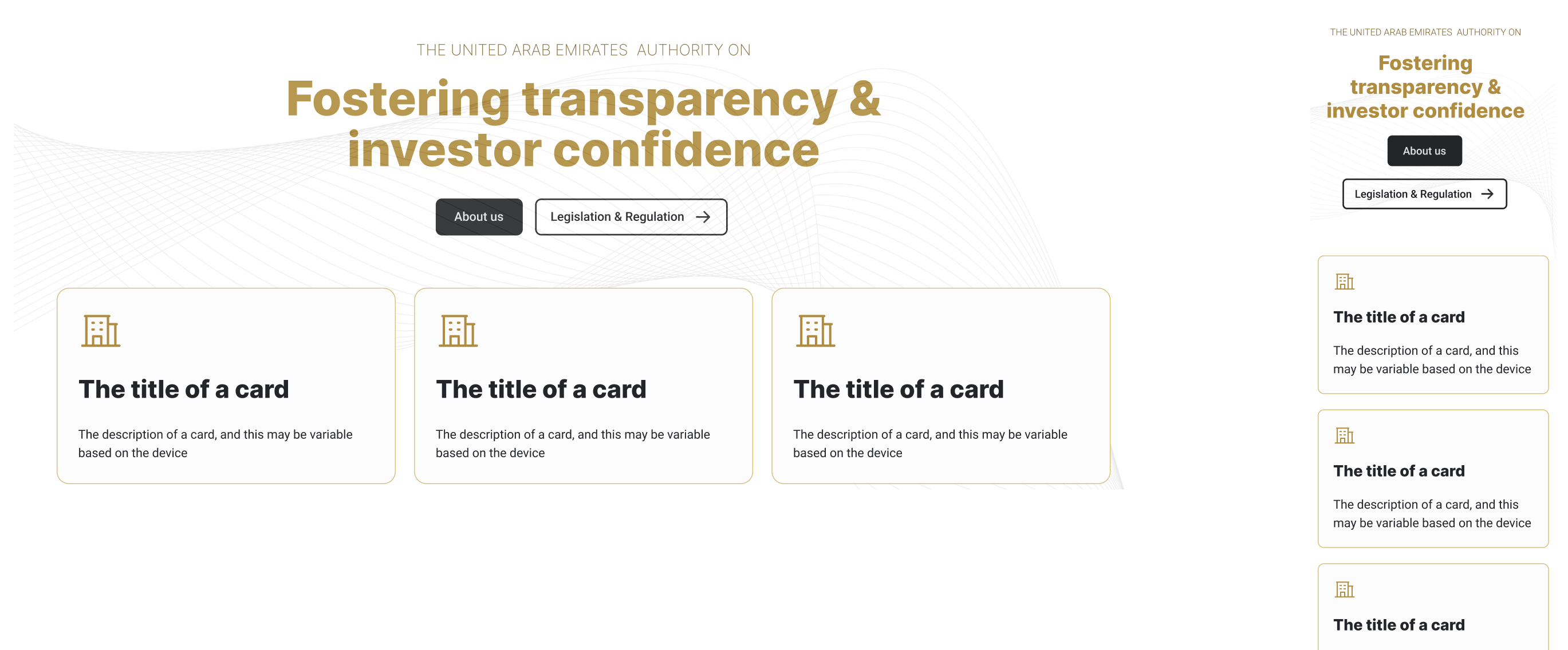
The new and improved "Card component"
The card component has many use cases. It is used for encapsulating any media object such as a news or a blog article, creating a list of initiatives, creative calls to action, a link to a service page and much more.
Responsive cards
When we released the initial version of the design system, it was understood that development teams will handle the responsive typography or responsive nature of elements inside a card. In this release, we are provide a responsive reaction to cards directly on the element itself.
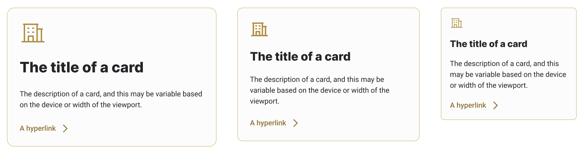
- The current and default size of the card has reduced the font size of the title and padding surrounding the content
- Two new variation have been added, which are
card-lgandcard-sm. It is recommended to use the large size when the container reaches the XL level and to use the small version on potrait versions of tablets and all mobile devices. - Cards also have a default gray colour as the background which stands out from the background colour of the website.
- The border and icon colour will react to the primary colour.
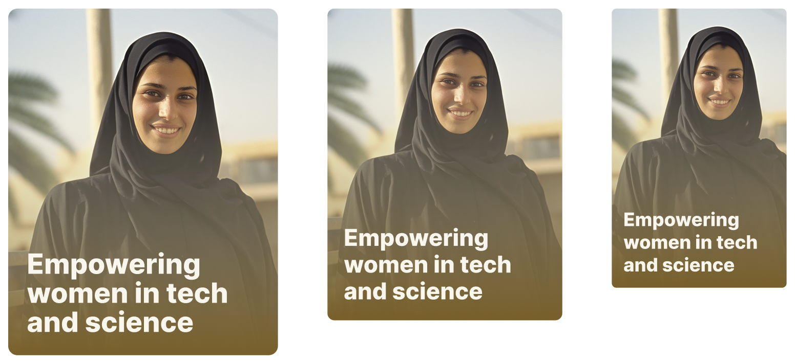
The creative card
Along with the standard card, media card, news and article card, and the bordered version of a card, we are now introducing the creative card. This version of the card allows for the untilisation of a full background image with a gradient placed between the image and text overlayed on the card. This card inherits the feature of the large, base and small variation.
Improving media cards
The improvements in the base card component have been applied to media and news cards as well. Developers are advised to ensure that responsive behaviour must be applied to cards for better usability.
New hero sections for the homepage
The original version of the design system introduced a hero image section. This block represented the ability to add an image and overlay text with a call to action in it. It was emphasised that the block must be responsive and on mobile devices, the block must adopt a portrait version.
The challenge highlighted is that there is a need to add more content within slides. Moreover, there is a need to not have an image altogeather.
Hence, we have created two new hero variations. The first one still follows a logic of a slider, but is designed to be content first rather than an image. The other one focuses on smart call to actions, a powerful headline and no image at all.
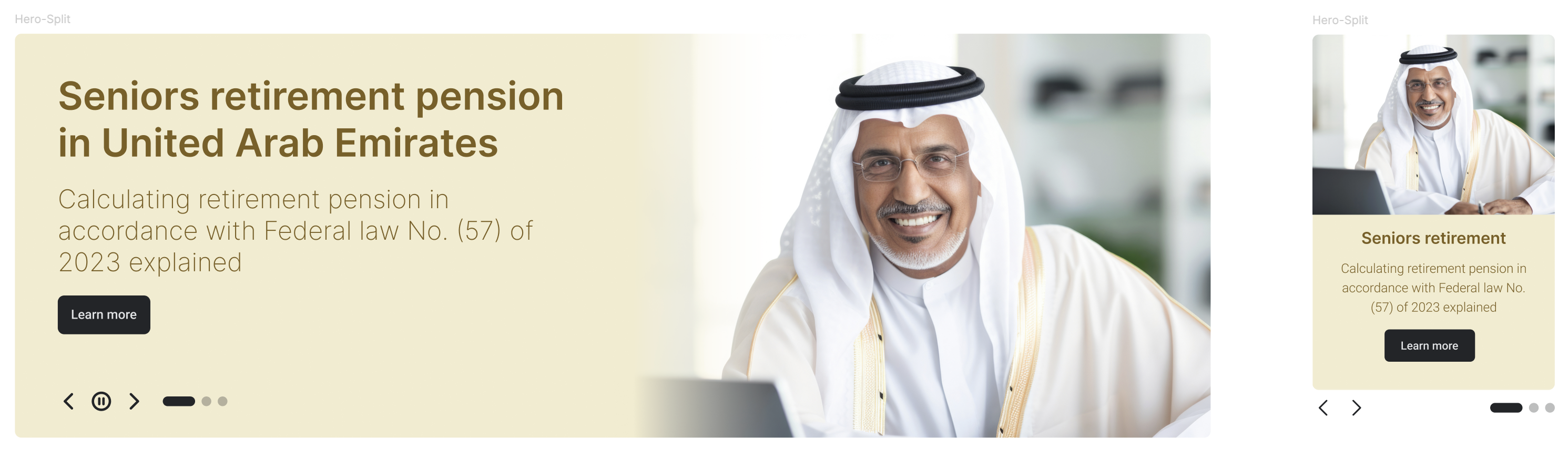
The new hero blocks can be used as a slider or a static version without movement. Should you choose to use a slider version, you must aim to not increase the required LCP as mentioned on the Page Index Criteria.