
Anatomy
aegov-navblock renders a <nav> landmark with an optional <h2> title, wrapping a <div role="list"> of aegov-navblock-item children. Each item host carries role="listitem" and contains a row — a real <a> (leaf with a destination), a toggle <button> (parent with sub-items), or a plain <button>/non-interactive <span> otherwise — plus, for a parent row, a collapsible <div> wrapper holding its own nested <div role="list"> of sub-items.
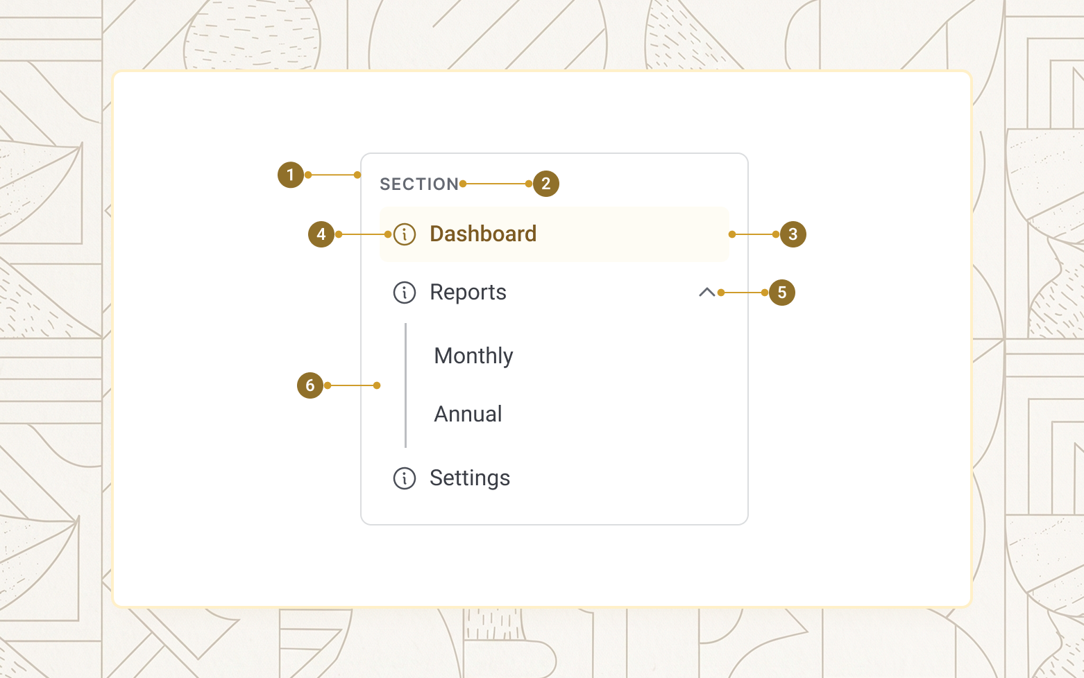
| Item | Name | Description |
|---|---|---|
1 |
Nav landmark | The <nav> element, labelled via label-nav |
2 |
Block title | Optional heading from block-title or the title slot |
3 |
Item row | The <a>/<button>/<span> rendered by each item |
4 |
Leading icon | Optional icon via the icon-start slot |
5 |
Expand/collapse indicator | Chevron or plus icon, shown only on parent rows |
6 |
Sub-region | The nested <div role="list"> of an open parent's subnav children |
Navblock basics
A navblock is one or more aegov-navblock-item children. An item with href and no children renders as a link; an item with nested aegov-navblock-item children automatically becomes a collapsible group — authors do not need to add slot="subnav" themselves, nested items are promoted into it automatically.
<aegov-navblock block-title="Workspace" label-nav="Project sidebar">
  <aegov-navblock-item href="/" is-active="true">Dashboard</aegov-navblock-item>
  <aegov-navblock-item>
    Reports
    <aegov-navblock-item href="/r/sales">Sales</aegov-navblock-item>
    <aegov-navblock-item href="/r/users">Users</aegov-navblock-item>
  </aegov-navblock-item>
  <aegov-navblock-item href="/settings">Settings</aegov-navblock-item>
</aegov-navblock>import { AegovNavblock, AegovNavblockItem } from '@aegov/designsystem-react';
export default function NavblockBasics() {
return (
<AegovNavblock blockTitle="Workspace" labelNav="Project sidebar">
<AegovNavblockItem href="/" isActive>Dashboard</AegovNavblockItem>
<AegovNavblockItem>
Reports
<AegovNavblockItem href="/r/sales">Sales</AegovNavblockItem>
<AegovNavblockItem href="/r/users">Users</AegovNavblockItem>
</AegovNavblockItem>
<AegovNavblockItem href="/settings">Settings</AegovNavblockItem>
</AegovNavblock>
);
}<template>
<aegov-navblock block-title="Workspace" label-nav="Project sidebar">
<aegov-navblock-item href="/" is-active="true">Dashboard</aegov-navblock-item>
<aegov-navblock-item>
Reports
<aegov-navblock-item href="/r/sales">Sales</aegov-navblock-item>
<aegov-navblock-item href="/r/users">Users</aegov-navblock-item>
</aegov-navblock-item>
<aegov-navblock-item href="/settings">Settings</aegov-navblock-item>
</aegov-navblock>
</template>import { Component } from '@angular/core';
import { AegovNavblock, AegovNavblockItem } from '@aegov/designsystem-angular';
@Component({
selector: 'app-navblock-basics',
imports: [AegovNavblock, AegovNavblockItem],
template: `
<aegov-navblock block-title="Workspace" label-nav="Project sidebar">
<aegov-navblock-item href="/" [isActive]="true">Dashboard</aegov-navblock-item>
<aegov-navblock-item>
Reports
<aegov-navblock-item href="/r/sales">Sales</aegov-navblock-item>
<aegov-navblock-item href="/r/users">Users</aegov-navblock-item>
</aegov-navblock-item>
<aegov-navblock-item href="/settings">Settings</aegov-navblock-item>
</aegov-navblock>
`,
})
export class NavblockBasicsComponent {}Collapsible and flat variants
variant switches the visual mode of the whole tree from a single prop on aegov-navblock — the markup underneath is identical either way. collapsible (default) shows nested items in an animated accordion, with the active item getting a filled background highlight. flat renders every item at the same indentation level; items with children become non-interactive bold group headers whose children are always visible, and the active item gets a colour/weight change with no background fill.
<aegov-navblock variant="collapsible" block-title="Collapsible">
  <aegov-navblock-item href="/" is-active="true">Dashboard</aegov-navblock-item>
  <aegov-navblock-item href="/transactions">Transactions</aegov-navblock-item>
  <aegov-navblock-item>
    Account
    <aegov-navblock-item href="/account/profile">Profile</aegov-navblock-item>
    <aegov-navblock-item href="/account/billing">Billing</aegov-navblock-item>
  </aegov-navblock-item>
</aegov-navblock>

<aegov-navblock variant="flat" block-title="Flat">
  <aegov-navblock-item href="/" is-active="true">Dashboard</aegov-navblock-item>
  <aegov-navblock-item href="/transactions">Transactions</aegov-navblock-item>
  <aegov-navblock-item>
    Account
    <aegov-navblock-item href="/account/profile">Profile</aegov-navblock-item>
    <aegov-navblock-item href="/account/billing">Billing</aegov-navblock-item>
  </aegov-navblock-item>
</aegov-navblock>import { AegovNavblock, AegovNavblockItem } from '@aegov/designsystem-react';
export default function NavblockVariants() {
return (
<>
<AegovNavblock variant="collapsible" blockTitle="Collapsible">
<AegovNavblockItem href="/" isActive>Dashboard</AegovNavblockItem>
<AegovNavblockItem href="/transactions">Transactions</AegovNavblockItem>
<AegovNavblockItem>
Account
<AegovNavblockItem href="/account/profile">Profile</AegovNavblockItem>
<AegovNavblockItem href="/account/billing">Billing</AegovNavblockItem>
</AegovNavblockItem>
</AegovNavblock>
<AegovNavblock variant="flat" blockTitle="Flat">
<AegovNavblockItem href="/" isActive>Dashboard</AegovNavblockItem>
<AegovNavblockItem href="/transactions">Transactions</AegovNavblockItem>
<AegovNavblockItem>
Account
<AegovNavblockItem href="/account/profile">Profile</AegovNavblockItem>
<AegovNavblockItem href="/account/billing">Billing</AegovNavblockItem>
</AegovNavblockItem>
</AegovNavblock>
</>
);
}<template>
<aegov-navblock variant="collapsible" block-title="Collapsible">
<aegov-navblock-item href="/" is-active="true">Dashboard</aegov-navblock-item>
<aegov-navblock-item href="/transactions">Transactions</aegov-navblock-item>
<aegov-navblock-item>
Account
<aegov-navblock-item href="/account/profile">Profile</aegov-navblock-item>
<aegov-navblock-item href="/account/billing">Billing</aegov-navblock-item>
</aegov-navblock-item>
</aegov-navblock>
<aegov-navblock variant="flat" block-title="Flat">
<aegov-navblock-item href="/" is-active="true">Dashboard</aegov-navblock-item>
<aegov-navblock-item href="/transactions">Transactions</aegov-navblock-item>
<aegov-navblock-item>
Account
<aegov-navblock-item href="/account/profile">Profile</aegov-navblock-item>
<aegov-navblock-item href="/account/billing">Billing</aegov-navblock-item>
</aegov-navblock-item>
</aegov-navblock>
</template>import { Component } from '@angular/core';
import { AegovNavblock, AegovNavblockItem } from '@aegov/designsystem-angular';
@Component({
selector: 'app-navblock-variants',
imports: [AegovNavblock, AegovNavblockItem],
template: `
<aegov-navblock variant="collapsible" block-title="Collapsible">
<aegov-navblock-item href="/" [isActive]="true">Dashboard</aegov-navblock-item>
<aegov-navblock-item href="/transactions">Transactions</aegov-navblock-item>
<aegov-navblock-item>
Account
<aegov-navblock-item href="/account/profile">Profile</aegov-navblock-item>
<aegov-navblock-item href="/account/billing">Billing</aegov-navblock-item>
</aegov-navblock-item>
</aegov-navblock>
<aegov-navblock variant="flat" block-title="Flat">
<aegov-navblock-item href="/" [isActive]="true">Dashboard</aegov-navblock-item>
<aegov-navblock-item href="/transactions">Transactions</aegov-navblock-item>
<aegov-navblock-item>
Account
<aegov-navblock-item href="/account/profile">Profile</aegov-navblock-item>
<aegov-navblock-item href="/account/billing">Billing</aegov-navblock-item>
</aegov-navblock-item>
</aegov-navblock>
`,
})
export class NavblockVariantsComponent {}Flat with active border
Add active-border alongside variant="flat" for the Flux sidebar pattern: a persistent light border runs the full height of the list, and the active top-level item's segment of that border switches to the primary colour — a merged active indicator with no layout shift. It has no effect in collapsible mode.
<aegov-navblock variant="flat" active-border="true" block-title="Workspace">
  <aegov-navblock-item href="/" is-active="true">Dashboard</aegov-navblock-item>
  <aegov-navblock-item>
    Account
    <aegov-navblock-item href="/account/profile">Profile</aegov-navblock-item>
    <aegov-navblock-item href="/account/billing">Billing</aegov-navblock-item>
  </aegov-navblock-item>
</aegov-navblock>import { AegovNavblock, AegovNavblockItem } from '@aegov/designsystem-react';
export default function NavblockActiveBorder() {
return (
<AegovNavblock variant="flat" activeBorder blockTitle="Workspace">
<AegovNavblockItem href="/" isActive>Dashboard</AegovNavblockItem>
<AegovNavblockItem>
Account
<AegovNavblockItem href="/account/profile">Profile</AegovNavblockItem>
<AegovNavblockItem href="/account/billing">Billing</AegovNavblockItem>
</AegovNavblockItem>
</AegovNavblock>
);
}<template>
<aegov-navblock variant="flat" active-border="true" block-title="Workspace">
<aegov-navblock-item href="/" is-active="true">Dashboard</aegov-navblock-item>
<aegov-navblock-item>
Account
<aegov-navblock-item href="/account/profile">Profile</aegov-navblock-item>
<aegov-navblock-item href="/account/billing">Billing</aegov-navblock-item>
</aegov-navblock-item>
</aegov-navblock>
</template>import { Component } from '@angular/core';
import { AegovNavblock, AegovNavblockItem } from '@aegov/designsystem-angular';
@Component({
selector: 'app-navblock-active-border',
imports: [AegovNavblock, AegovNavblockItem],
template: `
<aegov-navblock variant="flat" [activeBorder]="true" block-title="Workspace">
<aegov-navblock-item href="/" [isActive]="true">Dashboard</aegov-navblock-item>
<aegov-navblock-item>
Account
<aegov-navblock-item href="/account/profile">Profile</aegov-navblock-item>
<aegov-navblock-item href="/account/billing">Billing</aegov-navblock-item>
</aegov-navblock-item>
</aegov-navblock>
`,
})
export class NavblockActiveBorderComponent {}Block title
block-title renders a short heading above the items. Pass markup via the title slot instead to fully override it — for example to embed an icon next to the title.
<aegov-navblock block-title="Resources">
  <aegov-navblock-item href="/docs">Docs</aegov-navblock-item>
  <aegov-navblock-item href="/api">API reference</aegov-navblock-item>
  <aegov-navblock-item href="/releases">Release notes</aegov-navblock-item>
</aegov-navblock>import { AegovNavblock, AegovNavblockItem } from '@aegov/designsystem-react';
export default function NavblockBlockTitle() {
return (
<AegovNavblock blockTitle="Resources">
<AegovNavblockItem href="/docs">Docs</AegovNavblockItem>
<AegovNavblockItem href="/api">API reference</AegovNavblockItem>
<AegovNavblockItem href="/releases">Release notes</AegovNavblockItem>
</AegovNavblock>
);
}<template>
<aegov-navblock block-title="Resources">
<aegov-navblock-item href="/docs">Docs</aegov-navblock-item>
<aegov-navblock-item href="/api">API reference</aegov-navblock-item>
<aegov-navblock-item href="/releases">Release notes</aegov-navblock-item>
</aegov-navblock>
</template>import { Component } from '@angular/core';
import { AegovNavblock, AegovNavblockItem } from '@aegov/designsystem-angular';
@Component({
selector: 'app-navblock-block-title',
imports: [AegovNavblock, AegovNavblockItem],
template: `
<aegov-navblock block-title="Resources">
<aegov-navblock-item href="/docs">Docs</aegov-navblock-item>
<aegov-navblock-item href="/api">API reference</aegov-navblock-item>
<aegov-navblock-item href="/releases">Release notes</aegov-navblock-item>
</aegov-navblock>
`,
})
export class NavblockBlockTitleComponent {}Single open vs. multiple open
By default, opening one parent closes any other open parent that shares the same direct parent — at every level of the tree. Set is-multiple="true" to allow any number of parents to stay open at once instead.
<aegov-navblock is-multiple="true">
  <aegov-navblock-item>
    Reports
    <aegov-navblock-item href="/r/sales">Sales</aegov-navblock-item>
    <aegov-navblock-item href="/r/inventory">Inventory</aegov-navblock-item>
  </aegov-navblock-item>
  <aegov-navblock-item>
    Users
    <aegov-navblock-item href="/u/admins">Admins</aegov-navblock-item>
    <aegov-navblock-item href="/u/members">Members</aegov-navblock-item>
  </aegov-navblock-item>
</aegov-navblock>import { AegovNavblock, AegovNavblockItem } from '@aegov/designsystem-react';
export default function NavblockMultipleOpen() {
return (
<AegovNavblock isMultiple>
<AegovNavblockItem>
Reports
<AegovNavblockItem href="/r/sales">Sales</AegovNavblockItem>
<AegovNavblockItem href="/r/inventory">Inventory</AegovNavblockItem>
</AegovNavblockItem>
<AegovNavblockItem>
Users
<AegovNavblockItem href="/u/admins">Admins</AegovNavblockItem>
<AegovNavblockItem href="/u/members">Members</AegovNavblockItem>
</AegovNavblockItem>
</AegovNavblock>
);
}<template>
<aegov-navblock is-multiple="true">
<aegov-navblock-item>
Reports
<aegov-navblock-item href="/r/sales">Sales</aegov-navblock-item>
<aegov-navblock-item href="/r/inventory">Inventory</aegov-navblock-item>
</aegov-navblock-item>
<aegov-navblock-item>
Users
<aegov-navblock-item href="/u/admins">Admins</aegov-navblock-item>
<aegov-navblock-item href="/u/members">Members</aegov-navblock-item>
</aegov-navblock-item>
</aegov-navblock>
</template>import { Component } from '@angular/core';
import { AegovNavblock, AegovNavblockItem } from '@aegov/designsystem-angular';
@Component({
selector: 'app-navblock-multiple-open',
imports: [AegovNavblock, AegovNavblockItem],
template: `
<aegov-navblock [isMultiple]="true">
<aegov-navblock-item>
Reports
<aegov-navblock-item href="/r/sales">Sales</aegov-navblock-item>
<aegov-navblock-item href="/r/inventory">Inventory</aegov-navblock-item>
</aegov-navblock-item>
<aegov-navblock-item>
Users
<aegov-navblock-item href="/u/admins">Admins</aegov-navblock-item>
<aegov-navblock-item href="/u/members">Members</aegov-navblock-item>
</aegov-navblock-item>
</aegov-navblock>
`,
})
export class NavblockMultipleOpenComponent {}Toggle icon
Switch every parent row's expand/collapse indicator with the icon prop: chevron (default) rotates 180° on open; plus rotates 45° to visually form a cross (×).
<aegov-navblock icon="chevron" block-title="Chevron">
  <aegov-navblock-item>
    Reports
    <aegov-navblock-item href="/r/sales">Sales</aegov-navblock-item>
  </aegov-navblock-item>
</aegov-navblock>

<aegov-navblock icon="plus" block-title="Plus">
  <aegov-navblock-item>
    Reports
    <aegov-navblock-item href="/r/sales">Sales</aegov-navblock-item>
  </aegov-navblock-item>
</aegov-navblock>import { AegovNavblock, AegovNavblockItem } from '@aegov/designsystem-react';
export default function NavblockToggleIcon() {
return (
<>
<AegovNavblock icon="chevron" blockTitle="Chevron">
<AegovNavblockItem>
Reports
<AegovNavblockItem href="/r/sales">Sales</AegovNavblockItem>
</AegovNavblockItem>
</AegovNavblock>
<AegovNavblock icon="plus" blockTitle="Plus">
<AegovNavblockItem>
Reports
<AegovNavblockItem href="/r/sales">Sales</AegovNavblockItem>
</AegovNavblockItem>
</AegovNavblock>
</>
);
}<template>
<aegov-navblock icon="chevron" block-title="Chevron">
<aegov-navblock-item>
Reports
<aegov-navblock-item href="/r/sales">Sales</aegov-navblock-item>
</aegov-navblock-item>
</aegov-navblock>
<aegov-navblock icon="plus" block-title="Plus">
<aegov-navblock-item>
Reports
<aegov-navblock-item href="/r/sales">Sales</aegov-navblock-item>
</aegov-navblock-item>
</aegov-navblock>
</template>import { Component } from '@angular/core';
import { AegovNavblock, AegovNavblockItem } from '@aegov/designsystem-angular';
@Component({
selector: 'app-navblock-toggle-icon',
imports: [AegovNavblock, AegovNavblockItem],
template: `
<aegov-navblock icon="chevron" block-title="Chevron">
<aegov-navblock-item>
Reports
<aegov-navblock-item href="/r/sales">Sales</aegov-navblock-item>
</aegov-navblock-item>
</aegov-navblock>
<aegov-navblock icon="plus" block-title="Plus">
<aegov-navblock-item>
Reports
<aegov-navblock-item href="/r/sales">Sales</aegov-navblock-item>
</aegov-navblock-item>
</aegov-navblock>
`,
})
export class NavblockToggleIconComponent {}Sizes
size scales row typography, padding, and icon size. Three tokens are available — sm, base (default), and lg. The parent navblock resolves the token and cascades it to every descendant item. A Tailwind-style responsive string (e.g. "sm md:base xl:lg") is also accepted.
<aegov-navblock size="sm" block-title="Small">
  <aegov-navblock-item href="/" is-active="true">Home</aegov-navblock-item>
  <aegov-navblock-item href="/reports">Reports</aegov-navblock-item>
</aegov-navblock>

<aegov-navblock size="base" block-title="Base">
  <aegov-navblock-item href="/" is-active="true">Home</aegov-navblock-item>
  <aegov-navblock-item href="/reports">Reports</aegov-navblock-item>
</aegov-navblock>

<aegov-navblock size="lg" block-title="Large">
  <aegov-navblock-item href="/" is-active="true">Home</aegov-navblock-item>
  <aegov-navblock-item href="/reports">Reports</aegov-navblock-item>
</aegov-navblock>import { AegovNavblock, AegovNavblockItem } from '@aegov/designsystem-react';
export default function NavblockSizes() {
return (
<>
<AegovNavblock size="sm" blockTitle="Small">
<AegovNavblockItem href="/" isActive>Home</AegovNavblockItem>
<AegovNavblockItem href="/reports">Reports</AegovNavblockItem>
</AegovNavblock>
<AegovNavblock size="base" blockTitle="Base">
<AegovNavblockItem href="/" isActive>Home</AegovNavblockItem>
<AegovNavblockItem href="/reports">Reports</AegovNavblockItem>
</AegovNavblock>
<AegovNavblock size="lg" blockTitle="Large">
<AegovNavblockItem href="/" isActive>Home</AegovNavblockItem>
<AegovNavblockItem href="/reports">Reports</AegovNavblockItem>
</AegovNavblock>
</>
);
}<template>
<aegov-navblock size="sm" block-title="Small">
<aegov-navblock-item href="/" is-active="true">Home</aegov-navblock-item>
<aegov-navblock-item href="/reports">Reports</aegov-navblock-item>
</aegov-navblock>
<aegov-navblock size="base" block-title="Base">
<aegov-navblock-item href="/" is-active="true">Home</aegov-navblock-item>
<aegov-navblock-item href="/reports">Reports</aegov-navblock-item>
</aegov-navblock>
<aegov-navblock size="lg" block-title="Large">
<aegov-navblock-item href="/" is-active="true">Home</aegov-navblock-item>
<aegov-navblock-item href="/reports">Reports</aegov-navblock-item>
</aegov-navblock>
</template>import { Component } from '@angular/core';
import { AegovNavblock, AegovNavblockItem } from '@aegov/designsystem-angular';
@Component({
selector: 'app-navblock-sizes',
imports: [AegovNavblock, AegovNavblockItem],
template: `
<aegov-navblock size="sm" block-title="Small">
<aegov-navblock-item href="/" [isActive]="true">Home</aegov-navblock-item>
<aegov-navblock-item href="/reports">Reports</aegov-navblock-item>
</aegov-navblock>
<aegov-navblock size="base" block-title="Base">
<aegov-navblock-item href="/" [isActive]="true">Home</aegov-navblock-item>
<aegov-navblock-item href="/reports">Reports</aegov-navblock-item>
</aegov-navblock>
<aegov-navblock size="lg" block-title="Large">
<aegov-navblock-item href="/" [isActive]="true">Home</aegov-navblock-item>
<aegov-navblock-item href="/reports">Reports</aegov-navblock-item>
</aegov-navblock>
`,
})
export class NavblockSizesComponent {}Leading icons and inline content
Each item supports a leading icon via slot="icon-start". Anything else placed inside the item — including other components such as aegov-badge — appears inline next to the label, so a count or status pill needs no dedicated slot.
<aegov-navblock>
  <aegov-navblock-item href="/inbox" is-active="true">
    <svg slot="icon-start" viewBox="0 0 256 256" aria-hidden="true">
      <rect width="256" height="256" fill="none" />
      <path d="M32 96l96 64 96-64v96a16 16 0 0 1-16 16H48a16 16 0 0 1-16-16Z"
            fill="none" stroke="currentColor" stroke-width="20" stroke-linejoin="round" />
    </svg>
    Inbox
    <aegov-badge variant="primary">12</aegov-badge>
  </aegov-navblock-item>
  <aegov-navblock-item href="/sent">
    <svg slot="icon-start" viewBox="0 0 256 256" aria-hidden="true">
      <rect width="256" height="256" fill="none" />
      <path d="m48 56 176 72-176 72 32-72Z"
            fill="none" stroke="currentColor" stroke-width="20" stroke-linejoin="round" />
    </svg>
    Sent
  </aegov-navblock-item>
</aegov-navblock>import { AegovNavblock, AegovNavblockItem, AegovBadge } from '@aegov/designsystem-react';
export default function NavblockIcons() {
return (
<AegovNavblock>
<AegovNavblockItem href="/inbox" isActive>
<svg slot="icon-start" viewBox="0 0 256 256" aria-hidden="true">
<rect width="256" height="256" fill="none" />
<path d="M32 96l96 64 96-64v96a16 16 0 0 1-16 16H48a16 16 0 0 1-16-16Z"
fill="none" stroke="currentColor" strokeWidth="20" strokeLinejoin="round" />
</svg>
Inbox
<AegovBadge variant="primary">12</AegovBadge>
</AegovNavblockItem>
<AegovNavblockItem href="/sent">
<svg slot="icon-start" viewBox="0 0 256 256" aria-hidden="true">
<rect width="256" height="256" fill="none" />
<path d="m48 56 176 72-176 72 32-72Z"
fill="none" stroke="currentColor" strokeWidth="20" strokeLinejoin="round" />
</svg>
Sent
</AegovNavblockItem>
</AegovNavblock>
);
}<template>
<aegov-navblock>
<aegov-navblock-item href="/inbox" is-active="true">
<svg slot="icon-start" viewBox="0 0 256 256" aria-hidden="true">
<rect width="256" height="256" fill="none" />
<path d="M32 96l96 64 96-64v96a16 16 0 0 1-16 16H48a16 16 0 0 1-16-16Z"
fill="none" stroke="currentColor" stroke-width="20" stroke-linejoin="round" />
</svg>
Inbox
<aegov-badge variant="primary">12</aegov-badge>
</aegov-navblock-item>
<aegov-navblock-item href="/sent">
<svg slot="icon-start" viewBox="0 0 256 256" aria-hidden="true">
<rect width="256" height="256" fill="none" />
<path d="m48 56 176 72-176 72 32-72Z"
fill="none" stroke="currentColor" stroke-width="20" stroke-linejoin="round" />
</svg>
Sent
</aegov-navblock-item>
</aegov-navblock>
</template>import { Component } from '@angular/core';
import { AegovNavblock, AegovNavblockItem, AegovBadge } from '@aegov/designsystem-angular';
@Component({
selector: 'app-navblock-icons',
imports: [AegovNavblock, AegovNavblockItem, AegovBadge],
template: `
<aegov-navblock>
<aegov-navblock-item href="/inbox" [isActive]="true">
<svg slot="icon-start" viewBox="0 0 256 256" aria-hidden="true">
<rect width="256" height="256" fill="none" />
<path d="M32 96l96 64 96-64v96a16 16 0 0 1-16 16H48a16 16 0 0 1-16-16Z"
fill="none" stroke="currentColor" stroke-width="20" stroke-linejoin="round" />
</svg>
Inbox
<aegov-badge variant="primary">12</aegov-badge>
</aegov-navblock-item>
<aegov-navblock-item href="/sent">
<svg slot="icon-start" viewBox="0 0 256 256" aria-hidden="true">
<rect width="256" height="256" fill="none" />
<path d="m48 56 176 72-176 72 32-72Z"
fill="none" stroke="currentColor" stroke-width="20" stroke-linejoin="round" />
</svg>
Sent
</aegov-navblock-item>
</aegov-navblock>
`,
})
export class NavblockIconsComponent {}Deep nesting
Sub-items can themselves contain sub-items, recursively. When any descendant item is is-active, every ancestor group is automatically expanded on the initial render, so the active row is visible without any extra code.
<aegov-navblock>
  <aegov-navblock-item>
    Reports
    <aegov-navblock-item>
      Sales
      <aegov-navblock-item href="/r/sales/q1" is-active="true">Q1 — current</aegov-navblock-item>
      <aegov-navblock-item href="/r/sales/q2">Q2</aegov-navblock-item>
    </aegov-navblock-item>
    <aegov-navblock-item href="/r/users">Users</aegov-navblock-item>
  </aegov-navblock-item>
  <aegov-navblock-item href="/settings">Settings</aegov-navblock-item>
</aegov-navblock>import { AegovNavblock, AegovNavblockItem } from '@aegov/designsystem-react';
export default function NavblockDeepNesting() {
return (
<AegovNavblock>
<AegovNavblockItem>
Reports
<AegovNavblockItem>
Sales
<AegovNavblockItem href="/r/sales/q1" isActive>Q1 — current</AegovNavblockItem>
<AegovNavblockItem href="/r/sales/q2">Q2</AegovNavblockItem>
</AegovNavblockItem>
<AegovNavblockItem href="/r/users">Users</AegovNavblockItem>
</AegovNavblockItem>
<AegovNavblockItem href="/settings">Settings</AegovNavblockItem>
</AegovNavblock>
);
}<template>
<aegov-navblock>
<aegov-navblock-item>
Reports
<aegov-navblock-item>
Sales
<aegov-navblock-item href="/r/sales/q1" is-active="true">Q1 — current</aegov-navblock-item>
<aegov-navblock-item href="/r/sales/q2">Q2</aegov-navblock-item>
</aegov-navblock-item>
<aegov-navblock-item href="/r/users">Users</aegov-navblock-item>
</aegov-navblock-item>
<aegov-navblock-item href="/settings">Settings</aegov-navblock-item>
</aegov-navblock>
</template>import { Component } from '@angular/core';
import { AegovNavblock, AegovNavblockItem } from '@aegov/designsystem-angular';
@Component({
selector: 'app-navblock-deep-nesting',
imports: [AegovNavblock, AegovNavblockItem],
template: `
<aegov-navblock>
<aegov-navblock-item>
Reports
<aegov-navblock-item>
Sales
<aegov-navblock-item href="/r/sales/q1" [isActive]="true">Q1 — current</aegov-navblock-item>
<aegov-navblock-item href="/r/sales/q2">Q2</aegov-navblock-item>
</aegov-navblock-item>
<aegov-navblock-item href="/r/users">Users</aegov-navblock-item>
</aegov-navblock-item>
<aegov-navblock-item href="/settings">Settings</aegov-navblock-item>
</aegov-navblock>
`,
})
export class NavblockDeepNestingComponent {}Bordered
Set is-bordered="true" to wrap the block in a rounded border with internal padding — useful when the block sits directly on a coloured background without its own card frame.
<aegov-navblock is-bordered="true" block-title="Workspace">
  <aegov-navblock-item href="/" is-active="true">Dashboard</aegov-navblock-item>
  <aegov-navblock-item href="/reports">Reports</aegov-navblock-item>
</aegov-navblock>import { AegovNavblock, AegovNavblockItem } from '@aegov/designsystem-react';
export default function NavblockBordered() {
return (
<AegovNavblock isBordered blockTitle="Workspace">
<AegovNavblockItem href="/" isActive>Dashboard</AegovNavblockItem>
<AegovNavblockItem href="/reports">Reports</AegovNavblockItem>
</AegovNavblock>
);
}<template>
<aegov-navblock is-bordered="true" block-title="Workspace">
<aegov-navblock-item href="/" is-active="true">Dashboard</aegov-navblock-item>
<aegov-navblock-item href="/reports">Reports</aegov-navblock-item>
</aegov-navblock>
</template>import { Component } from '@angular/core';
import { AegovNavblock, AegovNavblockItem } from '@aegov/designsystem-angular';
@Component({
selector: 'app-navblock-bordered',
imports: [AegovNavblock, AegovNavblockItem],
template: `
<aegov-navblock [isBordered]="true" block-title="Workspace">
<aegov-navblock-item href="/" [isActive]="true">Dashboard</aegov-navblock-item>
<aegov-navblock-item href="/reports">Reports</aegov-navblock-item>
</aegov-navblock>
`,
})
export class NavblockBorderedComponent {}Disabled items
Set is-disabled to mark an item as unreachable. It renders with reduced opacity, is removed from the tab order (a disabled leaf renders as a non-focusable <span aria-disabled="true">, a disabled parent as a natively disabled <button>), and is skipped entirely by arrow-key navigation. Use it for a step the user cannot reach yet — for example one waiting on a prerequisite.
<aegov-navblock>
  <aegov-navblock-item href="/" is-active="true">Step one</aegov-navblock-item>
  <aegov-navblock-item href="/two">Step two</aegov-navblock-item>
  <aegov-navblock-item href="/three" is-disabled="true">Step three (locked)</aegov-navblock-item>
</aegov-navblock>import { AegovNavblock, AegovNavblockItem } from '@aegov/designsystem-react';
export default function NavblockDisabled() {
return (
<AegovNavblock>
<AegovNavblockItem href="/" isActive>Step one</AegovNavblockItem>
<AegovNavblockItem href="/two">Step two</AegovNavblockItem>
<AegovNavblockItem href="/three" isDisabled>Step three (locked)</AegovNavblockItem>
</AegovNavblock>
);
}<template>
<aegov-navblock>
<aegov-navblock-item href="/" is-active="true">Step one</aegov-navblock-item>
<aegov-navblock-item href="/two">Step two</aegov-navblock-item>
<aegov-navblock-item href="/three" is-disabled="true">Step three (locked)</aegov-navblock-item>
</aegov-navblock>
</template>import { Component } from '@angular/core';
import { AegovNavblock, AegovNavblockItem } from '@aegov/designsystem-angular';
@Component({
selector: 'app-navblock-disabled',
imports: [AegovNavblock, AegovNavblockItem],
template: `
<aegov-navblock>
<aegov-navblock-item href="/" [isActive]="true">Step one</aegov-navblock-item>
<aegov-navblock-item href="/two">Step two</aegov-navblock-item>
<aegov-navblock-item href="/three" [isDisabled]="true">Step three (locked)</aegov-navblock-item>
</aegov-navblock>
`,
})
export class NavblockDisabledComponent {}RTL support
The navblock reads dir="rtl" from the closest ancestor carrying a dir attribute (or the document root if none is set) — the same mechanism used across this design system's other navigation components. The sub-list's connector border, indentation, and active-border segment all mirror automatically through CSS logical properties, and the default label-nav switches to Arabic. Keyboard behaviour does not change with direction: ArrowRight always expands and ArrowLeft always collapses a parent row, and ArrowUp/ArrowDown move between rows.
<div dir="rtl">
  <aegov-navblock block-title="مساحة العمل">
    <aegov-navblock-item href="/" is-active="true">لوحة التحكم</aegov-navblock-item>
    <aegov-navblock-item>
      التقارير
      <aegov-navblock-item href="/r/sales">المبيعات</aegov-navblock-item>
      <aegov-navblock-item href="/r/users">المستخدمون</aegov-navblock-item>
    </aegov-navblock-item>
    <aegov-navblock-item href="/settings">الإعدادات</aegov-navblock-item>
  </aegov-navblock>
</div>import { AegovNavblock, AegovNavblockItem } from '@aegov/designsystem-react';
export default function RtlNavblock() {
return (
<div dir="rtl">
<AegovNavblock blockTitle="مساحة العمل">
<AegovNavblockItem href="/" isActive>لوحة التحكم</AegovNavblockItem>
<AegovNavblockItem>
التقارير
<AegovNavblockItem href="/r/sales">المبيعات</AegovNavblockItem>
<AegovNavblockItem href="/r/users">المستخدمون</AegovNavblockItem>
</AegovNavblockItem>
<AegovNavblockItem href="/settings">الإعدادات</AegovNavblockItem>
</AegovNavblock>
</div>
);
}<template>
<div dir="rtl">
<aegov-navblock block-title="مساحة العمل">
<aegov-navblock-item href="/" is-active="true">لوحة التحكم</aegov-navblock-item>
<aegov-navblock-item>
التقارير
<aegov-navblock-item href="/r/sales">المبيعات</aegov-navblock-item>
<aegov-navblock-item href="/r/users">المستخدمون</aegov-navblock-item>
</aegov-navblock-item>
<aegov-navblock-item href="/settings">الإعدادات</aegov-navblock-item>
</aegov-navblock>
</div>
</template>import { Component } from '@angular/core';
import { AegovNavblock, AegovNavblockItem } from '@aegov/designsystem-angular';
@Component({
selector: 'app-rtl-navblock',
imports: [AegovNavblock, AegovNavblockItem],
template: `
<div dir="rtl">
<aegov-navblock block-title="مساحة العمل">
<aegov-navblock-item href="/" [isActive]="true">لوحة التحكم</aegov-navblock-item>
<aegov-navblock-item>
التقارير
<aegov-navblock-item href="/r/sales">المبيعات</aegov-navblock-item>
<aegov-navblock-item href="/r/users">المستخدمون</aegov-navblock-item>
</aegov-navblock-item>
<aegov-navblock-item href="/settings">الإعدادات</aegov-navblock-item>
</aegov-navblock>
</div>
`,
})
export class RtlNavblockComponent {}Usage
Here is the recommended usage of a navblock on any website or application. These are recommended usage guides, however the developer must use the best practices of web and application development to accurately use this component.
Mark exactly one item as the current page
Set is-active on the single item matching the current route. If it's nested, its ancestor groups are opened automatically on load so the active row is visible without any extra code.
Choose flat for a short, shallow sidebar and collapsible for a deep one
Flat keeps every item visible at once with bold group headers — good for a handful of sections. Collapsible scales much better once groups start nesting two or three levels deep, since only the relevant branch needs to be open.
Keep one leading icon style consistent across a given navblock
Mixing icon and non-icon top-level items in the same list makes the icon column look accidental rather than intentional. Reserve icons for the top level and skip them on nested sub-items.
Don't set icon, size, or variant directly on an aegov-navblock-item
These cascade automatically from the parent aegov-navblock on every render. Setting them on an individual item works only until the next cascade pass overwrites it.
Don't rely on is-multiple to fix a confusing information architecture
Allowing every group open at once is useful for a short, flat list of independent sections — not as a substitute for restructuring a sidebar where groups are already too deep or too numerous to scan.
Don't use active-border outside of variant="flat"
It has no effect in collapsible mode, which already shows the active item with a filled background highlight instead.
API reference
The following are the properties and references of a navblock
aegov-navblock Properties
| Attribute | Description | Type | Default |
|---|---|---|---|
| Heading rendered above the items, as an |
| — |
| Accessible label for the |
|
|
| Allow multiple sibling parent items to stay open at once, at every level. When |
|
|
| Expand/collapse indicator style for every descendant item. |
|
|
| Size token cascaded to every descendant item. Accepts a single token ( |
|
|
| Wrap the block in a bordered, padded container. |
|
|
| Visual mode cascaded to every descendant item. |
|
|
| When |
|
|
| DOM |
| auto-generated |
aegov-navblock-item Properties
| Attribute | Description | Type | Default |
|---|---|---|---|
| Destination URL. Renders an |
| — |
| Anchor |
| — |
| Anchor |
| — |
| Marks the item as the current page. Sets |
|
|
| Visually disabled, not focusable, removed from arrow-key navigation. Click is a no-op. A disabled leaf renders as a |
|
|
| Whether the sub-region is open. Normally set by the parent navblock as rows toggle; can also be authored directly to open a group by default. |
|
|
| Set automatically by the parent |
|
|
Slots
| Component | Slot | Description |
|---|---|---|
| (default) | Top-level |
|
| Custom title content. Overrides |
| (default) | Row content — the label, and any inline siblings such as |
|
| Optional leading icon. |
|
| Nested |
Events
| Event | Detail | Description |
|---|---|---|
|
| Fired by an |
Pass-through attributes
| Component | Attribute group | Forwarded? | Where applied |
|---|---|---|---|
|
| Yes | Forwarded to the inner item wrapper |
|
| No | Stays on the host |
|
| Yes | Forwarded to the inner |
|
| Native | Applied to the host element. |
Notes
The following notes are applicable of this component.
Built-in accessibility
- Renders as a
<nav>landmark with a configurablearia-labelvialabel-nav, defaulting to "Sidebar navigation" (English) or "التنقل في الشريط الجانبي" (Arabic) when left unset. - Items are exposed as a list — the inner container and every sub-region are
<div role="list">, and eachaegov-navblock-itemhost carriesrole="listitem". (Native<ul>/<li>are not used because a list may not contain the custom-element hosts.) - Parent rows are real
<button>elements witharia-expandedandaria-controlslinking the trigger to its sub-region, which is labelled by the trigger (aria-labelledby). A collapsed sub-region is hidden, so its rows are not reachable byTab. - Leaf rows are
<a>elements whenhrefis set, or<button>otherwise. The active leaf carriesaria-current="page". - Disabled items are excluded from both
Taband arrow-key navigation: a disabled parent row is a nativelydisabled<button>, and a disabled leaf renders as a non-focusable<span aria-disabled="true">. - When any descendant item is
is-active, every ancestor group is expanded automatically on the initial render, so the active row is never hidden inside a collapsed parent by default. - In
variant="flat", a group header with children renders as a non-interactive<span role="presentation">rather than a button, since its children are always visible and there is nothing to toggle.
Developer responsibilities
- Mark exactly one item per route with
is-active. - Don't set
icon,size, orvariantdirectly on anaegov-navblock-item— they cascade from the parentaegov-navblockon every render and a manual value is overwritten on the next update. - Keep a consistent
icon/variantchoice for a given navblock instance — switching either only visually intended at the whole-tree level. - Provide a meaningful
label-navwhenever a page has more than one navigation landmark (for example, a navblock sidebar alongside a header navbar).
Keyboard support
| Key | Action |
|---|---|
Tab |
Move focus to the next visible row. Every link and parent row is its own Tab stop; rows inside a collapsed group and disabled rows are skipped. |
ArrowDown |
Move focus to the next visible row, wrapping to the first. |
ArrowUp |
Move focus to the previous visible row, wrapping to the last. |
Home |
Move focus to the first visible row. |
End |
Move focus to the last visible row. |
ArrowRight |
Expand a closed parent row (focus stays on it). Not swapped in RTL. |
ArrowLeft |
Collapse an open parent row; on a leaf or a closed row, move focus to its parent row instead. Not swapped in RTL. |
Enter |
Follow a leaf link, or toggle a parent row open/closed. |
Space |
Toggle a parent row open/closed (or activate a leaf rendered as a <button>). |
Notes
- A group with children rendered in
variant="flat"is always visible — its children are never hidden, and its header is not part of arrow-key navigation (there is nothing to toggle). - An unrecognised
iconrenders the default chevron. An unrecognisedvariantis not corrected: anything other thanflatbehaves ascollapsible. Both log a console warning in development builds only. An unrecognisedsizetoken falls back tobasesilently. active-borderonly has a visible effect whenvariant="flat"; it is otherwise a no-op.