
Anatomy
aegov-navbar renders a <nav> landmark wrapping a <div role="list">. Each aegov-navbar-item host carries role="listitem" and contains either a real <a> (when href is set) or a non-link <span> — both carrying the same visual treatment. An item with a dropdown slot additionally renders a chevron <button> and hands its entire trigger area over to the slotted aegov-dropdown.
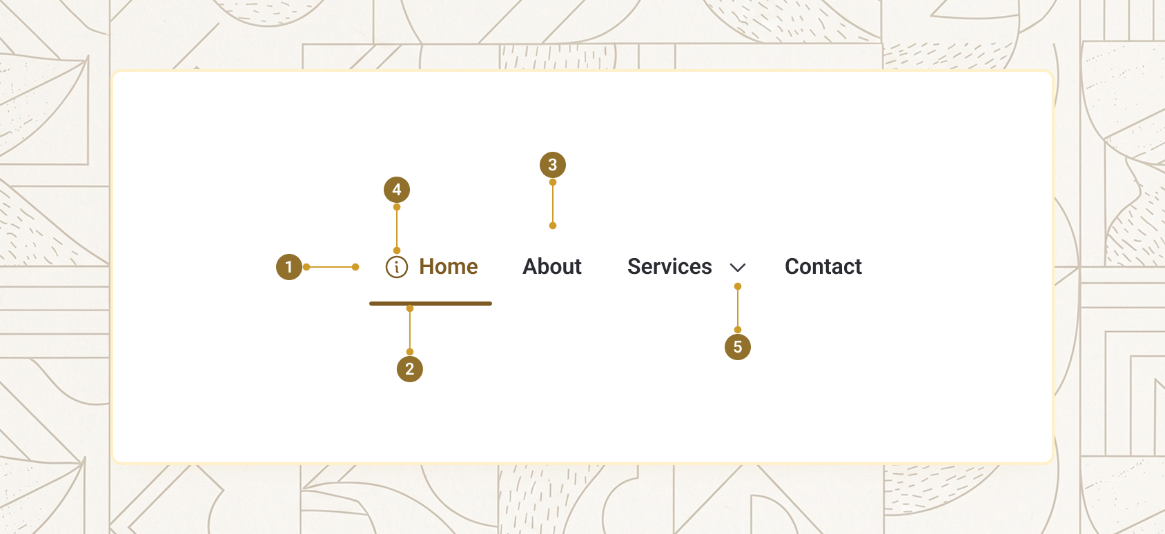
| Item | Name | Description |
|---|---|---|
1 |
Nav landmark | The <nav> element, labelled via label-nav |
2 |
Item list | The <div role="list"> wrapping every aegov-navbar-item |
3 |
Item link | The real <a> (or <span>) rendered by each item |
4 |
Leading icon | Optional icon via the icon-start slot |
5 |
Chevron toggle | Injected automatically when an item has a dropdown slot |
Navbar basics
A navbar is one or more aegov-navbar-item children, each with an href. Give the navbar a label-nav and mark the current page's item with is-active.
<aegov-navbar label-nav="Main navigation" gap="gap-6">
  <aegov-navbar-item href="/" is-active="true">Home</aegov-navbar-item>
  <aegov-navbar-item href="/services">Services</aegov-navbar-item>
  <aegov-navbar-item href="/awareness">Awareness centre</aegov-navbar-item>
  <aegov-navbar-item href="/open-data">Open data</aegov-navbar-item>
  <aegov-navbar-item href="/about">About</aegov-navbar-item>
</aegov-navbar>import { AegovNavbar, AegovNavbarItem } from '@aegov/designsystem-react';
export default function NavbarBasics() {
return (
<AegovNavbar labelNav="Main navigation" gap="gap-6">
<AegovNavbarItem href="/" isActive>Home</AegovNavbarItem>
<AegovNavbarItem href="/services">Services</AegovNavbarItem>
<AegovNavbarItem href="/awareness">Awareness centre</AegovNavbarItem>
<AegovNavbarItem href="/open-data">Open data</AegovNavbarItem>
<AegovNavbarItem href="/about">About</AegovNavbarItem>
</AegovNavbar>
);
}<template>
<aegov-navbar label-nav="Main navigation" gap="gap-6">
<aegov-navbar-item href="/" is-active="true">Home</aegov-navbar-item>
<aegov-navbar-item href="/services">Services</aegov-navbar-item>
<aegov-navbar-item href="/awareness">Awareness centre</aegov-navbar-item>
<aegov-navbar-item href="/open-data">Open data</aegov-navbar-item>
<aegov-navbar-item href="/about">About</aegov-navbar-item>
</aegov-navbar>
</template>import { Component } from '@angular/core';
import { AegovNavbar, AegovNavbarItem } from '@aegov/designsystem-angular';
@Component({
selector: 'app-navbar-basics',
imports: [AegovNavbar, AegovNavbarItem],
template: `
<aegov-navbar label-nav="Main navigation" gap="gap-6">
<aegov-navbar-item href="/" [isActive]="true">Home</aegov-navbar-item>
<aegov-navbar-item href="/services">Services</aegov-navbar-item>
<aegov-navbar-item href="/awareness">Awareness centre</aegov-navbar-item>
<aegov-navbar-item href="/open-data">Open data</aegov-navbar-item>
<aegov-navbar-item href="/about">About</aegov-navbar-item>
</aegov-navbar>
`,
})
export class NavbarBasicsComponent {}Sizes
size selects the typographic scale and item padding. Three tokens are available — sm, base (default), and lg. The navbar resolves the size and cascades it to every child aegov-navbar-item, so items always match their siblings without needing size set on each one individually.
<aegov-navbar size="sm" gap="gap-4">
  <aegov-navbar-item href="/" is-active="true">Home</aegov-navbar-item>
  <aegov-navbar-item href="/services">Services</aegov-navbar-item>
  <aegov-navbar-item href="/news">News</aegov-navbar-item>
  <aegov-navbar-item href="/about">About</aegov-navbar-item>
</aegov-navbar>

<aegov-navbar size="base" gap="gap-6">
  <aegov-navbar-item href="/" is-active="true">Home</aegov-navbar-item>
  <aegov-navbar-item href="/services">Services</aegov-navbar-item>
  <aegov-navbar-item href="/news">News</aegov-navbar-item>
  <aegov-navbar-item href="/about">About</aegov-navbar-item>
</aegov-navbar>

<aegov-navbar size="lg" gap="gap-8">
  <aegov-navbar-item href="/" is-active="true">Home</aegov-navbar-item>
  <aegov-navbar-item href="/services">Services</aegov-navbar-item>
  <aegov-navbar-item href="/news">News</aegov-navbar-item>
  <aegov-navbar-item href="/about">About</aegov-navbar-item>
</aegov-navbar>import { AegovNavbar, AegovNavbarItem } from '@aegov/designsystem-react';
export default function NavbarSizes() {
return (
<>
<AegovNavbar size="sm" gap="gap-4">
<AegovNavbarItem href="/" isActive>Home</AegovNavbarItem>
<AegovNavbarItem href="/services">Services</AegovNavbarItem>
<AegovNavbarItem href="/news">News</AegovNavbarItem>
<AegovNavbarItem href="/about">About</AegovNavbarItem>
</AegovNavbar>
<AegovNavbar size="base" gap="gap-6">
<AegovNavbarItem href="/" isActive>Home</AegovNavbarItem>
<AegovNavbarItem href="/services">Services</AegovNavbarItem>
<AegovNavbarItem href="/news">News</AegovNavbarItem>
<AegovNavbarItem href="/about">About</AegovNavbarItem>
</AegovNavbar>
<AegovNavbar size="lg" gap="gap-8">
<AegovNavbarItem href="/" isActive>Home</AegovNavbarItem>
<AegovNavbarItem href="/services">Services</AegovNavbarItem>
<AegovNavbarItem href="/news">News</AegovNavbarItem>
<AegovNavbarItem href="/about">About</AegovNavbarItem>
</AegovNavbar>
</>
);
}<template>
<aegov-navbar size="sm" gap="gap-4">
<aegov-navbar-item href="/" is-active="true">Home</aegov-navbar-item>
<aegov-navbar-item href="/services">Services</aegov-navbar-item>
<aegov-navbar-item href="/news">News</aegov-navbar-item>
<aegov-navbar-item href="/about">About</aegov-navbar-item>
</aegov-navbar>
<aegov-navbar size="base" gap="gap-6">
<aegov-navbar-item href="/" is-active="true">Home</aegov-navbar-item>
<aegov-navbar-item href="/services">Services</aegov-navbar-item>
<aegov-navbar-item href="/news">News</aegov-navbar-item>
<aegov-navbar-item href="/about">About</aegov-navbar-item>
</aegov-navbar>
<aegov-navbar size="lg" gap="gap-8">
<aegov-navbar-item href="/" is-active="true">Home</aegov-navbar-item>
<aegov-navbar-item href="/services">Services</aegov-navbar-item>
<aegov-navbar-item href="/news">News</aegov-navbar-item>
<aegov-navbar-item href="/about">About</aegov-navbar-item>
</aegov-navbar>
</template>import { Component } from '@angular/core';
import { AegovNavbar, AegovNavbarItem } from '@aegov/designsystem-angular';
@Component({
selector: 'app-navbar-sizes',
imports: [AegovNavbar, AegovNavbarItem],
template: `
<aegov-navbar size="sm" gap="gap-4">
<aegov-navbar-item href="/" [isActive]="true">Home</aegov-navbar-item>
<aegov-navbar-item href="/services">Services</aegov-navbar-item>
<aegov-navbar-item href="/news">News</aegov-navbar-item>
<aegov-navbar-item href="/about">About</aegov-navbar-item>
</aegov-navbar>
<aegov-navbar size="base" gap="gap-6">
<aegov-navbar-item href="/" [isActive]="true">Home</aegov-navbar-item>
<aegov-navbar-item href="/services">Services</aegov-navbar-item>
<aegov-navbar-item href="/news">News</aegov-navbar-item>
<aegov-navbar-item href="/about">About</aegov-navbar-item>
</aegov-navbar>
<aegov-navbar size="lg" gap="gap-8">
<aegov-navbar-item href="/" [isActive]="true">Home</aegov-navbar-item>
<aegov-navbar-item href="/services">Services</aegov-navbar-item>
<aegov-navbar-item href="/news">News</aegov-navbar-item>
<aegov-navbar-item href="/about">About</aegov-navbar-item>
</aegov-navbar>
`,
})
export class NavbarSizesComponent {}Responsive sizes
size also accepts a Tailwind-style responsive string. Each segment overrides smaller breakpoints, so the example below is sm on phones, base from the md breakpoint up, and lg from xl up.
<aegov-navbar size="sm md:base xl:lg" gap="gap-6">
  <aegov-navbar-item href="/" is-active="true">Home</aegov-navbar-item>
  <aegov-navbar-item href="/services">Services</aegov-navbar-item>
  <aegov-navbar-item href="/news">News</aegov-navbar-item>
  <aegov-navbar-item href="/about">About</aegov-navbar-item>
</aegov-navbar>import { AegovNavbar, AegovNavbarItem } from '@aegov/designsystem-react';
export default function NavbarResponsiveSizes() {
return (
<AegovNavbar size="sm md:base xl:lg" gap="gap-6">
<AegovNavbarItem href="/" isActive>Home</AegovNavbarItem>
<AegovNavbarItem href="/services">Services</AegovNavbarItem>
<AegovNavbarItem href="/news">News</AegovNavbarItem>
<AegovNavbarItem href="/about">About</AegovNavbarItem>
</AegovNavbar>
);
}<template>
<aegov-navbar size="sm md:base xl:lg" gap="gap-6">
<aegov-navbar-item href="/" is-active="true">Home</aegov-navbar-item>
<aegov-navbar-item href="/services">Services</aegov-navbar-item>
<aegov-navbar-item href="/news">News</aegov-navbar-item>
<aegov-navbar-item href="/about">About</aegov-navbar-item>
</aegov-navbar>
</template>import { Component } from '@angular/core';
import { AegovNavbar, AegovNavbarItem } from '@aegov/designsystem-angular';
@Component({
selector: 'app-navbar-responsive-sizes',
imports: [AegovNavbar, AegovNavbarItem],
template: `
<aegov-navbar size="sm md:base xl:lg" gap="gap-6">
<aegov-navbar-item href="/" [isActive]="true">Home</aegov-navbar-item>
<aegov-navbar-item href="/services">Services</aegov-navbar-item>
<aegov-navbar-item href="/news">News</aegov-navbar-item>
<aegov-navbar-item href="/about">About</aegov-navbar-item>
</aegov-navbar>
`,
})
export class NavbarResponsiveSizesComponent {}Gap between items
gap accepts any Tailwind gap-* utility class — the default is gap-3. Increase it on wide marketing layouts, or reduce it for dense administrative interfaces.
<aegov-navbar gap="gap-10">
  <aegov-navbar-item href="/" is-active="true">Home</aegov-navbar-item>
  <aegov-navbar-item href="/services">Services</aegov-navbar-item>
  <aegov-navbar-item href="/news">News</aegov-navbar-item>
  <aegov-navbar-item href="/contact">Contact</aegov-navbar-item>
</aegov-navbar>import { AegovNavbar, AegovNavbarItem } from '@aegov/designsystem-react';
export default function NavbarGap() {
return (
<AegovNavbar gap="gap-10">
<AegovNavbarItem href="/" isActive>Home</AegovNavbarItem>
<AegovNavbarItem href="/services">Services</AegovNavbarItem>
<AegovNavbarItem href="/news">News</AegovNavbarItem>
<AegovNavbarItem href="/contact">Contact</AegovNavbarItem>
</AegovNavbar>
);
}<template>
<aegov-navbar gap="gap-10">
<aegov-navbar-item href="/" is-active="true">Home</aegov-navbar-item>
<aegov-navbar-item href="/services">Services</aegov-navbar-item>
<aegov-navbar-item href="/news">News</aegov-navbar-item>
<aegov-navbar-item href="/contact">Contact</aegov-navbar-item>
</aegov-navbar>
</template>import { Component } from '@angular/core';
import { AegovNavbar, AegovNavbarItem } from '@aegov/designsystem-angular';
@Component({
selector: 'app-navbar-gap',
imports: [AegovNavbar, AegovNavbarItem],
template: `
<aegov-navbar gap="gap-10">
<aegov-navbar-item href="/" [isActive]="true">Home</aegov-navbar-item>
<aegov-navbar-item href="/services">Services</aegov-navbar-item>
<aegov-navbar-item href="/news">News</aegov-navbar-item>
<aegov-navbar-item href="/contact">Contact</aegov-navbar-item>
</aegov-navbar>
`,
})
export class NavbarGapComponent {}Active item
Set is-active on exactly one item per route. It sets aria-current="page" on the inner link and applies the active visual treatment — a bottom-border indicator and the primary text colour — so assistive technology and sighted users both get a single, unambiguous "you are here" signal.
<aegov-navbar label-nav="Main navigation" gap="gap-6">
  <aegov-navbar-item href="/">Home</aegov-navbar-item>
  <aegov-navbar-item href="/services" is-active="true">Services</aegov-navbar-item>
  <aegov-navbar-item href="/news">News</aegov-navbar-item>
  <aegov-navbar-item href="/about">About</aegov-navbar-item>
</aegov-navbar>import { AegovNavbar, AegovNavbarItem } from '@aegov/designsystem-react';
export default function NavbarActiveItem() {
return (
<AegovNavbar labelNav="Main navigation" gap="gap-6">
<AegovNavbarItem href="/">Home</AegovNavbarItem>
<AegovNavbarItem href="/services" isActive>Services</AegovNavbarItem>
<AegovNavbarItem href="/news">News</AegovNavbarItem>
<AegovNavbarItem href="/about">About</AegovNavbarItem>
</AegovNavbar>
);
}<template>
<aegov-navbar label-nav="Main navigation" gap="gap-6">
<aegov-navbar-item href="/">Home</aegov-navbar-item>
<aegov-navbar-item href="/services" is-active="true">Services</aegov-navbar-item>
<aegov-navbar-item href="/news">News</aegov-navbar-item>
<aegov-navbar-item href="/about">About</aegov-navbar-item>
</aegov-navbar>
</template>import { Component } from '@angular/core';
import { AegovNavbar, AegovNavbarItem } from '@aegov/designsystem-angular';
@Component({
selector: 'app-navbar-active-item',
imports: [AegovNavbar, AegovNavbarItem],
template: `
<aegov-navbar label-nav="Main navigation" gap="gap-6">
<aegov-navbar-item href="/">Home</aegov-navbar-item>
<aegov-navbar-item href="/services" [isActive]="true">Services</aegov-navbar-item>
<aegov-navbar-item href="/news">News</aegov-navbar-item>
<aegov-navbar-item href="/about">About</aegov-navbar-item>
</aegov-navbar>
`,
})
export class NavbarActiveItemComponent {}Disabled items
Set is-disabled to mark an item as unavailable. It renders as a non-clickable, visually dimmed <span> with aria-disabled="true". The <span> is not focusable, so both Tab and arrow-key navigation (ArrowLeft/ArrowRight/Home/End) skip it.
<aegov-navbar label-nav="Main navigation" gap="gap-6">
  <aegov-navbar-item href="/" is-active="true">Home</aegov-navbar-item>
  <aegov-navbar-item href="/services">Services</aegov-navbar-item>
  <aegov-navbar-item is-disabled="true">Open data (coming soon)</aegov-navbar-item>
  <aegov-navbar-item href="/about">About</aegov-navbar-item>
</aegov-navbar>import { AegovNavbar, AegovNavbarItem } from '@aegov/designsystem-react';
export default function NavbarDisabled() {
return (
<AegovNavbar labelNav="Main navigation" gap="gap-6">
<AegovNavbarItem href="/" isActive>Home</AegovNavbarItem>
<AegovNavbarItem href="/services">Services</AegovNavbarItem>
<AegovNavbarItem isDisabled>Open data (coming soon)</AegovNavbarItem>
<AegovNavbarItem href="/about">About</AegovNavbarItem>
</AegovNavbar>
);
}<template>
<aegov-navbar label-nav="Main navigation" gap="gap-6">
<aegov-navbar-item href="/" is-active="true">Home</aegov-navbar-item>
<aegov-navbar-item href="/services">Services</aegov-navbar-item>
<aegov-navbar-item is-disabled="true">Open data (coming soon)</aegov-navbar-item>
<aegov-navbar-item href="/about">About</aegov-navbar-item>
</aegov-navbar>
</template>import { Component } from '@angular/core';
import { AegovNavbar, AegovNavbarItem } from '@aegov/designsystem-angular';
@Component({
selector: 'app-navbar-disabled',
imports: [AegovNavbar, AegovNavbarItem],
template: `
<aegov-navbar label-nav="Main navigation" gap="gap-6">
<aegov-navbar-item href="/" [isActive]="true">Home</aegov-navbar-item>
<aegov-navbar-item href="/services">Services</aegov-navbar-item>
<aegov-navbar-item [isDisabled]="true">Open data (coming soon)</aegov-navbar-item>
<aegov-navbar-item href="/about">About</aegov-navbar-item>
</aegov-navbar>
`,
})
export class NavbarDisabledComponent {}Items with leading icons
Place an SVG (or any inline element) in an item's icon-start slot to render a leading icon next to its label. Mark the icon aria-hidden="true" so the item's label stays the single accessible name — keep icons consistent across the whole navbar rather than mixing icon and non-icon items.
<aegov-navbar gap="gap-8">
  <aegov-navbar-item href="/" is-active="true">
    <svg slot="icon-start" xmlns="http://www.w3.org/2000/svg" width="18" height="18" viewBox="0 0 256 256" aria-hidden="true"><rect width="256" height="256" fill="none"/><path d="M104,216V152h48v64h64V120a8,8,0,0,0-2.34-5.66l-80-80a8,8,0,0,0-11.32,0l-80,80A8,8,0,0,0,40,120v96Z" fill="none" stroke="currentColor" stroke-linecap="round" stroke-linejoin="round" stroke-width="16"/></svg>
    Home
  </aegov-navbar-item>
  <aegov-navbar-item href="/services">
    <svg slot="icon-start" xmlns="http://www.w3.org/2000/svg" width="18" height="18" viewBox="0 0 256 256" aria-hidden="true"><rect width="256" height="256" fill="none"/><path d="M200,224H56a8,8,0,0,1-8-8V40a8,8,0,0,1,8-8h96l56,56V216A8,8,0,0,1,200,224Z" fill="none" stroke="currentColor" stroke-linecap="round" stroke-linejoin="round" stroke-width="16"/><polyline points="152 32 152 88 208 88" fill="none" stroke="currentColor" stroke-linecap="round" stroke-linejoin="round" stroke-width="16"/></svg>
    Services
  </aegov-navbar-item>
  <aegov-navbar-item href="/contact">
    <svg slot="icon-start" xmlns="http://www.w3.org/2000/svg" width="18" height="18" viewBox="0 0 256 256" aria-hidden="true"><rect width="256" height="256" fill="none"/><polyline points="224 56 128 144 32 56" fill="none" stroke="currentColor" stroke-linecap="round" stroke-linejoin="round" stroke-width="16"/><path d="M32,56H224a0,0,0,0,1,0,0V192a8,8,0,0,1-8,8H40a8,8,0,0,1-8-8V56A0,0,0,0,1,32,56Z" fill="none" stroke="currentColor" stroke-linecap="round" stroke-linejoin="round" stroke-width="16"/><line x1="110.55" y1="128" x2="34.47" y2="197.74" fill="none" stroke="currentColor" stroke-linecap="round" stroke-linejoin="round" stroke-width="16"/><line x1="221.53" y1="197.74" x2="145.45" y2="128" fill="none" stroke="currentColor" stroke-linecap="round" stroke-linejoin="round" stroke-width="16"/></svg>
    Contact
  </aegov-navbar-item>
</aegov-navbar>import { AegovNavbar, AegovNavbarItem } from '@aegov/designsystem-react';
export default function NavbarIcons() {
return (
<AegovNavbar gap="gap-8">
<AegovNavbarItem href="/" isActive>
<svg slot="icon-start" xmlns="http://www.w3.org/2000/svg" width="18" height="18" viewBox="0 0 256 256" aria-hidden="true"><rect width="256" height="256" fill="none"/><path d="M104,216V152h48v64h64V120a8,8,0,0,0-2.34-5.66l-80-80a8,8,0,0,0-11.32,0l-80,80A8,8,0,0,0,40,120v96Z" fill="none" stroke="currentColor" strokeLinecap="round" strokeLinejoin="round" strokeWidth={16}/></svg>
Home
</AegovNavbarItem>
<AegovNavbarItem href="/services">
<svg slot="icon-start" xmlns="http://www.w3.org/2000/svg" width="18" height="18" viewBox="0 0 256 256" aria-hidden="true"><rect width="256" height="256" fill="none"/><path d="M200,224H56a8,8,0,0,1-8-8V40a8,8,0,0,1,8-8h96l56,56V216A8,8,0,0,1,200,224Z" fill="none" stroke="currentColor" strokeLinecap="round" strokeLinejoin="round" strokeWidth={16}/><polyline points="152 32 152 88 208 88" fill="none" stroke="currentColor" strokeLinecap="round" strokeLinejoin="round" strokeWidth={16}/></svg>
Services
</AegovNavbarItem>
<AegovNavbarItem href="/contact">
<svg slot="icon-start" xmlns="http://www.w3.org/2000/svg" width="18" height="18" viewBox="0 0 256 256" aria-hidden="true"><rect width="256" height="256" fill="none"/><polyline points="224 56 128 144 32 56" fill="none" stroke="currentColor" strokeLinecap="round" strokeLinejoin="round" strokeWidth={16}/><path d="M32,56H224a0,0,0,0,1,0,0V192a8,8,0,0,1-8,8H40a8,8,0,0,1-8-8V56A0,0,0,0,1,32,56Z" fill="none" stroke="currentColor" strokeLinecap="round" strokeLinejoin="round" strokeWidth={16}/><line x1="110.55" y1="128" x2="34.47" y2="197.74" fill="none" stroke="currentColor" strokeLinecap="round" strokeLinejoin="round" strokeWidth={16}/><line x1="221.53" y1="197.74" x2="145.45" y2="128" fill="none" stroke="currentColor" strokeLinecap="round" strokeLinejoin="round" strokeWidth={16}/></svg>
Contact
</AegovNavbarItem>
</AegovNavbar>
);
}<template>
<aegov-navbar gap="gap-8">
<aegov-navbar-item href="/" is-active="true">
<svg slot="icon-start" xmlns="http://www.w3.org/2000/svg" width="18" height="18" viewBox="0 0 256 256" aria-hidden="true"><rect width="256" height="256" fill="none"/><path d="M104,216V152h48v64h64V120a8,8,0,0,0-2.34-5.66l-80-80a8,8,0,0,0-11.32,0l-80,80A8,8,0,0,0,40,120v96Z" fill="none" stroke="currentColor" stroke-linecap="round" stroke-linejoin="round" stroke-width="16"/></svg>
Home
</aegov-navbar-item>
<aegov-navbar-item href="/services">
<svg slot="icon-start" xmlns="http://www.w3.org/2000/svg" width="18" height="18" viewBox="0 0 256 256" aria-hidden="true"><rect width="256" height="256" fill="none"/><path d="M200,224H56a8,8,0,0,1-8-8V40a8,8,0,0,1,8-8h96l56,56V216A8,8,0,0,1,200,224Z" fill="none" stroke="currentColor" stroke-linecap="round" stroke-linejoin="round" stroke-width="16"/><polyline points="152 32 152 88 208 88" fill="none" stroke="currentColor" stroke-linecap="round" stroke-linejoin="round" stroke-width="16"/></svg>
Services
</aegov-navbar-item>
<aegov-navbar-item href="/contact">
<svg slot="icon-start" xmlns="http://www.w3.org/2000/svg" width="18" height="18" viewBox="0 0 256 256" aria-hidden="true"><rect width="256" height="256" fill="none"/><polyline points="224 56 128 144 32 56" fill="none" stroke="currentColor" stroke-linecap="round" stroke-linejoin="round" stroke-width="16"/><path d="M32,56H224a0,0,0,0,1,0,0V192a8,8,0,0,1-8,8H40a8,8,0,0,1-8-8V56A0,0,0,0,1,32,56Z" fill="none" stroke="currentColor" stroke-linecap="round" stroke-linejoin="round" stroke-width="16"/><line x1="110.55" y1="128" x2="34.47" y2="197.74" fill="none" stroke="currentColor" stroke-linecap="round" stroke-linejoin="round" stroke-width="16"/><line x1="221.53" y1="197.74" x2="145.45" y2="128" fill="none" stroke="currentColor" stroke-linecap="round" stroke-linejoin="round" stroke-width="16"/></svg>
Contact
</aegov-navbar-item>
</aegov-navbar>
</template>import { Component } from '@angular/core';
import { AegovNavbar, AegovNavbarItem } from '@aegov/designsystem-angular';
@Component({
selector: 'app-navbar-icons',
imports: [AegovNavbar, AegovNavbarItem],
template: `
<aegov-navbar gap="gap-8">
<aegov-navbar-item href="/" [isActive]="true">
<svg slot="icon-start" xmlns="http://www.w3.org/2000/svg" width="18" height="18" viewBox="0 0 256 256" aria-hidden="true"><rect width="256" height="256" fill="none"/><path d="M104,216V152h48v64h64V120a8,8,0,0,0-2.34-5.66l-80-80a8,8,0,0,0-11.32,0l-80,80A8,8,0,0,0,40,120v96Z" fill="none" stroke="currentColor" stroke-linecap="round" stroke-linejoin="round" stroke-width="16"/></svg>
Home
</aegov-navbar-item>
<aegov-navbar-item href="/services">
<svg slot="icon-start" xmlns="http://www.w3.org/2000/svg" width="18" height="18" viewBox="0 0 256 256" aria-hidden="true"><rect width="256" height="256" fill="none"/><path d="M200,224H56a8,8,0,0,1-8-8V40a8,8,0,0,1,8-8h96l56,56V216A8,8,0,0,1,200,224Z" fill="none" stroke="currentColor" stroke-linecap="round" stroke-linejoin="round" stroke-width="16"/><polyline points="152 32 152 88 208 88" fill="none" stroke="currentColor" stroke-linecap="round" stroke-linejoin="round" stroke-width="16"/></svg>
Services
</aegov-navbar-item>
<aegov-navbar-item href="/contact">
<svg slot="icon-start" xmlns="http://www.w3.org/2000/svg" width="18" height="18" viewBox="0 0 256 256" aria-hidden="true"><rect width="256" height="256" fill="none"/><polyline points="224 56 128 144 32 56" fill="none" stroke="currentColor" stroke-linecap="round" stroke-linejoin="round" stroke-width="16"/><path d="M32,56H224a0,0,0,0,1,0,0V192a8,8,0,0,1-8,8H40a8,8,0,0,1-8-8V56A0,0,0,0,1,32,56Z" fill="none" stroke="currentColor" stroke-linecap="round" stroke-linejoin="round" stroke-width="16"/><line x1="110.55" y1="128" x2="34.47" y2="197.74" fill="none" stroke="currentColor" stroke-linecap="round" stroke-linejoin="round" stroke-width="16"/><line x1="221.53" y1="197.74" x2="145.45" y2="128" fill="none" stroke="currentColor" stroke-linecap="round" stroke-linejoin="round" stroke-width="16"/></svg>
Contact
</aegov-navbar-item>
</aegov-navbar>
`,
})
export class NavbarIconsComponent {}Items with a sub-menu
Place an aegov-dropdown in an item's dropdown slot to add a sub-menu — the item automatically injects a chevron toggle and routes its entire rect as the dropdown's trigger area. Set trigger="hover" on the dropdown to also open it on hover. Clicking the chevron opens or closes the menu. From the keyboard, Enter, Space or ArrowDown on the focused chevron opens the menu and moves focus to its first item, and Escape closes it. The dropdown is set to tab-behavior="disclosure" automatically, so Tab moves through its links. An item with both an href and a dropdown is intentional — the link navigates, and the chevron independently toggles the menu.
<aegov-navbar label-nav="Main navigation" gap="gap-8">
  <aegov-navbar-item href="/" is-active="true">Home</aegov-navbar-item>
  <aegov-navbar-item href="/services">
    Services
    <aegov-dropdown slot="dropdown" trigger="hover">
      <div slot="dropdown-content">
        <a href="/services/visas">Visas and entry permits</a>
        <a href="/services/passports">Passports</a>
        <a href="/services/emirates-id">Emirates ID</a>
      </div>
    </aegov-dropdown>
  </aegov-navbar-item>
  <aegov-navbar-item href="/news">News</aegov-navbar-item>
</aegov-navbar>import { AegovNavbar, AegovNavbarItem, AegovDropdown } from '@aegov/designsystem-react';
export default function NavbarSubmenu() {
return (
<AegovNavbar labelNav="Main navigation" gap="gap-8">
<AegovNavbarItem href="/" isActive>Home</AegovNavbarItem>
<AegovNavbarItem href="/services">
Services
<AegovDropdown slot="dropdown" trigger="hover">
<div slot="dropdown-content">
<a href="/services/visas">Visas and entry permits</a>
<a href="/services/passports">Passports</a>
<a href="/services/emirates-id">Emirates ID</a>
</div>
</AegovDropdown>
</AegovNavbarItem>
<AegovNavbarItem href="/news">News</AegovNavbarItem>
</AegovNavbar>
);
}<template>
<aegov-navbar label-nav="Main navigation" gap="gap-8">
<aegov-navbar-item href="/" is-active="true">Home</aegov-navbar-item>
<aegov-navbar-item href="/services">
Services
<aegov-dropdown slot="dropdown" trigger="hover">
<div slot="dropdown-content">
<a href="/services/visas">Visas and entry permits</a>
<a href="/services/passports">Passports</a>
<a href="/services/emirates-id">Emirates ID</a>
</div>
</aegov-dropdown>
</aegov-navbar-item>
<aegov-navbar-item href="/news">News</aegov-navbar-item>
</aegov-navbar>
</template>import { Component } from '@angular/core';
import { AegovNavbar, AegovNavbarItem, AegovDropdown } from '@aegov/designsystem-angular';
@Component({
selector: 'app-navbar-submenu',
imports: [AegovNavbar, AegovNavbarItem, AegovDropdown],
template: `
<aegov-navbar label-nav="Main navigation" gap="gap-8">
<aegov-navbar-item href="/" [isActive]="true">Home</aegov-navbar-item>
<aegov-navbar-item href="/services">
Services
<aegov-dropdown slot="dropdown" trigger="hover">
<div slot="dropdown-content">
<a href="/services/visas">Visas and entry permits</a>
<a href="/services/passports">Passports</a>
<a href="/services/emirates-id">Emirates ID</a>
</div>
</aegov-dropdown>
</aegov-navbar-item>
<aegov-navbar-item href="/news">News</aegov-navbar-item>
</aegov-navbar>
`,
})
export class NavbarSubmenuComponent {}RTL support
The navbar reads dir="rtl" from the closest [dir] ancestor, or the document root. In RTL mode, ArrowLeft and ArrowRight swap roles so that ArrowLeft moves to the next item, following the reading direction. Sub-menu content is portalled to document.body and copies the resolved direction, so a local dir="rtl" wrapper is enough. Layout, item gaps, and the active-item indicator all mirror automatically, since the underlying flex layout follows the container's text direction.
<div dir="rtl">
  <aegov-navbar label-nav="التنقل الرئيسي" gap="gap-6">
    <aegov-navbar-item href="/" is-active="true">الرئيسية</aegov-navbar-item>
    <aegov-navbar-item href="/services">
      الخدمات
      <aegov-dropdown slot="dropdown" trigger="hover">
        <div slot="dropdown-content">
          <a href="/services/visas">التأشيرات وتصاريح الدخول</a>
          <a href="/services/passports">جوازات السفر</a>
          <a href="/services/emirates-id">الهوية الإماراتية</a>
        </div>
      </aegov-dropdown>
    </aegov-navbar-item>
    <aegov-navbar-item href="/news">الأخبار</aegov-navbar-item>
    <aegov-navbar-item href="/about">عنّا</aegov-navbar-item>
  </aegov-navbar>
</div>import { AegovNavbar, AegovNavbarItem, AegovDropdown } from '@aegov/designsystem-react';
export default function RtlNavbar() {
return (
<div dir="rtl">
<AegovNavbar labelNav="التنقل الرئيسي" gap="gap-6">
<AegovNavbarItem href="/" isActive>الرئيسية</AegovNavbarItem>
<AegovNavbarItem href="/services">
الخدمات
<AegovDropdown slot="dropdown" trigger="hover">
<div slot="dropdown-content">
<a href="/services/visas">التأشيرات وتصاريح الدخول</a>
<a href="/services/passports">جوازات السفر</a>
<a href="/services/emirates-id">الهوية الإماراتية</a>
</div>
</AegovDropdown>
</AegovNavbarItem>
<AegovNavbarItem href="/news">الأخبار</AegovNavbarItem>
<AegovNavbarItem href="/about">عنّا</AegovNavbarItem>
</AegovNavbar>
</div>
);
}<template>
<div dir="rtl">
<aegov-navbar label-nav="التنقل الرئيسي" gap="gap-6">
<aegov-navbar-item href="/" is-active="true">الرئيسية</aegov-navbar-item>
<aegov-navbar-item href="/services">
الخدمات
<aegov-dropdown slot="dropdown" trigger="hover">
<div slot="dropdown-content">
<a href="/services/visas">التأشيرات وتصاريح الدخول</a>
<a href="/services/passports">جوازات السفر</a>
<a href="/services/emirates-id">الهوية الإماراتية</a>
</div>
</aegov-dropdown>
</aegov-navbar-item>
<aegov-navbar-item href="/news">الأخبار</aegov-navbar-item>
<aegov-navbar-item href="/about">عنّا</aegov-navbar-item>
</aegov-navbar>
</div>
</template>import { Component } from '@angular/core';
import { AegovNavbar, AegovNavbarItem, AegovDropdown } from '@aegov/designsystem-angular';
@Component({
selector: 'app-rtl-navbar',
imports: [AegovNavbar, AegovNavbarItem, AegovDropdown],
template: `
<div dir="rtl">
<aegov-navbar label-nav="التنقل الرئيسي" gap="gap-6">
<aegov-navbar-item href="/" [isActive]="true">الرئيسية</aegov-navbar-item>
<aegov-navbar-item href="/services">
الخدمات
<aegov-dropdown slot="dropdown" trigger="hover">
<div slot="dropdown-content">
<a href="/services/visas">التأشيرات وتصاريح الدخول</a>
<a href="/services/passports">جوازات السفر</a>
<a href="/services/emirates-id">الهوية الإماراتية</a>
</div>
</aegov-dropdown>
</aegov-navbar-item>
<aegov-navbar-item href="/news">الأخبار</aegov-navbar-item>
<aegov-navbar-item href="/about">عنّا</aegov-navbar-item>
</aegov-navbar>
</div>
`,
})
export class RtlNavbarComponent {}Usage
Here is the recommended usage of a navbar on any website or application. These are recommended usage guides, however the developer must use the best practices of web and application development to accurately use this component.
Mark exactly one item as the current page
Set is-active on the single item matching the current route. It's the only thing that sets aria-current="page" on the inner link — the one unambiguous "you are here" signal for both sighted and screen-reader users.
Give the navbar a specific label-nav when the page has more than one navigation landmark
A primary navbar plus a footer navbar both default to the same "Main navigation" label otherwise — a screen-reader user switching between landmarks can't tell them apart by name alone.
Pick a dropdown trigger that matches how people will actually use the navbar
trigger="hover" reads naturally on a wide, desktop-first navbar. The chevron itself always opens and closes on click and keyboard regardless of trigger, so touch and keyboard users are never locked out either way.
Don't render aegov-navbar-item outside of aegov-navbar
It isn't a standalone component — it throws a runtime error during initialisation unless it has an aegov-navbar ancestor.
Don't mix items with and without a leading icon in the same navbar
Icons help with quick orientation only if every item carries one consistently. A navbar with some icon-led items and some plain-text items looks unfinished and misaligned.
API reference
The following are the properties and references of a navbar
aegov-navbar Properties
| Attribute | Description | Type | Default |
|---|---|---|---|
| Size token cascaded to every child item. Accepts a single token ( |
|
|
| Tailwind |
|
|
| Accessible label for the inner |
|
|
aegov-navbar-item Properties
| Attribute | Description | Type | Default |
|---|---|---|---|
| URL the item links to. Omit to render a non-link |
| — |
| Anchor |
| — |
| Anchor |
| — |
| Marks the item as the current page. Sets |
|
|
| Renders the item as a non-clickable, visually dimmed |
|
|
| Set automatically by the parent |
|
|
Slots
| Component | Slot | Description |
|---|---|---|
| (default) | Place one or more |
| (default) | The item's label text. |
|
| Optional leading icon, typically an inline SVG. |
|
| Optional |
Events
| Note |
|---|
Neither |
Pass-through attributes
| Component | Attribute group | Forwarded? | Where applied |
|---|---|---|---|
|
| No | Apply directly to the host |
|
| Native | Applied to the host element. |
|
| Yes | Forwarded to the inner item wrapper |
|
| No | Stays on the host |
|
| Yes | Forwarded to the inner |
|
| Native | Applied to the host element. |
Notes
The following notes are applicable of this component.
Built-in accessibility
- Renders as a
<nav>landmark with a configurablearia-label, vialabel-nav, defaulting to "Main navigation" (English) or "التنقل الرئيسي" (Arabic) when left unset. - Items are exposed as a list — the inner container is a
<div role="list">and eachaegov-navbar-itemhost carriesrole="listitem"— so the list structure and item count reach assistive technology. (A native<ul>is not used because it may not contain the custom-element hosts.) - The active item sets
aria-current="page"on its inner link. - A disabled item renders a non-focusable
<span>witharia-disabled="true", so it is skipped by bothTaband arrow-key navigation. Screen-reader users still encounter it (and its disabled state) when reading through the list. - Arrow-key navigation among items and chevrons via
ArrowLeft/ArrowRight/Home/End, wrapping from the last item back to the first — direction-aware in RTL, soArrowLeftmoves to the next item when the reading direction is right-to-left. - When an item has a dropdown, the injected chevron is a real
<button>with anaria-labelnaming what it controls ("Open Services submenu", or the Arabic equivalent in RTL), and itsaria-expandedstays in sync with the dropdown's open state. The dropdown is switched totab-behavior="disclosure"automatically, since its contents are navigation links rather than a menu of commands.
Developer responsibilities
- Mark exactly one item per route with
is-active. - Provide a meaningful
label-navwhenever a page has more than one navigation landmark — for example, a primary navbar plus a footer navbar. - Keep item labels short — long labels can break the horizontal layout on smaller viewports.
- When supplying an icon via
icon-start, mark itaria-hidden="true"so the item's label remains the single accessible name. - For dropdown sub-menus, follow
aegov-dropdown's own accessibility guidance for the menu content itself.
Keyboard support
| Key | Action |
|---|---|
Tab |
Move focus into and out of the navbar, stopping at each linked item and chevron in turn. Disabled items are skipped. |
ArrowRight |
Move focus to the next item or chevron, wrapping to the first. In RTL, moves to the previous one instead. |
ArrowLeft |
Move focus to the previous item or chevron, wrapping to the last. In RTL, moves to the next one instead. |
Home |
Move focus to the first focusable item. |
End |
Move focus to the last focusable item. |
Enter |
Activate the focused link, or open/close the focused chevron's sub-menu (opening moves focus to its first item). |
Space |
Open/close the focused chevron's sub-menu (opening moves focus to its first item). |
ArrowDown (chevron focused) |
Open the sub-menu and move focus into it. |
Escape |
Close the open sub-menu. |
Notes
- An unknown
sizetoken silently falls back tobase— no console warning is emitted. - An item with both an
hrefand adropdownis intentional: the link navigates, and the chevron independently toggles the menu. aegov-navbar-itemmust be used inside<aegov-navbar>— using it standalone throws a runtime error during initialisation.- The direction used for arrow keys and the default
label-navis read from the closest[dir]ancestor, falling back to<html dir>. Sub-menu content is portalled todocument.body, but it copies the navbar item's resolved direction, so a localdir="rtl"wrapper works as well asdiron<html>.