
Anatomy
aegov-otp renders a role="group" wrapper around a row of real <input type="text"> cells — one per character. Typing a valid character auto-advances focus to the next cell; the assembled value across all cells is exposed as a single logical field, both through events and through native <form> submission via ElementInternals (no hidden input needed).
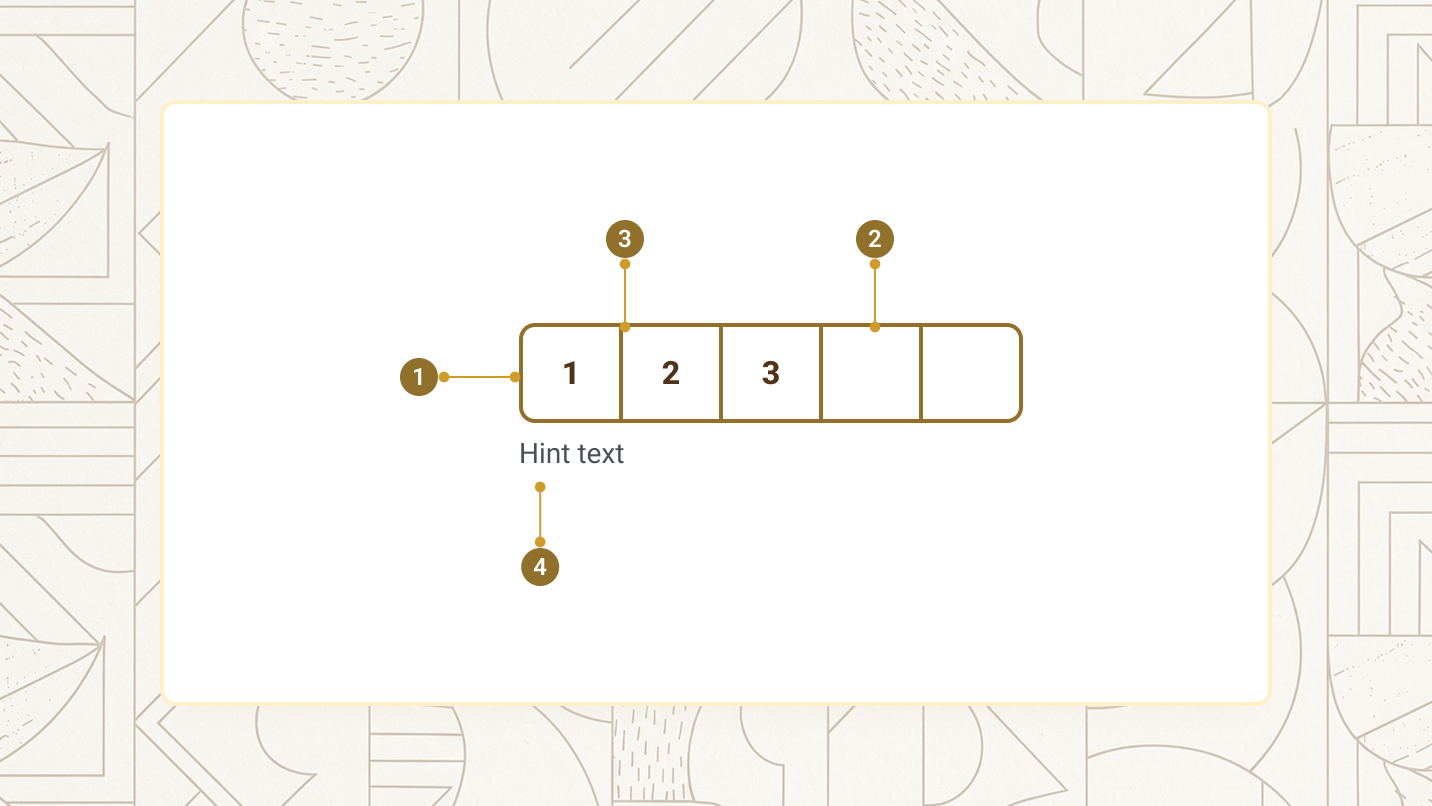
| Item | Name | Description |
|---|---|---|
1 |
Group wrapper | The role="group" element wrapping every cell |
2 |
Cell | One real <input> per character, sized by size |
3 |
Divider | Shown between cells only in continuous appearance |
4 |
Hint/error region | Helper text; once is-invalid is set, the error message appears above it and the hint stays visible |
Basic OTP
Set length and, to participate in form submission, name. Typing auto-advances focus; you can also paste an entire code into any cell — the component distributes it across cells from the start, ignoring spaces.
<aegov-otp length="6" name="otp_code"></aegov-otp>import { AegovOtp } from '@aegov/designsystem-react';
export default function OtpBasics() {
return <AegovOtp length={6} name="otp_code" />;
}<template>
<aegov-otp length="6" name="otp_code"></aegov-otp>
</template>import { Component } from '@angular/core';
import { AegovOtp } from '@aegov/designsystem-angular';
@Component({
selector: 'app-otp-basics',
imports: [AegovOtp],
template: `<aegov-otp length="6" name="otp_code"></aegov-otp>`,
})
export class OtpBasicsComponent {}Appearance
appearance="continuous" (default) draws one bordered group with thin dividers between cells — best when the code reads as a single token. appearance="individual" separates every cell into its own bordered box — better when the code reads as discrete digits, e.g. a PIN printed on a physical voucher.
<aegov-otp appearance="continuous" length="6"></aegov-otp>
<aegov-otp appearance="individual" length="6"></aegov-otp>import { AegovOtp } from '@aegov/designsystem-react';
export default function OtpAppearance() {
return (
<>
<AegovOtp appearance="continuous" length={6} />
<AegovOtp appearance="individual" length={6} />
</>
);
}<template>
<aegov-otp appearance="continuous" length="6"></aegov-otp>
<aegov-otp appearance="individual" length="6"></aegov-otp>
</template>import { Component } from '@angular/core';
import { AegovOtp } from '@aegov/designsystem-angular';
@Component({
selector: 'app-otp-appearance',
imports: [AegovOtp],
template: `
<aegov-otp appearance="continuous" length="6"></aegov-otp>
<aegov-otp appearance="individual" length="6"></aegov-otp>
`,
})
export class OtpAppearanceComponent {}Length
length sets the number of cells. Common values are 4 (PIN), 5 (default), 6 (most SMS/TOTP codes), or 8 (longer activation codes).
<aegov-otp length="4"></aegov-otp>
<aegov-otp length="5"></aegov-otp>
<aegov-otp length="6"></aegov-otp>
<aegov-otp length="8"></aegov-otp>import { AegovOtp } from '@aegov/designsystem-react';
export default function OtpLength() {
return (
<>
<AegovOtp length={4} />
<AegovOtp length={5} />
<AegovOtp length={6} />
<AegovOtp length={8} />
</>
);
}<template>
<aegov-otp length="4"></aegov-otp>
<aegov-otp length="5"></aegov-otp>
<aegov-otp length="6"></aegov-otp>
<aegov-otp length="8"></aegov-otp>
</template>import { Component } from '@angular/core';
import { AegovOtp } from '@aegov/designsystem-angular';
@Component({
selector: 'app-otp-length',
imports: [AegovOtp],
template: `
<aegov-otp length="4"></aegov-otp>
<aegov-otp length="5"></aegov-otp>
<aegov-otp length="6"></aegov-otp>
<aegov-otp length="8"></aegov-otp>
`,
})
export class OtpLengthComponent {}Sizes
size scales each cell. Six tokens are available — xs, sm, base (default), lg, xl, and 2xl.
<aegov-otp size="xs" length="6"></aegov-otp>
<aegov-otp size="sm" length="6"></aegov-otp>
<aegov-otp size="base" length="6"></aegov-otp>
<aegov-otp size="lg" length="6"></aegov-otp>
<aegov-otp size="xl" length="6"></aegov-otp>
<aegov-otp size="2xl" length="6"></aegov-otp>import { AegovOtp } from '@aegov/designsystem-react';
export default function OtpSizes() {
return (
<>
<AegovOtp size="xs" length={6} />
<AegovOtp size="sm" length={6} />
<AegovOtp size="base" length={6} />
<AegovOtp size="lg" length={6} />
<AegovOtp size="xl" length={6} />
<AegovOtp size="2xl" length={6} />
</>
);
}<template>
<aegov-otp size="xs" length="6"></aegov-otp>
<aegov-otp size="sm" length="6"></aegov-otp>
<aegov-otp size="base" length="6"></aegov-otp>
<aegov-otp size="lg" length="6"></aegov-otp>
<aegov-otp size="xl" length="6"></aegov-otp>
<aegov-otp size="2xl" length="6"></aegov-otp>
</template>import { Component } from '@angular/core';
import { AegovOtp } from '@aegov/designsystem-angular';
@Component({
selector: 'app-otp-sizes',
imports: [AegovOtp],
template: `
<aegov-otp size="xs" length="6"></aegov-otp>
<aegov-otp size="sm" length="6"></aegov-otp>
<aegov-otp size="base" length="6"></aegov-otp>
<aegov-otp size="lg" length="6"></aegov-otp>
<aegov-otp size="xl" length="6"></aegov-otp>
<aegov-otp size="2xl" length="6"></aegov-otp>
`,
})
export class OtpSizesComponent {}Responsive sizes
size also accepts a Tailwind-style responsive string. Each segment overrides smaller breakpoints, so the example below is sm on phones, base from the md breakpoint up, and lg from xl up.
<aegov-otp size="sm md:base xl:lg" length="6"></aegov-otp>import { AegovOtp } from '@aegov/designsystem-react';
export default function OtpResponsiveSizes() {
return <AegovOtp size="sm md:base xl:lg" length={6} />;
}<template>
<aegov-otp size="sm md:base xl:lg" length="6"></aegov-otp>
</template>import { Component } from '@angular/core';
import { AegovOtp } from '@aegov/designsystem-angular';
@Component({
selector: 'app-otp-responsive-sizes',
imports: [AegovOtp],
template: `<aegov-otp size="sm md:base xl:lg" length="6"></aegov-otp>`,
})
export class OtpResponsiveSizesComponent {}Variant
variant selects the colour family for the idle cell border, the focused cell border, and the filled-cell text. The focus ring always switches to the variant's support colour; the error state always stays red regardless of variant.
| Variant | Idle border | Focused border | Filled text |
|---|---|---|---|
primary (default) |
primary-600 |
primary-support-500 |
primary-900 |
secondary |
secondary-600 |
secondary-support-500 |
secondary-900 |
neutral-max |
aeblack-800 |
seablue-500 |
aeblack-950 |
neutral-min |
aeblack-400 |
seablue-500 |
aeblack-700 |
<aegov-otp variant="primary" length="6"></aegov-otp>
<aegov-otp variant="secondary" length="6"></aegov-otp>
<aegov-otp variant="neutral-max" length="6"></aegov-otp>
<aegov-otp variant="neutral-min" length="6"></aegov-otp>import { AegovOtp } from '@aegov/designsystem-react';
export default function OtpVariant() {
return (
<>
<AegovOtp variant="primary" length={6} />
<AegovOtp variant="secondary" length={6} />
<AegovOtp variant="neutral-max" length={6} />
<AegovOtp variant="neutral-min" length={6} />
</>
);
}<template>
<aegov-otp variant="primary" length="6"></aegov-otp>
<aegov-otp variant="secondary" length="6"></aegov-otp>
<aegov-otp variant="neutral-max" length="6"></aegov-otp>
<aegov-otp variant="neutral-min" length="6"></aegov-otp>
</template>import { Component } from '@angular/core';
import { AegovOtp } from '@aegov/designsystem-angular';
@Component({
selector: 'app-otp-variant',
imports: [AegovOtp],
template: `
<aegov-otp variant="primary" length="6"></aegov-otp>
<aegov-otp variant="secondary" length="6"></aegov-otp>
<aegov-otp variant="neutral-max" length="6"></aegov-otp>
<aegov-otp variant="neutral-min" length="6"></aegov-otp>
`,
})
export class OtpVariantComponent {}Numeric vs. alphanumeric
By default the field accepts digits only and shows the numeric keyboard on mobile (inputmode="numeric"). Set is-alphanumeric="true" to also accept letters — useful for codes that mix digits and letters, such as activation tokens.
<aegov-otp length="6"></aegov-otp>
<aegov-otp length="8" is-alphanumeric="true"></aegov-otp>import { AegovOtp } from '@aegov/designsystem-react';
export default function OtpAlphanumeric() {
return (
<>
<AegovOtp length={6} />
<AegovOtp length={8} isAlphanumeric />
</>
);
}<template>
<aegov-otp length="6"></aegov-otp>
<aegov-otp length="8" is-alphanumeric="true"></aegov-otp>
</template>import { Component } from '@angular/core';
import { AegovOtp } from '@aegov/designsystem-angular';
@Component({
selector: 'app-otp-alphanumeric',
imports: [AegovOtp],
template: `
<aegov-otp length="6"></aegov-otp>
<aegov-otp length="8" [isAlphanumeric]="true"></aegov-otp>
`,
})
export class OtpAlphanumericComponent {}Pattern validation
Set pattern to validate the assembled value. Once the user fills the last cell, the component checks the regex; on failure it emits aegovValidate with validity.patternMismatch set to true — combine this with your own UI to surface an inline error (see the is-invalid/error-message props, or the composed example further down this page).
<aegov-otp id="otp-pattern" length="6" pattern="^[1-3][0-9]{5}$"></aegov-otp>

<script>
  document.getElementById('otp-pattern').addEventListener('aegovValidate', (e) => {
    if (e.detail.validity.patternMismatch) {
      console.warn('Code did not match the expected pattern:', e.detail.value);
    }
  });
</script>import { AegovOtp } from '@aegov/designsystem-react';
export default function OtpPattern() {
return (
<AegovOtp
length={6}
pattern="^[1-3][0-9]{5}$"
onAegovValidate={(e) => {
if (e.detail.validity.patternMismatch) {
console.warn('Code did not match the expected pattern:', e.detail.value);
}
}}
/>
);
}<template>
<aegov-otp length="6" pattern="^[1-3][0-9]{5}$" @aegovValidate="onValidate"></aegov-otp>
</template>
<script setup lang="ts">
function onValidate(e: CustomEvent<{ value: string; validity: { patternMismatch: boolean } }>) {
if (e.detail.validity.patternMismatch) {
console.warn('Code did not match the expected pattern:', e.detail.value);
}
}
</script>import { Component } from '@angular/core';
import { AegovOtp } from '@aegov/designsystem-angular';
@Component({
selector: 'app-otp-pattern',
imports: [AegovOtp],
template: `
<aegov-otp length="6" pattern="^[1-3][0-9]{5}$" (aegovValidate)="onValidate($event)"></aegov-otp>
`,
})
export class OtpPatternComponent {
onValidate(e: CustomEvent<{ value: string; validity: { patternMismatch: boolean } }>) {
if (e.detail.validity.patternMismatch) {
console.warn('Code did not match the expected pattern:', e.detail.value);
}
}
}Disabled
Set is-disabled="true" to disable every cell. The field is muted and stops accepting keyboard input or paste.
<aegov-otp length="6" is-disabled="true" value="123"></aegov-otp>import { AegovOtp } from '@aegov/designsystem-react';
export default function OtpDisabled() {
return <AegovOtp length={6} isDisabled value="123" />;
}<template>
<aegov-otp length="6" is-disabled="true" value="123"></aegov-otp>
</template>import { Component } from '@angular/core';
import { AegovOtp } from '@aegov/designsystem-angular';
@Component({
selector: 'app-otp-disabled',
imports: [AegovOtp],
template: `<aegov-otp length="6" [isDisabled]="true" value="123"></aegov-otp>`,
})
export class OtpDisabledComponent {}Pre-filled value
Set value to seed the cells. Setting it again later (as a property, not just the initial attribute) redistributes the new value across the cells.
<aegov-otp length="6" value="478129"></aegov-otp>import { AegovOtp } from '@aegov/designsystem-react';
export default function OtpPrefilled() {
return <AegovOtp length={6} value="478129" />;
}<template>
<aegov-otp length="6" value="478129"></aegov-otp>
</template>import { Component } from '@angular/core';
import { AegovOtp } from '@aegov/designsystem-angular';
@Component({
selector: 'app-otp-prefilled',
imports: [AegovOtp],
template: `<aegov-otp length="6" value="478129"></aegov-otp>`,
})
export class OtpPrefilledComponent {}UAE Pass MFA verification example
A typical UAE Government scenario: confirming a UAE Pass two-factor authentication code sent by SMS. This composes aegov-otp with a real aegov-label (linked via field-id), wires aegovOtpComplete to kick off verification and aegovValidate to react to a pattern failure, and calls .clear() from a "resend code" button.
Waiting for code…
<aegov-label field-id="mfa">Enter the 6-digit code sent to your UAE Pass mobile number</aegov-label>
<aegov-otp id="mfa-otp" field-id="mfa" length="6" pattern="^[0-9]{6}$" name="mfa_code"></aegov-otp>
<p id="mfa-status" class="mt-3 text-sm text-aeblack-600">Waiting for code…</p>
<aegov-button id="mfa-resend" variant="secondary" appearance="outline" size="sm" class="mt-3">Resend code</aegov-button>

<script>
  const otp = document.getElementById('mfa-otp');
  const status = document.getElementById('mfa-status');

  otp.addEventListener('aegovOtpComplete', (e) => {
    status.textContent = 'Verifying ' + e.detail.value + '…';
    status.className = 'mt-3 text-sm text-techblue-600';
  });

  otp.addEventListener('aegovValidate', (e) => {
    if (e.detail.validity.patternMismatch) {
      status.textContent = 'That code is not valid. Please try again.';
      status.className = 'mt-3 text-sm text-aered-600';
    }
  });

  document.getElementById('mfa-resend').addEventListener('click', () => {
    otp.clear();
    status.textContent = 'Waiting for code…';
    status.className = 'mt-3 text-sm text-aeblack-600';
  });
</script>import { useRef, useState } from 'react';
import { AegovLabel, AegovOtp, AegovButton } from '@aegov/designsystem-react';
export default function OtpMfaExample() {
const otpRef = useRef<HTMLAegovOtpElement>(null);
const [status, setStatus] = useState({ text: 'Waiting for code…', color: 'text-aeblack-600' });
return (
<>
<AegovLabel fieldId="mfa">Enter the 6-digit code sent to your UAE Pass mobile number</AegovLabel>
<AegovOtp
ref={otpRef}
fieldId="mfa"
length={6}
pattern="^[0-9]{6}$"
name="mfa_code"
onAegovOtpComplete={(e) => setStatus({ text: `Verifying ${e.detail.value}…`, color: 'text-techblue-600' })}
onAegovValidate={(e) => {
if (e.detail.validity.patternMismatch) {
setStatus({ text: 'That code is not valid. Please try again.', color: 'text-aered-600' });
}
}}
/>
<p className={`mt-3 text-sm ${status.color}`}>{status.text}</p>
<AegovButton
variant="secondary"
appearance="outline"
size="sm"
className="mt-3"
onClick={() => {
otpRef.current?.clear();
setStatus({ text: 'Waiting for code…', color: 'text-aeblack-600' });
}}
>
Resend code
</AegovButton>
</>
);
}<template>
<aegov-label field-id="mfa">Enter the 6-digit code sent to your UAE Pass mobile number</aegov-label>
<aegov-otp
ref="otpRef"
field-id="mfa"
length="6"
pattern="^[0-9]{6}$"
name="mfa_code"
@aegovOtpComplete="onComplete"
@aegovValidate="onValidate"
></aegov-otp>
<p class="mt-3 text-sm" :class="statusColor">{{ statusText }}</p>
<aegov-button variant="secondary" appearance="outline" size="sm" class="mt-3" @click="onResend">
Resend code
</aegov-button>
</template>
<script setup>
import { ref } from 'vue';
const otpRef = ref(null);
const statusText = ref('Waiting for code…');
const statusColor = ref('text-aeblack-600');
function onComplete(e) {
statusText.value = `Verifying ${e.detail.value}…`;
statusColor.value = 'text-techblue-600';
}
function onValidate(e) {
if (e.detail.validity.patternMismatch) {
statusText.value = 'That code is not valid. Please try again.';
statusColor.value = 'text-aered-600';
}
}
function onResend() {
otpRef.value?.clear();
statusText.value = 'Waiting for code…';
statusColor.value = 'text-aeblack-600';
}
</script>import { Component, ViewChild } from '@angular/core';
import { NgClass } from '@angular/common';
import { AegovLabel, AegovOtp, AegovButton } from '@aegov/designsystem-angular';
@Component({
selector: 'app-otp-mfa-example',
imports: [AegovLabel, AegovOtp, AegovButton, NgClass],
template: `
<aegov-label field-id="mfa">Enter the 6-digit code sent to your UAE Pass mobile number</aegov-label>
<aegov-otp
#otp
field-id="mfa"
length="6"
pattern="^[0-9]{6}$"
name="mfa_code"
(aegovOtpComplete)="onComplete($event)"
(aegovValidate)="onValidate($event)"
></aegov-otp>
<p class="mt-3 text-sm" [ngClass]="statusColor">{{ statusText }}</p>
<aegov-button variant="secondary" appearance="outline" size="sm" class="mt-3" (click)="onResend()">
Resend code
</aegov-button>
`,
})
export class OtpMfaExampleComponent {
@ViewChild('otp') otp!: AegovOtp;
statusText = 'Waiting for code…';
statusColor = 'text-aeblack-600';
onComplete(e: CustomEvent<{ value: string }>) {
this.statusText = `Verifying ${e.detail.value}…`;
this.statusColor = 'text-techblue-600';
}
onValidate(e: CustomEvent<{ validity: { patternMismatch: boolean } }>) {
if (e.detail.validity.patternMismatch) {
this.statusText = 'That code is not valid. Please try again.';
this.statusColor = 'text-aered-600';
}
}
onResend() {
this.otp.clear();
this.statusText = 'Waiting for code…';
this.statusColor = 'text-aeblack-600';
}
}RTL support
The cells always run left to right, even inside dir="rtl": a code reads left to right in every language (an SMS shows "123456" on an Arabic phone too), so the first cell stays on the left, ArrowLeft always moves back and ArrowRight forward, and paste fills from the leftmost cell. Only the text around the cells follows the page language: each cell's aria-label ("حرف 2 من 6"), the hint and error text, and the built-in validation messages.
<div dir="rtl">
  <aegov-label field-id="mfa-ar">أدخل الرمز المكوّن من 6 أرقام المرسل إلى رقم هاتفك</aegov-label>
  <aegov-otp field-id="mfa-ar" length="6"></aegov-otp>
</div>import { AegovLabel, AegovOtp } from '@aegov/designsystem-react';
export default function RtlOtp() {
return (
<div dir="rtl">
<AegovLabel fieldId="mfa-ar">أدخل الرمز المكوّن من 6 أرقام المرسل إلى رقم هاتفك</AegovLabel>
<AegovOtp fieldId="mfa-ar" length={6} />
</div>
);
}<template>
<div dir="rtl">
<aegov-label field-id="mfa-ar">أدخل الرمز المكوّن من 6 أرقام المرسل إلى رقم هاتفك</aegov-label>
<aegov-otp field-id="mfa-ar" length="6"></aegov-otp>
</div>
</template>import { Component } from '@angular/core';
import { AegovLabel, AegovOtp } from '@aegov/designsystem-angular';
@Component({
selector: 'app-rtl-otp',
imports: [AegovLabel, AegovOtp],
template: `
<div dir="rtl">
<aegov-label field-id="mfa-ar">أدخل الرمز المكوّن من 6 أرقام المرسل إلى رقم هاتفك</aegov-label>
<aegov-otp field-id="mfa-ar" length="6"></aegov-otp>
</div>
`,
})
export class RtlOtpComponent {}Usage
Here is the recommended usage of an OTP field on any website or application. These are recommended usage guides, however the developer must use the best practices of web and application development to accurately use this component.
Pair the OTP with a real aegov-label via field-id
Each cell's own aria-label only describes its position ("Character 2 of 6") — it doesn't say what the code is for. A linked label supplies that.
Always verify the code server-side, even when using pattern
pattern is a fast client-side failure signal for obviously malformed input — it is not a substitute for checking the code against what was actually sent.
Give the user a way to resend the code and a way to reset the field
Call the clear() method from a "resend code" action so the visitor isn't left staring at a stale, half-typed code after requesting a new one.
Don't rely on aria-label on the host element as the field's only label
It names the cell group for screen readers, but sighted users see nothing. Use a visible aegov-label linked via field-id; each cell adds its own built-in position label.
Don't add a visible hidden <input> to submit the value yourself
The component already participates in native <form> submission via ElementInternals — give it a name and it submits the assembled value as a single field automatically.
Don't use a code longer than about 8 characters
Beyond that, individual cells become hard to scan as a single token and the row can overflow narrow layouts — split a longer secret into a different input type instead.
API reference
The following are the properties and references of an OTP field
Properties
| Attribute | Description | Type | Default |
|---|---|---|---|
| DOM |
| auto-generated |
| Visual layout. |
|
|
| Number of input cells. |
|
|
| Cell size token, or a Tailwind-style responsive string. |
|
|
| Colour family for the idle/focused cell border and the filled-cell text. The focus ring always uses the variant's support colour; the error state always stays red regardless of variant. |
|
|
| Accept ASCII letters and digits when |
|
|
| Regex string checked once every cell is filled. It is not anchored automatically — write |
| — |
| Disables every cell. |
|
|
| Marks the field required. |
|
|
| Puts every cell in the error state and shows the error message/slot. |
|
|
| Inline error text shown below the cells when |
|
|
| Helper text shown below the cells. It stays visible while an error shows (below the error message), and both describe every cell. Use the |
|
|
| Form field name used when submitting via |
| — |
| Current value. Setting it externally redistributes characters across the cells. |
|
|
| Additional CSS classes appended to the wrapper. |
| — |
This component renders inside a real shadow DOM, so extra-class only applies margin/padding (spacing) utilities — e.g. mt-4, md:px-6. Colour, border, typography, and every other visual utility are silently ignored: this is an isolated component whose internal styles can't be overridden, keeping it visually consistent wherever it's used.
Methods
| Method | Returns | Description |
|---|---|---|
|
| Clears every cell, emits |
|
| Re-runs validation and emits |
|
| Mirrors |
Slots
| Slot | Description |
|---|---|
| Shown when |
| Shown in place of |
Events
| Event | Detail | Description |
|---|---|---|
|
| Fires after every character change with the current assembled value. |
|
| Fires once every cell is filled and the code is valid — the optional |
|
| Unified validation event, fired on blur (when focus leaves the whole code, not when it moves between cells), on every edit, and on a manual |
Pass-through attributes
| Attribute group | Forwarded? | Where applied |
|---|---|---|
| Yes | The inner |
| Allowed | The host element. Use |
| Not forwarded | Use |
Notes
The following notes are applicable of this component.
Built-in accessibility
- Each cell is a real
<input type="text">withinputmode="numeric"(ortextwhenis-alphanumeric), so mobile devices show the matching keyboard. - The first cell carries
autocomplete="one-time-code", enabling iOS/Android SMS autofill. - All cells sit inside a
role="group"element so screen readers treat them as one field. Each cell has its ownaria-label— "Character N of L" (Arabic: "حرف N من L") — so a user knows their position. Each cell is its own tab stop. - Every cell carries
aria-invalid/aria-required/aria-describedby(pointing at the error and hint regions), so a user correcting any cell hears the error and hint, not just on the first one. Error styling also applies to every cell. - The error region only gets
role="alert"once focus has left the whole group at least once (or the form has reported it invalid, orvalidate('submit')has run) — this avoids interrupting the user with an announcement while they're still mid-way through typing between cells. The error text itself is still visible immediately; only the live-region announcement is deferred. - Focus auto-advances to the next cell after a valid character, and steps back to (and clears) the previous cell on
Backspacewhen the current cell is already empty. - Paste fills from the first cell, ignores whitespace, and rejects characters that fail the numeric/alphanumeric rule. A whole code entered into a later cell (autofill, dictation, a password manager) also fills from the first cell.
- The cells always run left to right, even on RTL pages — codes read left to right in every language. Cell labels and messages stay in the page language, and the built-in validation messages ("Enter 6 characters", "Invalid format") are translated on Arabic pages.
- Form participation is handled via
ElementInternals— the assembled value submits as a single field with no visible hidden input.
Developer responsibilities
- Pair the OTP with a real
aegov-labellinked viafield-id— each cell's ownaria-labelonly describes position, not purpose. - Use
patternonly as a fast client-side failure signal; always verify the code server-side. - Provide a way to resend the code and a way to reset the field — call
.clear()on the element. - Show the error yourself. The OTP doesn't display a message on its own:
validate()and theaegovValidateevent only report the result (detail.validity,detail.validationMessage). When the code is incomplete or wrong (on submit, or when the server rejects it), seterror-messageandis-invalidso the message is shown under the cells and announced, and clear them when the user edits the code. Without that, a wrong code shows nothing and screen-reader users hear nothing (WCAG 3.3.1). - Check the field on a 320 px wide screen. The cells shrink to fit instead of scrolling sideways, down to a 24 px minimum, so for long codes (8 or more characters) choose
size="base"or smaller to keep every digit easy to read and tap (WCAG 1.4.10).
Keyboard support
| Key | Action |
|---|---|
0–9, A–Z (alphanumeric mode) |
Enter a character. Auto-advances focus to the next cell. |
Backspace |
Clear the current cell, or — when it's already empty — clear and move focus to the previous cell. |
ArrowLeft |
Move focus to the previous cell (also in RTL — the cells never mirror). |
ArrowRight |
Move focus to the next cell (also in RTL). |
Home / End |
Move focus to the first/last cell. |
Ctrl/Cmd + V |
Paste the code; characters distribute across cells from the first one. |
Tab / Shift+Tab |
Move focus to the next/previous cell — each cell is its own tab stop — and out of the OTP after the last/before the first cell. |
Notes
- An unrecognised
appearance,variant, orsizevalue falls back to its default. patternis only checked once every cell is filled — a partially-filled value never triggers a pattern failure, onlytooShort.