
Anatomy
aegov-link renders a single real native <a> element — no shadow DOM, no wrapper markup. In its default form it's a plain styled inline link; setting any button-style prop switches its class output to match aegov-button exactly, while the tag stays a real anchor throughout.
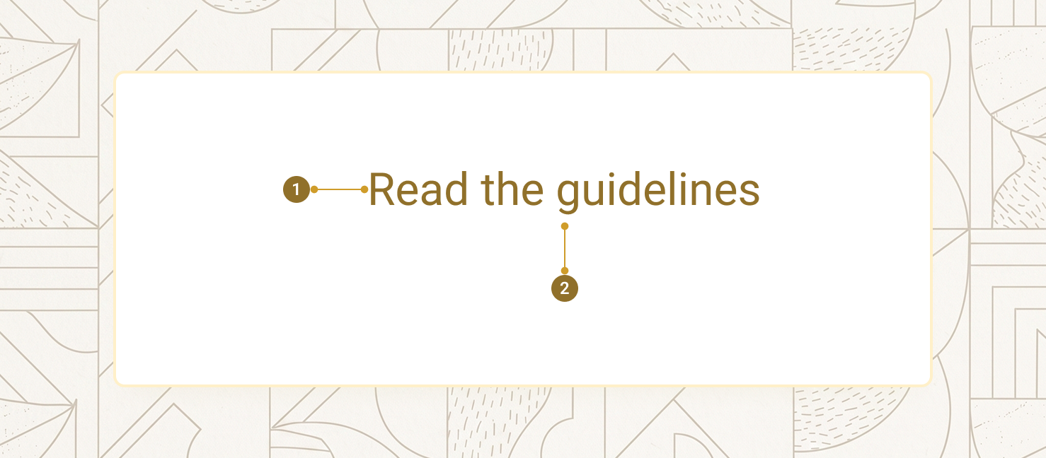
| Item | Name | Description |
|---|---|---|
1 |
Native anchor | The real <a> element — carries href, is keyboard-focusable, and is a genuine link to assistive technology |
2 |
Content | The default slot — link text, or an icon for is-icon links |
Text link
With no button-style prop set, aegov-link renders a plain inline link in the system's link colour, nothing else. It inherits its size from the surrounding text, so it drops cleanly into a paragraph, a list item, or a table cell. Setting target="_blank" with no explicit rel automatically adds rel="noopener noreferrer", and download is forwarded straight through to the native anchor.
Already have an account?
<p class="text-base">
  Already have an account?
  <aegov-link href="/sign-in">Sign in</aegov-link>
  to continue your application, or visit the
  <aegov-link href="https://u.ae" target="_blank">UAE Government portal<span class="sr-only"> (opens in a new tab)</span></aegov-link>
  for the full directory of federal services. Read the
  <aegov-link href="/files/visa-renewal-guide.pdf" download>visa renewal guide (PDF)</aegov-link>
  before you start.
</p>import { AegovLink } from '@aegov/designsystem-react';
export default function LinkText() {
return (
<p className="text-base">
Already have an account?{' '}
<AegovLink href="/sign-in">Sign in</AegovLink>{' '}
to continue your application, or visit the{' '}
<AegovLink href="https://u.ae" target="_blank">
UAE Government portal<span className="sr-only"> (opens in a new tab)</span>
</AegovLink>{' '}
for the full directory of federal services. Read the{' '}
<AegovLink href="/files/visa-renewal-guide.pdf" download>visa renewal guide (PDF)</AegovLink>{' '}
before you start.
</p>
);
}<template>
<p class="text-base">
Already have an account?
<aegov-link href="/sign-in">Sign in</aegov-link>
to continue your application, or visit the
<aegov-link href="https://u.ae" target="_blank">UAE Government portal<span class="sr-only"> (opens in a new tab)</span></aegov-link>
for the full directory of federal services. Read the
<aegov-link href="/files/visa-renewal-guide.pdf" download>visa renewal guide (PDF)</aegov-link>
before you start.
</p>
</template>import { Component } from '@angular/core';
import { AegovLink } from '@aegov/designsystem-angular';
@Component({
selector: 'app-link-text',
imports: [AegovLink],
template: `
<p class="text-base">
Already have an account?
<aegov-link href="/sign-in">Sign in</aegov-link>
to continue your application, or visit the
<aegov-link href="https://u.ae" target="_blank">UAE Government portal<span class="sr-only"> (opens in a new tab)</span></aegov-link>
for the full directory of federal services. Read the
<aegov-link href="/files/visa-renewal-guide.pdf" download>visa renewal guide (PDF)</aegov-link>
before you start.
</p>
`,
})
export class LinkTextComponent {}Button-styled links
Setting variant and/or appearance opts a link into the same visual system as aegov-button, for a call-to-action that must still be a real, navigable anchor. is-bold (on by default) only has an effect once button styling is already active.
<aegov-link href="/start" variant="primary" appearance="solid">Get started</aegov-link>
<aegov-link href="/sign-in" variant="secondary" appearance="outline">Sign in</aegov-link>
<aegov-link href="/learn-more" variant="primary" appearance="soft">Learn more</aegov-link>
<aegov-link href="/docs" variant="neutral-min" appearance="link">Read the docs</aegov-link>import { AegovLink } from '@aegov/designsystem-react';
export default function LinkButtonStyled() {
return (
<>
<AegovLink href="/start" variant="primary" appearance="solid">Get started</AegovLink>
<AegovLink href="/sign-in" variant="secondary" appearance="outline">Sign in</AegovLink>
<AegovLink href="/learn-more" variant="primary" appearance="soft">Learn more</AegovLink>
<AegovLink href="/docs" variant="neutral-min" appearance="link">Read the docs</AegovLink>
</>
);
}<template>
<aegov-link href="/start" variant="primary" appearance="solid">Get started</aegov-link>
<aegov-link href="/sign-in" variant="secondary" appearance="outline">Sign in</aegov-link>
<aegov-link href="/learn-more" variant="primary" appearance="soft">Learn more</aegov-link>
<aegov-link href="/docs" variant="neutral-min" appearance="link">Read the docs</aegov-link>
</template>import { Component } from '@angular/core';
import { AegovLink } from '@aegov/designsystem-angular';
@Component({
selector: 'app-link-button-styled',
imports: [AegovLink],
template: `
<aegov-link href="/start" variant="primary" appearance="solid">Get started</aegov-link>
<aegov-link href="/sign-in" variant="secondary" appearance="outline">Sign in</aegov-link>
<aegov-link href="/learn-more" variant="primary" appearance="soft">Learn more</aegov-link>
<aegov-link href="/docs" variant="neutral-min" appearance="link">Read the docs</aegov-link>
`,
})
export class LinkButtonStyledComponent {}Sizes
The size scale mirrors aegov-button exactly: xs, sm, base, lg, xl. size also accepts a responsive breakpoint string (e.g. "sm md:base lg:lg").
<aegov-link href="/a" variant="primary" appearance="solid" size="xs">Extra small</aegov-link>
<aegov-link href="/a" variant="primary" appearance="solid" size="sm">Small</aegov-link>
<aegov-link href="/a" variant="primary" appearance="solid" size="base">Base</aegov-link>
<aegov-link href="/a" variant="primary" appearance="solid" size="lg">Large</aegov-link>
<aegov-link href="/a" variant="primary" appearance="solid" size="xl">Extra large</aegov-link>import { AegovLink } from '@aegov/designsystem-react';
export default function LinkSizes() {
return (
<>
<AegovLink href="/a" variant="primary" appearance="solid" size="xs">Extra small</AegovLink>
<AegovLink href="/a" variant="primary" appearance="solid" size="sm">Small</AegovLink>
<AegovLink href="/a" variant="primary" appearance="solid" size="base">Base</AegovLink>
<AegovLink href="/a" variant="primary" appearance="solid" size="lg">Large</AegovLink>
<AegovLink href="/a" variant="primary" appearance="solid" size="xl">Extra large</AegovLink>
</>
);
}<template>
<aegov-link href="/a" variant="primary" appearance="solid" size="xs">Extra small</aegov-link>
<aegov-link href="/a" variant="primary" appearance="solid" size="sm">Small</aegov-link>
<aegov-link href="/a" variant="primary" appearance="solid" size="base">Base</aegov-link>
<aegov-link href="/a" variant="primary" appearance="solid" size="lg">Large</aegov-link>
<aegov-link href="/a" variant="primary" appearance="solid" size="xl">Extra large</aegov-link>
</template>import { Component } from '@angular/core';
import { AegovLink } from '@aegov/designsystem-angular';
@Component({
selector: 'app-link-sizes',
imports: [AegovLink],
template: `
<aegov-link href="/a" variant="primary" appearance="solid" size="xs">Extra small</aegov-link>
<aegov-link href="/a" variant="primary" appearance="solid" size="sm">Small</aegov-link>
<aegov-link href="/a" variant="primary" appearance="solid" size="base">Base</aegov-link>
<aegov-link href="/a" variant="primary" appearance="solid" size="lg">Large</aegov-link>
<aegov-link href="/a" variant="primary" appearance="solid" size="xl">Extra large</aegov-link>
`,
})
export class LinkSizesComponent {}Icon-only link
Pair is-icon with a button-style appearance for a square, icon-only link. Provide aria-label — the icon alone conveys nothing to a screen reader, and unlike a paired aegov-label, this aria-label genuinely reaches the real anchor's accessible name, since aegov-link has no shadow root to cross.
<aegov-link href="/settings" variant="primary" appearance="outline" is-icon="true" aria-label="Open settings">
  <svg xmlns="http://www.w3.org/2000/svg" width="20" height="20" viewBox="0 0 24 24" fill="none" stroke="currentColor" stroke-width="2" stroke-linecap="round" stroke-linejoin="round" aria-hidden="true">
    <circle cx="12" cy="12" r="3"></circle>
    <path d="M19.4 15a1.65 1.65 0 0 0 .33 1.82l.06.06a2 2 0 0 1 0 2.83 2 2 0 0 1-2.83 0l-.06-.06a1.65 1.65 0 0 0-1.82-.33 1.65 1.65 0 0 0-1 1.51V21a2 2 0 0 1-4 0v-.09A1.65 1.65 0 0 0 9 19.4a1.65 1.65 0 0 0-1.82.33l-.06.06a2 2 0 0 1-2.83 0 2 2 0 0 1 0-2.83l.06-.06a1.65 1.65 0 0 0 .33-1.82 1.65 1.65 0 0 0-1.51-1H3a2 2 0 0 1 0-4h.09A1.65 1.65 0 0 0 4.6 9a1.65 1.65 0 0 0-.33-1.82l-.06-.06a2 2 0 0 1 0-2.83 2 2 0 0 1 2.83 0l.06.06a1.65 1.65 0 0 0 1.82.33H9a1.65 1.65 0 0 0 1-1.51V3a2 2 0 0 1 4 0v.09a1.65 1.65 0 0 0 1 1.51 1.65 1.65 0 0 0 1.82-.33l.06-.06a2 2 0 0 1 2.83 0 2 2 0 0 1 0 2.83l-.06.06a1.65 1.65 0 0 0-.33 1.82V9a1.65 1.65 0 0 0 1.51 1H21a2 2 0 0 1 0 4h-.09a1.65 1.65 0 0 0-1.51 1z"></path>
  </svg>
</aegov-link>import { AegovLink } from '@aegov/designsystem-react';
export default function LinkIconOnly() {
return (
<AegovLink href="/settings" variant="primary" appearance="outline" isIcon aria-label="Open settings">
<svg xmlns="http://www.w3.org/2000/svg" width="20" height="20" viewBox="0 0 24 24" fill="none" stroke="currentColor" strokeWidth="2" strokeLinecap="round" strokeLinejoin="round" aria-hidden="true">
<circle cx="12" cy="12" r="3"></circle>
<path d="M19.4 15a1.65 1.65 0 0 0 .33 1.82l.06.06a2 2 0 0 1 0 2.83 2 2 0 0 1-2.83 0l-.06-.06a1.65 1.65 0 0 0-1.82-.33 1.65 1.65 0 0 0-1 1.51V21a2 2 0 0 1-4 0v-.09A1.65 1.65 0 0 0 9 19.4a1.65 1.65 0 0 0-1.82.33l-.06.06a2 2 0 0 1-2.83 0 2 2 0 0 1 0-2.83l.06-.06a1.65 1.65 0 0 0 .33-1.82 1.65 1.65 0 0 0-1.51-1H3a2 2 0 0 1 0-4h.09A1.65 1.65 0 0 0 4.6 9a1.65 1.65 0 0 0-.33-1.82l-.06-.06a2 2 0 0 1 0-2.83 2 2 0 0 1 2.83 0l.06.06a1.65 1.65 0 0 0 1.82.33H9a1.65 1.65 0 0 0 1-1.51V3a2 2 0 0 1 4 0v.09a1.65 1.65 0 0 0 1 1.51 1.65 1.65 0 0 0 1.82-.33l.06-.06a2 2 0 0 1 2.83 0 2 2 0 0 1 0 2.83l-.06.06a1.65 1.65 0 0 0-.33 1.82V9a1.65 1.65 0 0 0 1.51 1H21a2 2 0 0 1 0 4h-.09a1.65 1.65 0 0 0-1.51 1z"></path>
</svg>
</AegovLink>
);
}<template>
<aegov-link href="/settings" variant="primary" appearance="outline" is-icon="true" aria-label="Open settings">
<svg xmlns="http://www.w3.org/2000/svg" width="20" height="20" viewBox="0 0 24 24" fill="none" stroke="currentColor" stroke-width="2" stroke-linecap="round" stroke-linejoin="round" aria-hidden="true">
<circle cx="12" cy="12" r="3"></circle>
<path d="M19.4 15a1.65 1.65 0 0 0 .33 1.82l.06.06a2 2 0 0 1 0 2.83 2 2 0 0 1-2.83 0l-.06-.06a1.65 1.65 0 0 0-1.82-.33 1.65 1.65 0 0 0-1 1.51V21a2 2 0 0 1-4 0v-.09A1.65 1.65 0 0 0 9 19.4a1.65 1.65 0 0 0-1.82.33l-.06.06a2 2 0 0 1-2.83 0 2 2 0 0 1 0-2.83l.06-.06a1.65 1.65 0 0 0 .33-1.82 1.65 1.65 0 0 0-1.51-1H3a2 2 0 0 1 0-4h.09A1.65 1.65 0 0 0 4.6 9a1.65 1.65 0 0 0-.33-1.82l-.06-.06a2 2 0 0 1 0-2.83 2 2 0 0 1 2.83 0l.06.06a1.65 1.65 0 0 0 1.82.33H9a1.65 1.65 0 0 0 1-1.51V3a2 2 0 0 1 4 0v.09a1.65 1.65 0 0 0 1 1.51 1.65 1.65 0 0 0 1.82-.33l.06-.06a2 2 0 0 1 2.83 0 2 2 0 0 1 0 2.83l-.06.06a1.65 1.65 0 0 0-.33 1.82V9a1.65 1.65 0 0 0 1.51 1H21a2 2 0 0 1 0 4h-.09a1.65 1.65 0 0 0-1.51 1z"></path>
</svg>
</aegov-link>
</template>import { Component } from '@angular/core';
import { AegovLink } from '@aegov/designsystem-angular';
@Component({
selector: 'app-link-icon-only',
imports: [AegovLink],
template: `
<aegov-link href="/settings" variant="primary" appearance="outline" [isIcon]="true" aria-label="Open settings">
<svg xmlns="http://www.w3.org/2000/svg" width="20" height="20" viewBox="0 0 24 24" fill="none" stroke="currentColor" stroke-width="2" stroke-linecap="round" stroke-linejoin="round" aria-hidden="true">
<circle cx="12" cy="12" r="3"></circle>
<path d="M19.4 15a1.65 1.65 0 0 0 .33 1.82l.06.06a2 2 0 0 1 0 2.83 2 2 0 0 1-2.83 0l-.06-.06a1.65 1.65 0 0 0-1.82-.33 1.65 1.65 0 0 0-1 1.51V21a2 2 0 0 1-4 0v-.09A1.65 1.65 0 0 0 9 19.4a1.65 1.65 0 0 0-1.82.33l-.06.06a2 2 0 0 1-2.83 0 2 2 0 0 1 0-2.83l.06-.06a1.65 1.65 0 0 0 .33-1.82 1.65 1.65 0 0 0-1.51-1H3a2 2 0 0 1 0-4h.09A1.65 1.65 0 0 0 4.6 9a1.65 1.65 0 0 0-.33-1.82l-.06-.06a2 2 0 0 1 0-2.83 2 2 0 0 1 2.83 0l.06.06a1.65 1.65 0 0 0 1.82.33H9a1.65 1.65 0 0 0 1-1.51V3a2 2 0 0 1 4 0v.09a1.65 1.65 0 0 0 1 1.51 1.65 1.65 0 0 0 1.82-.33l.06-.06a2 2 0 0 1 2.83 0 2 2 0 0 1 0 2.83l-.06.06a1.65 1.65 0 0 0-.33 1.82V9a1.65 1.65 0 0 0 1.51 1H21a2 2 0 0 1 0 4h-.09a1.65 1.65 0 0 0-1.51 1z"></path>
</svg>
</aegov-link>
`,
})
export class LinkIconOnlyComponent {}Full-width link
Pair is-full with a button-style appearance and a block-level container for a stretched call-to-action.
<aegov-link href="/apply" variant="primary" appearance="solid" size="lg" is-full="true">Apply now</aegov-link>import { AegovLink } from '@aegov/designsystem-react';
export default function LinkFullWidth() {
return (
<AegovLink href="/apply" variant="primary" appearance="solid" size="lg" isFull>
Apply now
</AegovLink>
);
}<template>
<aegov-link href="/apply" variant="primary" appearance="solid" size="lg" is-full="true">Apply now</aegov-link>
</template>import { Component } from '@angular/core';
import { AegovLink } from '@aegov/designsystem-angular';
@Component({
selector: 'app-link-full-width',
imports: [AegovLink],
template: `
<aegov-link href="/apply" variant="primary" appearance="solid" size="lg" [isFull]="true">Apply now</aegov-link>
`,
})
export class LinkFullWidthComponent {}Disabled link
Native <a> elements have no disabled attribute, so aegov-link polyfills it: href, target, rel, and download are stripped so the browser can't navigate even if the element is activated programmatically, role="link" is set explicitly (a native <a> with no href silently loses its implicit link role), aria-disabled="true" is added, and the link is removed from the tab order.
<aegov-link href="/wip" variant="primary" appearance="solid" is-disabled="true">Coming soon</aegov-link>import { AegovLink } from '@aegov/designsystem-react';
export default function LinkDisabled() {
return (
<AegovLink href="/wip" variant="primary" appearance="solid" isDisabled>
Coming soon
</AegovLink>
);
}<template>
<aegov-link href="/wip" variant="primary" appearance="solid" is-disabled="true">Coming soon</aegov-link>
</template>import { Component } from '@angular/core';
import { AegovLink } from '@aegov/designsystem-angular';
@Component({
selector: 'app-link-disabled',
imports: [AegovLink],
template: `
<aegov-link href="/wip" variant="primary" appearance="solid" [isDisabled]="true">Coming soon</aegov-link>
`,
})
export class LinkDisabledComponent {}Intercepting navigation
aegovLinkClick fires on click, before the browser navigates. Call preventDefault() on the event detail's original MouseEvent to stop the default navigation and hand off to a client-side router.
<aegov-link href="/dashboard" id="dashboard-link">Open dashboard</aegov-link>

<script>
  document.getElementById('dashboard-link').addEventListener('aegovLinkClick', (e) => {
    e.detail.event.preventDefault();
    router.push(e.detail.href);
  });
</script>import { AegovLink } from '@aegov/designsystem-react';
import { useNavigate } from 'react-router-dom';
export default function LinkIntercept() {
const navigate = useNavigate();
return (
<AegovLink
href="/dashboard"
onAegovLinkClick={(e) => {
e.detail.event.preventDefault();
navigate(e.detail.href);
}}
>
Open dashboard
</AegovLink>
);
}<template>
<aegov-link href="/dashboard" @aegovLinkClick="onLinkClick">Open dashboard</aegov-link>
</template>
<script setup lang="ts">
import { useRouter } from 'vue-router';
const router = useRouter();
function onLinkClick(e: CustomEvent<{ href: string; event: MouseEvent }>) {
e.detail.event.preventDefault();
router.push(e.detail.href);
}
</script>import { Component } from '@angular/core';
import { Router } from '@angular/router';
import { AegovLink } from '@aegov/designsystem-angular';
@Component({
selector: 'app-link-intercept',
imports: [AegovLink],
template: `
<aegov-link href="/dashboard" (aegovLinkClick)="onLinkClick($event)">Open dashboard</aegov-link>
`,
})
export class LinkInterceptComponent {
constructor(private router: Router) {}
onLinkClick(e: CustomEvent<{ href: string; event: MouseEvent }>) {
e.detail.event.preventDefault();
this.router.navigateByUrl(e.detail.href);
}
}RTL support
aegov-link is direction-agnostic — it renders inline content and simply flows in whatever direction its container sets. No properties change between LTR and RTL.
تفضّل بزيارة
<div dir="rtl">
  <p class="text-base">
    تفضّل بزيارة
    <aegov-link href="https://u.ae" target="_blank">البوابة الرسمية لحكومة الإمارات</aegov-link>
    للاطلاع على الدليل الكامل للخدمات الاتحادية.
  </p>
  <div class="flex gap-3 mt-4">
    <aegov-link href="/start" variant="primary" appearance="solid">ابدأ الآن</aegov-link>
    <aegov-link href="/sign-in" variant="secondary" appearance="outline">تسجيل الدخول</aegov-link>
  </div>
</div>import { AegovLink } from '@aegov/designsystem-react';
export default function RtlLink() {
return (
<div dir="rtl">
<p className="text-base">
تفضّل بزيارة{' '}
<AegovLink href="https://u.ae" target="_blank">البوابة الرسمية لحكومة الإمارات</AegovLink>{' '}
للاطلاع على الدليل الكامل للخدمات الاتحادية.
</p>
<div className="flex gap-3 mt-4">
<AegovLink href="/start" variant="primary" appearance="solid">ابدأ الآن</AegovLink>
<AegovLink href="/sign-in" variant="secondary" appearance="outline">تسجيل الدخول</AegovLink>
</div>
</div>
);
}<template>
<div dir="rtl">
<p class="text-base">
تفضّل بزيارة
<aegov-link href="https://u.ae" target="_blank">البوابة الرسمية لحكومة الإمارات</aegov-link>
للاطلاع على الدليل الكامل للخدمات الاتحادية.
</p>
<div class="flex gap-3 mt-4">
<aegov-link href="/start" variant="primary" appearance="solid">ابدأ الآن</aegov-link>
<aegov-link href="/sign-in" variant="secondary" appearance="outline">تسجيل الدخول</aegov-link>
</div>
</div>
</template>import { Component } from '@angular/core';
import { AegovLink } from '@aegov/designsystem-angular';
@Component({
selector: 'app-rtl-link',
imports: [AegovLink],
template: `
<div dir="rtl">
<p class="text-base">
تفضّل بزيارة
<aegov-link href="https://u.ae" target="_blank">البوابة الرسمية لحكومة الإمارات</aegov-link>
للاطلاع على الدليل الكامل للخدمات الاتحادية.
</p>
<div class="flex gap-3 mt-4">
<aegov-link href="/start" variant="primary" appearance="solid">ابدأ الآن</aegov-link>
<aegov-link href="/sign-in" variant="secondary" appearance="outline">تسجيل الدخول</aegov-link>
</div>
</div>
`,
})
export class RtlLinkComponent {}Usage
Here is the recommended usage of a link on any website or application. These are recommended usage guides, however the developer must use the best practices of web and application development to accurately use this component.
Write link text that describes the destination
"Read the visa renewal guide" tells a screen-reader user scanning by link exactly where it goes. "Click here" or "Read more" does not.
Warn people before you open a new tab
target="_blank" is disorienting if it happens with no notice. Add a visually-hidden "(opens in a new tab)" note inside the link so assistive technology announces it too.
Reach for button styling only when the destination is real navigation
variant/appearance/size make a link look like a button for a call-to-action — but it still has to actually navigate somewhere. If the action doesn't change the URL (submit a form, open a modal), use aegov-button instead.
Don't reach for is-loading
aegov-link doesn't have it, deliberately — a loading state belongs on a real <button> performing an action, not an anchor that's about to navigate away. Use aegov-button for that case.
Don't put another interactive element inside the link's slot
A button or nested link inside aegov-link creates two competing click targets and confuses both mouse and keyboard users. Place the second control next to the link instead.
API reference
The following are the properties and references of a link
aegov-link properties
| Attribute | Description | Type | Default |
|---|---|---|---|
| The URL the link points to. Required. Stripped from the rendered |
| — |
| Anchor target. Not set unless you supply it, so the browser default (same tab) applies. Stripped when |
| — |
| Anchor rel. Auto-set to |
| — |
| DOM |
| auto-generated |
| Extra CSS classes merged onto the rendered |
| — |
| Button-style colour. Setting this, or any other button-style prop below, switches the link to button styling. |
| unset |
| Button-style appearance. |
| unset |
| Button-style size. Accepts a responsive breakpoint string. |
| unset |
| Renders as a square icon-only button-style link. Requires an |
|
|
| Stretches the link to fill its container width. |
|
|
| Bold text weight on button-styled links. Has no effect on the default text-link style. |
|
|
| Polyfills |
|
|
Slots
| Slot | Description |
|---|---|
(default) | The link content — text, or an icon for |
Events
| Event | Detail | Description |
|---|---|---|
|
| Fired on click, before navigation. Call |
Pass-through attributes
| Attribute | Notes | Forwards to |
|---|---|---|
| Standard anchor attributes, forwarded as-is. | inner |
| Forwarded to the inner | inner |
| Not forwarded. Use | n/a |
| Applied to the host element — stays host-only. Use | host |
Notes
The following notes are applicable of this component.
Built-in accessibility
- Renders a real native
<a>element — keyboard-focusable, recognised by assistive technology as a link, and crawlable by search engines, in both its default and button-styled forms. - When
target="_blank"is set with no explicitrel,rel="noopener noreferrer"is added automatically to prevent reverse-tabnabbing. is-disabledsetsrole="link"explicitly, since a native<a>with nohrefsilently loses its implicit link role — without this, a disabled link would announce as plain text to a screen reader instead of a (disabled) link.aria-*/data-*pass-through attributes (includingaria-labelfor icon-only links) reach the real anchor directly —aegov-linkhas no shadow root, so there's no boundary for an accessible name to cross.
Developer responsibilities
- Write descriptive link text — avoid "click here" or "read more". The slot content is what a screen reader announces when scanning by link.
- For
is-iconlinks, always providearia-label— the icon alone conveys nothing to assistive technology. - Warn people before
target="_blank"opens a new tab — a visually-hidden note inside the link (<span class="sr-only">(opens in a new tab)</span>) is announced by assistive technology without changing the visible text. - Maintain at least 4.5:1 text contrast if overriding colour via
extra-class. is-bolddefaults totrueand only affects button-styled links — setting it has no visible effect on the default text-link style, since that path doesn't use it at all.
Keyboard support
| Key | Function |
|---|---|
Tab |
Moves focus to the link. A disabled link is removed from the tab order entirely. |
Shift + Tab |
Moves focus away from the link. |
Enter |
Activates the link — navigates, or fires aegovLinkClick for interception. |