
Anatomy
aegov-drawer renders a panel anchored to one edge of the viewport, with an optional dimming backdrop behind it. It stays where you declare it — moving out of an ancestor only while open, and only if that ancestor would trap it (see is-portal) — takes its stacking order from a shared overlay manager, traps focus inside while open, and locks body scroll.
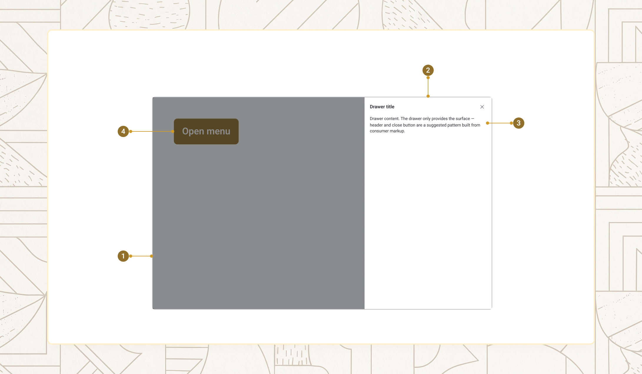
| Item | Name | Description |
|---|---|---|
1 |
Backdrop | The dimming overlay behind the panel (is-overlay) |
2 |
Panel | The dialog surface itself — position, size, and pinning apply here |
3 |
Content | Your own slotted markup — heading, body, and action area |
4 |
Trigger | The element (usually a button) whose click calls show() — not part of the component itself |
Position
position selects which edge the drawer slides from. right is the default and works well for filters and detail panels; left suits primary navigation; top and bottom suit transient toolbars or mobile action sheets.
Right-side drawer
Slides in from the right — best for filters and detail panels.
Left-side drawer
Slides in from the left — best for primary navigation.
Top drawer
Drops in from the top — useful for transient toolbars and announcements.
Bottom drawer
Slides in from the bottom — common on mobile for action sheets.
<aegov-button field-id="pos-right-btn">Right</aegov-button>
<aegov-button field-id="pos-left-btn">Left</aegov-button>
<aegov-button field-id="pos-top-btn">Top</aegov-button>
<aegov-button field-id="pos-bottom-btn">Bottom</aegov-button>

<aegov-drawer field-id="drawer-pos-right" position="right" label="Right-side drawer">
  <h3 id="pos-right-title" class="font-bold text-xl m-0">Right-side drawer</h3>
  <p class="text-base mt-2">Slides in from the right — best for filters and detail panels.</p>
</aegov-drawer>
<aegov-drawer field-id="drawer-pos-left" position="left" label="Left-side drawer">
  <h3 id="pos-left-title" class="font-bold text-xl m-0">Left-side drawer</h3>
  <p class="text-base mt-2">Slides in from the left — best for primary navigation.</p>
</aegov-drawer>
<aegov-drawer field-id="drawer-pos-top" position="top" label="Top drawer">
  <h3 id="pos-top-title" class="font-bold text-xl m-0">Top drawer</h3>
  <p class="text-base mt-2">Drops in from the top — useful for transient toolbars and announcements.</p>
</aegov-drawer>
<aegov-drawer field-id="drawer-pos-bottom" position="bottom" label="Bottom drawer">
  <h3 id="pos-bottom-title" class="font-bold text-xl m-0">Bottom drawer</h3>
  <p class="text-base mt-2">Slides in from the bottom — common on mobile for action sheets.</p>
</aegov-drawer>

<script>
  ['right', 'left', 'top', 'bottom'].forEach(function (pos) {
    var drawer = document.querySelector('[field-id="drawer-pos-' + pos + '"]');
    document.querySelector('[field-id="pos-' + pos + '-btn"]').addEventListener('click', function () { drawer.show(); });
  });
</script>import { useRef } from 'react';
import { AegovButton, AegovDrawer } from '@aegov/designsystem-react';
export default function DrawerPosition() {
const right = useRef<HTMLAegovDrawerElement>(null);
const left = useRef<HTMLAegovDrawerElement>(null);
const top = useRef<HTMLAegovDrawerElement>(null);
const bottom = useRef<HTMLAegovDrawerElement>(null);
return (
<>
<AegovButton onClick={() => right.current?.show()}>Right</AegovButton>
<AegovButton onClick={() => left.current?.show()}>Left</AegovButton>
<AegovButton onClick={() => top.current?.show()}>Top</AegovButton>
<AegovButton onClick={() => bottom.current?.show()}>Bottom</AegovButton>
<AegovDrawer ref={right} position="right" label="Right-side drawer">
<h3 id="pos-right-title" className="font-bold text-xl m-0">Right-side drawer</h3>
<p className="text-base mt-2">Slides in from the right — best for filters and detail panels.</p>
</AegovDrawer>
<AegovDrawer ref={left} position="left" label="Left-side drawer">
<h3 id="pos-left-title" className="font-bold text-xl m-0">Left-side drawer</h3>
<p className="text-base mt-2">Slides in from the left — best for primary navigation.</p>
</AegovDrawer>
<AegovDrawer ref={top} position="top" label="Top drawer">
<h3 id="pos-top-title" className="font-bold text-xl m-0">Top drawer</h3>
<p className="text-base mt-2">Drops in from the top — useful for transient toolbars and announcements.</p>
</AegovDrawer>
<AegovDrawer ref={bottom} position="bottom" label="Bottom drawer">
<h3 id="pos-bottom-title" className="font-bold text-xl m-0">Bottom drawer</h3>
<p className="text-base mt-2">Slides in from the bottom — common on mobile for action sheets.</p>
</AegovDrawer>
</>
);
}<script setup>
import { ref } from 'vue';
const right = ref(null);
const left = ref(null);
const top = ref(null);
const bottom = ref(null);
</script>
<template>
<aegov-button @click="right.show()">Right</aegov-button>
<aegov-button @click="left.show()">Left</aegov-button>
<aegov-button @click="top.show()">Top</aegov-button>
<aegov-button @click="bottom.show()">Bottom</aegov-button>
<aegov-drawer ref="right" position="right" label="Right-side drawer">
<h3 id="pos-right-title" class="font-bold text-xl m-0">Right-side drawer</h3>
<p class="text-base mt-2">Slides in from the right — best for filters and detail panels.</p>
</aegov-drawer>
<aegov-drawer ref="left" position="left" label="Left-side drawer">
<h3 id="pos-left-title" class="font-bold text-xl m-0">Left-side drawer</h3>
<p class="text-base mt-2">Slides in from the left — best for primary navigation.</p>
</aegov-drawer>
<aegov-drawer ref="top" position="top" label="Top drawer">
<h3 id="pos-top-title" class="font-bold text-xl m-0">Top drawer</h3>
<p class="text-base mt-2">Drops in from the top — useful for transient toolbars and announcements.</p>
</aegov-drawer>
<aegov-drawer ref="bottom" position="bottom" label="Bottom drawer">
<h3 id="pos-bottom-title" class="font-bold text-xl m-0">Bottom drawer</h3>
<p class="text-base mt-2">Slides in from the bottom — common on mobile for action sheets.</p>
</aegov-drawer>
</template>import { Component, ViewChild, ElementRef } from '@angular/core';
import { AegovButton, AegovDrawer } from '@aegov/designsystem-angular';
@Component({
selector: 'app-drawer-position',
imports: [AegovButton, AegovDrawer],
template: `
<aegov-button (click)="right.show()">Right</aegov-button>
<aegov-button (click)="left.show()">Left</aegov-button>
<aegov-button (click)="top.show()">Top</aegov-button>
<aegov-button (click)="bottom.show()">Bottom</aegov-button>
<aegov-drawer #right position="right" label="Right-side drawer">
<h3 id="pos-right-title" class="font-bold text-xl m-0">Right-side drawer</h3>
<p class="text-base mt-2">Slides in from the right — best for filters and detail panels.</p>
</aegov-drawer>
<aegov-drawer #left position="left" label="Left-side drawer">
<h3 id="pos-left-title" class="font-bold text-xl m-0">Left-side drawer</h3>
<p class="text-base mt-2">Slides in from the left — best for primary navigation.</p>
</aegov-drawer>
<aegov-drawer #top position="top" label="Top drawer">
<h3 id="pos-top-title" class="font-bold text-xl m-0">Top drawer</h3>
<p class="text-base mt-2">Drops in from the top — useful for transient toolbars and announcements.</p>
</aegov-drawer>
<aegov-drawer #bottom position="bottom" label="Bottom drawer">
<h3 id="pos-bottom-title" class="font-bold text-xl m-0">Bottom drawer</h3>
<p class="text-base mt-2">Slides in from the bottom — common on mobile for action sheets.</p>
</aegov-drawer>
`,
})
export class DrawerPositionComponent {
@ViewChild('right') right!: ElementRef;
@ViewChild('left') left!: ElementRef;
@ViewChild('top') top!: ElementRef;
@ViewChild('bottom') bottom!: ElementRef;
}Sizes
size controls the panel's width for left/right drawers, from xs (320px) to full (100vw). It also scales the inner padding and, when is-pinned="false", the edge gap and corner radius. On viewports narrower than 640px, every left/right size collapses to full width automatically. Top/bottom drawers ignore this prop for height — see Controlling top/bottom height below.
XS — 320px
Compact strip for notifications and quick-action panels.
SM — 384px
Narrow panel for filter sidebars and compact navigation.
Base — 480px (default)
Standard panel for settings and detail views.
LG — 640px
Wide panel for multi-field forms and data tables.
XL — 800px
Extra-wide panel for complex wizards and rich detail views.
<aegov-button field-id="size-xs-btn" size="sm">XS — 320px</aegov-button>
<aegov-button field-id="size-sm-btn" size="sm">SM — 384px</aegov-button>
<aegov-button field-id="size-base-btn" size="sm">Base — 480px</aegov-button>
<aegov-button field-id="size-lg-btn" size="sm">LG — 640px</aegov-button>
<aegov-button field-id="size-xl-btn" size="sm">XL — 800px</aegov-button>

<aegov-drawer field-id="drawer-size-xs" size="xs" label="XS — 320px">
  <h3 id="size-xs-title" class="font-bold text-lg m-0">XS — 320px</h3>
  <p class="text-base mt-2">Compact strip for notifications and quick-action panels.</p>
</aegov-drawer>
<aegov-drawer field-id="drawer-size-sm" size="sm" label="SM — 384px">
  <h3 id="size-sm-title" class="font-bold text-lg m-0">SM — 384px</h3>
  <p class="text-base mt-2">Narrow panel for filter sidebars and compact navigation.</p>
</aegov-drawer>
<aegov-drawer field-id="drawer-size-base" size="base" label="Base — 480px (default)">
  <h3 id="size-base-title" class="font-bold text-xl m-0">Base — 480px (default)</h3>
  <p class="text-base mt-2">Standard panel for settings and detail views.</p>
</aegov-drawer>
<aegov-drawer field-id="drawer-size-lg" size="lg" label="LG — 640px">
  <h3 id="size-lg-title" class="font-bold text-2xl m-0">LG — 640px</h3>
  <p class="text-base mt-2">Wide panel for multi-field forms and data tables.</p>
</aegov-drawer>
<aegov-drawer field-id="drawer-size-xl" size="xl" label="XL — 800px">
  <h3 id="size-xl-title" class="font-bold text-2xl m-0">XL — 800px</h3>
  <p class="text-base mt-2">Extra-wide panel for complex wizards and rich detail views.</p>
</aegov-drawer>

<script>
  ['xs', 'sm', 'base', 'lg', 'xl'].forEach(function (size) {
    var drawer = document.querySelector('[field-id="drawer-size-' + size + '"]');
    document.querySelector('[field-id="size-' + size + '-btn"]').addEventListener('click', function () { drawer.show(); });
  });
</script>import { useRef } from 'react';
import { AegovButton, AegovDrawer } from '@aegov/designsystem-react';
export default function DrawerSizes() {
const xs = useRef<HTMLAegovDrawerElement>(null);
const sm = useRef<HTMLAegovDrawerElement>(null);
const base = useRef<HTMLAegovDrawerElement>(null);
const lg = useRef<HTMLAegovDrawerElement>(null);
const xl = useRef<HTMLAegovDrawerElement>(null);
return (
<>
<AegovButton size="sm" onClick={() => xs.current?.show()}>XS — 320px</AegovButton>
<AegovButton size="sm" onClick={() => sm.current?.show()}>SM — 384px</AegovButton>
<AegovButton size="sm" onClick={() => base.current?.show()}>Base — 480px</AegovButton>
<AegovButton size="sm" onClick={() => lg.current?.show()}>LG — 640px</AegovButton>
<AegovButton size="sm" onClick={() => xl.current?.show()}>XL — 800px</AegovButton>
<AegovDrawer ref={xs} size="xs" label="XS — 320px">
<h3 id="size-xs-title" className="font-bold text-lg m-0">XS — 320px</h3>
<p className="text-base mt-2">Compact strip for notifications and quick-action panels.</p>
</AegovDrawer>
<AegovDrawer ref={sm} size="sm" label="SM — 384px">
<h3 id="size-sm-title" className="font-bold text-lg m-0">SM — 384px</h3>
<p className="text-base mt-2">Narrow panel for filter sidebars and compact navigation.</p>
</AegovDrawer>
<AegovDrawer ref={base} size="base" label="Base — 480px (default)">
<h3 id="size-base-title" className="font-bold text-xl m-0">Base — 480px (default)</h3>
<p className="text-base mt-2">Standard panel for settings and detail views.</p>
</AegovDrawer>
<AegovDrawer ref={lg} size="lg" label="LG — 640px">
<h3 id="size-lg-title" className="font-bold text-2xl m-0">LG — 640px</h3>
<p className="text-base mt-2">Wide panel for multi-field forms and data tables.</p>
</AegovDrawer>
<AegovDrawer ref={xl} size="xl" label="XL — 800px">
<h3 id="size-xl-title" className="font-bold text-2xl m-0">XL — 800px</h3>
<p className="text-base mt-2">Extra-wide panel for complex wizards and rich detail views.</p>
</AegovDrawer>
</>
);
}<script setup>
import { ref } from 'vue';
const xs = ref(null);
const sm = ref(null);
const base = ref(null);
const lg = ref(null);
const xl = ref(null);
</script>
<template>
<aegov-button size="sm" @click="xs.show()">XS — 320px</aegov-button>
<aegov-button size="sm" @click="sm.show()">SM — 384px</aegov-button>
<aegov-button size="sm" @click="base.show()">Base — 480px</aegov-button>
<aegov-button size="sm" @click="lg.show()">LG — 640px</aegov-button>
<aegov-button size="sm" @click="xl.show()">XL — 800px</aegov-button>
<aegov-drawer ref="xs" size="xs" label="XS — 320px">
<h3 id="size-xs-title" class="font-bold text-lg m-0">XS — 320px</h3>
<p class="text-base mt-2">Compact strip for notifications and quick-action panels.</p>
</aegov-drawer>
<aegov-drawer ref="sm" size="sm" label="SM — 384px">
<h3 id="size-sm-title" class="font-bold text-lg m-0">SM — 384px</h3>
<p class="text-base mt-2">Narrow panel for filter sidebars and compact navigation.</p>
</aegov-drawer>
<aegov-drawer ref="base" size="base" label="Base — 480px (default)">
<h3 id="size-base-title" class="font-bold text-xl m-0">Base — 480px (default)</h3>
<p class="text-base mt-2">Standard panel for settings and detail views.</p>
</aegov-drawer>
<aegov-drawer ref="lg" size="lg" label="LG — 640px">
<h3 id="size-lg-title" class="font-bold text-2xl m-0">LG — 640px</h3>
<p class="text-base mt-2">Wide panel for multi-field forms and data tables.</p>
</aegov-drawer>
<aegov-drawer ref="xl" size="xl" label="XL — 800px">
<h3 id="size-xl-title" class="font-bold text-2xl m-0">XL — 800px</h3>
<p class="text-base mt-2">Extra-wide panel for complex wizards and rich detail views.</p>
</aegov-drawer>
</template>import { Component, ViewChild, ElementRef } from '@angular/core';
import { AegovButton, AegovDrawer } from '@aegov/designsystem-angular';
@Component({
selector: 'app-drawer-sizes',
imports: [AegovButton, AegovDrawer],
template: `
<aegov-button size="sm" (click)="xs.show()">XS — 320px</aegov-button>
<aegov-button size="sm" (click)="sm.show()">SM — 384px</aegov-button>
<aegov-button size="sm" (click)="base.show()">Base — 480px</aegov-button>
<aegov-button size="sm" (click)="lg.show()">LG — 640px</aegov-button>
<aegov-button size="sm" (click)="xl.show()">XL — 800px</aegov-button>
<aegov-drawer #xs size="xs" label="XS — 320px">
<h3 id="size-xs-title" class="font-bold text-lg m-0">XS — 320px</h3>
<p class="text-base mt-2">Compact strip for notifications and quick-action panels.</p>
</aegov-drawer>
<aegov-drawer #sm size="sm" label="SM — 384px">
<h3 id="size-sm-title" class="font-bold text-lg m-0">SM — 384px</h3>
<p class="text-base mt-2">Narrow panel for filter sidebars and compact navigation.</p>
</aegov-drawer>
<aegov-drawer #base size="base" label="Base — 480px (default)">
<h3 id="size-base-title" class="font-bold text-xl m-0">Base — 480px (default)</h3>
<p class="text-base mt-2">Standard panel for settings and detail views.</p>
</aegov-drawer>
<aegov-drawer #lg size="lg" label="LG — 640px">
<h3 id="size-lg-title" class="font-bold text-2xl m-0">LG — 640px</h3>
<p class="text-base mt-2">Wide panel for multi-field forms and data tables.</p>
</aegov-drawer>
<aegov-drawer #xl size="xl" label="XL — 800px">
<h3 id="size-xl-title" class="font-bold text-2xl m-0">XL — 800px</h3>
<p class="text-base mt-2">Extra-wide panel for complex wizards and rich detail views.</p>
</aegov-drawer>
`,
})
export class DrawerSizesComponent {
@ViewChild('xs') xs!: ElementRef;
@ViewChild('sm') sm!: ElementRef;
@ViewChild('base') base!: ElementRef;
@ViewChild('lg') lg!: ElementRef;
@ViewChild('xl') xl!: ElementRef;
}Controlling top/bottom height
Top and bottom drawers have height: auto by default — the panel grows to fit whatever is slotted in, up to 100dvh. There is no fixed height per size tier for these two positions. To set a specific height, wrap your content in a div and apply the height there — because that wrapper lives in the light DOM (your own markup), ordinary CSS and Tailwind classes work on it directly.
Auto height
No height set on the wrapper — the drawer is exactly as tall as this content.
Fixed 50vh
The inner wrapper sets its own height, so the panel is always half the viewport tall.
<aegov-button field-id="height-auto-btn">Auto (content height)</aegov-button>
<aegov-button field-id="height-half-btn">Half the viewport</aegov-button>

<aegov-drawer field-id="drawer-height-auto" position="bottom" label="Auto height">
  <div>
    <h3 id="height-auto-title" class="font-bold text-lg m-0">Auto height</h3>
    <p class="text-base mt-2">No height set on the wrapper — the drawer is exactly as tall as this content.</p>
  </div>
</aegov-drawer>
<aegov-drawer field-id="drawer-height-half" position="bottom" label="Fixed 50vh">
  <div class="h-[50vh]">
    <h3 id="height-half-title" class="font-bold text-lg m-0">Fixed 50vh</h3>
    <p class="text-base mt-2">The inner wrapper sets its own height, so the panel is always half the viewport tall.</p>
  </div>
</aegov-drawer>

<script>
  ['auto', 'half'].forEach(function (v) {
    var drawer = document.querySelector('[field-id="drawer-height-' + v + '"]');
    document.querySelector('[field-id="height-' + v + '-btn"]').addEventListener('click', function () { drawer.show(); });
  });
</script>import { useRef } from 'react';
import { AegovButton, AegovDrawer } from '@aegov/designsystem-react';
export default function DrawerHeight() {
const auto = useRef<HTMLAegovDrawerElement>(null);
const half = useRef<HTMLAegovDrawerElement>(null);
return (
<>
<AegovButton onClick={() => auto.current?.show()}>Auto (content height)</AegovButton>
<AegovButton onClick={() => half.current?.show()}>Half the viewport</AegovButton>
<AegovDrawer ref={auto} position="bottom" label="Auto height">
<div>
<h3 id="height-auto-title" className="font-bold text-lg m-0">Auto height</h3>
<p className="text-base mt-2">No height set on the wrapper — the drawer is exactly as tall as this content.</p>
</div>
</AegovDrawer>
<AegovDrawer ref={half} position="bottom" label="Fixed 50vh">
<div className="h-[50vh]">
<h3 id="height-half-title" className="font-bold text-lg m-0">Fixed 50vh</h3>
<p className="text-base mt-2">The inner wrapper sets its own height, so the panel is always half the viewport tall.</p>
</div>
</AegovDrawer>
</>
);
}<script setup>
import { ref } from 'vue';
const auto = ref(null);
const half = ref(null);
</script>
<template>
<aegov-button @click="auto.show()">Auto (content height)</aegov-button>
<aegov-button @click="half.show()">Half the viewport</aegov-button>
<aegov-drawer ref="auto" position="bottom" label="Auto height">
<div>
<h3 id="height-auto-title" class="font-bold text-lg m-0">Auto height</h3>
<p class="text-base mt-2">No height set on the wrapper — the drawer is exactly as tall as this content.</p>
</div>
</aegov-drawer>
<aegov-drawer ref="half" position="bottom" label="Fixed 50vh">
<div class="h-[50vh]">
<h3 id="height-half-title" class="font-bold text-lg m-0">Fixed 50vh</h3>
<p class="text-base mt-2">The inner wrapper sets its own height, so the panel is always half the viewport tall.</p>
</div>
</aegov-drawer>
</template>import { Component, ViewChild, ElementRef } from '@angular/core';
import { AegovButton, AegovDrawer } from '@aegov/designsystem-angular';
@Component({
selector: 'app-drawer-height',
imports: [AegovButton, AegovDrawer],
template: `
<aegov-button (click)="auto.show()">Auto (content height)</aegov-button>
<aegov-button (click)="half.show()">Half the viewport</aegov-button>
<aegov-drawer #auto position="bottom" label="Auto height">
<div>
<h3 id="height-auto-title" class="font-bold text-lg m-0">Auto height</h3>
<p class="text-base mt-2">No height set on the wrapper — the drawer is exactly as tall as this content.</p>
</div>
</aegov-drawer>
<aegov-drawer #half position="bottom" label="Fixed 50vh">
<div class="h-[50vh]">
<h3 id="height-half-title" class="font-bold text-lg m-0">Fixed 50vh</h3>
<p class="text-base mt-2">The inner wrapper sets its own height, so the panel is always half the viewport tall.</p>
</div>
</aegov-drawer>
`,
})
export class DrawerHeightComponent {
@ViewChild('auto') auto!: ElementRef;
@ViewChild('half') half!: ElementRef;
}Pinned vs. floating
is-pinned="true" (the default) attaches the panel flush against the edge with no border-radius. Set is-pinned="false" to float it with a small gap and rounded corners — a softer, more contained look that pairs well with size="lg" or larger.
Pinned drawer
Flush against the edge — the default style.
Floating drawer
A small gap from the viewport edge with rounded corners.
<aegov-button field-id="pin-pinned-btn">Pinned</aegov-button>
<aegov-button field-id="pin-floating-btn">Floating</aegov-button>

<aegov-drawer field-id="drawer-pinned" is-pinned="true" label="Pinned drawer">
  <h3 id="pinned-title" class="font-bold text-xl m-0">Pinned drawer</h3>
  <p class="text-base mt-2">Flush against the edge — the default style.</p>
</aegov-drawer>
<aegov-drawer field-id="drawer-floating" is-pinned="false" size="lg" label="Floating drawer">
  <h3 id="floating-title" class="font-bold text-xl m-0">Floating drawer</h3>
  <p class="text-base mt-2">A small gap from the viewport edge with rounded corners.</p>
</aegov-drawer>

<script>
  document.querySelector('[field-id="pin-pinned-btn"]').addEventListener('click', function () {
    document.querySelector('[field-id="drawer-pinned"]').show();
  });
  document.querySelector('[field-id="pin-floating-btn"]').addEventListener('click', function () {
    document.querySelector('[field-id="drawer-floating"]').show();
  });
</script>import { useRef } from 'react';
import { AegovButton, AegovDrawer } from '@aegov/designsystem-react';
export default function DrawerPinned() {
const pinned = useRef<HTMLAegovDrawerElement>(null);
const floating = useRef<HTMLAegovDrawerElement>(null);
return (
<>
<AegovButton onClick={() => pinned.current?.show()}>Pinned</AegovButton>
<AegovButton onClick={() => floating.current?.show()}>Floating</AegovButton>
<AegovDrawer ref={pinned} isPinned label="Pinned drawer">
<h3 id="pinned-title" className="font-bold text-xl m-0">Pinned drawer</h3>
<p className="text-base mt-2">Flush against the edge — the default style.</p>
</AegovDrawer>
<AegovDrawer ref={floating} isPinned={false} size="lg" label="Floating drawer">
<h3 id="floating-title" className="font-bold text-xl m-0">Floating drawer</h3>
<p className="text-base mt-2">A small gap from the viewport edge with rounded corners.</p>
</AegovDrawer>
</>
);
}<script setup>
import { ref } from 'vue';
const pinned = ref(null);
const floating = ref(null);
</script>
<template>
<aegov-button @click="pinned.show()">Pinned</aegov-button>
<aegov-button @click="floating.show()">Floating</aegov-button>
<aegov-drawer ref="pinned" is-pinned="true" label="Pinned drawer">
<h3 id="pinned-title" class="font-bold text-xl m-0">Pinned drawer</h3>
<p class="text-base mt-2">Flush against the edge — the default style.</p>
</aegov-drawer>
<aegov-drawer ref="floating" is-pinned="false" size="lg" label="Floating drawer">
<h3 id="floating-title" class="font-bold text-xl m-0">Floating drawer</h3>
<p class="text-base mt-2">A small gap from the viewport edge with rounded corners.</p>
</aegov-drawer>
</template>import { Component, ViewChild, ElementRef } from '@angular/core';
import { AegovButton, AegovDrawer } from '@aegov/designsystem-angular';
@Component({
selector: 'app-drawer-pinned',
imports: [AegovButton, AegovDrawer],
template: `
<aegov-button (click)="pinned.show()">Pinned</aegov-button>
<aegov-button (click)="floating.show()">Floating</aegov-button>
<aegov-drawer #pinned is-pinned="true" label="Pinned drawer">
<h3 id="pinned-title" class="font-bold text-xl m-0">Pinned drawer</h3>
<p class="text-base mt-2">Flush against the edge — the default style.</p>
</aegov-drawer>
<aegov-drawer #floating is-pinned="false" size="lg" label="Floating drawer">
<h3 id="floating-title" class="font-bold text-xl m-0">Floating drawer</h3>
<p class="text-base mt-2">A small gap from the viewport edge with rounded corners.</p>
</aegov-drawer>
`,
})
export class DrawerPinnedComponent {
@ViewChild('pinned') pinned!: ElementRef;
@ViewChild('floating') floating!: ElementRef;
}Animation
animation controls the open/close transition. slide (default) translates the panel in from its edge; fade cross-fades it in place; none disables transitions entirely — useful for automated tests or when motion should be suppressed.
Slide animation
The panel translates in from the drawer's edge — the default transition.
Fade animation
The panel cross-fades in without directional motion.
No animation
The panel appears and disappears instantly.
<aegov-button field-id="anim-slide-btn">Slide</aegov-button>
<aegov-button field-id="anim-fade-btn">Fade</aegov-button>
<aegov-button field-id="anim-none-btn">None</aegov-button>

<aegov-drawer field-id="drawer-anim-slide" animation="slide" label="Slide animation">
  <h3 id="anim-slide-title" class="font-bold text-xl m-0">Slide animation</h3>
  <p class="text-base mt-2">The panel translates in from the drawer's edge — the default transition.</p>
</aegov-drawer>
<aegov-drawer field-id="drawer-anim-fade" animation="fade" label="Fade animation">
  <h3 id="anim-fade-title" class="font-bold text-xl m-0">Fade animation</h3>
  <p class="text-base mt-2">The panel cross-fades in without directional motion.</p>
</aegov-drawer>
<aegov-drawer field-id="drawer-anim-none" animation="none" label="No animation">
  <h3 id="anim-none-title" class="font-bold text-xl m-0">No animation</h3>
  <p class="text-base mt-2">The panel appears and disappears instantly.</p>
</aegov-drawer>

<script>
  ['slide', 'fade', 'none'].forEach(function (a) {
    var drawer = document.querySelector('[field-id="drawer-anim-' + a + '"]');
    document.querySelector('[field-id="anim-' + a + '-btn"]').addEventListener('click', function () { drawer.show(); });
  });
</script>import { useRef } from 'react';
import { AegovButton, AegovDrawer } from '@aegov/designsystem-react';
export default function DrawerAnimation() {
const slide = useRef<HTMLAegovDrawerElement>(null);
const fade = useRef<HTMLAegovDrawerElement>(null);
const none = useRef<HTMLAegovDrawerElement>(null);
return (
<>
<AegovButton onClick={() => slide.current?.show()}>Slide</AegovButton>
<AegovButton onClick={() => fade.current?.show()}>Fade</AegovButton>
<AegovButton onClick={() => none.current?.show()}>None</AegovButton>
<AegovDrawer ref={slide} animation="slide" label="Slide animation">
<h3 id="anim-slide-title" className="font-bold text-xl m-0">Slide animation</h3>
<p className="text-base mt-2">The panel translates in from the drawer's edge — the default transition.</p>
</AegovDrawer>
<AegovDrawer ref={fade} animation="fade" label="Fade animation">
<h3 id="anim-fade-title" className="font-bold text-xl m-0">Fade animation</h3>
<p className="text-base mt-2">The panel cross-fades in without directional motion.</p>
</AegovDrawer>
<AegovDrawer ref={none} animation="none" label="No animation">
<h3 id="anim-none-title" className="font-bold text-xl m-0">No animation</h3>
<p className="text-base mt-2">The panel appears and disappears instantly.</p>
</AegovDrawer>
</>
);
}<script setup>
import { ref } from 'vue';
const slide = ref(null);
const fade = ref(null);
const none = ref(null);
</script>
<template>
<aegov-button @click="slide.show()">Slide</aegov-button>
<aegov-button @click="fade.show()">Fade</aegov-button>
<aegov-button @click="none.show()">None</aegov-button>
<aegov-drawer ref="slide" animation="slide" label="Slide animation">
<h3 id="anim-slide-title" class="font-bold text-xl m-0">Slide animation</h3>
<p class="text-base mt-2">The panel translates in from the drawer's edge — the default transition.</p>
</aegov-drawer>
<aegov-drawer ref="fade" animation="fade" label="Fade animation">
<h3 id="anim-fade-title" class="font-bold text-xl m-0">Fade animation</h3>
<p class="text-base mt-2">The panel cross-fades in without directional motion.</p>
</aegov-drawer>
<aegov-drawer ref="none" animation="none" label="No animation">
<h3 id="anim-none-title" class="font-bold text-xl m-0">No animation</h3>
<p class="text-base mt-2">The panel appears and disappears instantly.</p>
</aegov-drawer>
</template>import { Component, ViewChild, ElementRef } from '@angular/core';
import { AegovButton, AegovDrawer } from '@aegov/designsystem-angular';
@Component({
selector: 'app-drawer-animation',
imports: [AegovButton, AegovDrawer],
template: `
<aegov-button (click)="slide.show()">Slide</aegov-button>
<aegov-button (click)="fade.show()">Fade</aegov-button>
<aegov-button (click)="none.show()">None</aegov-button>
<aegov-drawer #slide animation="slide" label="Slide animation">
<h3 id="anim-slide-title" class="font-bold text-xl m-0">Slide animation</h3>
<p class="text-base mt-2">The panel translates in from the drawer's edge — the default transition.</p>
</aegov-drawer>
<aegov-drawer #fade animation="fade" label="Fade animation">
<h3 id="anim-fade-title" class="font-bold text-xl m-0">Fade animation</h3>
<p class="text-base mt-2">The panel cross-fades in without directional motion.</p>
</aegov-drawer>
<aegov-drawer #none animation="none" label="No animation">
<h3 id="anim-none-title" class="font-bold text-xl m-0">No animation</h3>
<p class="text-base mt-2">The panel appears and disappears instantly.</p>
</aegov-drawer>
`,
})
export class DrawerAnimationComponent {
@ViewChild('slide') slide!: ElementRef;
@ViewChild('fade') fade!: ElementRef;
@ViewChild('none') none!: ElementRef;
}No overlay
Set is-overlay="false" to render the drawer without a dimming backdrop, so the page behind stays fully visible — and, paired with is-prevent-scroll="false", scrollable. This suits inspector-style panels that shouldn't interrupt the user's workflow. Even without the visible overlay, clicking outside still closes the drawer when is-close-with-overlay="true" (the default), via an invisible click-catching layer.
Quick info
This panel coexists with the page — no backdrop, no scroll lock.
<aegov-button field-id="no-overlay-btn">Open inspector panel</aegov-button>

<aegov-drawer field-id="drawer-no-overlay" is-overlay="false" is-prevent-scroll="false" is-pinned="false" label="Quick info">
  <h3 id="no-overlay-title" class="font-bold text-lg m-0">Quick info</h3>
  <p class="text-base mt-2">This panel coexists with the page — no backdrop, no scroll lock.</p>
</aegov-drawer>

<script>
  document.querySelector('[field-id="no-overlay-btn"]').addEventListener('click', function () {
    document.querySelector('[field-id="drawer-no-overlay"]').show();
  });
</script>import { useRef } from 'react';
import { AegovButton, AegovDrawer } from '@aegov/designsystem-react';
export default function DrawerNoOverlay() {
const drawer = useRef<HTMLAegovDrawerElement>(null);
return (
<>
<AegovButton onClick={() => drawer.current?.show()}>Open inspector panel</AegovButton>
<AegovDrawer ref={drawer} isOverlay={false} isPreventScroll={false} isPinned={false} label="Quick info">
<h3 id="no-overlay-title" className="font-bold text-lg m-0">Quick info</h3>
<p className="text-base mt-2">This panel coexists with the page — no backdrop, no scroll lock.</p>
</AegovDrawer>
</>
);
}<script setup>
import { ref } from 'vue';
const drawer = ref(null);
</script>
<template>
<aegov-button @click="drawer.show()">Open inspector panel</aegov-button>
<aegov-drawer ref="drawer" is-overlay="false" is-prevent-scroll="false" is-pinned="false" label="Quick info">
<h3 id="no-overlay-title" class="font-bold text-lg m-0">Quick info</h3>
<p class="text-base mt-2">This panel coexists with the page — no backdrop, no scroll lock.</p>
</aegov-drawer>
</template>import { Component, ViewChild, ElementRef } from '@angular/core';
import { AegovButton, AegovDrawer } from '@aegov/designsystem-angular';
@Component({
selector: 'app-drawer-no-overlay',
imports: [AegovButton, AegovDrawer],
template: `
<aegov-button (click)="drawer.show()">Open inspector panel</aegov-button>
<aegov-drawer #drawer is-overlay="false" is-prevent-scroll="false" is-pinned="false" label="Quick info">
<h3 id="no-overlay-title" class="font-bold text-lg m-0">Quick info</h3>
<p class="text-base mt-2">This panel coexists with the page — no backdrop, no scroll lock.</p>
</aegov-drawer>
`,
})
export class DrawerNoOverlayComponent {
@ViewChild('drawer') drawer!: ElementRef;
}Overlay opacity
overlay-opacity controls how dark the backdrop appears when is-overlay="true". Use light for a subtle hint, base (the default) for standard dimming, and dark for maximum focus on the panel.
Light overlay
A subtle dim — the page behind remains quite visible.
Base overlay
The default dimming level.
Dark overlay
A strong dim — focuses maximum attention on the panel.
<aegov-button field-id="opacity-light-btn">Light</aegov-button>
<aegov-button field-id="opacity-base-btn">Base</aegov-button>
<aegov-button field-id="opacity-dark-btn">Dark</aegov-button>

<aegov-drawer field-id="drawer-opacity-light" overlay-opacity="light" label="Light overlay">
  <h3 id="opacity-light-title" class="font-bold text-xl m-0">Light overlay</h3>
  <p class="text-base mt-2">A subtle dim — the page behind remains quite visible.</p>
</aegov-drawer>
<aegov-drawer field-id="drawer-opacity-base" overlay-opacity="base" label="Base overlay">
  <h3 id="opacity-base-title" class="font-bold text-xl m-0">Base overlay</h3>
  <p class="text-base mt-2">The default dimming level.</p>
</aegov-drawer>
<aegov-drawer field-id="drawer-opacity-dark" overlay-opacity="dark" label="Dark overlay">
  <h3 id="opacity-dark-title" class="font-bold text-xl m-0">Dark overlay</h3>
  <p class="text-base mt-2">A strong dim — focuses maximum attention on the panel.</p>
</aegov-drawer>

<script>
  ['light', 'base', 'dark'].forEach(function (o) {
    var drawer = document.querySelector('[field-id="drawer-opacity-' + o + '"]');
    document.querySelector('[field-id="opacity-' + o + '-btn"]').addEventListener('click', function () { drawer.show(); });
  });
</script>import { useRef } from 'react';
import { AegovButton, AegovDrawer } from '@aegov/designsystem-react';
export default function DrawerOverlayOpacity() {
const light = useRef<HTMLAegovDrawerElement>(null);
const base = useRef<HTMLAegovDrawerElement>(null);
const dark = useRef<HTMLAegovDrawerElement>(null);
return (
<>
<AegovButton onClick={() => light.current?.show()}>Light</AegovButton>
<AegovButton onClick={() => base.current?.show()}>Base</AegovButton>
<AegovButton onClick={() => dark.current?.show()}>Dark</AegovButton>
<AegovDrawer ref={light} overlayOpacity="light" label="Light overlay">
<h3 id="opacity-light-title" className="font-bold text-xl m-0">Light overlay</h3>
<p className="text-base mt-2">A subtle dim — the page behind remains quite visible.</p>
</AegovDrawer>
<AegovDrawer ref={base} overlayOpacity="base" label="Base overlay">
<h3 id="opacity-base-title" className="font-bold text-xl m-0">Base overlay</h3>
<p className="text-base mt-2">The default dimming level.</p>
</AegovDrawer>
<AegovDrawer ref={dark} overlayOpacity="dark" label="Dark overlay">
<h3 id="opacity-dark-title" className="font-bold text-xl m-0">Dark overlay</h3>
<p className="text-base mt-2">A strong dim — focuses maximum attention on the panel.</p>
</AegovDrawer>
</>
);
}<script setup>
import { ref } from 'vue';
const light = ref(null);
const base = ref(null);
const dark = ref(null);
</script>
<template>
<aegov-button @click="light.show()">Light</aegov-button>
<aegov-button @click="base.show()">Base</aegov-button>
<aegov-button @click="dark.show()">Dark</aegov-button>
<aegov-drawer ref="light" overlay-opacity="light" label="Light overlay">
<h3 id="opacity-light-title" class="font-bold text-xl m-0">Light overlay</h3>
<p class="text-base mt-2">A subtle dim — the page behind remains quite visible.</p>
</aegov-drawer>
<aegov-drawer ref="base" overlay-opacity="base" label="Base overlay">
<h3 id="opacity-base-title" class="font-bold text-xl m-0">Base overlay</h3>
<p class="text-base mt-2">The default dimming level.</p>
</aegov-drawer>
<aegov-drawer ref="dark" overlay-opacity="dark" label="Dark overlay">
<h3 id="opacity-dark-title" class="font-bold text-xl m-0">Dark overlay</h3>
<p class="text-base mt-2">A strong dim — focuses maximum attention on the panel.</p>
</aegov-drawer>
</template>import { Component, ViewChild, ElementRef } from '@angular/core';
import { AegovButton, AegovDrawer } from '@aegov/designsystem-angular';
@Component({
selector: 'app-drawer-overlay-opacity',
imports: [AegovButton, AegovDrawer],
template: `
<aegov-button (click)="light.show()">Light</aegov-button>
<aegov-button (click)="base.show()">Base</aegov-button>
<aegov-button (click)="dark.show()">Dark</aegov-button>
<aegov-drawer #light overlay-opacity="light" label="Light overlay">
<h3 id="opacity-light-title" class="font-bold text-xl m-0">Light overlay</h3>
<p class="text-base mt-2">A subtle dim — the page behind remains quite visible.</p>
</aegov-drawer>
<aegov-drawer #base overlay-opacity="base" label="Base overlay">
<h3 id="opacity-base-title" class="font-bold text-xl m-0">Base overlay</h3>
<p class="text-base mt-2">The default dimming level.</p>
</aegov-drawer>
<aegov-drawer #dark overlay-opacity="dark" label="Dark overlay">
<h3 id="opacity-dark-title" class="font-bold text-xl m-0">Dark overlay</h3>
<p class="text-base mt-2">A strong dim — focuses maximum attention on the panel.</p>
</aegov-drawer>
`,
})
export class DrawerOverlayOpacityComponent {
@ViewChild('light') light!: ElementRef;
@ViewChild('base') base!: ElementRef;
@ViewChild('dark') dark!: ElementRef;
}Composing with Card — service detail panel
A right-side drawer surfacing the full detail of a government service from a list view — a heading, structured content, and a primary action.
Renew Emirates ID
Federal Authority for Identity, Citizenship, Customs & Port Security
- Processing time
- 3 to 5 working days
- Fees
- AED 270 (5 years) · AED 370 (10 years)
- Required documents
- Existing Emirates ID, recent personal photo, proof of residence.
<aegov-button field-id="detail-open-btn">View service details</aegov-button>

<aegov-drawer field-id="drawer-detail" position="right" size="lg" is-pinned="false" label="Renew Emirates ID">
  <header class="pb-6 mb-6" style="border-bottom:1px solid var(--color-aeblack-100)">
    <div class="mb-2"><aegov-badge variant="aegreen" size="sm">Available online</aegov-badge></div>
    <h3 id="detail-title" class="font-bold text-2xl m-0">Renew Emirates ID</h3>
    <p class="text-base mt-2">Federal Authority for Identity, Citizenship, Customs & Port Security</p>
  </header>
  <dl class="mb-6">
    <div class="mb-4">
      <dt class="text-sm font-semibold">Processing time</dt>
      <dd class="text-base">3 to 5 working days</dd>
    </div>
    <div class="mb-4">
      <dt class="text-sm font-semibold">Fees</dt>
      <dd class="text-base">AED 270 (5 years) · AED 370 (10 years)</dd>
    </div>
    <div>
      <dt class="text-sm font-semibold">Required documents</dt>
      <dd class="text-base">Existing Emirates ID, recent personal photo, proof of residence.</dd>
    </div>
  </dl>
  <div class="flex justify-end gap-3">
    <aegov-button variant="secondary" field-id="detail-close-btn">Close</aegov-button>
    <aegov-button field-id="detail-start-btn">Start application</aegov-button>
  </div>
</aegov-drawer>

<script>
  var drawer = document.querySelector('[field-id="drawer-detail"]');
  document.querySelector('[field-id="detail-open-btn"]').addEventListener('click', function () { drawer.show(); });
  document.querySelector('[field-id="detail-close-btn"]').addEventListener('click', function () { drawer.close(); });
  document.querySelector('[field-id="detail-start-btn"]').addEventListener('click', function () { drawer.close(); });
</script>import { useRef } from 'react';
import { AegovButton, AegovBadge, AegovDrawer } from '@aegov/designsystem-react';
export default function DrawerServiceDetail() {
const drawer = useRef<HTMLAegovDrawerElement>(null);
return (
<>
<AegovButton onClick={() => drawer.current?.show()}>View service details</AegovButton>
<AegovDrawer ref={drawer} position="right" size="lg" isPinned={false} label="Renew Emirates ID">
<header className="pb-6 mb-6" style={{ borderBottom: '1px solid var(--color-aeblack-100)' }}>
<div className="mb-2"><AegovBadge variant="aegreen" size="sm">Available online</AegovBadge></div>
<h3 id="detail-title" className="font-bold text-2xl m-0">Renew Emirates ID</h3>
<p className="text-base mt-2">Federal Authority for Identity, Citizenship, Customs & Port Security</p>
</header>
<dl className="mb-6">
<div className="mb-4">
<dt className="text-sm font-semibold">Processing time</dt>
<dd className="text-base">3 to 5 working days</dd>
</div>
<div className="mb-4">
<dt className="text-sm font-semibold">Fees</dt>
<dd className="text-base">AED 270 (5 years) · AED 370 (10 years)</dd>
</div>
<div>
<dt className="text-sm font-semibold">Required documents</dt>
<dd className="text-base">Existing Emirates ID, recent personal photo, proof of residence.</dd>
</div>
</dl>
<div className="flex justify-end gap-3">
<AegovButton variant="secondary" onClick={() => drawer.current?.close()}>Close</AegovButton>
<AegovButton onClick={() => drawer.current?.close()}>Start application</AegovButton>
</div>
</AegovDrawer>
</>
);
}<script setup>
import { ref } from 'vue';
const drawer = ref(null);
</script>
<template>
<aegov-button @click="drawer.show()">View service details</aegov-button>
<aegov-drawer ref="drawer" position="right" size="lg" is-pinned="false" label="Renew Emirates ID">
<header class="pb-6 mb-6" style="border-bottom:1px solid var(--color-aeblack-100)">
<div class="mb-2"><aegov-badge variant="aegreen" size="sm">Available online</aegov-badge></div>
<h3 id="detail-title" class="font-bold text-2xl m-0">Renew Emirates ID</h3>
<p class="text-base mt-2">Federal Authority for Identity, Citizenship, Customs & Port Security</p>
</header>
<dl class="mb-6">
<div class="mb-4">
<dt class="text-sm font-semibold">Processing time</dt>
<dd class="text-base">3 to 5 working days</dd>
</div>
<div class="mb-4">
<dt class="text-sm font-semibold">Fees</dt>
<dd class="text-base">AED 270 (5 years) · AED 370 (10 years)</dd>
</div>
<div>
<dt class="text-sm font-semibold">Required documents</dt>
<dd class="text-base">Existing Emirates ID, recent personal photo, proof of residence.</dd>
</div>
</dl>
<div class="flex justify-end gap-3">
<aegov-button variant="secondary" @click="drawer.close()">Close</aegov-button>
<aegov-button @click="drawer.close()">Start application</aegov-button>
</div>
</aegov-drawer>
</template>import { Component, ViewChild, ElementRef } from '@angular/core';
import { AegovButton, AegovBadge, AegovDrawer } from '@aegov/designsystem-angular';
@Component({
selector: 'app-drawer-service-detail',
imports: [AegovButton, AegovBadge, AegovDrawer],
template: `
<aegov-button (click)="drawer.show()">View service details</aegov-button>
<aegov-drawer #drawer position="right" size="lg" is-pinned="false" label="Renew Emirates ID">
<header class="pb-6 mb-6" style="border-bottom:1px solid var(--color-aeblack-100)">
<div class="mb-2"><aegov-badge variant="aegreen" size="sm">Available online</aegov-badge></div>
<h3 id="detail-title" class="font-bold text-2xl m-0">Renew Emirates ID</h3>
<p class="text-base mt-2">Federal Authority for Identity, Citizenship, Customs & Port Security</p>
</header>
<dl class="mb-6">
<div class="mb-4">
<dt class="text-sm font-semibold">Processing time</dt>
<dd class="text-base">3 to 5 working days</dd>
</div>
<div class="mb-4">
<dt class="text-sm font-semibold">Fees</dt>
<dd class="text-base">AED 270 (5 years) · AED 370 (10 years)</dd>
</div>
<div>
<dt class="text-sm font-semibold">Required documents</dt>
<dd class="text-base">Existing Emirates ID, recent personal photo, proof of residence.</dd>
</div>
</dl>
<div class="flex justify-end gap-3">
<aegov-button variant="secondary" (click)="drawer.close()">Close</aegov-button>
<aegov-button (click)="drawer.close()">Start application</aegov-button>
</div>
</aegov-drawer>
`,
})
export class DrawerServiceDetailComponent {
@ViewChild('drawer') drawer!: ElementRef;
}RTL support
The drawer is direction-agnostic: position values are absolute viewport edges, so position="right" always slides in from the visual right of the screen regardless of dir. Slotted text, alignment, and any nested form controls adapt to dir="rtl" automatically. On open, the drawer pins the direction resolved at its declared position as dir on the host (removed again on close), so a local <div dir="rtl"> wrapper still applies if the drawer has to move out of a trapping ancestor.
تجديد الهوية الإماراتية
الهيئة الاتحادية للهوية والجنسية والجمارك وأمن المنافذ
<div dir="rtl">
  <aegov-button field-id="rtl-open-btn">عرض تفاصيل الخدمة</aegov-button>

  <aegov-drawer field-id="drawer-rtl" position="right" label="تجديد الهوية الإماراتية">
    <h3 id="rtl-title" class="font-bold text-xl m-0">تجديد الهوية الإماراتية</h3>
    <p class="text-base mt-2">الهيئة الاتحادية للهوية والجنسية والجمارك وأمن المنافذ</p>
    <div class="flex justify-end gap-3 mt-6">
      <aegov-button variant="secondary" field-id="rtl-close-btn">إغلاق</aegov-button>
      <aegov-button field-id="rtl-start-btn">بدء الطلب</aegov-button>
    </div>
  </aegov-drawer>
</div>

<script>
  var drawer = document.querySelector('[field-id="drawer-rtl"]');
  document.querySelector('[field-id="rtl-open-btn"]').addEventListener('click', function () { drawer.show(); });
  document.querySelector('[field-id="rtl-close-btn"]').addEventListener('click', function () { drawer.close(); });
  document.querySelector('[field-id="rtl-start-btn"]').addEventListener('click', function () { drawer.close(); });
</script>import { useRef } from 'react';
import { AegovButton, AegovDrawer } from '@aegov/designsystem-react';
export default function RtlDrawer() {
const drawer = useRef<HTMLAegovDrawerElement>(null);
return (
<div dir="rtl">
<AegovButton onClick={() => drawer.current?.show()}>عرض تفاصيل الخدمة</AegovButton>
<AegovDrawer ref={drawer} position="right" label="تجديد الهوية الإماراتية">
<h3 id="rtl-title" className="font-bold text-xl m-0">تجديد الهوية الإماراتية</h3>
<p className="text-base mt-2">الهيئة الاتحادية للهوية والجنسية والجمارك وأمن المنافذ</p>
<div className="flex justify-end gap-3 mt-6">
<AegovButton variant="secondary" onClick={() => drawer.current?.close()}>إغلاق</AegovButton>
<AegovButton onClick={() => drawer.current?.close()}>بدء الطلب</AegovButton>
</div>
</AegovDrawer>
</div>
);
}<script setup>
import { ref } from 'vue';
const drawer = ref(null);
</script>
<template>
<div dir="rtl">
<aegov-button @click="drawer.show()">عرض تفاصيل الخدمة</aegov-button>
<aegov-drawer ref="drawer" position="right" label="تجديد الهوية الإماراتية">
<h3 id="rtl-title" class="font-bold text-xl m-0">تجديد الهوية الإماراتية</h3>
<p class="text-base mt-2">الهيئة الاتحادية للهوية والجنسية والجمارك وأمن المنافذ</p>
<div class="flex justify-end gap-3 mt-6">
<aegov-button variant="secondary" @click="drawer.close()">إغلاق</aegov-button>
<aegov-button @click="drawer.close()">بدء الطلب</aegov-button>
</div>
</aegov-drawer>
</div>
</template>import { Component, ViewChild, ElementRef } from '@angular/core';
import { AegovButton, AegovDrawer } from '@aegov/designsystem-angular';
@Component({
selector: 'app-rtl-drawer',
imports: [AegovButton, AegovDrawer],
template: `
<div dir="rtl">
<aegov-button (click)="drawer.show()">عرض تفاصيل الخدمة</aegov-button>
<aegov-drawer #drawer position="right" label="تجديد الهوية الإماراتية">
<h3 id="rtl-title" class="font-bold text-xl m-0">تجديد الهوية الإماراتية</h3>
<p class="text-base mt-2">الهيئة الاتحادية للهوية والجنسية والجمارك وأمن المنافذ</p>
<div class="flex justify-end gap-3 mt-6">
<aegov-button variant="secondary" (click)="drawer.close()">إغلاق</aegov-button>
<aegov-button (click)="drawer.close()">بدء الطلب</aegov-button>
</div>
</aegov-drawer>
</div>
`,
})
export class RtlDrawerComponent {
@ViewChild('drawer') drawer!: ElementRef;
}Usage
Here is the recommended usage of a drawer on any website or application. These are recommended usage guides, however the developer must use the best practices of web and application development to accurately use this component.
Always give the drawer an accessible name
Set label to the text of the heading inside the panel, so screen readers announce more than just "dialog" the moment it opens.
Open and close it through show() / close() / toggle()
Drive the drawer from a trigger element's click handler, and keep a reference to that trigger so focus has somewhere sensible to return to on close.
Prefer the right edge for filters and detail panels, and the left edge for primary navigation
This matches common patterns users already expect from other government and consumer services.
Listen for aegovDrawerBeforeClose when the panel has unsaved changes
Call preventDefault() on the event to keep the drawer open and prompt the user, instead of silently discarding their input.
Don't nest a drawer's trigger and its own contents in a way that traps a user who needs the page underneath
If the panel must stay open while the user refers back to the page (a non-blocking inspector), use is-overlay="false" with is-prevent-scroll="false" rather than forcing a modal-style overlay.
Don't bury a long form's primary action below the fold
A drawer's content area scrolls, but its action buttons should stay reachable — pin them to the bottom of the panel rather than letting a long list push them out of view.
API reference
The following are the properties and references of a drawer
aegov-drawer properties
| Attribute | Description | Type | Default |
|---|---|---|---|
| DOM id for the dialog element. Auto-generated if omitted. |
| auto-generated |
| Whether the drawer is currently open. Prefer the |
|
|
| Which edge the drawer slides from. |
|
|
| Open/close transition style. |
|
|
| Attach flush to the edge with no border-radius. Set to |
|
|
| Show a dimming backdrop behind the panel. |
|
|
| Backdrop dim level. Only applies when |
|
|
| Close the drawer when the backdrop is clicked. Works even when |
|
|
| Lock body scroll while the drawer is open. Reference-counted, so it only unlocks once the last open overlay closes. |
|
|
| Allow the drawer to move itself while open when an ancestor would trap it (a |
|
|
| Panel width for left/right drawers (320px–100vw). Also scales inner padding and, when |
|
|
| Apply inner content padding. Turn off for full-bleed content. |
|
|
| Accessible name for the dialog, set as |
| (none) |
Slots
| Slot | Description |
|---|---|
(default) | The drawer content. Structure your own header, body, and action area inside. |
Events
| Event | Detail | Description |
|---|---|---|
|
| Fired immediately when the drawer begins opening. |
|
| Fired after the close animation completes and focus has been returned to the trigger. |
| cancellable | Fired before |
|
| Fired when the backdrop receives a click, regardless of whether |
|
| Fired when the user presses |
Methods
| Method | Returns | Description |
|---|---|---|
|
| Open the drawer. |
|
| Close the drawer. Fires the cancellable |
|
| Flip the open state. Closing this way skips |
Pass-through attributes
| Attribute | Notes | Forwards to |
|---|---|---|
| Forwarded automatically, but the attribute also stays on the host, where it is not valid ARIA. | inner dialog element |
other | Forwarded automatically. | inner dialog element |
| Not forwarded. Use | n/a |
| Applied to the host element — stays host-only. Because | host |
Notes
The following notes are applicable of this component.
Built-in accessibility
- The panel renders with
role="dialog"andaria-modal="true". - Focus is trapped inside the drawer while it is open —
TabandShift + Tabcycle through its focusable elements only, including focusable elements inside slotted shadow-DOM components (e.g.aegov-button). - On open, the first focusable element in the panel receives focus. If the panel has no focusable content, the panel itself is focused so assistive technology still announces it.
- On close, focus is returned to whatever element opened the drawer.
- Body scroll is locked while the drawer is open — reference-counted, so it correctly stays locked if another overlay is also open, and only unlocks once the last one closes.
Escapealways closes the drawer, per WCAG 2.1.2 (No Keyboard Trap), even ahead of a cancellableaegovDrawerBeforeCloselistener.- The drawer stays where it is declared. Only while it is open, and only if an ancestor would trap its fixed-position layers (a
transform,filter, stacking context, or hidden ancestor), it moves out of that ancestor and returns on close (is-portal). - While open, the direction resolved at its declared position is pinned as
diron the host, so slotted content keeps an ancestor'sdir="rtl"even after a move. Adiryou set on the host yourself is left alone.
Developer responsibilities
- Always label the drawer. Set the
labelprop to the text of the visible heading inside the panel. Without it, screen readers announce only "dialog". Do not rely onaria-labelledbyon the host: the dialog lives in a shadow root and cannot resolve anidin your page. - Drive the drawer through a trigger element's click handler calling
show()— this is also what lets the component correctly capture and restore focus to that specific trigger on close. - For navigation drawers, use a
<nav>element inside the panel and ensure every link is keyboard-reachable. - Keep a drawer's primary action reachable — a long list of content should scroll inside the panel rather than pushing its action buttons out of view.
- Listen for
aegovDrawerBeforeCloseand callpreventDefault()if the panel contains unsaved changes, to prompt the user before discarding them.
Keyboard support
| Key | Function |
|---|---|
Escape |
Closes the drawer and returns focus to the trigger element. With overlays stacked (a modal opened from the drawer), only the top one responds to Escape and Tab. |
Tab |
Moves focus to the next focusable element inside the panel, wrapping to the first once past the last. |
Shift + Tab |
Moves focus to the previous focusable element inside the panel, wrapping to the last once past the first. |
Enter, Space |
Activates the focused button or control. |