
Anatomy
aegov-datepicker renders a styled trigger — one input in single mode, two in range mode — plus a calendar dialog that opens in a portal at the end of document.body, not inline in the surrounding layout.
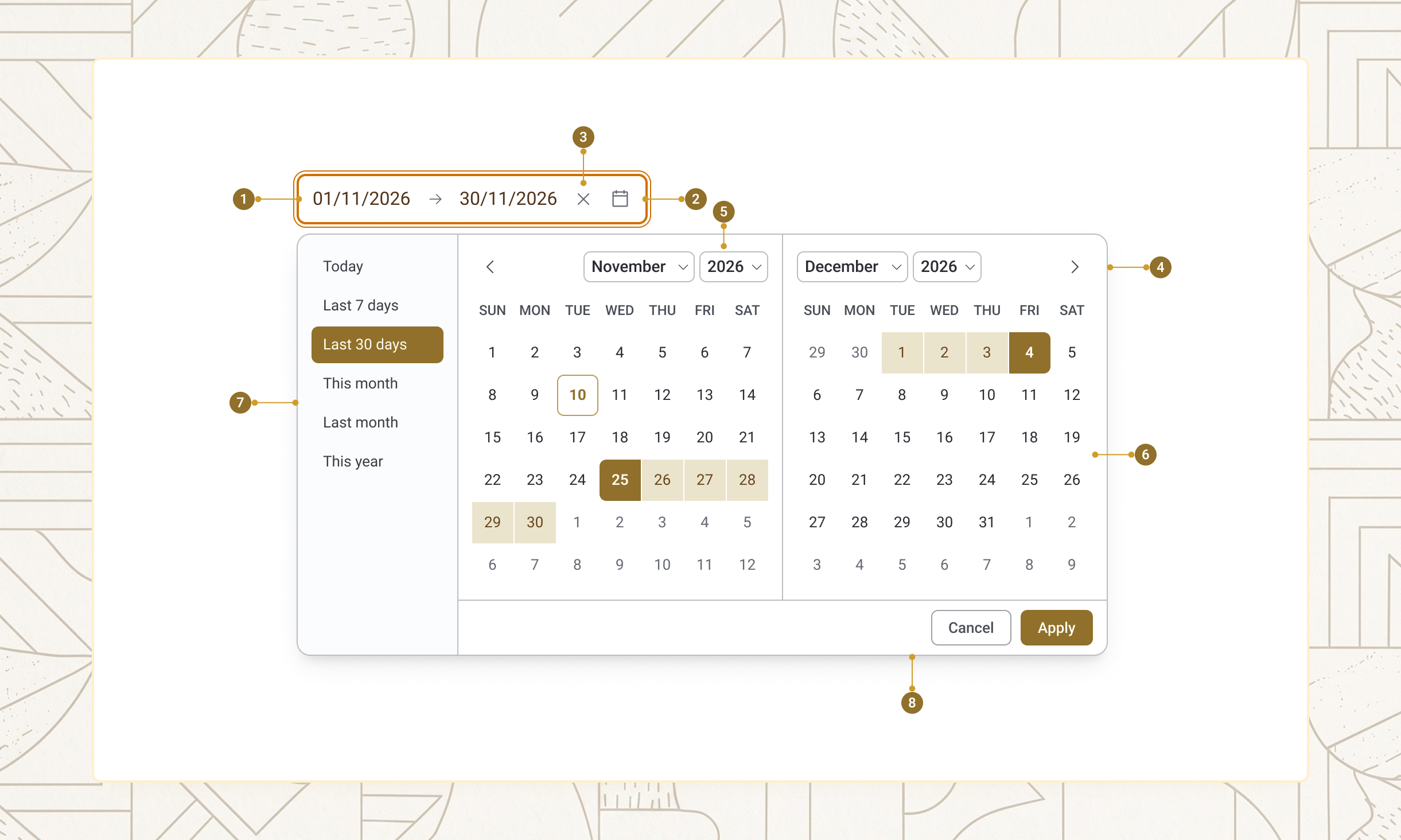
| Item | Name | Description |
|---|---|---|
1 |
Trigger input | Read-only text input(s) showing the formatted value |
2 |
Calendar icon | Decorative, aria-hidden |
3 |
Clear button | Shown once a value is set (is-clearable, default on) |
4 |
Calendar dialog | Portaled role="dialog", positioned relative to the trigger |
5 |
Header | Prev/next navigation plus month/year selects (or a static label) |
6 |
Day grid | role="grid" of selectable day buttons |
7 |
Presets sidebar (range only) | One-click range shortcuts, when presets is set |
8 |
Footer (optional) | Apply / Cancel buttons, when is-with-confirmation is set |
Single date
The default appearance="single" collects one date. Clicking a day commits the selection, fires aegovDatepickerChange, and closes the calendar.
<aegov-form-field>
  <aegov-label>Date of birth</aegov-label>
  <aegov-datepicker format="DD MMM YYYY" is-disable-future="true"></aegov-datepicker>
</aegov-form-field>import { AegovFormField, AegovLabel, AegovDatepicker } from '@aegov/designsystem-react';
export default function DatepickerSingle() {
return (
<AegovFormField>
<AegovLabel>Date of birth</AegovLabel>
<AegovDatepicker format="DD MMM YYYY" isDisableFuture />
</AegovFormField>
);
}<template>
<aegov-form-field>
<aegov-label>Date of birth</aegov-label>
<aegov-datepicker format="DD MMM YYYY" is-disable-future="true"></aegov-datepicker>
</aegov-form-field>
</template>import { Component } from '@angular/core';
import { AegovFormField, AegovLabel, AegovDatepicker } from '@aegov/designsystem-angular';
@Component({
selector: 'app-datepicker-single',
imports: [AegovFormField, AegovLabel, AegovDatepicker],
template: `
<aegov-form-field>
<aegov-label>Date of birth</aegov-label>
<aegov-datepicker format="DD MMM YYYY" [isDisableFuture]="true"></aegov-datepicker>
</aegov-form-field>
`,
})
export class DatepickerSingleComponent {}Date range
Set appearance="range" to render two trigger inputs — start and end — and a side-by-side two-month calendar. The first click marks the start, the second marks the end. Clicking a day before the existing start swaps the two automatically.
<aegov-form-field>
  <aegov-label>Stay dates</aegov-label>
  <aegov-datepicker appearance="range" label-range-start="Check-in" label-range-end="Check-out" format="DD MMM YYYY"></aegov-datepicker>
</aegov-form-field>import { AegovFormField, AegovLabel, AegovDatepicker } from '@aegov/designsystem-react';
export default function DatepickerRange() {
return (
<AegovFormField>
<AegovLabel>Stay dates</AegovLabel>
<AegovDatepicker
appearance="range"
labelRangeStart="Check-in"
labelRangeEnd="Check-out"
format="DD MMM YYYY"
/>
</AegovFormField>
);
}<template>
<aegov-form-field>
<aegov-label>Stay dates</aegov-label>
<aegov-datepicker appearance="range" label-range-start="Check-in" label-range-end="Check-out" format="DD MMM YYYY"></aegov-datepicker>
</aegov-form-field>
</template>import { Component } from '@angular/core';
import { AegovFormField, AegovLabel, AegovDatepicker } from '@aegov/designsystem-angular';
@Component({
selector: 'app-datepicker-range',
imports: [AegovFormField, AegovLabel, AegovDatepicker],
template: `
<aegov-form-field>
<aegov-label>Stay dates</aegov-label>
<aegov-datepicker appearance="range" label-range-start="Check-in" label-range-end="Check-out" format="DD MMM YYYY"></aegov-datepicker>
</aegov-form-field>
`,
})
export class DatepickerRangeComponent {}Output format
format controls how the selected date renders into the trigger and into the value string emitted with each change. The default is YYYY-MM-DD.
| Token | Output | Example |
|---|---|---|
YYYY |
4-digit year | 2026 |
YY |
2-digit year | 26 |
MMMM |
Full month name | September |
MMM |
Short month name | Sep |
MM |
2-digit month | 09 |
M |
Numeric month | 9 |
DD |
2-digit day | 08 |
D |
Numeric day | 8 |
ddd |
Full weekday | Tuesday |
dd |
Short weekday | Tue |
<aegov-form-field>
  <aegov-label>Date (DD MMM YYYY)</aegov-label>
  <aegov-datepicker format="DD MMM YYYY" placeholder="DD MMM YYYY"></aegov-datepicker>
</aegov-form-field>
<aegov-form-field>
  <aegov-label>Date (MMMM D, YYYY)</aegov-label>
  <aegov-datepicker format="MMMM D, YYYY" placeholder="MMMM D, YYYY"></aegov-datepicker>
</aegov-form-field>
<aegov-form-field>
  <aegov-label>Date (YYYY-MM-DD)</aegov-label>
  <aegov-datepicker format="YYYY-MM-DD" placeholder="YYYY-MM-DD"></aegov-datepicker>
</aegov-form-field>import { AegovFormField, AegovLabel, AegovDatepicker } from '@aegov/designsystem-react';
export default function DatepickerFormat() {
return (
<>
<AegovFormField>
<AegovLabel>Date (DD MMM YYYY)</AegovLabel>
<AegovDatepicker format="DD MMM YYYY" placeholder="DD MMM YYYY" />
</AegovFormField>
<AegovFormField>
<AegovLabel>Date (MMMM D, YYYY)</AegovLabel>
<AegovDatepicker format="MMMM D, YYYY" placeholder="MMMM D, YYYY" />
</AegovFormField>
<AegovFormField>
<AegovLabel>Date (YYYY-MM-DD)</AegovLabel>
<AegovDatepicker format="YYYY-MM-DD" placeholder="YYYY-MM-DD" />
</AegovFormField>
</>
);
}<template>
<aegov-form-field>
<aegov-label>Date (DD MMM YYYY)</aegov-label>
<aegov-datepicker format="DD MMM YYYY" placeholder="DD MMM YYYY"></aegov-datepicker>
</aegov-form-field>
<aegov-form-field>
<aegov-label>Date (MMMM D, YYYY)</aegov-label>
<aegov-datepicker format="MMMM D, YYYY" placeholder="MMMM D, YYYY"></aegov-datepicker>
</aegov-form-field>
<aegov-form-field>
<aegov-label>Date (YYYY-MM-DD)</aegov-label>
<aegov-datepicker format="YYYY-MM-DD" placeholder="YYYY-MM-DD"></aegov-datepicker>
</aegov-form-field>
</template>import { Component } from '@angular/core';
import { AegovFormField, AegovLabel, AegovDatepicker } from '@aegov/designsystem-angular';
@Component({
selector: 'app-datepicker-format',
imports: [AegovFormField, AegovLabel, AegovDatepicker],
template: `
<aegov-form-field>
<aegov-label>Date (DD MMM YYYY)</aegov-label>
<aegov-datepicker format="DD MMM YYYY" placeholder="DD MMM YYYY"></aegov-datepicker>
</aegov-form-field>
<aegov-form-field>
<aegov-label>Date (MMMM D, YYYY)</aegov-label>
<aegov-datepicker format="MMMM D, YYYY" placeholder="MMMM D, YYYY"></aegov-datepicker>
</aegov-form-field>
<aegov-form-field>
<aegov-label>Date (YYYY-MM-DD)</aegov-label>
<aegov-datepicker format="YYYY-MM-DD" placeholder="YYYY-MM-DD"></aegov-datepicker>
</aegov-form-field>
`,
})
export class DatepickerFormatComponent {}Minimum and maximum dates
min and max constrain the selectable range. Both accept an ISO date string or the literal today. is-disable-future="true" is a shorthand for max="today".
<aegov-form-field>
  <aegov-label>Emirates ID issue date</aegov-label>
  <aegov-datepicker is-disable-future="true" format="DD MMM YYYY"></aegov-datepicker>
</aegov-form-field>
<aegov-form-field>
  <aegov-label>Appointment date</aegov-label>
  <aegov-datepicker min="today" format="DD MMM YYYY"></aegov-datepicker>
</aegov-form-field>import { AegovFormField, AegovLabel, AegovDatepicker } from '@aegov/designsystem-react';
export default function DatepickerMinMax() {
return (
<>
<AegovFormField>
<AegovLabel>Emirates ID issue date</AegovLabel>
<AegovDatepicker isDisableFuture format="DD MMM YYYY" />
</AegovFormField>
<AegovFormField>
<AegovLabel>Appointment date</AegovLabel>
<AegovDatepicker min="today" format="DD MMM YYYY" />
</AegovFormField>
</>
);
}<template>
<aegov-form-field>
<aegov-label>Emirates ID issue date</aegov-label>
<aegov-datepicker is-disable-future="true" format="DD MMM YYYY"></aegov-datepicker>
</aegov-form-field>
<aegov-form-field>
<aegov-label>Appointment date</aegov-label>
<aegov-datepicker min="today" format="DD MMM YYYY"></aegov-datepicker>
</aegov-form-field>
</template>import { Component } from '@angular/core';
import { AegovFormField, AegovLabel, AegovDatepicker } from '@aegov/designsystem-angular';
@Component({
selector: 'app-datepicker-min-max',
imports: [AegovFormField, AegovLabel, AegovDatepicker],
template: `
<aegov-form-field>
<aegov-label>Emirates ID issue date</aegov-label>
<aegov-datepicker [isDisableFuture]="true" format="DD MMM YYYY"></aegov-datepicker>
</aegov-form-field>
<aegov-form-field>
<aegov-label>Appointment date</aegov-label>
<aegov-datepicker min="today" format="DD MMM YYYY"></aegov-datepicker>
</aegov-form-field>
`,
})
export class DatepickerMinMaxComponent {}Blackout dates
Pass a comma-separated list of ISO dates to blackout. Listed days are visually muted, marked aria-disabled, and cannot be picked — useful for closed days or fully booked slots. A value set from code that lands on a blackout date makes the field invalid (customError), with a message such as "15 Sep 2026 is not available. Choose another date" in the datepicker's UI language. blackout only accepts an explicit date list; it has no recurring-pattern syntax.
<aegov-form-field>
  <aegov-label>Service appointment date</aegov-label>
  <aegov-datepicker min="today" blackout="2026-09-15,2026-09-16,2026-09-22" format="DD MMM YYYY"></aegov-datepicker>
</aegov-form-field>import { AegovFormField, AegovLabel, AegovDatepicker } from '@aegov/designsystem-react';
export default function DatepickerBlackout() {
return (
<AegovFormField>
<AegovLabel>Service appointment date</AegovLabel>
<AegovDatepicker
min="today"
blackout="2026-09-15,2026-09-16,2026-09-22"
format="DD MMM YYYY"
/>
</AegovFormField>
);
}<template>
<aegov-form-field>
<aegov-label>Service appointment date</aegov-label>
<aegov-datepicker min="today" blackout="2026-09-15,2026-09-16,2026-09-22" format="DD MMM YYYY"></aegov-datepicker>
</aegov-form-field>
</template>import { Component } from '@angular/core';
import { AegovFormField, AegovLabel, AegovDatepicker } from '@aegov/designsystem-angular';
@Component({
selector: 'app-datepicker-blackout',
imports: [AegovFormField, AegovLabel, AegovDatepicker],
template: `
<aegov-form-field>
<aegov-label>Service appointment date</aegov-label>
<aegov-datepicker min="today" blackout="2026-09-15,2026-09-16,2026-09-22" format="DD MMM YYYY"></aegov-datepicker>
</aegov-form-field>
`,
})
export class DatepickerBlackoutComponent {}Range constraints
In range mode, min-range and max-range cap how many days the selection may span. While the user chooses the end date (mouse hover or keyboard focus), an out-of-limit preview turns red and a message such as "Range must be at least 3 days" shows under the months and is announced. A second click that would violate the limit is refused with the same message, and the start date stays. Pair this with a hint stating the allowed range up front.
<aegov-form-field>
  <aegov-label>Leave dates</aegov-label>
  <aegov-datepicker appearance="range" label-range-start="Leave start" label-range-end="Leave end" min-range="2" max-range="14" hint="Choose between 2 and 14 days" format="DD MMM YYYY"></aegov-datepicker>
</aegov-form-field>import { AegovFormField, AegovLabel, AegovDatepicker } from '@aegov/designsystem-react';
export default function DatepickerRangeConstraints() {
return (
<AegovFormField>
<AegovLabel>Leave dates</AegovLabel>
<AegovDatepicker
appearance="range"
labelRangeStart="Leave start"
labelRangeEnd="Leave end"
minRange={2}
maxRange={14}
hint="Choose between 2 and 14 days"
format="DD MMM YYYY"
/>
</AegovFormField>
);
}<template>
<aegov-form-field>
<aegov-label>Leave dates</aegov-label>
<aegov-datepicker appearance="range" label-range-start="Leave start" label-range-end="Leave end" min-range="2" max-range="14" hint="Choose between 2 and 14 days" format="DD MMM YYYY"></aegov-datepicker>
</aegov-form-field>
</template>import { Component } from '@angular/core';
import { AegovFormField, AegovLabel, AegovDatepicker } from '@aegov/designsystem-angular';
@Component({
selector: 'app-datepicker-range-constraints',
imports: [AegovFormField, AegovLabel, AegovDatepicker],
template: `
<aegov-form-field>
<aegov-label>Leave dates</aegov-label>
<aegov-datepicker appearance="range" label-range-start="Leave start" label-range-end="Leave end" min-range="2" max-range="14" hint="Choose between 2 and 14 days" format="DD MMM YYYY"></aegov-datepicker>
</aegov-form-field>
`,
})
export class DatepickerRangeConstraintsComponent {}Presets
In range mode, presets renders a sidebar of one-click range shortcuts. Pass a comma-separated list of preset ids. Supported ids: today, yesterday, tomorrow, thisWeek, lastWeek, nextWeek, last7Days, next7Days, last14Days, next14Days, last30Days, next30Days, thisMonth, lastMonth, nextMonth, last3Months, next3Months, last6Months, next6Months, thisQuarter, lastQuarter, nextQuarter, thisYear, lastYear, nextYear, yearToDate, allTime.
<aegov-form-field>
  <aegov-label>Report period</aegov-label>
  <aegov-datepicker appearance="range" presets="today,yesterday,last7Days,thisMonth,lastMonth" label-range-start="From" label-range-end="To" format="DD MMM YYYY"></aegov-datepicker>
</aegov-form-field>import { AegovFormField, AegovLabel, AegovDatepicker } from '@aegov/designsystem-react';
export default function DatepickerPresets() {
return (
<AegovFormField>
<AegovLabel>Report period</AegovLabel>
<AegovDatepicker
appearance="range"
presets="today,yesterday,last7Days,thisMonth,lastMonth"
labelRangeStart="From"
labelRangeEnd="To"
format="DD MMM YYYY"
/>
</AegovFormField>
);
}<template>
<aegov-form-field>
<aegov-label>Report period</aegov-label>
<aegov-datepicker appearance="range" presets="today,yesterday,last7Days,thisMonth,lastMonth" label-range-start="From" label-range-end="To" format="DD MMM YYYY"></aegov-datepicker>
</aegov-form-field>
</template>import { Component } from '@angular/core';
import { AegovFormField, AegovLabel, AegovDatepicker } from '@aegov/designsystem-angular';
@Component({
selector: 'app-datepicker-presets',
imports: [AegovFormField, AegovLabel, AegovDatepicker],
template: `
<aegov-form-field>
<aegov-label>Report period</aegov-label>
<aegov-datepicker appearance="range" presets="today,yesterday,last7Days,thisMonth,lastMonth" label-range-start="From" label-range-end="To" format="DD MMM YYYY"></aegov-datepicker>
</aegov-form-field>
`,
})
export class DatepickerPresetsComponent {}Apply / Cancel confirmation
Set is-with-confirmation="true" to render Apply and Cancel buttons in the calendar footer. While the calendar is open, clicks build a pending selection that only commits to the trigger on Apply. Cancel and outside clicks discard the pending state without firing a change event.
<aegov-form-field>
  <aegov-label>Booking dates</aegov-label>
  <aegov-datepicker appearance="range" is-with-confirmation="true" label-range-start="Start" label-range-end="End" format="DD MMM YYYY"></aegov-datepicker>
</aegov-form-field>import { AegovFormField, AegovLabel, AegovDatepicker } from '@aegov/designsystem-react';
export default function DatepickerConfirmation() {
return (
<AegovFormField>
<AegovLabel>Booking dates</AegovLabel>
<AegovDatepicker
appearance="range"
isWithConfirmation
labelRangeStart="Start"
labelRangeEnd="End"
format="DD MMM YYYY"
/>
</AegovFormField>
);
}<template>
<aegov-form-field>
<aegov-label>Booking dates</aegov-label>
<aegov-datepicker appearance="range" is-with-confirmation="true" label-range-start="Start" label-range-end="End" format="DD MMM YYYY"></aegov-datepicker>
</aegov-form-field>
</template>import { Component } from '@angular/core';
import { AegovFormField, AegovLabel, AegovDatepicker } from '@aegov/designsystem-angular';
@Component({
selector: 'app-datepicker-confirmation',
imports: [AegovFormField, AegovLabel, AegovDatepicker],
template: `
<aegov-form-field>
<aegov-label>Booking dates</aegov-label>
<aegov-datepicker appearance="range" [isWithConfirmation]="true" label-range-start="Start" label-range-end="End" format="DD MMM YYYY"></aegov-datepicker>
</aegov-form-field>
`,
})
export class DatepickerConfirmationComponent {}Week start day
start-day sets the first column of the calendar grid — 0 Sunday (default), 1 Monday, 6 Saturday. UAE working-week conventions typically use 1 or 6.
<aegov-form-field>
  <aegov-label>Week starts Monday</aegov-label>
  <aegov-datepicker start-day="1"></aegov-datepicker>
</aegov-form-field>
<aegov-form-field>
  <aegov-label>Week starts Saturday</aegov-label>
  <aegov-datepicker start-day="6"></aegov-datepicker>
</aegov-form-field>import { AegovFormField, AegovLabel, AegovDatepicker } from '@aegov/designsystem-react';
export default function DatepickerWeekStart() {
return (
<>
<AegovFormField>
<AegovLabel>Week starts Monday</AegovLabel>
<AegovDatepicker startDay={1} />
</AegovFormField>
<AegovFormField>
<AegovLabel>Week starts Saturday</AegovLabel>
<AegovDatepicker startDay={6} />
</AegovFormField>
</>
);
}<template>
<aegov-form-field>
<aegov-label>Week starts Monday</aegov-label>
<aegov-datepicker start-day="1"></aegov-datepicker>
</aegov-form-field>
<aegov-form-field>
<aegov-label>Week starts Saturday</aegov-label>
<aegov-datepicker start-day="6"></aegov-datepicker>
</aegov-form-field>
</template>import { Component } from '@angular/core';
import { AegovFormField, AegovLabel, AegovDatepicker } from '@aegov/designsystem-angular';
@Component({
selector: 'app-datepicker-week-start',
imports: [AegovFormField, AegovLabel, AegovDatepicker],
template: `
<aegov-form-field>
<aegov-label>Week starts Monday</aegov-label>
<aegov-datepicker start-day="1"></aegov-datepicker>
</aegov-form-field>
<aegov-form-field>
<aegov-label>Week starts Saturday</aegov-label>
<aegov-datepicker start-day="6"></aegov-datepicker>
</aegov-form-field>
`,
})
export class DatepickerWeekStartComponent {}Header style
is-header-selectable (default true) renders month and year dropdowns in the calendar header so the user can jump quickly. Set it false for a static month-year label with only chevron navigation. Pair with year-range-start / year-range-end to bound the year dropdown — useful for a date-of-birth field.
<aegov-form-field>
  <aegov-label>Date</aegov-label>
  <aegov-datepicker is-header-selectable="false"></aegov-datepicker>
</aegov-form-field>
<aegov-form-field>
  <aegov-label>Date of birth</aegov-label>
  <aegov-datepicker year-range-start="1925" year-range-end="2026" is-disable-future="true"></aegov-datepicker>
</aegov-form-field>import { AegovFormField, AegovLabel, AegovDatepicker } from '@aegov/designsystem-react';
export default function DatepickerHeaderStyle() {
return (
<>
<AegovFormField>
<AegovLabel>Date</AegovLabel>
<AegovDatepicker isHeaderSelectable={false} />
</AegovFormField>
<AegovFormField>
<AegovLabel>Date of birth</AegovLabel>
<AegovDatepicker
yearRangeStart={1925}
yearRangeEnd={2026}
isDisableFuture
/>
</AegovFormField>
</>
);
}<template>
<aegov-form-field>
<aegov-label>Date</aegov-label>
<aegov-datepicker is-header-selectable="false"></aegov-datepicker>
</aegov-form-field>
<aegov-form-field>
<aegov-label>Date of birth</aegov-label>
<aegov-datepicker year-range-start="1925" year-range-end="2026" is-disable-future="true"></aegov-datepicker>
</aegov-form-field>
</template>import { Component } from '@angular/core';
import { AegovFormField, AegovLabel, AegovDatepicker } from '@aegov/designsystem-angular';
@Component({
selector: 'app-datepicker-header-style',
imports: [AegovFormField, AegovLabel, AegovDatepicker],
template: `
<aegov-form-field>
<aegov-label>Date</aegov-label>
<aegov-datepicker [isHeaderSelectable]="false"></aegov-datepicker>
</aegov-form-field>
<aegov-form-field>
<aegov-label>Date of birth</aegov-label>
<aegov-datepicker year-range-start="1925" year-range-end="2026" [isDisableFuture]="true"></aegov-datepicker>
</aegov-form-field>
`,
})
export class DatepickerHeaderStyleComponent {}Disabled and required
Set is-disabled="true" to lock the trigger and prevent the calendar from opening. Set is-required="true" to mark the field required and forward required to the inner input.
<aegov-form-field>
  <aegov-label>Application date</aegov-label>
  <aegov-datepicker is-required="true"></aegov-datepicker>
</aegov-form-field>
<aegov-form-field>
  <aegov-label>Submitted on</aegov-label>
  <aegov-datepicker is-disabled="true" value="2026-05-01" format="DD MMM YYYY"></aegov-datepicker>
</aegov-form-field>import { AegovFormField, AegovLabel, AegovDatepicker } from '@aegov/designsystem-react';
export default function DatepickerDisabledRequired() {
return (
<>
<AegovFormField>
<AegovLabel>Application date</AegovLabel>
<AegovDatepicker isRequired />
</AegovFormField>
<AegovFormField>
<AegovLabel>Submitted on</AegovLabel>
<AegovDatepicker isDisabled value="2026-05-01" format="DD MMM YYYY" />
</AegovFormField>
</>
);
}<template>
<aegov-form-field>
<aegov-label>Application date</aegov-label>
<aegov-datepicker is-required="true"></aegov-datepicker>
</aegov-form-field>
<aegov-form-field>
<aegov-label>Submitted on</aegov-label>
<aegov-datepicker is-disabled="true" value="2026-05-01" format="DD MMM YYYY"></aegov-datepicker>
</aegov-form-field>
</template>import { Component } from '@angular/core';
import { AegovFormField, AegovLabel, AegovDatepicker } from '@aegov/designsystem-angular';
@Component({
selector: 'app-datepicker-disabled-required',
imports: [AegovFormField, AegovLabel, AegovDatepicker],
template: `
<aegov-form-field>
<aegov-label>Application date</aegov-label>
<aegov-datepicker [isRequired]="true"></aegov-datepicker>
</aegov-form-field>
<aegov-form-field>
<aegov-label>Submitted on</aegov-label>
<aegov-datepicker [isDisabled]="true" value="2026-05-01" format="DD MMM YYYY"></aegov-datepicker>
</aegov-form-field>
`,
})
export class DatepickerDisabledRequiredComponent {}Sizes
size scales the trigger input — xs, sm, base (default), lg, xl. Accepts a responsive breakpoint string, the same convention used by aegov-input.
<aegov-form-field>
  <aegov-label>Extra small (xs)</aegov-label>
  <aegov-datepicker size="xs"></aegov-datepicker>
</aegov-form-field>
<aegov-form-field>
  <aegov-label>Small (sm)</aegov-label>
  <aegov-datepicker size="sm"></aegov-datepicker>
</aegov-form-field>
<aegov-form-field>
  <aegov-label>Base (default)</aegov-label>
  <aegov-datepicker size="base"></aegov-datepicker>
</aegov-form-field>
<aegov-form-field>
  <aegov-label>Large (lg)</aegov-label>
  <aegov-datepicker size="lg"></aegov-datepicker>
</aegov-form-field>
<aegov-form-field>
  <aegov-label>Extra large (xl)</aegov-label>
  <aegov-datepicker size="xl"></aegov-datepicker>
</aegov-form-field>import { AegovFormField, AegovLabel, AegovDatepicker } from '@aegov/designsystem-react';
export default function DatepickerSizes() {
return (
<>
<AegovFormField>
<AegovLabel>Extra small (xs)</AegovLabel>
<AegovDatepicker size="xs" />
</AegovFormField>
<AegovFormField>
<AegovLabel>Small (sm)</AegovLabel>
<AegovDatepicker size="sm" />
</AegovFormField>
<AegovFormField>
<AegovLabel>Base (default)</AegovLabel>
<AegovDatepicker size="base" />
</AegovFormField>
<AegovFormField>
<AegovLabel>Large (lg)</AegovLabel>
<AegovDatepicker size="lg" />
</AegovFormField>
<AegovFormField>
<AegovLabel>Extra large (xl)</AegovLabel>
<AegovDatepicker size="xl" />
</AegovFormField>
</>
);
}<template>
<aegov-form-field>
<aegov-label>Extra small (xs)</aegov-label>
<aegov-datepicker size="xs"></aegov-datepicker>
</aegov-form-field>
<aegov-form-field>
<aegov-label>Small (sm)</aegov-label>
<aegov-datepicker size="sm"></aegov-datepicker>
</aegov-form-field>
<aegov-form-field>
<aegov-label>Base (default)</aegov-label>
<aegov-datepicker size="base"></aegov-datepicker>
</aegov-form-field>
<aegov-form-field>
<aegov-label>Large (lg)</aegov-label>
<aegov-datepicker size="lg"></aegov-datepicker>
</aegov-form-field>
<aegov-form-field>
<aegov-label>Extra large (xl)</aegov-label>
<aegov-datepicker size="xl"></aegov-datepicker>
</aegov-form-field>
</template>import { Component } from '@angular/core';
import { AegovFormField, AegovLabel, AegovDatepicker } from '@aegov/designsystem-angular';
@Component({
selector: 'app-datepicker-sizes',
imports: [AegovFormField, AegovLabel, AegovDatepicker],
template: `
<aegov-form-field>
<aegov-label>Extra small (xs)</aegov-label>
<aegov-datepicker size="xs"></aegov-datepicker>
</aegov-form-field>
<aegov-form-field>
<aegov-label>Small (sm)</aegov-label>
<aegov-datepicker size="sm"></aegov-datepicker>
</aegov-form-field>
<aegov-form-field>
<aegov-label>Base (default)</aegov-label>
<aegov-datepicker size="base"></aegov-datepicker>
</aegov-form-field>
<aegov-form-field>
<aegov-label>Large (lg)</aegov-label>
<aegov-datepicker size="lg"></aegov-datepicker>
</aegov-form-field>
<aegov-form-field>
<aegov-label>Extra large (xl)</aegov-label>
<aegov-datepicker size="xl"></aegov-datepicker>
</aegov-form-field>
`,
})
export class DatepickerSizesComponent {}Variant
variant selects the colour family for the trigger's idle border, the selected day fill, the today indicator, and the hover background. The focus ring uses the variant's own support colour (primary-support-500 / secondary-support-500 / seablue-500 for both neutral variants, one step lighter in dark mode); the error border stays aered-600 regardless of variant.
| Variant | Idle border | Selected day fill | Today text | Hover background |
|---|---|---|---|---|
primary |
primary-600 |
primary-600 |
primary-600 |
primary-100 |
secondary |
secondary-600 |
secondary-600 |
secondary-700 |
secondary-100 |
neutral-max |
aeblack-800 |
aeblack-800 |
aeblack-800 |
aeblack-100 |
neutral-min |
aeblack-400 |
aeblack-800 |
aeblack-800 |
aeblack-50 |
neutral-min keeps the trigger's idle border quiet (aeblack-400) but the selected-day fill deliberately stays dark (aeblack-800) rather than using its own light token, so the calendar's checked state remains legible even for the lightest variant.
Variant example
<aegov-form-field>
  <aegov-label>Primary</aegov-label>
  <aegov-datepicker variant="primary"></aegov-datepicker>
</aegov-form-field>
<aegov-form-field>
  <aegov-label>Secondary</aegov-label>
  <aegov-datepicker variant="secondary"></aegov-datepicker>
</aegov-form-field>
<aegov-form-field>
  <aegov-label>Neutral-max</aegov-label>
  <aegov-datepicker variant="neutral-max"></aegov-datepicker>
</aegov-form-field>
<aegov-form-field>
  <aegov-label>Neutral-min</aegov-label>
  <aegov-datepicker variant="neutral-min"></aegov-datepicker>
</aegov-form-field>import { AegovFormField, AegovLabel, AegovDatepicker } from '@aegov/designsystem-react';
export default function DatepickerVariants() {
return (
<>
<AegovFormField>
<AegovLabel>Primary</AegovLabel>
<AegovDatepicker variant="primary" />
</AegovFormField>
<AegovFormField>
<AegovLabel>Secondary</AegovLabel>
<AegovDatepicker variant="secondary" />
</AegovFormField>
<AegovFormField>
<AegovLabel>Neutral-max</AegovLabel>
<AegovDatepicker variant="neutral-max" />
</AegovFormField>
<AegovFormField>
<AegovLabel>Neutral-min</AegovLabel>
<AegovDatepicker variant="neutral-min" />
</AegovFormField>
</>
);
}<template>
<aegov-form-field>
<aegov-label>Primary</aegov-label>
<aegov-datepicker variant="primary"></aegov-datepicker>
</aegov-form-field>
<aegov-form-field>
<aegov-label>Secondary</aegov-label>
<aegov-datepicker variant="secondary"></aegov-datepicker>
</aegov-form-field>
<aegov-form-field>
<aegov-label>Neutral-max</aegov-label>
<aegov-datepicker variant="neutral-max"></aegov-datepicker>
</aegov-form-field>
<aegov-form-field>
<aegov-label>Neutral-min</aegov-label>
<aegov-datepicker variant="neutral-min"></aegov-datepicker>
</aegov-form-field>
</template>import { Component } from '@angular/core';
import { AegovFormField, AegovLabel, AegovDatepicker } from '@aegov/designsystem-angular';
@Component({
selector: 'app-datepicker-variants',
imports: [AegovFormField, AegovLabel, AegovDatepicker],
template: `
<aegov-form-field>
<aegov-label>Primary</aegov-label>
<aegov-datepicker variant="primary"></aegov-datepicker>
</aegov-form-field>
<aegov-form-field>
<aegov-label>Secondary</aegov-label>
<aegov-datepicker variant="secondary"></aegov-datepicker>
</aegov-form-field>
<aegov-form-field>
<aegov-label>Neutral-max</aegov-label>
<aegov-datepicker variant="neutral-max"></aegov-datepicker>
</aegov-form-field>
<aegov-form-field>
<aegov-label>Neutral-min</aegov-label>
<aegov-datepicker variant="neutral-min"></aegov-datepicker>
</aegov-form-field>
`,
})
export class DatepickerVariantsComponent {}Custom trigger
The trigger slot replaces the default input with any focusable element — useful for an icon-only button or another custom launcher. The component still owns open/close state and positioning; the slotted element only needs to be focusable.
<aegov-datepicker>
  <aegov-button slot="trigger" appearance="outline">Pick a date</aegov-button>
</aegov-datepicker>import { AegovDatepicker, AegovButton } from '@aegov/designsystem-react';
export default function DatepickerCustomTrigger() {
return (
<AegovDatepicker>
<AegovButton slot="trigger" appearance="outline">
Pick a date
</AegovButton>
</AegovDatepicker>
);
}<template>
<aegov-datepicker>
<aegov-button slot="trigger" appearance="outline">Pick a date</aegov-button>
</aegov-datepicker>
</template>import { Component } from '@angular/core';
import { AegovDatepicker, AegovButton } from '@aegov/designsystem-angular';
@Component({
selector: 'app-datepicker-custom-trigger',
imports: [AegovDatepicker, AegovButton],
template: `
<aegov-datepicker>
<aegov-button slot="trigger" appearance="outline">Pick a date</aegov-button>
</aegov-datepicker>
`,
})
export class DatepickerCustomTriggerComponent {}RTL support
When the host (or an ancestor) is dir="rtl", the portaled calendar mirrors its layout: the second calendar in range mode swaps sides, the presets sidebar moves to the opposite edge, and the prev/next chevron icons swap so they still point in the reading direction. Without locale, month and weekday names and the datepicker's own text follow the page language — the nearest lang, or dir="rtl" when no lang is set — so an Arabic page gets Arabic text throughout; locale="ar" forces it. Left/Right arrow keys follow the visual direction, and the calendar portal carries the same dir and lang. Add start-day="6" to match the UAE week convention.
<div dir="rtl" lang="ar">
  <aegov-form-field>
    <aegov-label>فترة التقرير</aegov-label>
    <aegov-datepicker appearance="range" locale="ar" start-day="6" presets="today,last7Days,thisMonth,lastMonth" label-range-start="من" label-range-end="إلى" format="D MMMM YYYY"></aegov-datepicker>
  </aegov-form-field>
</div>import { AegovFormField, AegovLabel, AegovDatepicker } from '@aegov/designsystem-react';
export default function RtlDatepicker() {
return (
<div dir="rtl" lang="ar">
<AegovFormField>
<AegovLabel>فترة التقرير</AegovLabel>
<AegovDatepicker
appearance="range"
locale="ar"
startDay={6}
presets="today,last7Days,thisMonth,lastMonth"
labelRangeStart="من"
labelRangeEnd="إلى"
format="D MMMM YYYY"
/>
</AegovFormField>
</div>
);
}<template>
<div dir="rtl" lang="ar">
<aegov-form-field>
<aegov-label>فترة التقرير</aegov-label>
<aegov-datepicker appearance="range" locale="ar" start-day="6" presets="today,last7Days,thisMonth,lastMonth" label-range-start="من" label-range-end="إلى" format="D MMMM YYYY"></aegov-datepicker>
</aegov-form-field>
</div>
</template>import { Component } from '@angular/core';
import { AegovFormField, AegovLabel, AegovDatepicker } from '@aegov/designsystem-angular';
@Component({
selector: 'app-rtl-datepicker',
imports: [AegovFormField, AegovLabel, AegovDatepicker],
template: `
<div dir="rtl" lang="ar">
<aegov-form-field>
<aegov-label>فترة التقرير</aegov-label>
<aegov-datepicker appearance="range" locale="ar" start-day="6" presets="today,last7Days,thisMonth,lastMonth" label-range-start="من" label-range-end="إلى" format="D MMMM YYYY"></aegov-datepicker>
</aegov-form-field>
</div>
`,
})
export class RtlDatepickerComponent {}Usage
Here is the recommended usage of a datepicker on any website or application. These are recommended usage guides, however the developer must use the best practices of web and application development to accurately use this component.
Use is-disable-future for backward-looking fields
For a date of birth, document issue date, or "date this happened" field, is-disable-future="true" reads clearer than a manually computed max="today", and it never drifts out of date.
Always give the field a visible label
Placeholder text and label-range-start / label-range-end disappear visually once a value is filled in. Wrap every datepicker in aegov-form-field with an aegov-label, as in the examples on this page, rather than relying on the placeholder.
Match start-day and locale together for Arabic contexts
Pair locale="ar" with start-day="6" (Saturday) so the calendar's week layout matches the UAE convention users already expect, rather than leaving the default Sunday start.
Offer presets for reporting or analytics ranges
When a range field maps to a common reporting period ("Last 30 days", "This quarter"), configure presets so the user can pick it in one click instead of two manual day-clicks.
Do not expect blackout to express recurring rules
blackout is a literal comma-separated list of exact dates — it has no concept of "every weekend" or "every Friday". Enumerate every excluded date individually.
Do not leave range limits for users to discover by failing
A second click that would violate min-range / max-range is refused with a message under the months — but users only see it after trying. Set a clear hint describing the allowed range up front.
API reference
The following are the properties and references of a datepicker
aegov-datepicker properties
| Property | Attribute | Description | Type | Default |
|---|---|---|---|---|
|
| Selection mode — single date or date range. |
|
|
|
| Pre-selected value. Single: "YYYY-MM-DD". Range: "YYYY-MM-DD / YYYY-MM-DD". |
|
|
|
| Output and display format built from calendar tokens (see Output format). |
|
|
|
| Placeholder for the single-mode input. Empty defaults to "Select date" in the UI language (see |
|
|
|
| Placeholder for the range-mode start input. Empty defaults to "Start date" in the UI language (see |
|
|
|
| Placeholder for the range-mode end input. Empty defaults to "End date" in the UI language (see |
|
|
|
| Minimum selectable date — an ISO date string, or the literal |
|
|
|
| Maximum selectable date — an ISO date string, or the literal |
|
|
|
| Shorthand for |
|
|
|
| First weekday column of the calendar grid. |
|
|
|
| BCP 47 locale for month and weekday names and formatted dates (e.g. |
|
|
|
| Minimum number of days a range selection must span. |
|
|
|
| Maximum number of days a range selection may span. |
|
|
|
| Comma-separated list of exact ISO dates that cannot be selected. A value set from code that falls on one is invalid ( |
|
|
|
| Comma-separated preset ids rendered as a sidebar of range shortcuts (range mode only — see Presets). |
|
|
|
| Disables the trigger and prevents the calendar from opening. |
|
|
|
| Marks the field as required for form validation and forwards |
|
|
|
| Shows a clear button once a value is set. |
|
|
|
| Renders month / year select dropdowns in the calendar header. Set |
|
|
|
| First year in the year dropdown. Used only when |
|
|
|
| Last year in the year dropdown. Used only when |
|
|
|
| Renders Apply / Cancel buttons in the calendar footer; the selection only commits on Apply. |
|
|
|
| Trigger size token. Accepts a single token or a responsive breakpoint string. |
|
|
|
| Colour family for the trigger border, selected day fill, today indicator, and hover background. The focus ring follows the variant's support colour; the error border stays red regardless of variant (see Variant). |
|
|
|
| Unique field ID. Auto-generated if omitted; used to derive hint/error ids. |
| generated |
|
| Form field name for |
| undefined |
|
| Visual and accessible invalid state. |
|
|
|
| Inline error message. Use the |
|
|
|
| Helper hint shown below the trigger. It stays visible while an error shows — the error renders above it and both are announced as the description. Use the |
|
|
Slots
| Slot | Description |
|---|---|
| Replaces the default input with any focusable element (e.g. an icon button). The component still owns open/close state and positioning, and sets |
| Rich markup for the hint, in place of the plain-text |
| Rich markup for the error message, in place of the plain-text |
Events
| Event | Detail | Fires when |
|---|---|---|
|
| The value commits — single click in single mode, second click (or Apply) in range mode, a preset click, or |
|
| The calendar opens. |
|
| The calendar closes, for any reason (selection, Cancel, outside click, Escape). |
|
| The clear button is clicked, or |
|
| The visible month or year changes through the Previous/Next buttons or the month/year selects. Not fired when keyboard focus moves into another month, or when a preset is chosen. |
|
| The user picks or clears a value (trigger |
Methods
| Method | Returns | Description |
|---|---|---|
|
| Opens the calendar. No-op while |
|
| Closes the calendar. |
|
| Clears the value and emits |
|
| Resolves the current formatted value string. |
|
| Range mode only — formatted start date, or |
|
| Range mode only — formatted end date, or |
|
| Range mode only — the preset id matching the current selection, or |
|
| Imperatively re-runs validation and returns the full validity state. |
|
| Sets a custom error message; an empty string clears it. |
Pass-through attributes
| Attribute | Notes | Forwards to |
|---|---|---|
| Forwarded automatically to the inner input(s). | inner |
| Forwarded automatically — useful for analytics hooks and test selectors. | inner |
| Forwarded as-is to the inner input(s). | inner |
| Forwarded as-is to the inner input(s), including the bare boolean-attribute shorthand ( | inner |
| Applied to the host element — stays host-only, never forwarded inward. | host |
Notes
The following notes are applicable of this component.
Built-in accessibility
- The trigger has
role="combobox",aria-haspopup="dialog",aria-expanded, andaria-controls(pointing at the dialog when open), so screen readers announce the calendar relationship. - The portal calendar renders as
role="dialog"witharia-modal="true", labelled viaaria-labelledbypointing at a visually-hidden element showing the current month and year — it updates as the user navigates months. - A polite
aria-liveregion inside the portal announces month changes and range-limit messages (the focused day itself is read from its button, so it is not repeated). A second live region on the host (outside the portal) announces the final confirmed selection after the calendar closes, so the announcement survives the portal being torn down. - The calendar grid has
role="grid"; each day is arole="gridcell"containing a button with a full-datearia-label(e.g. "Tuesday, September 8, 2026"). Unavailable dates append ", unavailable" to their label. - Day buttons expose
aria-selectedon their gridcell,aria-current="date"for today, andaria-disabledfor blackout / out-of-range dates. Unavailable days stay focusable (no nativedisabled), so arrow-key navigation never strands focus, but they cannot be chosen. - Navigation chevron icons are
aria-hidden="true"— the prev/next buttons carry their own bilingualaria-label("Previous month, May 2026" style), not the icon. - Preset buttons expose
aria-pressedto reflect whether they match the current selection. The presets sidebar hasrole="group"with its ownaria-label. - Focus moves into the calendar on open (the selected day, the range start, or today) and returns on close to the element that was focused before opening (else the field), using roving
tabindexwithin the grid so only one day is ever in the tab order at a time. - The trigger's inner input is
readOnly— users cannot type free-form text and produce an invalid date; every selection happens through the dialog. - The calendar closes automatically if its trigger scrolls out of the viewport, and re-positions on every scroll and resize.
Developer responsibilities
- Always give the datepicker a visible label: put it in
aegov-form-fieldwith anaegov-label. The label becomes the field's accessible name (in range mode it is combined withlabel-range-start/label-range-end, e.g. "Leave dates, Leave start"). Aplaceholderor the range labels alone are not enough: they are hidden once a date is chosen, so the field's purpose is no longer visible (WCAG 3.3.2). Usearia-labelon the host only when a visible label is truly not possible, such as a custom icon trigger. blackoutonly accepts an explicit, literal list of ISO dates — there is no recurring-exclusion syntax (no "every weekend", no "every Friday"). A recurring closure schedule must be enumerated into individual dates by your own code before being passed in.- In range mode, a second click that would violate
min-range/max-rangeis refused: the start date stays, and a message such as "Range must be at least 3 days" shows under the months and is announced. State the allowed range inhintas well, so users know it before they open the calendar. - If you supply a custom trigger via the
triggerslot, make sure it is itself a focusable, named element — the component does not add tab-stop behaviour to arbitrary slotted content.is-disabledstops clicks but not Enter / Space on a focusable custom trigger, so disable the trigger element as well. - In Arabic contexts, set
dir="rtl"(andlang="ar") on the host or an ancestor for the right-to-left layout — the built-in text, month and day names then follow the page language withoutlocale; setlocale="ar"only to force Arabic regardless of the page (localedoes not change direction). Setstart-day="6"to match the UAE week convention.
Keyboard support
| Key | Function |
|---|---|
Enter, Space |
Opens the calendar from the trigger; picks the focused day inside the calendar. |
Arrow Left / Right |
Moves the focused day by one column (mirrors direction in RTL). |
Arrow Up / Down |
Moves the focused day by one week. |
Page Up / Down |
Moves the focused day by one month. |
Shift + Page Up / Down |
Moves the focused day by one year. |
Home / End |
Moves to the first / last day of the current week. |
Escape |
Closes the calendar without committing (discards pending state in confirmation mode). |
Tab |
Cycles only through the calendar's own focusable elements while open (a focus trap). |