
Options
The ratio property accepts either a small set of named presets, or any custom n/m ratio string.

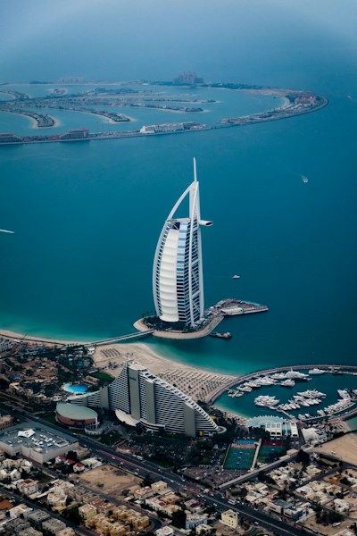

Named presets
Only three strings are truly special-cased in the component: auto lets the slotted content size itself naturally (left→right: square, video, auto shown here); square enforces a 1:1 box; video enforces 16:9. Every other ratio — including common ones like 4/3 or 21/9 — is not a separately-recognised preset, it is just a custom n/m string handled by the same general rule below.


Custom ratios
Any n/m string is valid — useful for ultrawide hero banners (21/9, right) or traditional photo formats (4/3, left). The component validates the format with a regular expression and falls back to auto if the string is malformed.
Fit modes
The fit property controls how slotted media is sized inside the container — it maps directly to CSS object-fit. Use cover (default) for imagery that should fill the box and crop as needed. Use contain when the whole image must stay visible, such as a logo or diagram, accepting letterboxing if the source ratio differs.
fit="cover" (default)
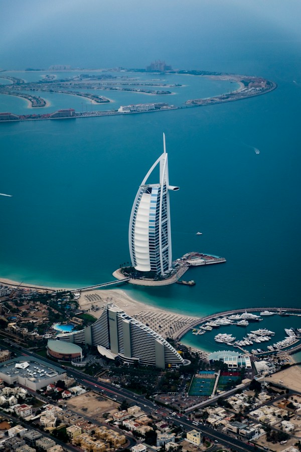
fit="contain"
<aegov-aspect-ratio ratio="square" fit="cover">
  <img src="https://images.unsplash.com/photo-1518684079-3c830dcef090?w=600" alt="Abu Dhabi skyline" />
</aegov-aspect-ratio>

<aegov-aspect-ratio ratio="square" fit="contain">
  <img src="https://images.unsplash.com/photo-1518684079-3c830dcef090?w=600" alt="Abu Dhabi skyline" />
</aegov-aspect-ratio>import { AegovAspectRatio } from '@aegov/designsystem-react';
export default function FitModes() {
return (
<>
<AegovAspectRatio ratio="square" fit="cover">
<img src="https://images.unsplash.com/photo-1518684079-3c830dcef090?w=600" alt="Abu Dhabi skyline" />
</AegovAspectRatio>
<AegovAspectRatio ratio="square" fit="contain">
<img src="https://images.unsplash.com/photo-1518684079-3c830dcef090?w=600" alt="Abu Dhabi skyline" />
</AegovAspectRatio>
</>
);
}<template>
<aegov-aspect-ratio ratio="square" fit="cover">
<img src="https://images.unsplash.com/photo-1518684079-3c830dcef090?w=600" alt="Abu Dhabi skyline" />
</aegov-aspect-ratio>
<aegov-aspect-ratio ratio="square" fit="contain">
<img src="https://images.unsplash.com/photo-1518684079-3c830dcef090?w=600" alt="Abu Dhabi skyline" />
</aegov-aspect-ratio>
</template>import { Component } from '@angular/core';
import { AegovAspectRatio } from '@aegov/designsystem-angular';
@Component({
selector: 'app-fit-modes',
imports: [AegovAspectRatio],
template: `
<aegov-aspect-ratio ratio="square" fit="cover">
<img src="https://images.unsplash.com/photo-1518684079-3c830dcef090?w=600" alt="Abu Dhabi skyline" />
</aegov-aspect-ratio>
<aegov-aspect-ratio ratio="square" fit="contain">
<img src="https://images.unsplash.com/photo-1518684079-3c830dcef090?w=600" alt="Abu Dhabi skyline" />
</aegov-aspect-ratio>
`,
})
export class FitModesComponent {}Embedded video and iframes
aegov-aspect-ratio is the recommended way to embed responsive video players and map iframes — it guarantees the embed fills its container at the chosen ratio without a legacy padding-bottom hack. Always set a title on the iframe; the component warns in the console if one is missing.
<aegov-aspect-ratio ratio="video">
  <iframe
    src="https://www.youtube.com/embed/dQw4w9WgXcQ"
    title="Sample embedded video"
    allowfullscreen></iframe>
</aegov-aspect-ratio>import { AegovAspectRatio } from '@aegov/designsystem-react';
export default function EmbeddedVideo() {
return (
<AegovAspectRatio ratio="video">
<iframe
src="https://www.youtube.com/embed/dQw4w9WgXcQ"
title="Sample embedded video"
allowFullScreen
/>
</AegovAspectRatio>
);
}<template>
<aegov-aspect-ratio ratio="video">
<iframe
src="https://www.youtube.com/embed/dQw4w9WgXcQ"
title="Sample embedded video"
allowfullscreen
></iframe>
</aegov-aspect-ratio>
</template>import { Component } from '@angular/core';
import { AegovAspectRatio } from '@aegov/designsystem-angular';
@Component({
selector: 'app-embedded-video',
imports: [AegovAspectRatio],
template: `
<aegov-aspect-ratio ratio="video">
<iframe
src="https://www.youtube.com/embed/dQw4w9WgXcQ"
title="Sample embedded video"
allowfullscreen
></iframe>
</aegov-aspect-ratio>
`,
})
export class EmbeddedVideoComponent {}Responsive ratio
ratio accepts a Tailwind-style responsive string with breakpoint prefixes (xs, sm, md, lg, xl, 2xl). Each segment overrides smaller breakpoints — the example below is square on phones, video from md up, and 21/9 from xl up. Resize the browser to see it adapt.
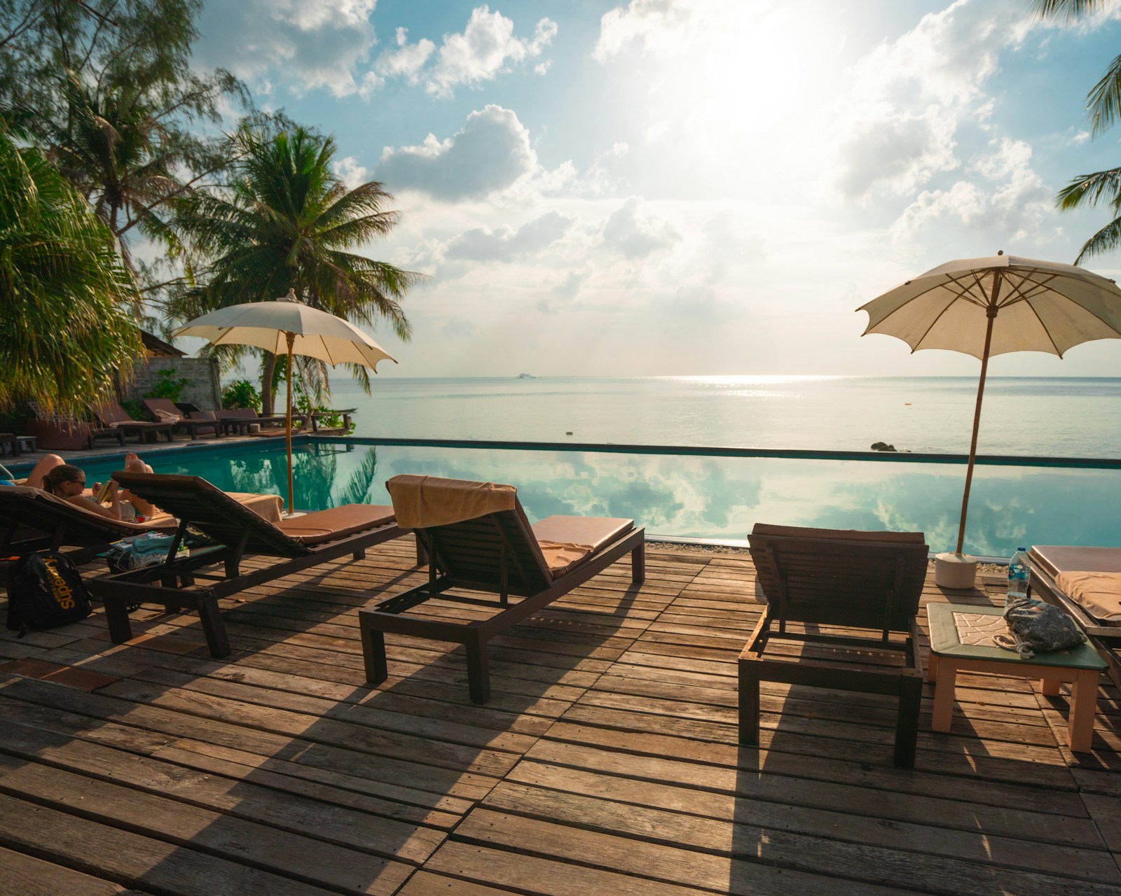
<aegov-aspect-ratio ratio="square md:video xl:21/9">
  <img
    src="https://images.unsplash.com/photo-1582719508461-905c673771fd?w=1600"
    alt="Panoramic view of the Burj Khalifa at night" />
</aegov-aspect-ratio>import { AegovAspectRatio } from '@aegov/designsystem-react';
export default function ResponsiveRatio() {
return (
<AegovAspectRatio ratio="square md:video xl:21/9">
<img
src="https://images.unsplash.com/photo-1582719508461-905c673771fd?w=1600"
alt="Panoramic view of the Burj Khalifa at night"
/>
</AegovAspectRatio>
);
}<template>
<aegov-aspect-ratio ratio="square md:video xl:21/9">
<img
src="https://images.unsplash.com/photo-1582719508461-905c673771fd?w=1600"
alt="Panoramic view of the Burj Khalifa at night"
/>
</aegov-aspect-ratio>
</template>import { Component } from '@angular/core';
import { AegovAspectRatio } from '@aegov/designsystem-angular';
@Component({
selector: 'app-responsive-ratio',
imports: [AegovAspectRatio],
template: `
<aegov-aspect-ratio ratio="square md:video xl:21/9">
<img
src="https://images.unsplash.com/photo-1582719508461-905c673771fd?w=1600"
alt="Panoramic view of the Burj Khalifa at night"
/>
</aegov-aspect-ratio>
`,
})
export class ResponsiveRatioComponent {}Avatar tile
Combine ratio="square" with extra-class for rounded corners to produce square staff-photo tiles for a directory or team listing.




<aegov-aspect-ratio ratio="square" extra-class="rounded-lg">
  <img src="https://randomuser.me/api/portraits/men/32.jpg" alt="Staff portrait" />
</aegov-aspect-ratio>import { AegovAspectRatio } from '@aegov/designsystem-react';
export default function AvatarTile() {
return (
<AegovAspectRatio ratio="square" extraClass="rounded-lg">
<img src="https://randomuser.me/api/portraits/men/32.jpg" alt="Staff portrait" />
</AegovAspectRatio>
);
}<template>
<aegov-aspect-ratio ratio="square" extra-class="rounded-lg">
<img src="https://randomuser.me/api/portraits/men/32.jpg" alt="Staff portrait" />
</aegov-aspect-ratio>
</template>import { Component } from '@angular/core';
import { AegovAspectRatio } from '@aegov/designsystem-angular';
@Component({
selector: 'app-avatar-tile',
imports: [AegovAspectRatio],
template: `
<aegov-aspect-ratio ratio="square" extraClass="rounded-lg">
<img src="https://randomuser.me/api/portraits/men/32.jpg" alt="Staff portrait" />
</aegov-aspect-ratio>
`,
})
export class AvatarTileComponent {}RTL support
Aspect ratio is a purely geometric wrapper — it has no directional layout, padding, or margin of its own, so it renders identically inside a dir="rtl" container.
Usage
Here is the recommended usage of an aspect ratio on any website or application. These are recommended usage guides, however the developer must use the best practices of web and application development to accurately use this component.
Wrap any media that loads after the page does
Reserve space for images, video embeds, and map iframes before they finish loading, so the page does not jump as content arrives.
Match the ratio to the source content
Use video (16:9) for widescreen footage and square for avatar or thumbnail grids — an intentional mismatch between the ratio and the source image just means more cropping via fit="cover".
Use fit="contain" when no part of the source can be cropped
Logos, diagrams, and screenshots usually need to stay whole. cover (the default) crops to fill the box, which is wrong for content where every pixel matters.
Do not use it to fake a fixed-height crop for cropping's own sake
If content simply needs a hard pixel height with no aspect relationship to width, a plain CSS height is simpler and clearer than reaching for a ratio component.
Do not rely on it to fix a source image with the wrong orientation
fit="cover" will crop a portrait photo dropped into a video (landscape) box, often cutting off the subject. Re-crop or re-select the source image instead of masking the problem with the ratio box.
Do not skip title on embedded iframes
The component only logs a console warning on first load — it will not add a title for you, and iframes added later are not checked, so an untitled map or video embed can still reach production.
API reference
The following are the properties and references of an aspect ratio
aegov-aspect-ratio default properties
| Attribute | Description | Type | Default |
|---|---|---|---|
| Aspect ratio to apply. A named preset ( |
|
|
| How slotted media ( |
|
|
| Additional CSS classes merged onto the inner container (not the host element) — for example |
| undefined |
Slots
| Slot | Description |
|---|---|
(default) | Media or content to be sized to the configured aspect ratio. |
This component emits no custom events — it is a layout primitive with no interactive state of its own.
Pass-through attributes
| Attribute | Notes | Forwards to |
|---|---|---|
| Not automatically forwarded. Apply directly to | n/a |
| Not automatically forwarded. Apply directly to | n/a |
| Allowed on the host. The host has no display rule of its own (it stays inline), so inside a flex or grid parent give it a width, e.g. | host element |
Notes
The following notes are applicable of this component.
Built-in accessibility
- The component introduces no roles, landmarks, or ARIA attributes of its own — it is purely a layout primitive. Slotted content (
img,iframe,video) retains its native semantics. - Invalid
ratiostrings silently fall back toauto; invalidfitvalues fall back tocoverand log a console warning during development. - The inner container uses
overflow: clipwith a 4pxoverflow-clip-margininstead ofoverflow: hidden. Focus rings on slotted interactive elements remain visible up to 4px outside the clipping boundary, satisfying WCAG SC 2.4.11 (Focus Not Obscured). Unlikeoverflow: hidden,overflow: clipdoes not create a new scroll container or stacking context. - On load, the component checks every slotted
<iframe>for atitleattribute and logs aconsole.warnif one is missing — surfacing the WCAG SC 4.1.2 requirement during development without breaking the page.
Developer responsibility
The following is required for a developer to add additionally or pay attention to regarding this component.
- Provide meaningful
alttext on slotted<img>elements. For purely decorative imagery, usealt=""so screen readers skip it. - Provide a
titleattribute on every embedded<iframe>(maps, video players) so assistive technology can announce the embed. The component only warns about a missing title in the console — it does not add one for you. - Provide accessible captions or a transcript for
<video>content where required.
Additional notes
- Controls that need a focus ring wider than 4px (the
overflow-clip-marginvalue) should increase their ownoutline-offsetaccordingly, since content further than 4px outside the box is still clipped.