
Responsive design
The design system has six breakpoints, based on common screen resolutions. Each breakpoint is a minimum width: styles prefixed with it apply from that width and up.
| Breakpoint | Minimum width | CSS |
|---|---|---|
| 480 px |
|
| 640 px |
|
| 768 px |
|
| 1024 px |
|
| 1280 px |
|
| 1536 px |
|
The xs breakpoint is added by the design system; the others are the Tailwind CSS defaults. Learn more about responsive design in Tailwind CSS.
Understanding the breakpoints helps you understand the grid, because the grid reacts to them and lets you change the number of columns at each breakpoint.
The approach to mobile responsive design
Since the arrival of smartphones, websites that adapt to the screen size of the device have become essential. Media queries were first proposed in 1994, the W3C began work on them in 2000, and the rapid growth of smartphones and touch devices led to Media Queries becoming a W3C Recommendation in 2012.
Today it is hard to imagine a website without media queries. In 2020, Google announced that mobile-first indexing would become the primary way Google Search indexes websites.
Why is this important?
The design system takes a mobile-first approach in its CSS. When you design and build the front end of your website, start with the layout for a mobile device, and then gradually add the changes needed for larger screens.
How to create mobile-first responsive layouts
Start by designing and writing code that works on the smallest screen. Then add conditional styles for what changes as the screen gets larger. As the design system is built on Tailwind CSS, you can learn more from its guide to working mobile-first.
In practice, unprefixed utilities (such as uppercase) apply to all screen sizes, while prefixed utilities (such as md:uppercase) apply only from that breakpoint and up. To target mobile, use the unprefixed utility, not sm:.
<!-- One column on mobile, two from md, three from lg -->
<div class="grid grid-cols-1 md:grid-cols-2 lg:grid-cols-3 gap-4 md:gap-6">
  ...
</div>

<!-- Centred text on mobile, aligned to the start from md -->
<h2 class="text-center md:text-start">Our services</h2>
The importance of a mobile-first approach
A common school of thought is to let analytics decide: the share of traffic from each type of device defines the approach. However, for consistent and usable design that stands the test of time, it is prudent never to ignore mobile devices and small screens when designing and building interfaces for websites and services.
What about larger screens?
Responsive design is not only about small screens. To be truly responsive, the design and development team must also consider how the website looks on large screens. The sections below explain containers, grids and the default sizes, and the design system can be extended for larger screens when required by adding breakpoint variants.
Containers
Containers are the most basic layout elements. They limit the width of the content and keep it aligned and centred on the page. The design system provides the aegov-container class, which adds the correct side padding at each breakpoint and centres the content up to a maximum width of 1536 px.
Before using a container, keep the following in mind:
A <div> with the container class must not be the main wrapper of your whole website. Instead, give each broad section of the page its own container. This lets a section, for example one with a background image, stretch across the full width of the screen, while its content stays aligned with the content of the other sections.
Container padding at each breakpoint
The container is fluid: it takes the full width of the screen, minus the side padding, until it reaches its maximum width of 1536 px. From then on, it stays centred with an inner content width of 1488 px.
| Screen width | Side padding | Inner content width |
|---|---|---|
Below 640 px | 12 px ( | 100% − 24 px |
640 px ( | 20 px ( | 100% − 40 px |
768 px ( | 14 px ( | 100% − 28 px |
1024 px ( | 24 px ( | 100% − 48 px |
1536 px ( | 24 px | 1488 px, centred |
<!-- A full-width section with its content aligned in a container -->
<section class="bg-primary-50 py-12 lg:py-20">
  <div class="aegov-container">
    <h2>Our services</h2>
    ...
  </div>
</section>
Why is the container fluid on mobile?
Below the large breakpoints, the container uses the full width of the device, minus the side padding. Mobile devices come in many screen sizes and can be held in portrait or landscape orientation, so a fluid layout adapts content and elements to any screen.
Full-width sections
A section can span the full width of the screen, ignoring the container, for example a hero section with a full-screen background image. Keep the text and actions inside an aegov-container within that section, so that they stay aligned with the rest of the page.
Do not make the content of the entire website full width. On large screens of 2,500 px or more, lines of text become too long to read and the layout loses its intended look. A full-width approach is acceptable for campaign websites, creative landing pages, initiative microsites or graphics-led websites, but only with responsive typography for large screens; it is not recommended for corporate websites.
Grid
A grid lets designers and developers align content vertically and horizontally, and it continues to evolve with design trends. The design system follows the Tailwind CSS approach, in which:
- column widths are calculated as percentages rather than fixed widths;
- the space between columns (the gutter or gap) is set separately, with gap utilities;
- columns are created with CSS Grid or Flexbox, without a separate row class.
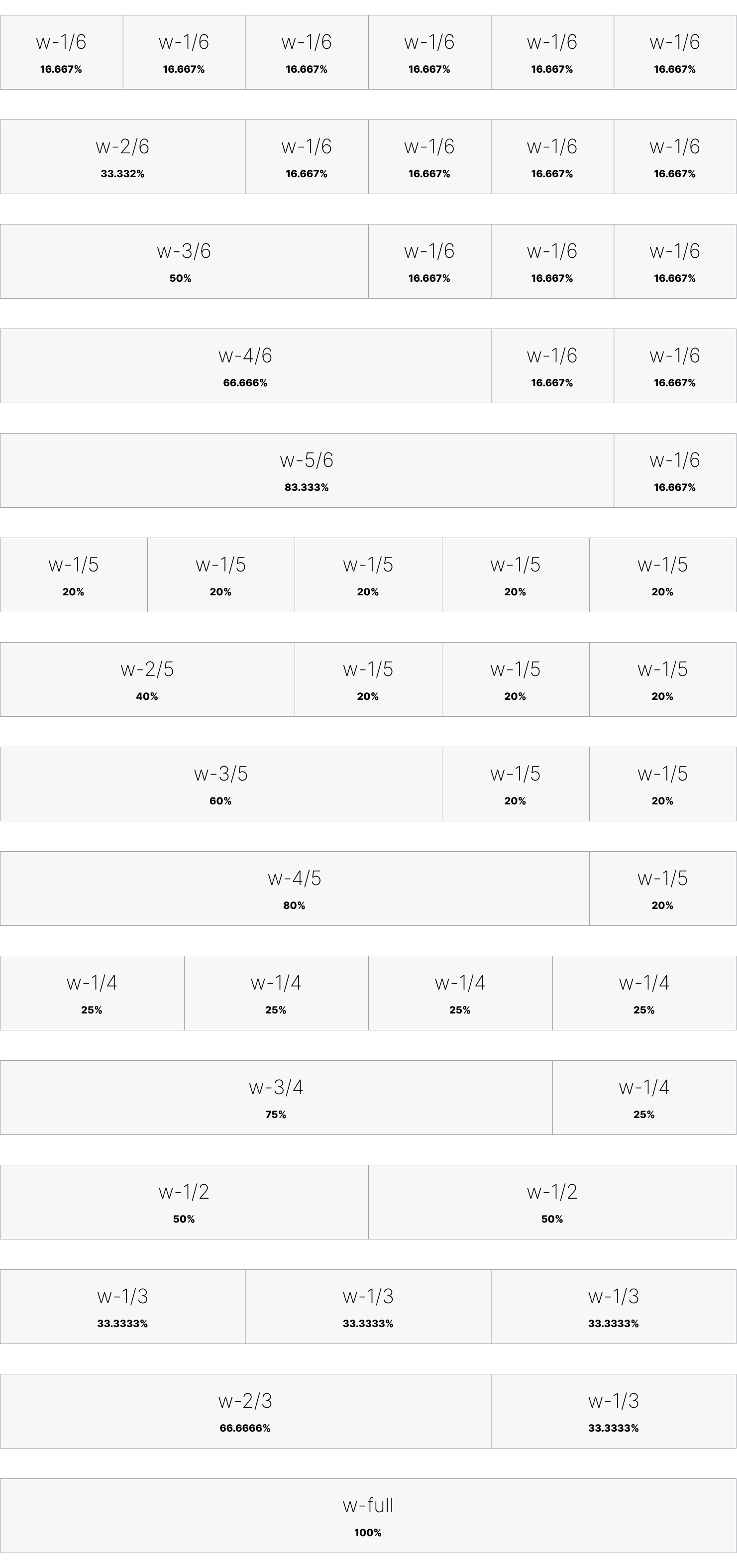
The following shows the column widths available in the design system, adapted from Tailwind CSS.
The 6-column approach
In a 6-column layout, each column is one sixth (1/6) of the container, so column widths come in multiples of 16.667%. The example below uses CSS Grid, changes the number of columns at each breakpoint and adds a 24px gap (gap-6) between the columns.
With CSS Grid
<div class="grid grid-cols-1 md:grid-cols-2 lg:grid-cols-3 xl:grid-cols-6 gap-6">
  <div>1/6</div>
  <div>1/6</div>
  <div>1/6</div>
  <div>1/6</div>
  <div>1/6</div>
  <div>1/6</div>
</div>
You can combine columns so that an item spans from one to five of them. See the example below, and grid column start and end in Tailwind CSS.
<div class="grid grid-cols-1 lg:grid-cols-6 gap-6">
  <div>1/6</div>
  <div class="lg:col-span-2">2/6</div>
  <div class="lg:col-span-3">3/6</div>
</div>
With Flexbox
The same 6-column layout can be built with Flexbox, where you control the width of each item at each breakpoint, or switch Flexbox off on certain screen sizes. Percentage widths already add up to 100%, so add a gutter with padding inside each item rather than a gap, which would push the items onto a new line. When you need gutters, CSS Grid is usually simpler.
<div class="block lg:flex lg:flex-wrap">
  <div class="w-full lg:w-2/6 xl:w-1/6">1/6</div>
  <div class="w-full lg:w-2/6 xl:w-1/6">1/6</div>
  <div class="w-full lg:w-2/6 xl:w-1/6">1/6</div>
  <div class="w-full lg:w-2/6 xl:w-1/6">1/6</div>
  <div class="w-full lg:w-2/6 xl:w-1/6">1/6</div>
  <div class="w-full lg:w-2/6 xl:w-1/6">1/6</div>
</div>
Use width utilities flexibly to create 4-column or 3-column layouts:
- The 4-column approach creates columns of 25% each, combined in multiples of 25%. It is useful for horizontal rows of four items.
- The 3-column approach creates columns of 33.333% each.
What about the traditional 12-column grid?
The 12-column grid (1/12) was the backbone of consistent web design for many years. Designers now mostly use sixths, quarters and thirds, which give more realistic column widths. A 12-column grid can still be useful on large screens, for example when a sidebar needs less emphasis than the content area and 2/6 is too wide while 1/6 is too narrow. Tailwind CSS supports 12 columns as well; use them only when needed.
<!-- A narrow sidebar (2/12) and a wide content area (10/12) on large screens -->
<div class="grid grid-cols-1 xl:grid-cols-12 gap-6">
  <aside class="xl:col-span-2">Sidebar</aside>
  <main class="xl:col-span-10">Content</main>
</div>
Grid with spacing
Columns do not add space around themselves by default. Traditional grids forced a gutter between columns, whereas modern web design may also place elements with no space between them.
Use gutters when content needs to be visually separated, such as a set of news cards on a homepage. Set the gutter on each grid with the gap utilities; see gap in Tailwind CSS.
The design system recommends a 24px gutter (gap-6) on large screens. On smaller screens, adjust the gap to what looks best, for example 16px (gap-4).
<!-- Four news cards: 16px gutter on mobile, 24px from lg -->
<div class="grid grid-cols-1 sm:grid-cols-2 lg:grid-cols-4 gap-4 lg:gap-6">
  <aegov-card>...</aegov-card>
  <aegov-card>...</aegov-card>
  <aegov-card>...</aegov-card>
  <aegov-card>...</aegov-card>
</div>
Spacing
Spacing is an important, and often overlooked, part of a design system, and it must be used intelligently. When designers talk about making a website "breathe", they are talking about spacing.
Use the scale
Whether linear or modular, adopt one standard scale. Tailwind CSS includes a comprehensive numeric spacing scale.
Spacing units
Use standard spacing units instead of arbitrary values, tied to the baseline and the size of the text.
Responsive adjustment
Adjust spacing as the screen size changes, including the margins around the content area.
Visual balance
Mathematical consistency matters, but so does visual balance. Always review the design to make sure it feels right.
Spacing is not only about putting space between elements; used strategically, it creates clearer, more intuitive interfaces. As with any design rule, understand the reasoning behind it, because there will always be exceptions based on context.
The spacing scale
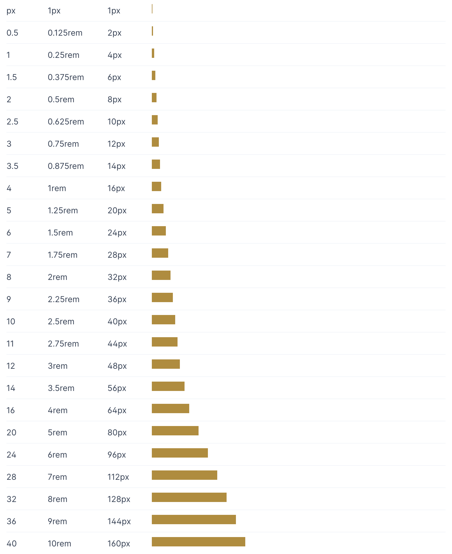
One spacing unit is 0.25rem (4 px). Use increments of 2px up to the base font size of 16px (1rem), and increments of 4px from there up to 48px. Larger spacing, used between sections, continues in bigger steps.
Keep spacing proportional: 16px is twice as much spacing as 8px, for example.
| Use | Suggested spacing | Example classes |
|---|---|---|
Between an icon and its text | 8 px |
|
Padding inside components, such as cards | 16–24 px |
|
Gutters between grid items | 16–24 px |
|
Space between blocks of content | 32–48 px |
|
Space between page sections | 48–96 px |
|
Layouts in both directions
UAE government websites are published in Arabic (right to left) and English (left to right). Build layouts with logical properties, which follow the reading direction, so that one layout works in both languages:
- Use
ms-,me-,ps-,pe-,start-andend-instead ofml-,mr-,pl-,pr-,left-andright-. - Use
text-startandtext-endinstead oftext-leftandtext-right. - Grid and Flexbox already follow the reading direction, so columns reverse automatically on Arabic pages.
- Use the
rtl:andltr:variants only for the rare cases that logical properties cannot cover, such as mirroring a directional icon.
<div class="ps-6 border-s-4 text-start">
  ...
</div>
<div class="pl-6 border-l-4 text-left">
  ...
</div>