
Anatomy
aegov-timeline renders a <section> region landmark wrapping a <div role="list"> of steps, each step host carrying role="listitem". Each aegov-timeline-step shows an indicator (a numbered circle or, in compact variant, a small dot), a connector to the step before and after it, and an optional label and description.
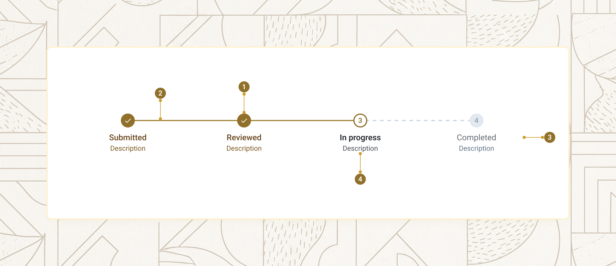
| Item | Name | Description |
|---|---|---|
1 |
Indicator | The numbered circle (or dot, in compact variant) showing the step's status. |
2 |
Connector | The line between two indicators. Solid when the step before it is completed, dashed otherwise. |
3 |
Label | The step's default-slot text, shown below (horizontal) or beside (vertical) the indicator. |
4 |
Description | Optional supplementary text below the label, from the description prop. |
Basics
aegov-timeline composes a parent wrapper with one or more aegov-timeline-step children. The parent calculates each step's index, first/last position, and connector state automatically — your markup only needs per-step status and label content.
<aegov-timeline>
  <aegov-timeline-step status="completed" description="Submitted">Application</aegov-timeline-step>
  <aegov-timeline-step status="completed" description="Verified">Documents</aegov-timeline-step>
  <aegov-timeline-step status="active" description="In review">Approval</aegov-timeline-step>
  <aegov-timeline-step status="pending">Issuance</aegov-timeline-step>
</aegov-timeline>import { AegovTimeline, AegovTimelineStep } from '@aegov/designsystem-react';
export default function TimelineBasics() {
return (
<AegovTimeline>
<AegovTimelineStep status="completed" description="Submitted">Application</AegovTimelineStep>
<AegovTimelineStep status="completed" description="Verified">Documents</AegovTimelineStep>
<AegovTimelineStep status="active" description="In review">Approval</AegovTimelineStep>
<AegovTimelineStep status="pending">Issuance</AegovTimelineStep>
</AegovTimeline>
);
}<template>
<aegov-timeline>
<aegov-timeline-step status="completed" description="Submitted">Application</aegov-timeline-step>
<aegov-timeline-step status="completed" description="Verified">Documents</aegov-timeline-step>
<aegov-timeline-step status="active" description="In review">Approval</aegov-timeline-step>
<aegov-timeline-step status="pending">Issuance</aegov-timeline-step>
</aegov-timeline>
</template>import { Component } from '@angular/core';
import { AegovTimeline, AegovTimelineStep } from '@aegov/designsystem-angular';
@Component({
selector: 'app-timeline-basics',
imports: [AegovTimeline, AegovTimelineStep],
template: `
<aegov-timeline>
<aegov-timeline-step status="completed" description="Submitted">Application</aegov-timeline-step>
<aegov-timeline-step status="completed" description="Verified">Documents</aegov-timeline-step>
<aegov-timeline-step status="active" description="In review">Approval</aegov-timeline-step>
<aegov-timeline-step status="pending">Issuance</aegov-timeline-step>
</aegov-timeline>
`,
})
export class TimelineBasicsComponent {}Status and progression
Each step requires a status of completed, active, or pending. The parent reads these values to colour the connectors between steps — the connector before a step renders solid only when the step before it is completed; the connector after a step is solid only when that step itself is completed.
<aegov-timeline>
  <aegov-timeline-step status="completed">Identity</aegov-timeline-step>
  <aegov-timeline-step status="completed">Documents</aegov-timeline-step>
  <aegov-timeline-step status="active">Verification</aegov-timeline-step>
  <aegov-timeline-step status="pending">Approval</aegov-timeline-step>
  <aegov-timeline-step status="pending">Issuance</aegov-timeline-step>
</aegov-timeline>import { AegovTimeline, AegovTimelineStep } from '@aegov/designsystem-react';
export default function TimelineStatus() {
return (
<AegovTimeline>
<AegovTimelineStep status="completed">Identity</AegovTimelineStep>
<AegovTimelineStep status="completed">Documents</AegovTimelineStep>
<AegovTimelineStep status="active">Verification</AegovTimelineStep>
<AegovTimelineStep status="pending">Approval</AegovTimelineStep>
<AegovTimelineStep status="pending">Issuance</AegovTimelineStep>
</AegovTimeline>
);
}<template>
<aegov-timeline>
<aegov-timeline-step status="completed">Identity</aegov-timeline-step>
<aegov-timeline-step status="completed">Documents</aegov-timeline-step>
<aegov-timeline-step status="active">Verification</aegov-timeline-step>
<aegov-timeline-step status="pending">Approval</aegov-timeline-step>
<aegov-timeline-step status="pending">Issuance</aegov-timeline-step>
</aegov-timeline>
</template>import { Component } from '@angular/core';
import { AegovTimeline, AegovTimelineStep } from '@aegov/designsystem-angular';
@Component({
selector: 'app-timeline-status',
imports: [AegovTimeline, AegovTimelineStep],
template: `
<aegov-timeline>
<aegov-timeline-step status="completed">Identity</aegov-timeline-step>
<aegov-timeline-step status="completed">Documents</aegov-timeline-step>
<aegov-timeline-step status="active">Verification</aegov-timeline-step>
<aegov-timeline-step status="pending">Approval</aegov-timeline-step>
<aegov-timeline-step status="pending">Issuance</aegov-timeline-step>
</aegov-timeline>
`,
})
export class TimelineStatusComponent {}Step description
Each step accepts an optional description — a single supplementary line shown below the label. Use it for state subtext such as a date, status note, or short explanation.
<aegov-timeline>
  <aegov-timeline-step status="completed" description="Submitted on 12 Mar">Application received</aegov-timeline-step>
  <aegov-timeline-step status="completed" description="Verified on 13 Mar">Documents reviewed</aegov-timeline-step>
  <aegov-timeline-step status="active" description="In review">Approval pending</aegov-timeline-step>
  <aegov-timeline-step status="pending" description="Estimated 18 Mar">Issuance</aegov-timeline-step>
</aegov-timeline>import { AegovTimeline, AegovTimelineStep } from '@aegov/designsystem-react';
export default function TimelineDescription() {
return (
<AegovTimeline>
<AegovTimelineStep status="completed" description="Submitted on 12 Mar">Application received</AegovTimelineStep>
<AegovTimelineStep status="completed" description="Verified on 13 Mar">Documents reviewed</AegovTimelineStep>
<AegovTimelineStep status="active" description="In review">Approval pending</AegovTimelineStep>
<AegovTimelineStep status="pending" description="Estimated 18 Mar">Issuance</AegovTimelineStep>
</AegovTimeline>
);
}<template>
<aegov-timeline>
<aegov-timeline-step status="completed" description="Submitted on 12 Mar">Application received</aegov-timeline-step>
<aegov-timeline-step status="completed" description="Verified on 13 Mar">Documents reviewed</aegov-timeline-step>
<aegov-timeline-step status="active" description="In review">Approval pending</aegov-timeline-step>
<aegov-timeline-step status="pending" description="Estimated 18 Mar">Issuance</aegov-timeline-step>
</aegov-timeline>
</template>import { Component } from '@angular/core';
import { AegovTimeline, AegovTimelineStep } from '@aegov/designsystem-angular';
@Component({
selector: 'app-timeline-description',
imports: [AegovTimeline, AegovTimelineStep],
template: `
<aegov-timeline>
<aegov-timeline-step status="completed" description="Submitted on 12 Mar">Application received</aegov-timeline-step>
<aegov-timeline-step status="completed" description="Verified on 13 Mar">Documents reviewed</aegov-timeline-step>
<aegov-timeline-step status="active" description="In review">Approval pending</aegov-timeline-step>
<aegov-timeline-step status="pending" description="Estimated 18 Mar">Issuance</aegov-timeline-step>
</aegov-timeline>
`,
})
export class TimelineDescriptionComponent {}Variants
variant selects the visual style. default (numbered circles, with a checkmark for completed steps) is the most informative. compact reduces each step to a small dot — useful inside cards or sidebars. In horizontal compact mode, labels are hidden visually but remain available to assistive technology; in vertical compact mode, labels are shown beside the dot.
<aegov-timeline variant="default">
  <aegov-timeline-step status="completed">Apply</aegov-timeline-step>
  <aegov-timeline-step status="completed">Verify</aegov-timeline-step>
  <aegov-timeline-step status="active">Approve</aegov-timeline-step>
  <aegov-timeline-step status="pending">Issue</aegov-timeline-step>
</aegov-timeline>

<aegov-timeline variant="compact">
  <aegov-timeline-step status="completed">Step 1</aegov-timeline-step>
  <aegov-timeline-step status="completed">Step 2</aegov-timeline-step>
  <aegov-timeline-step status="active">Step 3</aegov-timeline-step>
  <aegov-timeline-step status="pending">Step 4</aegov-timeline-step>
</aegov-timeline>import { AegovTimeline, AegovTimelineStep } from '@aegov/designsystem-react';
export default function TimelineVariants() {
return (
<>
<AegovTimeline variant="default">
<AegovTimelineStep status="completed">Apply</AegovTimelineStep>
<AegovTimelineStep status="completed">Verify</AegovTimelineStep>
<AegovTimelineStep status="active">Approve</AegovTimelineStep>
<AegovTimelineStep status="pending">Issue</AegovTimelineStep>
</AegovTimeline>
<AegovTimeline variant="compact">
<AegovTimelineStep status="completed">Step 1</AegovTimelineStep>
<AegovTimelineStep status="completed">Step 2</AegovTimelineStep>
<AegovTimelineStep status="active">Step 3</AegovTimelineStep>
<AegovTimelineStep status="pending">Step 4</AegovTimelineStep>
</AegovTimeline>
</>
);
}<template>
<aegov-timeline variant="default">
<aegov-timeline-step status="completed">Apply</aegov-timeline-step>
<aegov-timeline-step status="completed">Verify</aegov-timeline-step>
<aegov-timeline-step status="active">Approve</aegov-timeline-step>
<aegov-timeline-step status="pending">Issue</aegov-timeline-step>
</aegov-timeline>
<aegov-timeline variant="compact">
<aegov-timeline-step status="completed">Step 1</aegov-timeline-step>
<aegov-timeline-step status="completed">Step 2</aegov-timeline-step>
<aegov-timeline-step status="active">Step 3</aegov-timeline-step>
<aegov-timeline-step status="pending">Step 4</aegov-timeline-step>
</aegov-timeline>
</template>import { Component } from '@angular/core';
import { AegovTimeline, AegovTimelineStep } from '@aegov/designsystem-angular';
@Component({
selector: 'app-timeline-variants',
imports: [AegovTimeline, AegovTimelineStep],
template: `
<aegov-timeline variant="default">
<aegov-timeline-step status="completed">Apply</aegov-timeline-step>
<aegov-timeline-step status="completed">Verify</aegov-timeline-step>
<aegov-timeline-step status="active">Approve</aegov-timeline-step>
<aegov-timeline-step status="pending">Issue</aegov-timeline-step>
</aegov-timeline>
<aegov-timeline variant="compact">
<aegov-timeline-step status="completed">Step 1</aegov-timeline-step>
<aegov-timeline-step status="completed">Step 2</aegov-timeline-step>
<aegov-timeline-step status="active">Step 3</aegov-timeline-step>
<aegov-timeline-step status="pending">Step 4</aegov-timeline-step>
</aegov-timeline>
`,
})
export class TimelineVariantsComponent {}Orientation
orientation switches between horizontal (default — steps laid out left-to-right, mirrored in RTL) and vertical (steps stacked top-to-bottom). Vertical works well for service-application sidebars and step-by-step instructions.
<aegov-timeline orientation="vertical">
  <aegov-timeline-step status="completed" description="Submitted">Service request</aegov-timeline-step>
  <aegov-timeline-step status="completed" description="Reviewed">Documents verified</aegov-timeline-step>
  <aegov-timeline-step status="active" description="In progress">Approval pending</aegov-timeline-step>
  <aegov-timeline-step status="pending" description="Estimated 5 working days">Issuance</aegov-timeline-step>
  <aegov-timeline-step status="pending">Collection</aegov-timeline-step>
</aegov-timeline>import { AegovTimeline, AegovTimelineStep } from '@aegov/designsystem-react';
export default function TimelineOrientation() {
return (
<AegovTimeline orientation="vertical">
<AegovTimelineStep status="completed" description="Submitted">Service request</AegovTimelineStep>
<AegovTimelineStep status="completed" description="Reviewed">Documents verified</AegovTimelineStep>
<AegovTimelineStep status="active" description="In progress">Approval pending</AegovTimelineStep>
<AegovTimelineStep status="pending" description="Estimated 5 working days">Issuance</AegovTimelineStep>
<AegovTimelineStep status="pending">Collection</AegovTimelineStep>
</AegovTimeline>
);
}<template>
<aegov-timeline orientation="vertical">
<aegov-timeline-step status="completed" description="Submitted">Service request</aegov-timeline-step>
<aegov-timeline-step status="completed" description="Reviewed">Documents verified</aegov-timeline-step>
<aegov-timeline-step status="active" description="In progress">Approval pending</aegov-timeline-step>
<aegov-timeline-step status="pending" description="Estimated 5 working days">Issuance</aegov-timeline-step>
<aegov-timeline-step status="pending">Collection</aegov-timeline-step>
</aegov-timeline>
</template>import { Component } from '@angular/core';
import { AegovTimeline, AegovTimelineStep } from '@aegov/designsystem-angular';
@Component({
selector: 'app-timeline-orientation',
imports: [AegovTimeline, AegovTimelineStep],
template: `
<aegov-timeline orientation="vertical">
<aegov-timeline-step status="completed" description="Submitted">Service request</aegov-timeline-step>
<aegov-timeline-step status="completed" description="Reviewed">Documents verified</aegov-timeline-step>
<aegov-timeline-step status="active" description="In progress">Approval pending</aegov-timeline-step>
<aegov-timeline-step status="pending" description="Estimated 5 working days">Issuance</aegov-timeline-step>
<aegov-timeline-step status="pending">Collection</aegov-timeline-step>
</aegov-timeline>
`,
})
export class TimelineOrientationComponent {}Sizes
size sets the indicator size. Three tokens are available — sm, base (default), and lg — and, like Badge and Callout, it accepts a responsive breakpoint string such as size="sm md:base xl:lg". Label and description typography stays the same; only the indicator scales.
<aegov-timeline size="sm">
  <aegov-timeline-step status="completed">Apply</aegov-timeline-step>
  <aegov-timeline-step status="active">Review</aegov-timeline-step>
  <aegov-timeline-step status="pending">Approve</aegov-timeline-step>
</aegov-timeline>

<aegov-timeline size="base">
  <aegov-timeline-step status="completed">Apply</aegov-timeline-step>
  <aegov-timeline-step status="active">Review</aegov-timeline-step>
  <aegov-timeline-step status="pending">Approve</aegov-timeline-step>
</aegov-timeline>

<aegov-timeline size="lg">
  <aegov-timeline-step status="completed">Apply</aegov-timeline-step>
  <aegov-timeline-step status="active">Review</aegov-timeline-step>
  <aegov-timeline-step status="pending">Approve</aegov-timeline-step>
</aegov-timeline>import { AegovTimeline, AegovTimelineStep } from '@aegov/designsystem-react';
export default function TimelineSizes() {
return (
<>
<AegovTimeline size="sm">
<AegovTimelineStep status="completed">Apply</AegovTimelineStep>
<AegovTimelineStep status="active">Review</AegovTimelineStep>
<AegovTimelineStep status="pending">Approve</AegovTimelineStep>
</AegovTimeline>
<AegovTimeline size="base">
<AegovTimelineStep status="completed">Apply</AegovTimelineStep>
<AegovTimelineStep status="active">Review</AegovTimelineStep>
<AegovTimelineStep status="pending">Approve</AegovTimelineStep>
</AegovTimeline>
<AegovTimeline size="lg">
<AegovTimelineStep status="completed">Apply</AegovTimelineStep>
<AegovTimelineStep status="active">Review</AegovTimelineStep>
<AegovTimelineStep status="pending">Approve</AegovTimelineStep>
</AegovTimeline>
</>
);
}<template>
<aegov-timeline size="sm">
<aegov-timeline-step status="completed">Apply</aegov-timeline-step>
<aegov-timeline-step status="active">Review</aegov-timeline-step>
<aegov-timeline-step status="pending">Approve</aegov-timeline-step>
</aegov-timeline>
<aegov-timeline size="base">
<aegov-timeline-step status="completed">Apply</aegov-timeline-step>
<aegov-timeline-step status="active">Review</aegov-timeline-step>
<aegov-timeline-step status="pending">Approve</aegov-timeline-step>
</aegov-timeline>
<aegov-timeline size="lg">
<aegov-timeline-step status="completed">Apply</aegov-timeline-step>
<aegov-timeline-step status="active">Review</aegov-timeline-step>
<aegov-timeline-step status="pending">Approve</aegov-timeline-step>
</aegov-timeline>
</template>import { Component } from '@angular/core';
import { AegovTimeline, AegovTimelineStep } from '@aegov/designsystem-angular';
@Component({
selector: 'app-timeline-sizes',
imports: [AegovTimeline, AegovTimelineStep],
template: `
<aegov-timeline size="sm">
<aegov-timeline-step status="completed">Apply</aegov-timeline-step>
<aegov-timeline-step status="active">Review</aegov-timeline-step>
<aegov-timeline-step status="pending">Approve</aegov-timeline-step>
</aegov-timeline>
<aegov-timeline size="base">
<aegov-timeline-step status="completed">Apply</aegov-timeline-step>
<aegov-timeline-step status="active">Review</aegov-timeline-step>
<aegov-timeline-step status="pending">Approve</aegov-timeline-step>
</aegov-timeline>
<aegov-timeline size="lg">
<aegov-timeline-step status="completed">Apply</aegov-timeline-step>
<aegov-timeline-step status="active">Review</aegov-timeline-step>
<aegov-timeline-step status="pending">Approve</aegov-timeline-step>
</aegov-timeline>
`,
})
export class TimelineSizesComponent {}Custom step icon
Each step accepts an icon slot for replacing the default number/checkmark with a custom SVG. It's only rendered in the default variant — the compact dot variant ignores it. Mark custom icons aria-hidden="true"; the screen-reader description is still provided automatically.
<aegov-timeline>
  <aegov-timeline-step status="completed">
    <svg slot="icon" width="16" height="16" viewBox="0 0 24 24" fill="none" stroke="currentColor" stroke-width="2" stroke-linecap="round" stroke-linejoin="round" aria-hidden="true">
      <path d="M20 21v-2a4 4 0 0 0-4-4H8a4 4 0 0 0-4 4v2"/>
      <circle cx="12" cy="7" r="4"/>
    </svg>
    Identity verified
  </aegov-timeline-step>
  <aegov-timeline-step status="completed">
    <svg slot="icon" width="16" height="16" viewBox="0 0 24 24" fill="none" stroke="currentColor" stroke-width="2" stroke-linecap="round" stroke-linejoin="round" aria-hidden="true">
      <path d="M14 2H6a2 2 0 0 0-2 2v16a2 2 0 0 0 2 2h12a2 2 0 0 0 2-2V8z"/>
      <polyline points="14 2 14 8 20 8"/>
    </svg>
    Documents uploaded
  </aegov-timeline-step>
  <aegov-timeline-step status="active">
    <svg slot="icon" width="16" height="16" viewBox="0 0 24 24" fill="none" stroke="currentColor" stroke-width="2" stroke-linecap="round" stroke-linejoin="round" aria-hidden="true">
      <circle cx="12" cy="12" r="10"/>
      <polyline points="12 6 12 12 16 14"/>
    </svg>
    Approval in progress
  </aegov-timeline-step>
</aegov-timeline>import { AegovTimeline, AegovTimelineStep } from '@aegov/designsystem-react';
export default function TimelineIcon() {
return (
<AegovTimeline>
<AegovTimelineStep status="completed">
<svg slot="icon" width="16" height="16" viewBox="0 0 24 24" fill="none" stroke="currentColor" strokeWidth={2} strokeLinecap="round" strokeLinejoin="round" aria-hidden="true">
<path d="M20 21v-2a4 4 0 0 0-4-4H8a4 4 0 0 0-4 4v2" />
<circle cx="12" cy="7" r="4" />
</svg>
Identity verified
</AegovTimelineStep>
<AegovTimelineStep status="completed">
<svg slot="icon" width="16" height="16" viewBox="0 0 24 24" fill="none" stroke="currentColor" strokeWidth={2} strokeLinecap="round" strokeLinejoin="round" aria-hidden="true">
<path d="M14 2H6a2 2 0 0 0-2 2v16a2 2 0 0 0 2 2h12a2 2 0 0 0 2-2V8z" />
<polyline points="14 2 14 8 20 8" />
</svg>
Documents uploaded
</AegovTimelineStep>
<AegovTimelineStep status="active">
<svg slot="icon" width="16" height="16" viewBox="0 0 24 24" fill="none" stroke="currentColor" strokeWidth={2} strokeLinecap="round" strokeLinejoin="round" aria-hidden="true">
<circle cx="12" cy="12" r="10" />
<polyline points="12 6 12 12 16 14" />
</svg>
Approval in progress
</AegovTimelineStep>
</AegovTimeline>
);
}<template>
<aegov-timeline>
<aegov-timeline-step status="completed">
<svg slot="icon" width="16" height="16" viewBox="0 0 24 24" fill="none" stroke="currentColor" stroke-width="2" stroke-linecap="round" stroke-linejoin="round" aria-hidden="true">
<path d="M20 21v-2a4 4 0 0 0-4-4H8a4 4 0 0 0-4 4v2"/>
<circle cx="12" cy="7" r="4"/>
</svg>
Identity verified
</aegov-timeline-step>
<aegov-timeline-step status="completed">
<svg slot="icon" width="16" height="16" viewBox="0 0 24 24" fill="none" stroke="currentColor" stroke-width="2" stroke-linecap="round" stroke-linejoin="round" aria-hidden="true">
<path d="M14 2H6a2 2 0 0 0-2 2v16a2 2 0 0 0 2 2h12a2 2 0 0 0 2-2V8z"/>
<polyline points="14 2 14 8 20 8"/>
</svg>
Documents uploaded
</aegov-timeline-step>
<aegov-timeline-step status="active">
<svg slot="icon" width="16" height="16" viewBox="0 0 24 24" fill="none" stroke="currentColor" stroke-width="2" stroke-linecap="round" stroke-linejoin="round" aria-hidden="true">
<circle cx="12" cy="12" r="10"/>
<polyline points="12 6 12 12 16 14"/>
</svg>
Approval in progress
</aegov-timeline-step>
</aegov-timeline>
</template>import { Component } from '@angular/core';
import { AegovTimeline, AegovTimelineStep } from '@aegov/designsystem-angular';
@Component({
selector: 'app-timeline-icon',
imports: [AegovTimeline, AegovTimelineStep],
template: `
<aegov-timeline>
<aegov-timeline-step status="completed">
<svg slot="icon" width="16" height="16" viewBox="0 0 24 24" fill="none" stroke="currentColor" stroke-width="2" stroke-linecap="round" stroke-linejoin="round" aria-hidden="true">
<path d="M20 21v-2a4 4 0 0 0-4-4H8a4 4 0 0 0-4 4v2"/>
<circle cx="12" cy="7" r="4"/>
</svg>
Identity verified
</aegov-timeline-step>
<aegov-timeline-step status="completed">
<svg slot="icon" width="16" height="16" viewBox="0 0 24 24" fill="none" stroke="currentColor" stroke-width="2" stroke-linecap="round" stroke-linejoin="round" aria-hidden="true">
<path d="M14 2H6a2 2 0 0 0-2 2v16a2 2 0 0 0 2 2h12a2 2 0 0 0 2-2V8z"/>
<polyline points="14 2 14 8 20 8"/>
</svg>
Documents uploaded
</aegov-timeline-step>
<aegov-timeline-step status="active">
<svg slot="icon" width="16" height="16" viewBox="0 0 24 24" fill="none" stroke="currentColor" stroke-width="2" stroke-linecap="round" stroke-linejoin="round" aria-hidden="true">
<circle cx="12" cy="12" r="10"/>
<polyline points="12 6 12 12 16 14"/>
</svg>
Approval in progress
</aegov-timeline-step>
</aegov-timeline>
`,
})
export class TimelineIconComponent {}Combined example
A vertical, large-size timeline with descriptions and a mix of statuses — typical of a service-tracking sidebar.
<aegov-timeline orientation="vertical" size="lg">
  <aegov-timeline-step status="completed" description="12 Mar 2026">Application submitted</aegov-timeline-step>
  <aegov-timeline-step status="completed" description="13 Mar 2026">Emirates ID verified</aegov-timeline-step>
  <aegov-timeline-step status="completed" description="14 Mar 2026">Supporting documents reviewed</aegov-timeline-step>
  <aegov-timeline-step status="active" description="In review by the issuing authority">Approval pending</aegov-timeline-step>
  <aegov-timeline-step status="pending" description="Estimated 18 Mar 2026">Permit issuance</aegov-timeline-step>
  <aegov-timeline-step status="pending" description="Pick up at the service centre">Collection</aegov-timeline-step>
</aegov-timeline>import { AegovTimeline, AegovTimelineStep } from '@aegov/designsystem-react';
export default function TimelineCombined() {
return (
<AegovTimeline orientation="vertical" size="lg">
<AegovTimelineStep status="completed" description="12 Mar 2026">Application submitted</AegovTimelineStep>
<AegovTimelineStep status="completed" description="13 Mar 2026">Emirates ID verified</AegovTimelineStep>
<AegovTimelineStep status="completed" description="14 Mar 2026">Supporting documents reviewed</AegovTimelineStep>
<AegovTimelineStep status="active" description="In review by the issuing authority">Approval pending</AegovTimelineStep>
<AegovTimelineStep status="pending" description="Estimated 18 Mar 2026">Permit issuance</AegovTimelineStep>
<AegovTimelineStep status="pending" description="Pick up at the service centre">Collection</AegovTimelineStep>
</AegovTimeline>
);
}<template>
<aegov-timeline orientation="vertical" size="lg">
<aegov-timeline-step status="completed" description="12 Mar 2026">Application submitted</aegov-timeline-step>
<aegov-timeline-step status="completed" description="13 Mar 2026">Emirates ID verified</aegov-timeline-step>
<aegov-timeline-step status="completed" description="14 Mar 2026">Supporting documents reviewed</aegov-timeline-step>
<aegov-timeline-step status="active" description="In review by the issuing authority">Approval pending</aegov-timeline-step>
<aegov-timeline-step status="pending" description="Estimated 18 Mar 2026">Permit issuance</aegov-timeline-step>
<aegov-timeline-step status="pending" description="Pick up at the service centre">Collection</aegov-timeline-step>
</aegov-timeline>
</template>import { Component } from '@angular/core';
import { AegovTimeline, AegovTimelineStep } from '@aegov/designsystem-angular';
@Component({
selector: 'app-timeline-combined',
imports: [AegovTimeline, AegovTimelineStep],
template: `
<aegov-timeline orientation="vertical" size="lg">
<aegov-timeline-step status="completed" description="12 Mar 2026">Application submitted</aegov-timeline-step>
<aegov-timeline-step status="completed" description="13 Mar 2026">Emirates ID verified</aegov-timeline-step>
<aegov-timeline-step status="completed" description="14 Mar 2026">Supporting documents reviewed</aegov-timeline-step>
<aegov-timeline-step status="active" description="In review by the issuing authority">Approval pending</aegov-timeline-step>
<aegov-timeline-step status="pending" description="Estimated 18 Mar 2026">Permit issuance</aegov-timeline-step>
<aegov-timeline-step status="pending" description="Pick up at the service centre">Collection</aegov-timeline-step>
</aegov-timeline>
`,
})
export class TimelineCombinedComponent {}RTL support
The timeline is direction-agnostic. When the document or any ancestor is set to dir="rtl", the horizontal layout flips so step 1 sits on the right and steps progress leftward, and the region's default aria-label and each step's screen-reader description switch to Arabic automatically. In vertical orientation, the indicators and connectors move to the right-hand side and labels align to the reading direction.
<div dir="rtl">
  <aegov-timeline>
    <aegov-timeline-step status="completed" description="تم الاستلام">تقديم الطلب</aegov-timeline-step>
    <aegov-timeline-step status="completed" description="تم التحقق">التحقق من المستندات</aegov-timeline-step>
    <aegov-timeline-step status="active" description="قيد المراجعة">الموافقة</aegov-timeline-step>
    <aegov-timeline-step status="pending">الإصدار</aegov-timeline-step>
  </aegov-timeline>
</div>import { AegovTimeline, AegovTimelineStep } from '@aegov/designsystem-react';
export default function RtlTimeline() {
return (
<div dir="rtl">
<AegovTimeline>
<AegovTimelineStep status="completed" description="تم الاستلام">تقديم الطلب</AegovTimelineStep>
<AegovTimelineStep status="completed" description="تم التحقق">التحقق من المستندات</AegovTimelineStep>
<AegovTimelineStep status="active" description="قيد المراجعة">الموافقة</AegovTimelineStep>
<AegovTimelineStep status="pending">الإصدار</AegovTimelineStep>
</AegovTimeline>
</div>
);
}<template>
<div dir="rtl">
<aegov-timeline>
<aegov-timeline-step status="completed" description="تم الاستلام">تقديم الطلب</aegov-timeline-step>
<aegov-timeline-step status="completed" description="تم التحقق">التحقق من المستندات</aegov-timeline-step>
<aegov-timeline-step status="active" description="قيد المراجعة">الموافقة</aegov-timeline-step>
<aegov-timeline-step status="pending">الإصدار</aegov-timeline-step>
</aegov-timeline>
</div>
</template>import { Component } from '@angular/core';
import { AegovTimeline, AegovTimelineStep } from '@aegov/designsystem-angular';
@Component({
selector: 'app-rtl-timeline',
imports: [AegovTimeline, AegovTimelineStep],
template: `
<div dir="rtl">
<aegov-timeline>
<aegov-timeline-step status="completed" description="تم الاستلام">تقديم الطلب</aegov-timeline-step>
<aegov-timeline-step status="completed" description="تم التحقق">التحقق من المستندات</aegov-timeline-step>
<aegov-timeline-step status="active" description="قيد المراجعة">الموافقة</aegov-timeline-step>
<aegov-timeline-step status="pending">الإصدار</aegov-timeline-step>
</aegov-timeline>
</div>
`,
})
export class RtlTimelineComponent {}Usage
Here is the recommended usage of a timeline on any website or application. These are recommended usage guides, however the developer must use the best practices of web and application development to accurately use this component.
Give every step a meaningful label as its default-slot text
The screen-reader-only "Step N of M: label" description depends on it — a step with no text content is announced without any context.
Use vertical orientation for sidebars and step-by-step instructions
Horizontal works well as a page-top progress strip; vertical reads better alongside body content or in a narrow sidebar.
Override the default aria-label with a more specific description when several timelines exist on one page
Set aria-label="Application progress" (or the Arabic equivalent) directly on <aegov-timeline> — it's forwarded to the region landmark automatically.
Mark custom step icons aria-hidden="true"
The step's own screen-reader description already announces the step number, label, and status — an unhidden custom icon would be redundant or confusing to assistive technology.
Don't use a timeline for clickable step navigation
It's a presentational, non-interactive component with no keyboard or pointer handling. If users need to jump between steps, wrap step content in real buttons or links, or build a dedicated interactive stepper.
Don't reorder steps out of their real sequence
The visual progression is what gives aria-current="step" its meaning — a shuffled step order breaks the "what's done / what's next" mental model the component exists to provide.
API reference
The following are the properties and references of a timeline
aegov-timeline properties
| Attribute | Description | Type | Default |
|---|---|---|---|
| DOM |
| auto-generated |
| Visual style of the step indicators. |
|
|
| Indicator size token or a responsive string. |
|
|
| Layout direction of the step list. |
|
|
aegov-timeline-step properties
| Attribute | Description | Type | Default |
|---|---|---|---|
| Visual state of the step. Controls indicator colour and connector solidity. |
|
|
| Optional supplementary text shown below the label. |
|
|
| Set automatically by the parent | various | various |
Slots
| Component | Slot | Description |
|---|---|---|
| (default) | Place one or more |
| (default) | The step label text. Captured into the step's screen-reader description. |
|
| Optional icon replacing the default number/checkmark. Only rendered in the |
Pass-through attributes
| Attribute | Notes | Forwards to |
|---|---|---|
| Set on | inner |
| Not forwarded automatically — apply directly to | n/a |
| Not forwarded. Use | n/a |
| Applied to the host element. | host |
Notes
The following notes are applicable of this component.
Built-in accessibility
- The container renders as a
<section>region landmark whosearia-labeldefaults to"Timeline"in LTR and"الجدول الزمني"in RTL — no developer translation needed. Passaria-labelon the host to override with a more specific description. - Steps are exposed as a list — the inner container is a
<div role="list">and eachaegov-timeline-stephost carriesrole="listitem"— so screen readers announce the step count and position. (A native<ol>is not used because it may not contain the custom-element hosts.) - The currently active step's host (its
role="listitem"element) carriesaria-current="step"— only the step withstatus="active"has it. - Each step's indicator includes visually hidden text giving its position and status. In the
defaultvariant it reads"Step N of M (completed/current)"(Arabic:"الخطوة N من M (مكتمل/الحالية)"), followed by the visible label. In thecompactvariant, where labels are visually hidden in horizontal mode, it includes the label too:"Step N of M: <label> (completed/current)". Pending steps get no status suffix. - Decorative connectors and indicator graphics are marked
aria-hidden="true". - If
aegov-timeline-stepis used outside<aegov-timeline>, it renders a visiblerole="alert"configuration-error message instead of a normal step — confirmed live — so a misuse is caught during development rather than silently rendering broken markup.
Developer responsibilities
- Provide a meaningful label as default-slot text on every step. The screen-reader description depends on it.
- When using a custom
iconslot, setaria-hidden="true"on the icon — the step'ssr-onlylabel is still rendered regardless. - Keep step ordering meaningful — the visual progression is what gives
aria-current="step"value. - Override
aria-labelon<aegov-timeline>when more specific context is needed, e.g.aria-label="Application progress"oraria-label="مسار الطلب".
Notes
- The timeline is a presentational component — it does not respond to keyboard or pointer input. If your flow needs clickable step navigation, wrap step content in a button or link, or build a separate interactive stepper.
- An unrecognised
variant,orientationor stepstatusfalls back to its default (default,horizontal,pending) and logs a console warning in development builds only. - Connector colour is computed automatically — confirmed live: the connector before a step renders solid only when the previous step's status is
completed, and the connector after a step renders solid only when that step itself iscompleted.