
Anatomy
aegov-range renders one real native <input type="range"> in single mode, or two (low/high) in range mode — visually hidden but focusable and fully keyboard-driven. A custom track, fill, and one or two thumb elements are drawn on top purely for consistent cross-browser visuals; dragging a custom thumb keeps the underlying native input's value in sync.
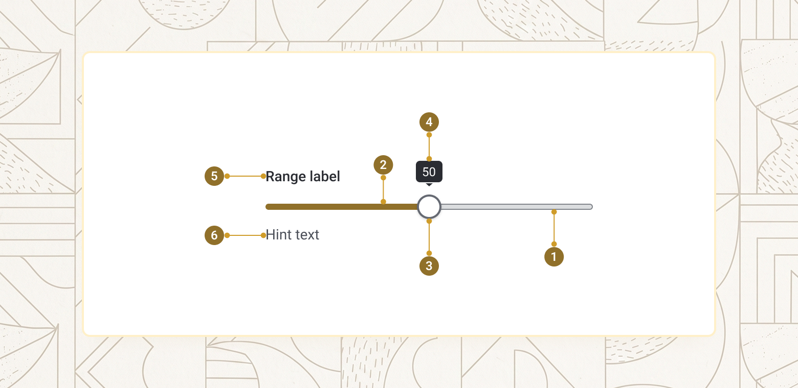
| Item | Name | Description |
|---|---|---|
1 |
Track | The full-width background bar representing min to max |
2 |
Fill | The coloured segment between the start and the current value (or between the two thumbs in range mode) |
3 |
Thumb | The draggable handle — one in single mode, two (low/high) in range mode |
4 |
Value display (optional) | Tooltip, in-thumb text, or flanking min/max labels, depending on display |
5 |
Label | Text naming the field (label prop) |
6 |
Hint / error message | Supporting helper text, which stays visible when the error message appears above it once is-invalid is set |
Basics
Set min, max, and value for a single-thumb slider. Add display="tooltip" so the current value floats in a bubble above the thumb — it is positioned over the content above the slider, so it takes no extra layout space.
<aegov-range field-id="range-basics" name="range-basics" label="Search radius (km)" min="1" max="50" value="10" display="tooltip"></aegov-range>import { AegovRange } from '@aegov/designsystem-react';
export default function RangeBasics() {
return (
<AegovRange
fieldId="range-basics"
name="range-basics"
label="Search radius (km)"
min={1}
max={50}
value={10}
display="tooltip"
/>
);
}<template>
<aegov-range field-id="range-basics" name="range-basics" label="Search radius (km)" min="1" max="50" value="10" display="tooltip"></aegov-range>
</template>import { Component } from '@angular/core';
import { AegovRange } from '@aegov/designsystem-angular';
@Component({
selector: 'app-range-basics',
imports: [AegovRange],
template: `
<aegov-range field-id="range-basics" name="range-basics" label="Search radius (km)" min="1" max="50" value="10" display="tooltip"></aegov-range>
`,
})
export class RangeBasicsComponent {}Single vs. dual-thumb mode
Use the default mode="single" for one thumb and one value. Use mode="range" for two thumbs selecting a low/high pair — set value-low and value-high instead of value. The low thumb can never be dragged, clicked, or keyed past the high thumb's value (and vice versa); the component always keeps at least one step of separation between them.
<aegov-range field-id="range-mode-single" name="range-mode-single" label="Monthly income (AED, thousands)" min="0" max="100" value="25" display="tooltip"></aegov-range>
<aegov-range field-id="range-mode-dual" name="range-mode-dual" mode="range" label="Age of dependants" min="0" max="80" value-low="18" value-high="65" display="full"></aegov-range>import { AegovRange } from '@aegov/designsystem-react';
export default function RangeModes() {
return (
<>
<AegovRange
fieldId="range-mode-single"
name="range-mode-single"
label="Monthly income (AED, thousands)"
min={0}
max={100}
value={25}
display="tooltip"
/>
<AegovRange
fieldId="range-mode-dual"
name="range-mode-dual"
mode="range"
label="Age of dependants"
min={0}
max={80}
valueLow={18}
valueHigh={65}
display="full"
/>
</>
);
}<template>
<aegov-range field-id="range-mode-single" name="range-mode-single" label="Monthly income (AED, thousands)" min="0" max="100" value="25" display="tooltip"></aegov-range>
<aegov-range field-id="range-mode-dual" name="range-mode-dual" mode="range" label="Age of dependants" min="0" max="80" value-low="18" value-high="65" display="full"></aegov-range>
</template>import { Component } from '@angular/core';
import { AegovRange } from '@aegov/designsystem-angular';
@Component({
selector: 'app-range-modes',
imports: [AegovRange],
template: `
<aegov-range field-id="range-mode-single" name="range-mode-single" label="Monthly income (AED, thousands)" min="0" max="100" value="25" display="tooltip"></aegov-range>
<aegov-range field-id="range-mode-dual" name="range-mode-dual" mode="range" label="Age of dependants" min="0" max="80" value-low="18" value-high="65" display="full"></aegov-range>
`,
})
export class RangeModesComponent {}Value display
display controls how the current value is shown alongside the slider: none (default, nothing extra), tooltip (a small bubble floating above each thumb, always shown), thumb (the value sits inside an enlarged thumb, always visible), or full (adds fixed min/max labels at each end of the track, on top of the in-thumb value).
<aegov-range field-id="range-display-none" name="range-display-none" label="display = none" value="40"></aegov-range>
<aegov-range field-id="range-display-tooltip" name="range-display-tooltip" label="display = tooltip" value="40" display="tooltip"></aegov-range>
<aegov-range field-id="range-display-thumb" name="range-display-thumb" label="display = thumb" value="40" display="thumb"></aegov-range>
<aegov-range field-id="range-display-full" name="range-display-full" label="display = full" value="40" display="full"></aegov-range>import { AegovRange } from '@aegov/designsystem-react';
export default function RangeDisplay() {
return (
<>
<AegovRange fieldId="range-display-none" name="range-display-none" label="display = none" value={40} />
<AegovRange fieldId="range-display-tooltip" name="range-display-tooltip" label="display = tooltip" value={40} display="tooltip" />
<AegovRange fieldId="range-display-thumb" name="range-display-thumb" label="display = thumb" value={40} display="thumb" />
<AegovRange fieldId="range-display-full" name="range-display-full" label="display = full" value={40} display="full" />
</>
);
}<template>
<aegov-range field-id="range-display-none" name="range-display-none" label="display = none" value="40"></aegov-range>
<aegov-range field-id="range-display-tooltip" name="range-display-tooltip" label="display = tooltip" value="40" display="tooltip"></aegov-range>
<aegov-range field-id="range-display-thumb" name="range-display-thumb" label="display = thumb" value="40" display="thumb"></aegov-range>
<aegov-range field-id="range-display-full" name="range-display-full" label="display = full" value="40" display="full"></aegov-range>
</template>import { Component } from '@angular/core';
import { AegovRange } from '@aegov/designsystem-angular';
@Component({
selector: 'app-range-display',
imports: [AegovRange],
template: `
<aegov-range field-id="range-display-none" name="range-display-none" label="display = none" value="40"></aegov-range>
<aegov-range field-id="range-display-tooltip" name="range-display-tooltip" label="display = tooltip" value="40" display="tooltip"></aegov-range>
<aegov-range field-id="range-display-thumb" name="range-display-thumb" label="display = thumb" value="40" display="thumb"></aegov-range>
<aegov-range field-id="range-display-full" name="range-display-full" label="display = full" value="40" display="full"></aegov-range>
`,
})
export class RangeDisplayComponent {}Min, max, and step
min and max define the bounds; step controls the granularity of both dragging/keying and the minimum enforced gap between thumbs in range mode. Use a fractional step for currency or ratio values, and a larger step (10, 25, 50) when fine precision isn't meaningful.
<aegov-range field-id="range-step-1" name="range-step-1" label="Years of UAE residency" min="0" max="40" step="1" value="5" display="tooltip"></aegov-range>
<aegov-range field-id="range-step-25" name="range-step-25" label="Service fee (AED)" min="0" max="500" step="25" value="200" display="full"></aegov-range>
<aegov-range field-id="range-step-decimal" name="range-step-decimal" label="Acceptance threshold" min="0" max="1" step="0.05" value="0.75" display="thumb"></aegov-range>import { AegovRange } from '@aegov/designsystem-react';
export default function RangeMinMaxStep() {
return (
<>
<AegovRange fieldId="range-step-1" name="range-step-1" label="Years of UAE residency" min={0} max={40} step={1} value={5} display="tooltip" />
<AegovRange fieldId="range-step-25" name="range-step-25" label="Service fee (AED)" min={0} max={500} step={25} value={200} display="full" />
<AegovRange fieldId="range-step-decimal" name="range-step-decimal" label="Acceptance threshold" min={0} max={1} step={0.05} value={0.75} display="thumb" />
</>
);
}<template>
<aegov-range field-id="range-step-1" name="range-step-1" label="Years of UAE residency" min="0" max="40" step="1" value="5" display="tooltip"></aegov-range>
<aegov-range field-id="range-step-25" name="range-step-25" label="Service fee (AED)" min="0" max="500" step="25" value="200" display="full"></aegov-range>
<aegov-range field-id="range-step-decimal" name="range-step-decimal" label="Acceptance threshold" min="0" max="1" step="0.05" value="0.75" display="thumb"></aegov-range>
</template>import { Component } from '@angular/core';
import { AegovRange } from '@aegov/designsystem-angular';
@Component({
selector: 'app-range-min-max-step',
imports: [AegovRange],
template: `
<aegov-range field-id="range-step-1" name="range-step-1" label="Years of UAE residency" min="0" max="40" step="1" value="5" display="tooltip"></aegov-range>
<aegov-range field-id="range-step-25" name="range-step-25" label="Service fee (AED)" min="0" max="500" step="25" value="200" display="full"></aegov-range>
<aegov-range field-id="range-step-decimal" name="range-step-decimal" label="Acceptance threshold" min="0" max="1" step="0.05" value="0.75" display="thumb"></aegov-range>
`,
})
export class RangeMinMaxStepComponent {}Sizes
size accepts five tokens, from xs up to xl. It scales the track thickness only — the 24px thumb stays constant at every size so it remains comfortably tappable on touch devices — and accepts a responsive breakpoint string (e.g. size="sm md:base").
<aegov-range field-id="range-size-xs" name="range-size-xs" label="Extra small" size="xs" value="50"></aegov-range>
<aegov-range field-id="range-size-sm" name="range-size-sm" label="Small" size="sm" value="50"></aegov-range>
<aegov-range field-id="range-size-base" name="range-size-base" label="Base" size="base" value="50"></aegov-range>
<aegov-range field-id="range-size-lg" name="range-size-lg" label="Large" size="lg" value="50"></aegov-range>
<aegov-range field-id="range-size-xl" name="range-size-xl" label="Extra large" size="xl" value="50"></aegov-range>import { AegovRange } from '@aegov/designsystem-react';
export default function RangeSizes() {
return (
<>
<AegovRange fieldId="range-size-xs" name="range-size-xs" label="Extra small" size="xs" value={50} />
<AegovRange fieldId="range-size-sm" name="range-size-sm" label="Small" size="sm" value={50} />
<AegovRange fieldId="range-size-base" name="range-size-base" label="Base" size="base" value={50} />
<AegovRange fieldId="range-size-lg" name="range-size-lg" label="Large" size="lg" value={50} />
<AegovRange fieldId="range-size-xl" name="range-size-xl" label="Extra large" size="xl" value={50} />
</>
);
}<template>
<aegov-range field-id="range-size-xs" name="range-size-xs" label="Extra small" size="xs" value="50"></aegov-range>
<aegov-range field-id="range-size-sm" name="range-size-sm" label="Small" size="sm" value="50"></aegov-range>
<aegov-range field-id="range-size-base" name="range-size-base" label="Base" size="base" value="50"></aegov-range>
<aegov-range field-id="range-size-lg" name="range-size-lg" label="Large" size="lg" value="50"></aegov-range>
<aegov-range field-id="range-size-xl" name="range-size-xl" label="Extra large" size="xl" value="50"></aegov-range>
</template>import { Component } from '@angular/core';
import { AegovRange } from '@aegov/designsystem-angular';
@Component({
selector: 'app-range-sizes',
imports: [AegovRange],
template: `
<aegov-range field-id="range-size-xs" name="range-size-xs" label="Extra small" size="xs" value="50"></aegov-range>
<aegov-range field-id="range-size-sm" name="range-size-sm" label="Small" size="sm" value="50"></aegov-range>
<aegov-range field-id="range-size-base" name="range-size-base" label="Base" size="base" value="50"></aegov-range>
<aegov-range field-id="range-size-lg" name="range-size-lg" label="Large" size="lg" value="50"></aegov-range>
<aegov-range field-id="range-size-xl" name="range-size-xl" label="Extra large" size="xl" value="50"></aegov-range>
`,
})
export class RangeSizesComponent {}Variant
variant selects the colour family for the active fill segment, the in-thumb value text, and the thumb's focus ring — the off-track and the thumb body always stay constant (aeblack-100 and white respectively) regardless of variant, so grip contrast stays consistent across every colour family.
| Variant | Track (constant) | Active fill | Thumb (constant) |
|---|---|---|---|
primary |
aeblack-100 |
primary-600 |
white |
secondary |
aeblack-100 |
secondary-600 |
white |
neutral-max |
aeblack-100 |
aeblack-800 |
white |
neutral-min |
aeblack-100 |
aeblack-400 |
white |
Variant example
<aegov-range field-id="range-variant-primary" name="range-variant-primary" variant="primary" label="Primary" value="50" display="tooltip"></aegov-range>
<aegov-range field-id="range-variant-secondary" name="range-variant-secondary" variant="secondary" label="Secondary" value="50" display="tooltip"></aegov-range>
<aegov-range field-id="range-variant-neutral-max" name="range-variant-neutral-max" variant="neutral-max" label="Neutral-max" value="50" display="tooltip"></aegov-range>
<aegov-range field-id="range-variant-neutral-min" name="range-variant-neutral-min" variant="neutral-min" label="Neutral-min" value="50" display="tooltip"></aegov-range>import { AegovRange } from '@aegov/designsystem-react';
export default function RangeVariants() {
return (
<>
<AegovRange fieldId="range-variant-primary" name="range-variant-primary" variant="primary" label="Primary" value={50} display="tooltip" />
<AegovRange fieldId="range-variant-secondary" name="range-variant-secondary" variant="secondary" label="Secondary" value={50} display="tooltip" />
<AegovRange fieldId="range-variant-neutral-max" name="range-variant-neutral-max" variant="neutral-max" label="Neutral-max" value={50} display="tooltip" />
<AegovRange fieldId="range-variant-neutral-min" name="range-variant-neutral-min" variant="neutral-min" label="Neutral-min" value={50} display="tooltip" />
</>
);
}<template>
<aegov-range field-id="range-variant-primary" name="range-variant-primary" variant="primary" label="Primary" value="50" display="tooltip"></aegov-range>
<aegov-range field-id="range-variant-secondary" name="range-variant-secondary" variant="secondary" label="Secondary" value="50" display="tooltip"></aegov-range>
<aegov-range field-id="range-variant-neutral-max" name="range-variant-neutral-max" variant="neutral-max" label="Neutral-max" value="50" display="tooltip"></aegov-range>
<aegov-range field-id="range-variant-neutral-min" name="range-variant-neutral-min" variant="neutral-min" label="Neutral-min" value="50" display="tooltip"></aegov-range>
</template>import { Component } from '@angular/core';
import { AegovRange } from '@aegov/designsystem-angular';
@Component({
selector: 'app-range-variants',
imports: [AegovRange],
template: `
<aegov-range field-id="range-variant-primary" name="range-variant-primary" variant="primary" label="Primary" value="50" display="tooltip"></aegov-range>
<aegov-range field-id="range-variant-secondary" name="range-variant-secondary" variant="secondary" label="Secondary" value="50" display="tooltip"></aegov-range>
<aegov-range field-id="range-variant-neutral-max" name="range-variant-neutral-max" variant="neutral-max" label="Neutral-max" value="50" display="tooltip"></aegov-range>
<aegov-range field-id="range-variant-neutral-min" name="range-variant-neutral-min" variant="neutral-min" label="Neutral-min" value="50" display="tooltip"></aegov-range>
`,
})
export class RangeVariantsComponent {}Orientation
Set orientation="vertical" for a vertical slider — well suited to equaliser-style controls or a tall side panel. The track is 200px tall by default; set the --range-height custom property on the host or an ancestor to change it. The minimum sits at the bottom, and Arrow Up raises the value.
<aegov-range field-id="range-vertical-1" name="range-vertical-1" label="Bass" orientation="vertical" value="20" display="tooltip" style="height: 200px"></aegov-range>
<aegov-range field-id="range-vertical-2" name="range-vertical-2" label="Mid" orientation="vertical" value="60" display="tooltip" style="height: 200px"></aegov-range>
<aegov-range field-id="range-vertical-3" name="range-vertical-3" label="Treble" orientation="vertical" value="90" display="tooltip" style="height: 200px"></aegov-range>import { AegovRange } from '@aegov/designsystem-react';
export default function RangeVertical() {
return (
<div style={{ display: 'flex', gap: '2.5rem', alignItems: 'flex-end' }}>
<AegovRange fieldId="range-vertical-1" name="range-vertical-1" label="Bass" orientation="vertical" value={20} display="tooltip" style={{ height: '200px' }} />
<AegovRange fieldId="range-vertical-2" name="range-vertical-2" label="Mid" orientation="vertical" value={60} display="tooltip" style={{ height: '200px' }} />
<AegovRange fieldId="range-vertical-3" name="range-vertical-3" label="Treble" orientation="vertical" value={90} display="tooltip" style={{ height: '200px' }} />
</div>
);
}<template>
<div style="display:flex; gap:2.5rem; align-items:flex-end;">
<aegov-range field-id="range-vertical-1" name="range-vertical-1" label="Bass" orientation="vertical" value="20" display="tooltip" style="height: 200px"></aegov-range>
<aegov-range field-id="range-vertical-2" name="range-vertical-2" label="Mid" orientation="vertical" value="60" display="tooltip" style="height: 200px"></aegov-range>
<aegov-range field-id="range-vertical-3" name="range-vertical-3" label="Treble" orientation="vertical" value="90" display="tooltip" style="height: 200px"></aegov-range>
</div>
</template>import { Component } from '@angular/core';
import { AegovRange } from '@aegov/designsystem-angular';
@Component({
selector: 'app-range-vertical',
imports: [AegovRange],
template: `
<div style="display:flex; gap:2.5rem; align-items:flex-end;">
<aegov-range field-id="range-vertical-1" name="range-vertical-1" label="Bass" orientation="vertical" value="20" display="tooltip" style="height: 200px"></aegov-range>
<aegov-range field-id="range-vertical-2" name="range-vertical-2" label="Mid" orientation="vertical" value="60" display="tooltip" style="height: 200px"></aegov-range>
<aegov-range field-id="range-vertical-3" name="range-vertical-3" label="Treble" orientation="vertical" value="90" display="tooltip" style="height: 200px"></aegov-range>
</div>
`,
})
export class RangeVerticalComponent {}Disabled
Set is-disabled="true" to dim the slider, block pointer/touch dragging, and mark the native input(s) disabled — removing them from the tab order and from form submission.
<aegov-range field-id="range-disabled" name="range-disabled" label="Disabled" value="40" is-disabled="true" display="tooltip"></aegov-range>import { AegovRange } from '@aegov/designsystem-react';
export default function RangeDisabled() {
return (
<AegovRange fieldId="range-disabled" name="range-disabled" label="Disabled" value={40} isDisabled display="tooltip" />
);
}<template>
<aegov-range field-id="range-disabled" name="range-disabled" label="Disabled" value="40" is-disabled="true" display="tooltip"></aegov-range>
</template>import { Component } from '@angular/core';
import { AegovRange } from '@aegov/designsystem-angular';
@Component({
selector: 'app-range-disabled',
imports: [AegovRange],
template: `
<aegov-range field-id="range-disabled" name="range-disabled" label="Disabled" value="40" [isDisabled]="true" display="tooltip"></aegov-range>
`,
})
export class RangeDisabledComponent {}Validation
is-invalid and error-message apply to every native input the slider renders (both thumbs, in range mode). is-required has no validation effect, because a range always has a value — business rules are the realistic case. A common pattern is a group of business rules checked on aegovValidate — for example, enforcing a minimum span between the two thumbs — using setCustomValidity() to surface a message when the rule fails.
<aegov-range field-id="range-validation" name="range-validation" mode="range" label="Trip duration (days)" min="0" max="30" value-low="14" value-high="16" display="full" is-invalid="true" error-message="Trips must span at least 3 days."></aegov-range>import { AegovRange } from '@aegov/designsystem-react';
export default function RangeValidation() {
return (
<AegovRange
fieldId="range-validation"
name="range-validation"
mode="range"
label="Trip duration (days)"
min={0}
max={30}
valueLow={14}
valueHigh={16}
display="full"
isInvalid
errorMessage="Trips must span at least 3 days."
/>
);
}<template>
<aegov-range field-id="range-validation" name="range-validation" mode="range" label="Trip duration (days)" min="0" max="30" value-low="14" value-high="16" display="full" is-invalid="true" error-message="Trips must span at least 3 days."></aegov-range>
</template>import { Component } from '@angular/core';
import { AegovRange } from '@aegov/designsystem-angular';
@Component({
selector: 'app-range-validation',
imports: [AegovRange],
template: `
<aegov-range field-id="range-validation" name="range-validation" mode="range" label="Trip duration (days)" min="0" max="30" value-low="14" value-high="16" display="full" [isInvalid]="true" errorMessage="Trips must span at least 3 days."></aegov-range>
`,
})
export class RangeValidationComponent {}RTL support
The range is direction-agnostic. When the document or any ancestor is dir="rtl", the fill, the min/max labels, and pointer-to-value mapping all mirror automatically — min sits on the right, max on the left, and dragging toward the start of the track (now the right edge) decreases the value. Arrow keys follow the visual direction as well: Arrow Left increases the value and Arrow Right decreases it. No extra configuration is needed.
<div dir="rtl">
  <aegov-range field-id="range-rtl" name="range-rtl" label="نصف قطر البحث (كم)" min="1" max="50" value="10" display="full"></aegov-range>
</div>import { AegovRange } from '@aegov/designsystem-react';
export default function RtlRange() {
return (
<div dir="rtl">
<AegovRange fieldId="range-rtl" name="range-rtl" label="نصف قطر البحث (كم)" min={1} max={50} value={10} display="full" />
</div>
);
}<template>
<div dir="rtl">
<aegov-range field-id="range-rtl" name="range-rtl" label="نصف قطر البحث (كم)" min="1" max="50" value="10" display="full"></aegov-range>
</div>
</template>import { Component } from '@angular/core';
import { AegovRange } from '@aegov/designsystem-angular';
@Component({
selector: 'app-rtl-range',
imports: [AegovRange],
template: `
<div dir="rtl">
<aegov-range field-id="range-rtl" name="range-rtl" label="نصف قطر البحث (كم)" min="1" max="50" value="10" display="full"></aegov-range>
</div>
`,
})
export class RtlRangeComponent {}Usage
Here is the recommended usage of a range on any website or application. These are recommended usage guides, however the developer must use the best practices of web and application development to accurately use this component.
Always pair a slider with a visible value, unless the exact number truly doesn't matter
Set display="tooltip", "thumb", or "full" so users get feedback on the number they're choosing, not just its relative position on the track.
Use range mode for a genuine "between X and Y" span, not two independent values
A dual-thumb slider communicates "pick a range" — for two unrelated single numbers (e.g. minimum salary and years of experience), use two separate single-mode sliders or numeric inputs instead.
Do not use a slider when a user needs to enter a precise, arbitrary number
Sliders are great for approximate, bounded magnitudes but a poor way to land on an exact value like a specific salary figure or a date — use a numeric aegov-input (optionally alongside a slider) for that.
Do not seed range mode with value-low and value-high closer together than step
The component will clamp any further interaction to keep the required gap, but a starting pair that already violates it (e.g. value-low="50" value-high="50" step="1") skips that correction until the user actually touches a thumb.
API reference
The following are the properties and references of a range
aegov-range default properties
| Attribute | Description | Type | Default |
|---|---|---|---|
| DOM id for the underlying |
| auto-generated |
| Reflected on the host for |
| (none) |
| Single thumb, or dual thumb for selecting a low/high span. |
|
|
| Current value in single mode. Ignored in range mode. Kept within |
|
|
| Low thumb value in range mode. Ignored in single mode. Kept within |
|
|
| High thumb value in range mode. Ignored in single mode. Kept within |
|
|
| Minimum value. |
|
|
| Maximum value. |
|
|
| Step increment for both the value grid and the minimum enforced gap between the two thumbs in range mode. |
|
|
| How the current value is shown alongside the slider: |
|
|
| Slider layout direction. In |
|
|
| Track thickness token. The 24px thumb stays constant at every size. Accepts a responsive breakpoint string, e.g. |
|
|
| Colour family for the active fill segment, the in-thumb value text, and the thumb's focus ring (camel for |
|
|
| Label text. In single mode, renders a real |
| (none) |
| Disables the slider — dims it, blocks pointer/touch drag, and sets the native |
|
|
| Sets native |
|
|
| Visual + |
|
|
| Inline error message shown when |
|
|
| Helper text shown below the slider. It stays visible while an error shows — the error renders above it and both are announced as the description. Use the |
|
|
| Additional CSS classes applied to the internal wrapper. |
| (none) |
This component renders inside a real shadow DOM, so extra-class only applies margin/padding (spacing) utilities — e.g. mt-4, md:px-6. Colour, border, typography, and every other visual utility are silently ignored: this is an isolated component whose internal styles can't be overridden, keeping it visually consistent wherever it's used.
Events
| Event | Description | Detail |
|---|---|---|
| Fires continuously while a thumb is being dragged, touched, or moved by a keypress — every intermediate value, not just the final one. |
|
| Fires once the value is committed — on pointer/touch release, or immediately on each keypress (native range inputs fire |
|
| Unified validation event. See §2.3. |
|
Methods
| Method | Description |
|---|---|
| Imperatively re-runs validation and emits |
| Mirrors |
Slots
| Slot | Description |
|---|---|
| Rich markup for the hint, in place of the plain-text |
| Rich markup for the error message, in place of the plain-text |
Pass-through attributes
| Attribute | Notes |
|---|---|
| Forwarded automatically, except |
| Forwarded automatically. |
| Forwarded onto the (single-mode) native input. |
| Not forwarded. Use |
| Applied to the host element — stays host-only, never forwarded inward. In |
Notes
The following notes are applicable of this component.
Built-in accessibility
aegov-rangeis built on one or two real<input type="range">elements, so screen readers, the OS accessibility rotor, and keyboard handling all treat it as a native slider — nothing is reimplemented in ARIA-only markup.aria-valuemin,aria-valuemax, andaria-valuenoware kept in sync as the user drags or types. In range mode, the low thumb'saria-valuemaxis clamped to the current high value (and the high thumb'saria-valueminto the current low value), so each handle always reports its own currently-permitted range.- The custom thumb-and-track visuals sit on top of the real native input(s) purely for consistent cross-browser styling — the native input drives all keyboard interaction, and pointer/touch dragging on the custom thumb keeps the native input's value in sync via re-render, so both interaction paths end up in the same state.
- Each thumb in range mode gets a bilingual, self-composed
aria-labelcombining the field'slabelwith the thumb's role — e.g. "Age of dependants — Range minimum" in English, or the Arabic equivalent when the component resolves the document as RTL. No developer translation work is needed. - Hint and error text are wired to every native input the component renders via
aria-describedbyautomatically. The hint stays visible while an error shows, so the description reads the error, then the hint. The error region only takesrole="alert"after the user has blurred at least once, so a validation message present at initial load isn't announced as an interruption.
Developer responsibility
The following is required for a developer to add additionally or pay attention to regarding this component.
- Always provide a
labelthat names the unit being chosen (km, AED, years) — a bare slider gives users no way to interpret the number. - Pair a slider with a visible numeric readout whenever precision matters — set
displaytotooltip,thumb, orfullrather than leaving it atnone. - Keep the value range realistic for a slider. When a user needs to type an exact, arbitrary number, pair with (or use instead) a numeric
aegov-input. - In range mode, seed
value-low/value-highso thatvalue-low + step ≤ value-high— the component clamps this on every interaction, but a seeded starting value that already violates it is not corrected automatically. - In
verticalorientation, the track is200pxtall by default — set--range-heighton the host or an ancestor when you need a different length.
Additional notes
sizeaccepts a responsive breakpoint string, the same convention used by Badge, Banner, and Checkbox (e.g.size="sm md:base").- The off-track and the thumb body never change colour with
variant— only the active fill segment, the in-thumb value text and the focus ring do. This is a deliberate constant, not a limitation, so the grip stays equally visible across every colour family. name/form submission is handled viaElementInternalson the host element. In range mode this submits two separateFormDataentries,{name}-lowand{name}-high, rather than one combined value.
Keyboard support
| Key | Function |
|---|---|
| Tab | Moves focus to the slider (or, in range mode, to the low thumb, then the high thumb as a separate stop). |
| Shift + Tab | Moves focus to the previous focusable element. |
| Arrow Right / Arrow Up | Increases the focused thumb's value by one step. In RTL, Left and Right follow the visual direction, so Arrow Left increases and Arrow Right decreases. |
| Arrow Left / Arrow Down | Decreases the focused thumb's value by one step (reversed for Left and Right in RTL, as above). |
| Home | Jumps the focused thumb to its minimum (min for a single thumb or the low thumb; the low thumb's current value, plus one step, for the high thumb). |
| End | Jumps the focused thumb to its maximum (max for a single thumb or the high thumb; the high thumb's current value, minus one step, for the low thumb). |
| Page Up / Page Down | Moves the value by a larger, browser-defined increment. |
In range mode, the low and high thumbs are always reachable and adjustable independently via keyboard, exactly as with mouse or touch — a fully-clamped, native-slider-driven interaction where each thumb is its own tab stop.