
Anatomy
aegov-progress renders a custom visual track (and, optionally, a top or trailing counter and a description line) alongside a hidden native <progress> element carrying the same value/max — the native element exists purely so assistive technology gets correct semantics; the visual track is marked aria-hidden="true" so it isn't announced twice.
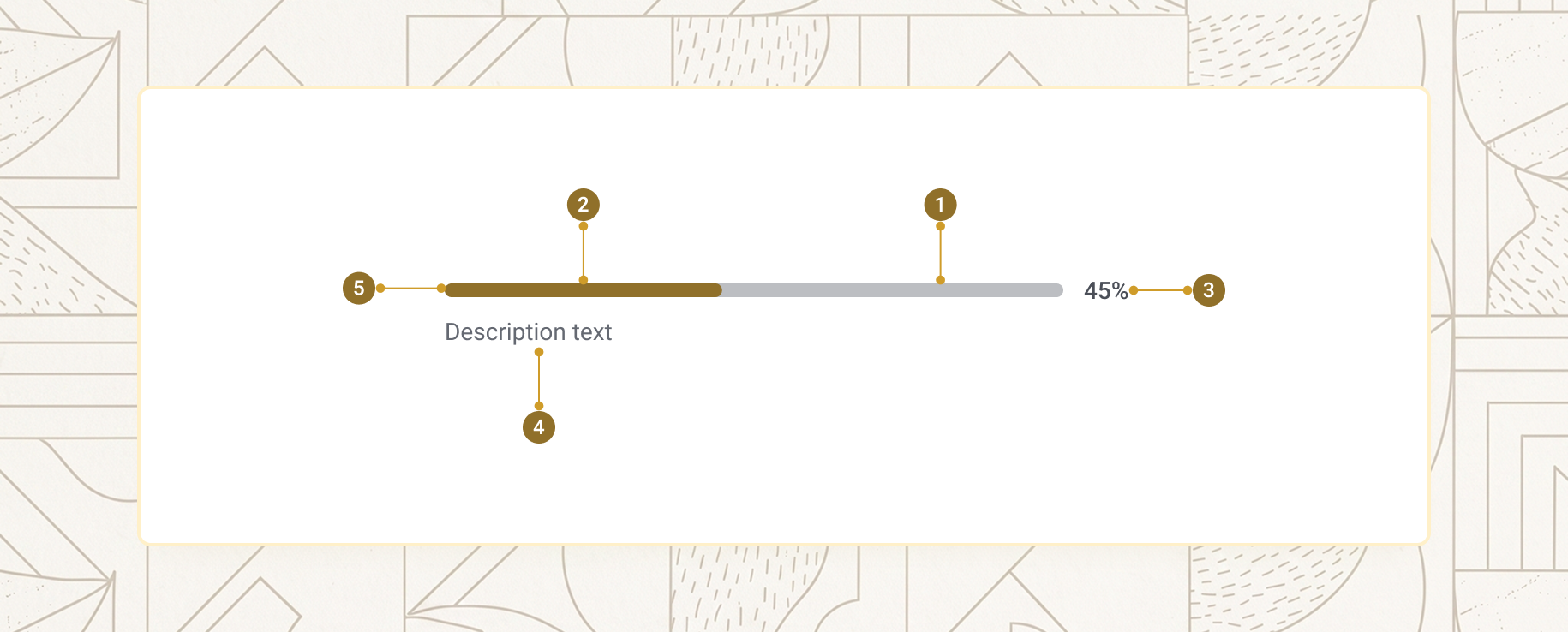
| Item | Name | Description |
|---|---|---|
1 |
Track | The visible background bar, aria-hidden |
2 |
Fill | The coloured portion, width driven by value/max |
3 |
Counter | Optional numeric readout — top or trailing |
4 |
Description | Optional status line below the bar |
5 |
Native <progress> |
Visually hidden; carries the real accessible value |
Basic progress
Set value for a determinate bar, or omit it entirely for an indeterminate (loading) state. Always provide a label, an aria-label, or a paired <label> so screen readers know what the progress represents.
<aegov-progress value="40" label="Upload progress"></aegov-progress>import { AegovProgress } from '@aegov/designsystem-react';
export default function ProgressBasics() {
return <AegovProgress value={40} label="Upload progress" />;
}<template>
<aegov-progress value="40" label="Upload progress"></aegov-progress>
</template>import { Component } from '@angular/core';
import { AegovProgress } from '@aegov/designsystem-angular';
@Component({
selector: 'app-progress-basics',
imports: [AegovProgress],
template: `<aegov-progress value="40" label="Upload progress"></aegov-progress>`,
})
export class ProgressBasicsComponent {}Determinate value
Set value to a number between 0 and max (defaults to 100) — the fill width is calculated from value / max. Use max when reporting progress over a total other than 100, e.g. "3 of 10 documents uploaded".
<aegov-progress value="25" label="Task progress"></aegov-progress>
<aegov-progress value="60" label="Task progress"></aegov-progress>
<aegov-progress value="90" label="Task progress"></aegov-progress>

<!-- Custom max: reporting 3 of 10 -->
<aegov-progress value="3" max="10" label="Documents uploaded"></aegov-progress>import { AegovProgress } from '@aegov/designsystem-react';
export default function ProgressValue() {
return (
<>
<AegovProgress value={25} label="Task progress" />
<AegovProgress value={60} label="Task progress" />
<AegovProgress value={90} label="Task progress" />
<AegovProgress value={3} max={10} label="Documents uploaded" />
</>
);
}<template>
<aegov-progress value="25" label="Task progress"></aegov-progress>
<aegov-progress value="60" label="Task progress"></aegov-progress>
<aegov-progress value="90" label="Task progress"></aegov-progress>
<aegov-progress value="3" max="10" label="Documents uploaded"></aegov-progress>
</template>import { Component } from '@angular/core';
import { AegovProgress } from '@aegov/designsystem-angular';
@Component({
selector: 'app-progress-value',
imports: [AegovProgress],
template: `
<aegov-progress value="25" label="Task progress"></aegov-progress>
<aegov-progress value="60" label="Task progress"></aegov-progress>
<aegov-progress value="90" label="Task progress"></aegov-progress>
<aegov-progress value="3" max="10" label="Documents uploaded"></aegov-progress>
`,
})
export class ProgressValueComponent {}Indeterminate (loading)
Omit value entirely to render an animated indeterminate state — the native <progress> is rendered without a value attribute, putting it into the browser's own indeterminate state. Use this while waiting on an operation of unknown duration.
<aegov-progress label="Loading"></aegov-progress>
<aegov-progress label="Submitting" description="Submitting your application…"></aegov-progress>import { AegovProgress } from '@aegov/designsystem-react';
export default function ProgressIndeterminate() {
return (
<>
<AegovProgress label="Loading" />
<AegovProgress label="Submitting" description="Submitting your application…" />
</>
);
}<template>
<aegov-progress label="Loading"></aegov-progress>
<aegov-progress label="Submitting" description="Submitting your application…"></aegov-progress>
</template>import { Component } from '@angular/core';
import { AegovProgress } from '@aegov/designsystem-angular';
@Component({
selector: 'app-progress-indeterminate',
imports: [AegovProgress],
template: `
<aegov-progress label="Loading"></aegov-progress>
<aegov-progress label="Submitting" description="Submitting your application…"></aegov-progress>
`,
})
export class ProgressIndeterminateComponent {}Counter
counter places a numeric readout next to the bar — trailing (after the bar, same row) or top (above the bar). It's always hidden in the indeterminate state. counter-suffix is appended directly to the value with no automatic spacing, so include any leading space or unit yourself.
<!-- Trailing counter: renders "75%" -->
<aegov-progress value="75" counter="trailing" counter-suffix="%" label="Progress"></aegov-progress>

<!-- Top counter: renders "3/10" -->
<aegov-progress value="3" max="10" counter="top" counter-suffix="/10" label="Documents uploaded"></aegov-progress>

<!-- Suffix with a leading space: renders "120 MB" -->
<aegov-progress value="120" max="500" counter="trailing" counter-suffix=" MB" label="File size"></aegov-progress>import { AegovProgress } from '@aegov/designsystem-react';
export default function ProgressCounter() {
return (
<>
<AegovProgress value={75} counter="trailing" counterSuffix="%" label="Progress" />
<AegovProgress value={3} max={10} counter="top" counterSuffix="/10" label="Documents uploaded" />
<AegovProgress value={120} max={500} counter="trailing" counterSuffix=" MB" label="File size" />
</>
);
}<template>
<aegov-progress value="75" counter="trailing" counter-suffix="%" label="Progress"></aegov-progress>
<aegov-progress value="3" max="10" counter="top" counter-suffix="/10" label="Documents uploaded"></aegov-progress>
<aegov-progress value="120" max="500" counter="trailing" counter-suffix=" MB" label="File size"></aegov-progress>
</template>import { Component } from '@angular/core';
import { AegovProgress } from '@aegov/designsystem-angular';
@Component({
selector: 'app-progress-counter',
imports: [AegovProgress],
template: `
<aegov-progress value="75" counter="trailing" counter-suffix="%" label="Progress"></aegov-progress>
<aegov-progress value="3" max="10" counter="top" counter-suffix="/10" label="Documents uploaded"></aegov-progress>
<aegov-progress value="120" max="500" counter="trailing" counter-suffix=" MB" label="File size"></aegov-progress>
`,
})
export class ProgressCounterComponent {}Description
description renders a <p> line beneath the bar, automatically linked to the hidden native <progress> via aria-describedby — assistive technology announces it when the user navigates to the progress bar. Use it for short status text such as the current step or the file currently being processed.
<aegov-progress
  value="40"
  counter="trailing"
  counter-suffix="%"
  label="Upload progress"
  description="Uploading 2 of 5 files">
</aegov-progress>import { AegovProgress } from '@aegov/designsystem-react';
export default function ProgressDescription() {
return (
<AegovProgress
value={40}
counter="trailing"
counterSuffix="%"
label="Upload progress"
description="Uploading 2 of 5 files"
/>
);
}<template>
<aegov-progress
value="40"
counter="trailing"
counter-suffix="%"
label="Upload progress"
description="Uploading 2 of 5 files"
></aegov-progress>
</template>import { Component } from '@angular/core';
import { AegovProgress } from '@aegov/designsystem-angular';
@Component({
selector: 'app-progress-description',
imports: [AegovProgress],
template: `
<aegov-progress
value="40"
counter="trailing"
counter-suffix="%"
label="Upload progress"
description="Uploading 2 of 5 files"
></aegov-progress>
`,
})
export class ProgressDescriptionComponent {}Track height
height controls the thickness of the bar on the Tailwind spacing scale (each unit is 0.25rem) — default "2" (0.5rem/8px). Use a thinner bar (1 or 1.5) for inline usage and a thicker one (3 or 4) when the progress bar is the focal element on the screen.
<aegov-progress value="50" height="1" label="Progress"></aegov-progress>   <!-- 4px -->
<aegov-progress value="50" height="1.5" label="Progress"></aegov-progress> <!-- 6px -->
<aegov-progress value="50" height="2" label="Progress"></aegov-progress>   <!-- 8px (default) -->
<aegov-progress value="50" height="3" label="Progress"></aegov-progress>   <!-- 12px -->
<aegov-progress value="50" height="4" label="Progress"></aegov-progress> <!-- 16px -->import { AegovProgress } from '@aegov/designsystem-react';
export default function ProgressHeight() {
return (
<>
<AegovProgress value={50} height="1" label="Progress" />
<AegovProgress value={50} height="1.5" label="Progress" />
<AegovProgress value={50} height="2" label="Progress" />
<AegovProgress value={50} height="3" label="Progress" />
<AegovProgress value={50} height="4" label="Progress" />
</>
);
}<template>
<aegov-progress value="50" height="1" label="Progress"></aegov-progress>
<aegov-progress value="50" height="1.5" label="Progress"></aegov-progress>
<aegov-progress value="50" height="2" label="Progress"></aegov-progress>
<aegov-progress value="50" height="3" label="Progress"></aegov-progress>
<aegov-progress value="50" height="4" label="Progress"></aegov-progress>
</template>import { Component } from '@angular/core';
import { AegovProgress } from '@aegov/designsystem-angular';
@Component({
selector: 'app-progress-height',
imports: [AegovProgress],
template: `
<aegov-progress value="50" height="1" label="Progress"></aegov-progress>
<aegov-progress value="50" height="1.5" label="Progress"></aegov-progress>
<aegov-progress value="50" height="2" label="Progress"></aegov-progress>
<aegov-progress value="50" height="3" label="Progress"></aegov-progress>
<aegov-progress value="50" height="4" label="Progress"></aegov-progress>
`,
})
export class ProgressHeightComponent {}Composing with a form field
Wrap the progress bar in aegov-form-field to associate it with a real aegov-label — the label is then announced to screen readers along with the progress value, satisfying the accessibility requirement without needing the label prop at all.
<aegov-form-field>
  <aegov-label>Profile completeness</aegov-label>
  <aegov-progress value="80" counter="trailing" counter-suffix="%"></aegov-progress>
</aegov-form-field>import { AegovFormField, AegovLabel, AegovProgress } from '@aegov/designsystem-react';
export default function ProgressFormField() {
return (
<AegovFormField>
<AegovLabel>Profile completeness</AegovLabel>
<AegovProgress value={80} counter="trailing" counterSuffix="%" />
</AegovFormField>
);
}<template>
<aegov-form-field>
<aegov-label>Profile completeness</aegov-label>
<aegov-progress value="80" counter="trailing" counter-suffix="%"></aegov-progress>
</aegov-form-field>
</template>import { Component } from '@angular/core';
import { AegovFormField, AegovLabel, AegovProgress } from '@aegov/designsystem-angular';
@Component({
selector: 'app-progress-form-field',
imports: [AegovFormField, AegovLabel, AegovProgress],
template: `
<aegov-form-field>
<aegov-label>Profile completeness</aegov-label>
<aegov-progress value="80" counter="trailing" counter-suffix="%"></aegov-progress>
</aegov-form-field>
`,
})
export class ProgressFormFieldComponent {}Combined example
A typical document-upload status: a determinate bar with a top counter, a description line, and a thicker track for visibility.
<aegov-progress
  value="6"
  max="8"
  height="3"
  counter="top"
  counter-suffix="/8"
  label="Document upload progress"
  description="Uploading supporting documents — please keep this tab open.">
</aegov-progress>import { AegovProgress } from '@aegov/designsystem-react';
export default function ProgressCombined() {
return (
<AegovProgress
value={6}
max={8}
height="3"
counter="top"
counterSuffix="/8"
label="Document upload progress"
description="Uploading supporting documents — please keep this tab open."
/>
);
}<template>
<aegov-progress
value="6"
max="8"
height="3"
counter="top"
counter-suffix="/8"
label="Document upload progress"
description="Uploading supporting documents — please keep this tab open."
></aegov-progress>
</template>import { Component } from '@angular/core';
import { AegovProgress } from '@aegov/designsystem-angular';
@Component({
selector: 'app-progress-combined',
imports: [AegovProgress],
template: `
<aegov-progress
value="6"
max="8"
height="3"
counter="top"
counter-suffix="/8"
label="Document upload progress"
description="Uploading supporting documents — please keep this tab open."
></aegov-progress>
`,
})
export class ProgressCombinedComponent {}RTL support
The fill grows from the track's start edge using a CSS logical property (inset-inline-start), so it mirrors automatically in RTL — no JavaScript direction detection involved, and the bar is never portalled, so there's no ancestor-dir gap to worry about here. The top counter follows the document's text direction, and the trailing counter sits at the end edge of the row.
<div dir="rtl">
  <aegov-progress
    value="6"
    max="8"
    height="3"
    counter="top"
    counter-suffix="/٨"
    label="تقدم رفع المستندات"
    description="جارٍ تحميل المستندات الداعمة — يرجى إبقاء هذه الصفحة مفتوحة.">
  </aegov-progress>
</div>import { AegovProgress } from '@aegov/designsystem-react';
export default function RtlProgress() {
return (
<div dir="rtl">
<AegovProgress
value={6}
max={8}
height="3"
counter="top"
counterSuffix="/٨"
label="تقدم رفع المستندات"
description="جارٍ تحميل المستندات الداعمة — يرجى إبقاء هذه الصفحة مفتوحة."
/>
</div>
);
}<template>
<div dir="rtl">
<aegov-progress
value="6"
max="8"
height="3"
counter="top"
counter-suffix="/٨"
label="تقدم رفع المستندات"
description="جارٍ تحميل المستندات الداعمة — يرجى إبقاء هذه الصفحة مفتوحة."
></aegov-progress>
</div>
</template>import { Component } from '@angular/core';
import { AegovProgress } from '@aegov/designsystem-angular';
@Component({
selector: 'app-rtl-progress',
imports: [AegovProgress],
template: `
<div dir="rtl">
<aegov-progress
value="6"
max="8"
height="3"
counter="top"
counter-suffix="/٨"
label="تقدم رفع المستندات"
description="جارٍ تحميل المستندات الداعمة — يرجى إبقاء هذه الصفحة مفتوحة."
></aegov-progress>
</div>
`,
})
export class RtlProgressComponent {}Usage
Here is the recommended usage of a progress bar on any website or application. These are recommended usage guides, however the developer must use the best practices of web and application development to accurately use this component.
Always give the progress bar an accessible label
A visible <aegov-label> (inside aegov-form-field), the label prop, or an aria-label/aria-labelledby pass-through all work — the component logs a console warning during development if none is present.
Switch to a determinate value as soon as one is known
Indeterminate progress is appropriate only while the true duration is genuinely unknown. Once a real percentage is available, set value so the user can estimate how much longer the task will take.
Use description (or a live-region sibling) to announce state changes
A single "Uploading 2 of 5 files" line, updated as the task progresses, gives both sighted and screen-reader users a running status without needing to interpret the bar itself.
Don't try to recolour the bar to signal success or failure
There are no colour variants by design. Communicate a status change through the description text or a sibling aegov-callout, not by overriding the fill colour with extra-class.
Don't forget the leading space (or unit) in counter-suffix
It's appended directly to the value with no automatic spacing — counter-suffix="MB" renders "120MB", not "120 MB". Include the space yourself when you want one.
Don't rely on field-id alone to satisfy the accessibility warning
Pairing a field-id with a real <label for="..."> (or aegov-label inside aegov-form-field) does satisfy it — but the field-id prop by itself, with no label actually pointing at it, does not.
API reference
The following are the properties and references of a progress bar
Properties
| Attribute | Description | Type | Default |
|---|---|---|---|
| DOM |
| auto-generated |
| Current progress value. Omit for an indeterminate (loading) state. |
| — |
| Maximum value used to compute the fill percentage. |
|
|
| Track thickness on the Tailwind spacing scale — each unit is |
|
|
| Counter placement. Hidden when not set, and always hidden in the indeterminate state. |
| — |
| Suffix appended directly to the counter value, with no automatic spacing. |
|
|
| Accessible label applied as |
| — |
| Description text rendered as a paragraph below the bar, linked to the native |
| — |
| Additional CSS classes applied to the wrapper. |
| — |
Slots
| Note |
|---|
This component exposes no slots — the counter, suffix, and description are all configured via properties. |
Events
| Note |
|---|
This component emits no custom events. To react to progress changes, observe the underlying source of progress in your own application code and update |
Pass-through attributes
| Attribute group | Forwarded to | Notes |
|---|---|---|
| Hidden native | Use for |
| Hidden native | Also forwarded, in addition to |
| Host element | Applied to the wrapper, alongside |
Notes
The following notes are applicable of this component.
Built-in accessibility
- A hidden native
<progress>element, carrying the samevalue/max, is always rendered so assistive technology gets correct progress semantics — the visible custom track isaria-hidden="true"so it isn't announced as a duplicate. - When
valueis omitted, the native<progress>renders with novalueattribute at all, which is what puts it into the browser's own indeterminate state (not a class or ARIA attribute the component invents). - Setting
descriptiongives the resulting<p>an auto-generatedidand links it to the native<progress>viaaria-describedby— a developer-suppliedaria-describedbypass-through is composed with it, so both are announced. - A console warning fires in development if the bar has no
labelprop, noaria-label/aria-labelledbypass-through, and no external<label for="field-id">pointing at it.
Developer responsibilities
- Provide a label via the
labelprop,aria-label/aria-labelledby, or a real<label>(typically viaaegov-labelinsideaegov-form-field). - Move from indeterminate to a determinate
valueas soon as a real completion percentage is known. - Use
description, or a siblingaria-live="polite"element, to announce state changes such as "Upload complete". - When
counter-suffixis set and the bar is determinate, the component already sets a matchingaria-valuetextautomatically (e.g."75%") — only pass througharia-valuetextmanually when you need a fuller custom description (e.g."6 of 8 documents uploaded").
Notes
counter-suffixis appended with no automatic spacing — include any leading space or unit yourself (e.g." MB").heightaccepts a Tailwind spacing-scale string; a non-numeric value falls back to the default0.5rem(and logs a console warning).- There are no colour variants (success/error/etc.) by design — communicate status through
descriptionor a siblingaegov-calloutrather than recolouring the fill.