
Anatomy
aegov-fileupload wraps a real native <input type="file">. Depending on appearance, the visible control is a styled input row with a trailing browse button, a stand-alone trigger button with a file list beneath it, or a bordered drag-and-drop dropzone.
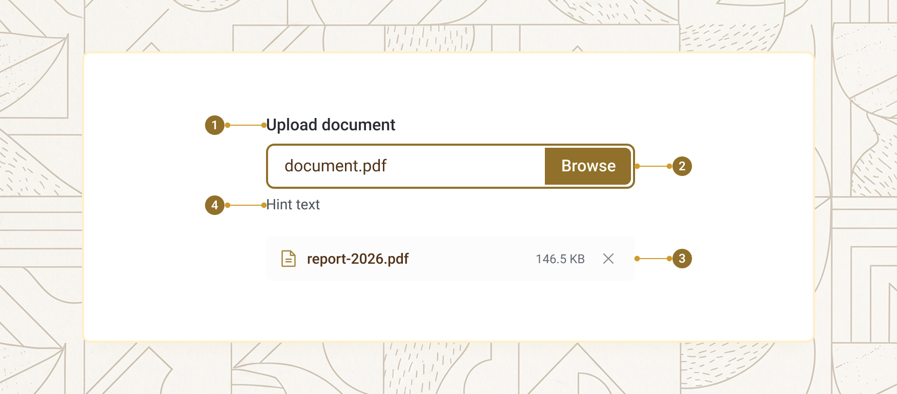
| Item | Name | Description |
|---|---|---|
1 |
Label | The field's visible name, rendered above the control |
2 |
Control | The input row, button, or dropzone — the exact surface depends on appearance |
3 |
File list | Picked files, each with its name, size, and a remove button (button/dropzone appearances) |
4 |
Hint / helper / error | Supporting text below the control — the hint, the auto-generated allowed-types summary, and the error message when invalid (the hint and summary stay visible alongside it) |
Appearances
appearance selects the layout. All three share the same validation, events, and form behaviour — only the visual presentation differs. default looks like a styled text input with a trailing Browse button, and replaces the whole selection on each pick — best for a single required document inside a dense form. button renders a stand-alone trigger button with picked files listed below it, accumulating across picks. dropzone renders a large drag-and-drop target with a fallback browse button, also accumulating — best for a high-volume upload step.
<aegov-fileupload appearance="default" label="Passport bio-data page" accept="image/*,.pdf" max-file-size="5242880"></aegov-fileupload>
<aegov-fileupload appearance="button" label="Supporting documents" is-multiple="true" max-files="5" accept=".pdf,.docx,image/*"></aegov-fileupload>
<aegov-fileupload appearance="dropzone" label="Drop your supporting documents here" hint="Accepted: PDF, JPG, PNG. Maximum 10 MB per file." is-multiple="true" max-file-size="10485760" accept=".pdf,image/*"></aegov-fileupload>import { AegovFileupload } from '@aegov/designsystem-react';
export default function FileUploadAppearances() {
return (
<>
<AegovFileupload appearance="default" label="Passport bio-data page" accept="image/*,.pdf" maxFileSize={5242880} />
<AegovFileupload appearance="button" label="Supporting documents" isMultiple maxFiles={5} accept=".pdf,.docx,image/*" />
<AegovFileupload appearance="dropzone" label="Drop your supporting documents here" hint="Accepted: PDF, JPG, PNG. Maximum 10 MB per file." isMultiple maxFileSize={10485760} accept=".pdf,image/*" />
</>
);
}<template>
<aegov-fileupload appearance="default" label="Passport bio-data page" accept="image/*,.pdf" max-file-size="5242880"></aegov-fileupload>
<aegov-fileupload appearance="button" label="Supporting documents" is-multiple="true" max-files="5" accept=".pdf,.docx,image/*"></aegov-fileupload>
<aegov-fileupload appearance="dropzone" label="Drop your supporting documents here" hint="Accepted: PDF, JPG, PNG. Maximum 10 MB per file." is-multiple="true" max-file-size="10485760" accept=".pdf,image/*"></aegov-fileupload>
</template>import { Component } from '@angular/core';
import { AegovFileupload } from '@aegov/designsystem-angular';
@Component({
selector: 'app-file-upload-appearances',
imports: [AegovFileupload],
template: `
<aegov-fileupload appearance="default" label="Passport bio-data page" accept="image/*,.pdf" max-file-size="5242880"></aegov-fileupload>
<aegov-fileupload appearance="button" label="Supporting documents" is-multiple="true" max-files="5" accept=".pdf,.docx,image/*"></aegov-fileupload>
<aegov-fileupload appearance="dropzone" label="Drop your supporting documents here" hint="Accepted: PDF, JPG, PNG. Maximum 10 MB per file." is-multiple="true" max-file-size="10485760" accept=".pdf,image/*"></aegov-fileupload>
`,
})
export class FileUploadAppearancesComponent {}File type and size validation
Set accept to a comma-separated list of extensions, MIME types, or wildcards. The component enforces it both as a filter hint to the OS picker and again after selection — the OS picker's own filter can usually be bypassed by the user, so the second check matters. Set max-file-size in bytes to reject oversized files. When accept is set and label-help is omitted, a friendly "Allowed: …" summary is generated automatically.
<aegov-fileupload label="Passport photograph" accept="image/jpeg,image/png" max-file-size="2097152"></aegov-fileupload>import { AegovFileupload } from '@aegov/designsystem-react';
export default function FileUploadValidation() {
return (
<AegovFileupload label="Passport photograph" accept="image/jpeg,image/png" maxFileSize={2097152} />
);
}<template>
<aegov-fileupload label="Passport photograph" accept="image/jpeg,image/png" max-file-size="2097152"></aegov-fileupload>
</template>import { Component } from '@angular/core';
import { AegovFileupload } from '@aegov/designsystem-angular';
@Component({
selector: 'app-file-upload-validation',
imports: [AegovFileupload],
template: `
<aegov-fileupload label="Passport photograph" accept="image/jpeg,image/png" max-file-size="2097152"></aegov-fileupload>
`,
})
export class FileUploadValidationComponent {}Multiple files and maximum count
Set is-multiple="true" to let the picker return more than one file at a time (and let the dropzone accept several dropped files). The button and dropzone appearances accumulate across picks even without it — set max-files="1" there when only one file is allowed. Pair it with max-files to cap the total — once the cap is reached, further picks beyond it are not added, and a notice under the field names the files that were left out. Picking a file with the same name as one already in the list replaces that entry rather than adding a duplicate.
<aegov-fileupload appearance="button" label="Vehicle registration documents" is-multiple="true" max-files="3" accept=".pdf,image/*"></aegov-fileupload>import { AegovFileupload } from '@aegov/designsystem-react';
export default function FileUploadMultiple() {
return (
<AegovFileupload appearance="button" label="Vehicle registration documents" isMultiple maxFiles={3} accept=".pdf,image/*" />
);
}<template>
<aegov-fileupload appearance="button" label="Vehicle registration documents" is-multiple="true" max-files="3" accept=".pdf,image/*"></aegov-fileupload>
</template>import { Component } from '@angular/core';
import { AegovFileupload } from '@aegov/designsystem-angular';
@Component({
selector: 'app-file-upload-multiple',
imports: [AegovFileupload],
template: `
<aegov-fileupload appearance="button" label="Vehicle registration documents" is-multiple="true" max-files="3" accept=".pdf,image/*"></aegov-fileupload>
`,
})
export class FileUploadMultipleComponent {}Sizes
size scales the input row height (default appearance) or the trigger button height (button/dropzone appearances). Accepts xs, sm, base (default), lg, xl, or a Tailwind-style responsive string such as sm md:base xl:lg.
<aegov-fileupload size="xs" label="Extra small" accept=".pdf"></aegov-fileupload>
<aegov-fileupload size="sm" label="Small" accept=".pdf"></aegov-fileupload>
<aegov-fileupload size="base" label="Base (default)" accept=".pdf"></aegov-fileupload>
<aegov-fileupload size="lg" label="Large" accept=".pdf"></aegov-fileupload>
<aegov-fileupload size="xl" label="Extra large" accept=".pdf"></aegov-fileupload>import { AegovFileupload } from '@aegov/designsystem-react';
export default function FileUploadSizes() {
return (
<>
<AegovFileupload size="xs" label="Extra small" accept=".pdf" />
<AegovFileupload size="sm" label="Small" accept=".pdf" />
<AegovFileupload size="base" label="Base (default)" accept=".pdf" />
<AegovFileupload size="lg" label="Large" accept=".pdf" />
<AegovFileupload size="xl" label="Extra large" accept=".pdf" />
</>
);
}<template>
<aegov-fileupload size="xs" label="Extra small" accept=".pdf"></aegov-fileupload>
<aegov-fileupload size="sm" label="Small" accept=".pdf"></aegov-fileupload>
<aegov-fileupload size="base" label="Base (default)" accept=".pdf"></aegov-fileupload>
<aegov-fileupload size="lg" label="Large" accept=".pdf"></aegov-fileupload>
<aegov-fileupload size="xl" label="Extra large" accept=".pdf"></aegov-fileupload>
</template>import { Component } from '@angular/core';
import { AegovFileupload } from '@aegov/designsystem-angular';
@Component({
selector: 'app-file-upload-sizes',
imports: [AegovFileupload],
template: `
<aegov-fileupload size="xs" label="Extra small" accept=".pdf"></aegov-fileupload>
<aegov-fileupload size="sm" label="Small" accept=".pdf"></aegov-fileupload>
<aegov-fileupload size="base" label="Base (default)" accept=".pdf"></aegov-fileupload>
<aegov-fileupload size="lg" label="Large" accept=".pdf"></aegov-fileupload>
<aegov-fileupload size="xl" label="Extra large" accept=".pdf"></aegov-fileupload>
`,
})
export class FileUploadSizesComponent {}Variant
variant selects the colour family for the default-appearance border, the button-appearance fill, the dropzone border, and the file-name accent. The focus ring uses the variant's own support colour; the error border stays aered-600 regardless of variant.
| Variant | Idle border (default) | Browse btn bg | Dropzone border | File-name text |
|---|---|---|---|---|
primary |
primary-600 |
primary-600 |
primary-300 |
primary-900 |
secondary |
secondary-600 |
secondary-600 |
secondary-300 |
secondary-900 |
neutral-max |
aeblack-800 |
aeblack-800 |
aeblack-300 |
aeblack-950 |
neutral-min |
aeblack-400 |
aeblack-200 |
aeblack-200 |
aeblack-700 |
<aegov-fileupload variant="primary" label="Primary" accept=".pdf"></aegov-fileupload>
<aegov-fileupload variant="secondary" label="Secondary" accept=".pdf"></aegov-fileupload>
<aegov-fileupload variant="neutral-max" label="Neutral-max" accept=".pdf"></aegov-fileupload>
<aegov-fileupload variant="neutral-min" label="Neutral-min" accept=".pdf"></aegov-fileupload>import { AegovFileupload } from '@aegov/designsystem-react';
export default function FileUploadVariants() {
return (
<>
<AegovFileupload variant="primary" label="Primary" accept=".pdf" />
<AegovFileupload variant="secondary" label="Secondary" accept=".pdf" />
<AegovFileupload variant="neutral-max" label="Neutral-max" accept=".pdf" />
<AegovFileupload variant="neutral-min" label="Neutral-min" accept=".pdf" />
</>
);
}<template>
<aegov-fileupload variant="primary" label="Primary" accept=".pdf"></aegov-fileupload>
<aegov-fileupload variant="secondary" label="Secondary" accept=".pdf"></aegov-fileupload>
<aegov-fileupload variant="neutral-max" label="Neutral-max" accept=".pdf"></aegov-fileupload>
<aegov-fileupload variant="neutral-min" label="Neutral-min" accept=".pdf"></aegov-fileupload>
</template>import { Component } from '@angular/core';
import { AegovFileupload } from '@aegov/designsystem-angular';
@Component({
selector: 'app-file-upload-variants',
imports: [AegovFileupload],
template: `
<aegov-fileupload variant="primary" label="Primary" accept=".pdf"></aegov-fileupload>
<aegov-fileupload variant="secondary" label="Secondary" accept=".pdf"></aegov-fileupload>
<aegov-fileupload variant="neutral-max" label="Neutral-max" accept=".pdf"></aegov-fileupload>
<aegov-fileupload variant="neutral-min" label="Neutral-min" accept=".pdf"></aegov-fileupload>
`,
})
export class FileUploadVariantsComponent {}Required and disabled
Set is-required="true" to render a red asterisk next to the label and report valueMissing to the form through ElementInternals while no file is chosen, so it participates in native form validation. Set is-disabled="true" to lock the control against any interaction.
<aegov-fileupload label="Identification" is-required="true" accept=".pdf,image/*"></aegov-fileupload>
<aegov-fileupload label="Pre-filled application (locked)" is-disabled="true" accept=".pdf"></aegov-fileupload>import { AegovFileupload } from '@aegov/designsystem-react';
export default function FileUploadDisabledRequired() {
return (
<>
<AegovFileupload label="Identification" isRequired accept="image/*,.pdf" />
<AegovFileupload label="Pre-filled application (locked)" isDisabled accept=".pdf" />
</>
);
}<template>
<aegov-fileupload label="Identification" is-required="true" accept="image/*,.pdf"></aegov-fileupload>
<aegov-fileupload label="Pre-filled application (locked)" is-disabled="true" accept=".pdf"></aegov-fileupload>
</template>import { Component } from '@angular/core';
import { AegovFileupload } from '@aegov/designsystem-angular';
@Component({
selector: 'app-file-upload-disabled-required',
imports: [AegovFileupload],
template: `
<aegov-fileupload label="Identification" is-required="true" accept="image/*,.pdf"></aegov-fileupload>
<aegov-fileupload label="Pre-filled application (locked)" is-disabled="true" accept=".pdf"></aegov-fileupload>
`,
})
export class FileUploadDisabledRequiredComponent {}RTL support
The component is direction-agnostic — every layout works the same way under dir="rtl", reading its computed direction from the nearest ancestor the same way any real element does (there is no portal involved, so this always works). In the default appearance, the browse button keeps its position at the trailing edge of the row relative to the reading direction, which is the physical left in RTL. Built-in strings — button text, "No file chosen", the drag-and-drop prompt, the "Allowed: …" summary, file sizes, rejection and max-files messages, "Required" and "Remove {filename}" — switch to Arabic when the nearest dir (or <html dir>) is rtl; lang alone does not switch them. Supply Arabic label, hint, label-help and label-button text yourself for a fully localized field.
<div dir="rtl">
  <aegov-fileupload label="رفع الهوية الإماراتية" hint="يرجى رفع نسخة واضحة من وجهي الهوية بصيغة PDF." label-button="اختر ملف" accept=".pdf" max-file-size="5242880"></aegov-fileupload>
  <aegov-fileupload appearance="dropzone" label="المستندات الداعمة للطلب" hint="أرفق صوراً ضوئية للهوية الإماراتية وجواز السفر." label-button="استعراض الملفات" is-multiple="true" max-files="5" accept=".pdf,image/*"></aegov-fileupload>
</div>import { AegovFileupload } from '@aegov/designsystem-react';
export default function RtlFileUpload() {
return (
<div dir="rtl">
<AegovFileupload label="رفع الهوية الإماراتية" hint="يرجى رفع نسخة واضحة من وجهي الهوية بصيغة PDF." labelButton="اختر ملف" accept=".pdf" maxFileSize={5242880} />
<AegovFileupload appearance="dropzone" label="المستندات الداعمة للطلب" hint="أرفق صوراً ضوئية للهوية الإماراتية وجواز السفر." labelButton="استعراض الملفات" isMultiple maxFiles={5} accept=".pdf,image/*" />
</div>
);
}<template>
<div dir="rtl">
<aegov-fileupload label="رفع الهوية الإماراتية" hint="يرجى رفع نسخة واضحة من وجهي الهوية بصيغة PDF." label-button="اختر ملف" accept=".pdf" max-file-size="5242880"></aegov-fileupload>
<aegov-fileupload appearance="dropzone" label="المستندات الداعمة للطلب" hint="أرفق صوراً ضوئية للهوية الإماراتية وجواز السفر." label-button="استعراض الملفات" is-multiple="true" max-files="5" accept=".pdf,image/*"></aegov-fileupload>
</div>
</template>import { Component } from '@angular/core';
import { AegovFileupload } from '@aegov/designsystem-angular';
@Component({
selector: 'app-rtl-file-upload',
imports: [AegovFileupload],
template: `
<div dir="rtl">
<aegov-fileupload label="رفع الهوية الإماراتية" hint="يرجى رفع نسخة واضحة من وجهي الهوية بصيغة PDF." label-button="اختر ملف" accept=".pdf" max-file-size="5242880"></aegov-fileupload>
<aegov-fileupload appearance="dropzone" label="المستندات الداعمة للطلب" hint="أرفق صوراً ضوئية للهوية الإماراتية وجواز السفر." label-button="استعراض الملفات" is-multiple="true" max-files="5" accept=".pdf,image/*"></aegov-fileupload>
</div>
`,
})
export class RtlFileUploadComponent {}Usage
Here is the recommended usage of a file upload on any website or application. These are recommended usage guides, however the developer must use the best practices of web and application development to accurately use this component.
Give every field a real, visible label
A file upload with no visible label is hard to identify by touch, by eye, or by screen reader — set label, or pair it with an external aegov-label.
Always pair a dropzone with its fallback button
Drag-and-drop is a pointer-only enhancement — appearance="dropzone" always renders a real button alongside the drop target, so keyboard and touch users have an equivalent way in. Never remove or hide it.
State size and type limits in the hint, not just label-help
The summary generated from accept (when label-help is omitted) lists only the allowed types — it never mentions max-file-size. If there's also a size limit, say so explicitly in hint — a user shouldn't have to fail an upload once to learn the limit.
Do not rely on the OS picker's accept filter alone
The browser's file dialog filter is a convenience, not a guarantee — most OS pickers let a user override it and choose "All files". aegov-fileupload re-validates every picked file against accept after selection; never assume the filter alone was enough if you're validating independently downstream.
Do not use the default appearance for an accumulating multi-file upload
The default appearance replaces the entire selection on every pick — it's built for a single required document. For a field where users add several files over multiple picks, use appearance="button" or appearance="dropzone" instead, both of which accumulate.
API reference
The following are the properties and references of a file upload
aegov-fileupload properties
| Attribute | Description | Type | Default |
|---|---|---|---|
| DOM |
| auto-generated |
| Layout — a styled input with a browse button, a stand-alone trigger button, or a drag-and-drop dropzone. |
|
|
| Control size. Accepts a single token or a responsive string, e.g. |
|
|
| Colour family for the default-appearance border, the button-appearance fill, the dropzone border, and the file-name accent. The focus ring uses the variant's support colour; the error border stays |
|
|
| Lets the picker return several files, and lets the dropzone accept several dropped files (without it, only the first dropped file is used). |
|
|
| Comma-separated list of allowed file types — extensions ( |
| none |
| Maximum size of a single file, in bytes. |
| none |
| Maximum number of files in the selection, in every appearance. Files beyond the cap are left out and named in a notice under the field; the files that were kept stay a valid selection. |
| none |
| Disables the control. |
|
|
| Marks the field as required and renders a red asterisk on the label. While empty, the field reports |
|
|
| Form field name. Reflected on the host; every selected file is submitted under this one name through |
| none |
| Label text rendered above the control. |
| none |
| Helper/hint text rendered below the control, before the allowed-types summary. It stays visible while an error shows, and both are announced with the control. |
| none |
| Helper text under the control. Overrides the auto-generated "Allowed: …" summary built from |
| none |
| Puts the field into the error state. |
|
|
| Inline error text shown below the field when |
|
|
| Custom text for the trigger/browse button. |
| none |
Slots
| Slot | When rendered | Purpose |
|---|---|---|
| Whenever provided — stays visible while an error shows | Rich HTML alternative to the |
| When | Rich HTML error markup shown below the field. |
Events
| Event | Detail | Description |
|---|---|---|
|
| Fires after every successful add or remove. |
|
| Fires when a file is removed via its remove button. |
|
| Fires whenever validation runs. Mapped validity flags indicate the failure type — |
Methods
| Method | Returns | Description |
|---|---|---|
|
| Resolves with a copy of the currently selected files. |
|
| Empties the selection and resets the inner native input. |
|
| Runs field validation and returns the result. |
|
| Sets a custom validation message. Pass an empty string to clear it. |
Pass-through attributes
| Attribute | Notes | Forwards to |
|---|---|---|
| Preserves | inner |
|
| inner |
| Auto-focus on page load. | inner |
| Associates the control with a | inner |
| Custom tab order. | inner |
| Native browser tooltip. | inner |
| Chromium/WebKit-only flag for directory selection. | inner |
| Stay on the host element — never forwarded inward. | host |
Notes
The following notes are applicable of this component.
Built-in accessibility
- The control is anchored on a real
<input type="file">, so it is keyboard-focusable, screen-reader-friendly, and submits with native forms viaElementInternals. - Default appearance: the visible
labelis a real<label for>on the native input. Button and dropzone appearances: the label names therole="group"around the trigger, and the trigger button's name is its visible text followed by the label (for example "Browse Files, Supporting documents"), so speech-input users can say what they see. A label fromaegov-form-field, oraria-label/aria-labelledbyon the host, is used the same way. - Default appearance: the native input carries
aria-invalidand anaria-describedbylinking "Required" (whenis-requiredis set — a file input can't takearia-required), the allowed-types summary, the error and the hint, directly on the visible, focusable control. Its accessible name includes the visible "Browse" text after the label, so speech-input users can say "click Browse". - Button and dropzone appearances: the native input is visually hidden (
aria-hidden,tabindex="-1") behind a realaegov-button, inside the named group. The trigger button itself carriesaria-invalidand anaria-descriptionthat reads the current selection, "Required", the allowed types, the error and the hint, so assistive tech announces the field's state on the control that has focus. - The error region gets
role="alert"once the user has interacted with the field at least once, so a validation message already present at initial load doesn't interrupt assistive tech on page arrival. - Each file's remove button has a bilingual
aria-label("Remove {filename}"); its icon isaria-hidden="true". - Added and removed files are announced through a polite status message ("passport.pdf added (1 file)", "passport.pdf removed"), in Arabic when the field is inside
dir="rtl", otherwise in English. - In the button and dropzone appearances, picking a file with the same name as one already in the list replaces that entry instead of adding it twice.
- With
max-files, files over the limit are not added: a visible notice under the list names them ("report.pdf not added: maximum 3 files.") and is announced. It is a notice, not an error, so the field is not marked invalid. - The native input's value is reset after every pick, so selecting the exact same file again still fires
aegovFileuploadChange.
Developer responsibilities
- Always set a real
label(or pair with an externalaegov-label) — the control has no other fallback accessible name. - For
appearance="dropzone", drag-and-drop is a pointer-only enhancement; the fallback browse button is the accessible way in for keyboard and touch users. Never remove it. - Use
error-messageor theerrorslot to surface validation messages — both are announced with the control automatically, alongside the hint, which stays visible. - The component only selects files; it does not upload them. When your code uploads the files, show the progress and the result for each one (for example "Uploading 2 of 3", "passport.pdf uploaded", "passport.pdf failed, the file is too large") and announce those changes in a polite live region (
role="status") so screen-reader users hear them without moving focus (WCAG 4.1.3). Report a failed upload witherror-messageandis-invalid, and give the user a way to retry or remove the file. appearance="default"replaces the entire selection on each pick;buttonanddropzoneaccumulate. Callclear()to reset programmatically.- The OS file picker's own type filter (built from
accept) can usually be bypassed by the user (most pickers offer an "All files" option) — the component re-validates every picked file after selection regardless, so don't skipaccepteven if you also validate server-side.
Keyboard support
| Key | Function |
|---|---|
Tab / Shift + Tab |
Moves focus into the control, between picked files' remove buttons, and to the next/previous focusable element. |
Enter, Space |
Opens the OS file picker when the trigger (native input, in default appearance, or the browse/dropzone button) is focused. |
Enter, Space |
Removes the focused file when a remove button is focused. |