
Anatomy
The aegov-callout component renders a leading icon, a content area, and two optional trailing regions — a single inline link or a row of action buttons — plus an optional dismiss button.
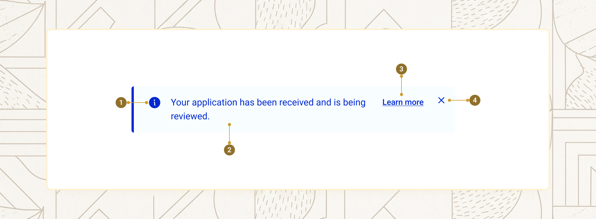
| Item | Name | Description |
|---|---|---|
1 |
Variant icon | Automatic icon matching the variant, or a custom icon via the icon slot |
2 |
Content | The slotted message text |
3 |
Link or actions | A single trailing link, or a row of action buttons — mutually exclusive |
4 |
Dismiss button | Closes the callout, shown only when is-dismissible="true" |
Variants
The variant property sets the colour scheme, the default leading icon, and the implicit ARIA role. error and warning resolve to role="alert"; default, success, and info resolve to role="status".
<aegov-callout variant="default">A neutral notice with no severity attached.</aegov-callout>
<aegov-callout variant="info">UAE Pass authentication is now available for all government services.</aegov-callout>
<aegov-callout variant="success">Your application has been received. You will receive an SMS confirmation shortly.</aegov-callout>
<aegov-callout variant="warning">Your residency permit expires in 14 days. Renew before 15 May to avoid late fees.</aegov-callout>
<aegov-callout variant="error">We could not verify your Emirates ID. Please check the number and try again.</aegov-callout>import { AegovCallout } from '@aegov/designsystem-react';
export default function CalloutVariants() {
return (
<>
<AegovCallout variant="default">A neutral notice with no severity attached.</AegovCallout>
<AegovCallout variant="info">UAE Pass authentication is now available for all government services.</AegovCallout>
<AegovCallout variant="success">Your application has been received. You will receive an SMS confirmation shortly.</AegovCallout>
<AegovCallout variant="warning">Your residency permit expires in 14 days. Renew before 15 May to avoid late fees.</AegovCallout>
<AegovCallout variant="error">We could not verify your Emirates ID. Please check the number and try again.</AegovCallout>
</>
);
}<template>
<aegov-callout variant="default">A neutral notice with no severity attached.</aegov-callout>
<aegov-callout variant="info">UAE Pass authentication is now available for all government services.</aegov-callout>
<aegov-callout variant="success">Your application has been received. You will receive an SMS confirmation shortly.</aegov-callout>
<aegov-callout variant="warning">Your residency permit expires in 14 days. Renew before 15 May to avoid late fees.</aegov-callout>
<aegov-callout variant="error">We could not verify your Emirates ID. Please check the number and try again.</aegov-callout>
</template>import { Component } from '@angular/core';
import { AegovCallout } from '@aegov/designsystem-angular';
@Component({
selector: 'app-callout-variants',
imports: [AegovCallout],
template: `
<aegov-callout variant="default">A neutral notice with no severity attached.</aegov-callout>
<aegov-callout variant="info">UAE Pass authentication is now available for all government services.</aegov-callout>
<aegov-callout variant="success">Your application has been received. You will receive an SMS confirmation shortly.</aegov-callout>
<aegov-callout variant="warning">Your residency permit expires in 14 days. Renew before 15 May to avoid late fees.</aegov-callout>
<aegov-callout variant="error">We could not verify your Emirates ID. Please check the number and try again.</aegov-callout>
`,
})
export class CalloutVariantsComponent {}Appearance
soft (default) uses a tinted background with a coloured start-side border — the standard treatment for inline notices that shouldn't dominate the page. solid uses a fully saturated colour panel with no border — louder, suitable for blocking errors or hero confirmations.
<aegov-callout appearance="soft" variant="success">
  Soft success — your service request has been logged.
</aegov-callout>

<aegov-callout appearance="solid" variant="success">
  Solid success — your payment was processed successfully.
</aegov-callout>import { AegovCallout } from '@aegov/designsystem-react';
export default function CalloutAppearance() {
return (
<>
<AegovCallout appearance="soft" variant="success">
Soft success — your service request has been logged.
</AegovCallout>
<AegovCallout appearance="solid" variant="success">
Solid success — your payment was processed successfully.
</AegovCallout>
</>
);
}<template>
<aegov-callout appearance="soft" variant="success">
Soft success — your service request has been logged.
</aegov-callout>
<aegov-callout appearance="solid" variant="success">
Solid success — your payment was processed successfully.
</aegov-callout>
</template>import { Component } from '@angular/core';
import { AegovCallout } from '@aegov/designsystem-angular';
@Component({
selector: 'app-callout-appearance',
imports: [AegovCallout],
template: `
<aegov-callout appearance="soft" variant="success">
Soft success — your service request has been logged.
</aegov-callout>
<aegov-callout appearance="solid" variant="success">
Solid success — your payment was processed successfully.
</aegov-callout>
`,
})
export class CalloutAppearanceComponent {}Size
The size property scales font size, icon size, and padding together. Three tokens are available: sm, base (default), and lg.
<aegov-callout size="sm" variant="info">Compact callout, suitable for dense forms and side panels.</aegov-callout>
<aegov-callout size="base" variant="info">Default size, suitable for most page contexts.</aegov-callout>
<aegov-callout size="lg" variant="info">Prominent callout for landing pages and hero confirmations.</aegov-callout>import { AegovCallout } from '@aegov/designsystem-react';
export default function CalloutSizes() {
return (
<>
<AegovCallout size="sm" variant="info">Compact callout, suitable for dense forms and side panels.</AegovCallout>
<AegovCallout size="base" variant="info">Default size, suitable for most page contexts.</AegovCallout>
<AegovCallout size="lg" variant="info">Prominent callout for landing pages and hero confirmations.</AegovCallout>
</>
);
}<template>
<aegov-callout size="sm" variant="info">Compact callout, suitable for dense forms and side panels.</aegov-callout>
<aegov-callout size="base" variant="info">Default size, suitable for most page contexts.</aegov-callout>
<aegov-callout size="lg" variant="info">Prominent callout for landing pages and hero confirmations.</aegov-callout>
</template>import { Component } from '@angular/core';
import { AegovCallout } from '@aegov/designsystem-angular';
@Component({
selector: 'app-callout-sizes',
imports: [AegovCallout],
template: `
<aegov-callout size="sm" variant="info">Compact callout, suitable for dense forms and side panels.</aegov-callout>
<aegov-callout size="base" variant="info">Default size, suitable for most page contexts.</aegov-callout>
<aegov-callout size="lg" variant="info">Prominent callout for landing pages and hero confirmations.</aegov-callout>
`,
})
export class CalloutSizesComponent {}Responsive size
size can also be set per breakpoint using a responsive string. Only the three tokens above — sm, base, lg — are valid values at any breakpoint. Pick a value to preview what it resolves to.
<aegov-callout size="sm md:base xl:lg" variant="info">
  Resizes with the viewport
</aegov-callout>import { AegovCallout } from '@aegov/designsystem-react';
export default function ResponsiveCallout() {
return (
<AegovCallout size="sm md:base xl:lg" variant="info">
Resizes with the viewport
</AegovCallout>
);
}<template>
<aegov-callout size="sm md:base xl:lg" variant="info">
Resizes with the viewport
</aegov-callout>
</template>import { Component } from '@angular/core';
import { AegovCallout } from '@aegov/designsystem-angular';
@Component({
selector: 'app-responsive-callout',
imports: [AegovCallout],
template: `
<aegov-callout size="sm md:base xl:lg" variant="info">
Resizes with the viewport
</aegov-callout>
`,
})
export class ResponsiveCalloutComponent {}Dismissible callout
<aegov-callout id="onboardingTip" variant="info" is-dismissible="true">
  Tip: you can save your progress at any time by clicking the floppy disk icon at the bottom of the page.
</aegov-callout>

<script>
  document.getElementById('onboardingTip')
    .addEventListener('aegovCalloutDismiss', () => {
      localStorage.setItem('onboarding-tip-dismissed', 'true');
    });
</script>import { AegovCallout } from '@aegov/designsystem-react';
export default function DismissibleCallout() {
return (
<AegovCallout
variant="info"
isDismissible
onAegovCalloutDismiss={() => localStorage.setItem('onboarding-tip-dismissed', 'true')}
>
Tip: you can save your progress at any time by clicking the floppy disk icon at the bottom of the page.
</AegovCallout>
);
}<template>
<aegov-callout variant="info" is-dismissible="true" @aegovCalloutDismiss="onDismiss">
Tip: you can save your progress at any time by clicking the floppy disk icon at the bottom of the page.
</aegov-callout>
</template>
<script setup lang="ts">
function onDismiss() {
localStorage.setItem('onboarding-tip-dismissed', 'true');
}
</script>import { Component } from '@angular/core';
import { AegovCallout } from '@aegov/designsystem-angular';
@Component({
selector: 'app-dismissible-callout',
imports: [AegovCallout],
template: `
<aegov-callout
variant="info"
[isDismissible]="true"
(aegovCalloutDismiss)="onDismiss()"
>
Tip: you can save your progress at any time by clicking the floppy disk icon at the bottom of the page.
</aegov-callout>
`,
})
export class DismissibleCalloutComponent {
onDismiss() {
localStorage.setItem('onboarding-tip-dismissed', 'true');
}
}Action buttons
The actions slot holds buttons rendered on their own row below the content. Use it when the message requires a decision — confirming an outcome, opening a related task, or downloading a generated document. Children of the slot must be aegov-button or aegov-link.
<aegov-callout variant="success" appearance="soft">
  <strong>Application received.</strong> Your Emirates ID renewal request has been logged with reference EID-2026-049381. You will receive an SMS once it has been approved.
  <aegov-button slot="actions" size="sm">View application</aegov-button>
  <aegov-button slot="actions" size="sm" appearance="outline">Download receipt</aegov-button>
</aegov-callout>import { AegovCallout, AegovButton } from '@aegov/designsystem-react';
export default function CalloutActions() {
return (
<AegovCallout variant="success" appearance="soft">
<strong>Application received.</strong> Your Emirates ID renewal request has been logged with reference EID-2026-049381. You will receive an SMS once it has been approved.
<AegovButton slot="actions" size="sm">View application</AegovButton>
<AegovButton slot="actions" size="sm" appearance="outline">Download receipt</AegovButton>
</AegovCallout>
);
}<template>
<aegov-callout variant="success" appearance="soft">
<strong>Application received.</strong> Your Emirates ID renewal request has been logged with reference EID-2026-049381. You will receive an SMS once it has been approved.
<aegov-button slot="actions" size="sm">View application</aegov-button>
<aegov-button slot="actions" size="sm" appearance="outline">Download receipt</aegov-button>
</aegov-callout>
</template>import { Component } from '@angular/core';
import { AegovCallout, AegovButton } from '@aegov/designsystem-angular';
@Component({
selector: 'app-callout-actions',
imports: [AegovCallout, AegovButton],
template: `
<aegov-callout variant="success" appearance="soft">
<strong>Application received.</strong> Your Emirates ID renewal request has been logged with reference EID-2026-049381. You will receive an SMS once it has been approved.
<aegov-button slot="actions" size="sm">View application</aegov-button>
<aegov-button slot="actions" size="sm" appearance="outline">Download receipt</aegov-button>
</aegov-callout>
`,
})
export class CalloutActionsComponent {}Inline link
The link slot renders a single inline link on the trailing side, before the dismiss button. Use it when the callout points to related reading and a full action button would be too heavy. Mutually exclusive with actions.
<aegov-callout variant="info">
  A new privacy policy is in effect from 1 May 2026.
  <a slot="link" href="/policies/privacy">Read the policy</a>
</aegov-callout>import { AegovCallout } from '@aegov/designsystem-react';
export default function CalloutLink() {
return (
<AegovCallout variant="info">
A new privacy policy is in effect from 1 May 2026.
<a slot="link" href="/policies/privacy">Read the policy</a>
</AegovCallout>
);
}<template>
<aegov-callout variant="info">
A new privacy policy is in effect from 1 May 2026.
<a slot="link" href="/policies/privacy">Read the policy</a>
</aegov-callout>
</template>import { Component } from '@angular/core';
import { AegovCallout } from '@aegov/designsystem-angular';
@Component({
selector: 'app-callout-link',
imports: [AegovCallout],
template: `
<aegov-callout variant="info">
A new privacy policy is in effect from 1 May 2026.
<a slot="link" href="/policies/privacy">Read the policy</a>
</aegov-callout>
`,
})
export class CalloutLinkComponent {}Custom icon
When the variant icon doesn't fit your message — a ministry-specific glyph, a service-specific symbol — slot in your own SVG via the icon slot. It entirely replaces the default variant icon; mark it aria-hidden="true" unless it conveys unique information.
<aegov-callout variant="info">
  <svg slot="icon" xmlns="http://www.w3.org/2000/svg" viewBox="0 0 256 256" class="size-6" aria-hidden="true">
    <path d="M225.86,102.82c-3.77-3.94-7.67-8-9.14-11.57-1.36-3.27-1.44-8.69-1.52-13.94-.15-9.76-.31-20.82-8-28.51s-18.75-7.85-28.51-8c-5.25-.08-10.67-.16-13.94-1.52-3.56-1.47-7.63-5.37-11.57-9.14C146.28,23.51,138.44,16,128,16s-18.27,7.51-25.18,14.14c-3.94,3.77-8,7.67-11.57,9.14C88,40.64,82.56,40.72,77.31,40.8c-9.76.15-20.82.31-28.51,8S41,67.55,40.8,77.31c-.08,5.25-.16,10.67-1.52,13.94-1.47,3.56-5.37,7.63-9.14,11.57C23.51,109.72,16,117.56,16,128s7.51,18.27,14.14,25.18c3.77,3.94,7.67,8,9.14,11.57,1.36,3.27,1.44,8.69,1.52,13.94.15,9.76.31,20.82,8,28.51s18.75,7.85,28.51,8c5.25.08,10.67.16,13.94,1.52,3.56,1.47,7.63,5.37,11.57,9.14C109.72,232.49,117.56,240,128,240s18.27-7.51,25.18-14.14c3.94-3.77,8-7.67,11.57-9.14,3.27-1.36,8.69-1.44,13.94-1.52,9.76-.15,20.82-.31,28.51-8s7.85-18.75,8-28.51c.08-5.25.16-10.67,1.52-13.94,1.47-3.56,5.37-7.59,9.14-11.57C232.49,146.28,240,138.44,240,128S232.49,109.73,225.86,102.82Zm-11.55,39.29c-4.79,5-9.75,10.17-12.38,16.52-2.52,6.1-2.63,13.07-2.73,19.82-.1,7-.21,14.33-3.32,17.43s-10.39,3.22-17.43,3.32c-6.75.1-13.72.21-19.82,2.73-6.35,2.63-11.52,7.59-16.52,12.38S132,224,128,224s-9.15-4.92-14.11-9.69-10.17-9.75-16.52-12.38c-6.1-2.52-13.07-2.63-19.82-2.73-7-.1-14.33-.21-17.43-3.32s-3.22-10.39-3.32-17.43c-.1-6.75-.21-13.72-2.73-19.82-2.63-6.35-7.59-11.52-12.38-16.52S32,132,32,128s4.92-9.15,9.69-14.11,9.75-10.17,12.38-16.52c2.52-6.1,2.63-13.07,2.73-19.82.1-7,.21-14.33,3.32-17.43S70.51,56.9,77.55,56.8c6.75-.1,13.72-.21,19.82-2.73,6.35-2.63,11.52-7.59,16.52-12.38S124,32,128,32s9.15,4.92,14.11,9.69,10.17,9.75,16.52,12.38c6.1,2.52,13.07,2.63,19.82,2.73,7,.1,14.33.21,17.43,3.32s3.22,10.39,3.32,17.43c.1,6.75.21,13.72,2.73,19.82,2.63,6.35,7.59,11.52,12.38,16.52S224,124,224,128,219.08,137.15,214.31,142.11ZM173.66,98.34a8,8,0,0,1,0,11.32l-56,56a8,8,0,0,1-11.32,0l-24-24a8,8,0,0,1,11.32-11.32L112,148.69l50.34-50.35A8,8,0,0,1,173.66,98.34Z" fill="currentColor"/>
  </svg>
  A custom icon adds branded context without losing the variant colour scheme.
</aegov-callout>import { AegovCallout } from '@aegov/designsystem-react';
export default function CalloutCustomIcon() {
return (
<AegovCallout variant="info">
<svg slot="icon" xmlns="http://www.w3.org/2000/svg" viewBox="0 0 256 256" className="size-6" aria-hidden="true">
<path d="M225.86,102.82c-3.77-3.94-7.67-8-9.14-11.57-1.36-3.27-1.44-8.69-1.52-13.94-.15-9.76-.31-20.82-8-28.51s-18.75-7.85-28.51-8c-5.25-.08-10.67-.16-13.94-1.52-3.56-1.47-7.63-5.37-11.57-9.14C146.28,23.51,138.44,16,128,16s-18.27,7.51-25.18,14.14c-3.94,3.77-8,7.67-11.57,9.14C88,40.64,82.56,40.72,77.31,40.8c-9.76.15-20.82.31-28.51,8S41,67.55,40.8,77.31c-.08,5.25-.16,10.67-1.52,13.94-1.47,3.56-5.37,7.63-9.14,11.57C23.51,109.72,16,117.56,16,128s7.51,18.27,14.14,25.18c3.77,3.94,7.67,8,9.14,11.57,1.36,3.27,1.44,8.69,1.52,13.94.15,9.76.31,20.82,8,28.51s18.75,7.85,28.51,8c5.25.08,10.67.16,13.94,1.52,3.56,1.47,7.63,5.37,11.57,9.14C109.72,232.49,117.56,240,128,240s18.27-7.51,25.18-14.14c3.94-3.77,8-7.67,11.57-9.14,3.27-1.36,8.69-1.44,13.94-1.52,9.76-.15,20.82-.31,28.51-8s7.85-18.75,8-28.51c.08-5.25.16-10.67,1.52-13.94,1.47-3.56,5.37-7.59,9.14-11.57C232.49,146.28,240,138.44,240,128S232.49,109.73,225.86,102.82Zm-11.55,39.29c-4.79,5-9.75,10.17-12.38,16.52-2.52,6.1-2.63,13.07-2.73,19.82-.1,7-.21,14.33-3.32,17.43s-10.39,3.22-17.43,3.32c-6.75.1-13.72.21-19.82,2.73-6.35,2.63-11.52,7.59-16.52,12.38S132,224,128,224s-9.15-4.92-14.11-9.69-10.17-9.75-16.52-12.38c-6.1-2.52-13.07-2.63-19.82-2.73-7-.1-14.33-.21-17.43-3.32s-3.22-10.39-3.32-17.43c-.1-6.75-.21-13.72-2.73-19.82-2.63-6.35-7.59-11.52-12.38-16.52S32,132,32,128s4.92-9.15,9.69-14.11,9.75-10.17,12.38-16.52c2.52-6.1,2.63-13.07,2.73-19.82.1-7,.21-14.33,3.32-17.43S70.51,56.9,77.55,56.8c6.75-.1,13.72-.21,19.82-2.73,6.35-2.63,11.52-7.59,16.52-12.38S124,32,128,32s9.15,4.92,14.11,9.69,10.17,9.75,16.52,12.38c6.1,2.52,13.07,2.63,19.82,2.73,7,.1,14.33.21,17.43,3.32s3.22,10.39,3.32,17.43c.1,6.75.21,13.72,2.73,19.82,2.63,6.35,7.59,11.52,12.38,16.52S224,124,224,128,219.08,137.15,214.31,142.11ZM173.66,98.34a8,8,0,0,1,0,11.32l-56,56a8,8,0,0,1-11.32,0l-24-24a8,8,0,0,1,11.32-11.32L112,148.69l50.34-50.35A8,8,0,0,1,173.66,98.34Z" fill="currentColor"/>
</svg>
A custom icon adds branded context without losing the variant colour scheme.
</AegovCallout>
);
}<template>
<aegov-callout variant="info">
<svg slot="icon" xmlns="http://www.w3.org/2000/svg" viewBox="0 0 256 256" class="size-6" aria-hidden="true">
<path d="M225.86,102.82c-3.77-3.94-7.67-8-9.14-11.57-1.36-3.27-1.44-8.69-1.52-13.94-.15-9.76-.31-20.82-8-28.51s-18.75-7.85-28.51-8c-5.25-.08-10.67-.16-13.94-1.52-3.56-1.47-7.63-5.37-11.57-9.14C146.28,23.51,138.44,16,128,16s-18.27,7.51-25.18,14.14c-3.94,3.77-8,7.67-11.57,9.14C88,40.64,82.56,40.72,77.31,40.8c-9.76.15-20.82.31-28.51,8S41,67.55,40.8,77.31c-.08,5.25-.16,10.67-1.52,13.94-1.47,3.56-5.37,7.63-9.14,11.57C23.51,109.72,16,117.56,16,128s7.51,18.27,14.14,25.18c3.77,3.94,7.67,8,9.14,11.57,1.36,3.27,1.44,8.69,1.52,13.94.15,9.76.31,20.82,8,28.51s18.75,7.85,28.51,8c5.25.08,10.67.16,13.94,1.52,3.56,1.47,7.63,5.37,11.57,9.14C109.72,232.49,117.56,240,128,240s18.27-7.51,25.18-14.14c3.94-3.77,8-7.67,11.57-9.14,3.27-1.36,8.69-1.44,13.94-1.52,9.76-.15,20.82-.31,28.51-8s7.85-18.75,8-28.51c.08-5.25.16-10.67,1.52-13.94,1.47-3.56,5.37-7.59,9.14-11.57C232.49,146.28,240,138.44,240,128S232.49,109.73,225.86,102.82Zm-11.55,39.29c-4.79,5-9.75,10.17-12.38,16.52-2.52,6.1-2.63,13.07-2.73,19.82-.1,7-.21,14.33-3.32,17.43s-10.39,3.22-17.43,3.32c-6.75.1-13.72.21-19.82,2.73-6.35,2.63-11.52,7.59-16.52,12.38S132,224,128,224s-9.15-4.92-14.11-9.69-10.17-9.75-16.52-12.38c-6.1-2.52-13.07-2.63-19.82-2.73-7-.1-14.33-.21-17.43-3.32s-3.22-10.39-3.32-17.43c-.1-6.75-.21-13.72-2.73-19.82-2.63-6.35-7.59-11.52-12.38-16.52S32,132,32,128s4.92-9.15,9.69-14.11,9.75-10.17,12.38-16.52c2.52-6.1,2.63-13.07,2.73-19.82.1-7,.21-14.33,3.32-17.43S70.51,56.9,77.55,56.8c6.75-.1,13.72-.21,19.82-2.73,6.35-2.63,11.52-7.59,16.52-12.38S124,32,128,32s9.15,4.92,14.11,9.69,10.17,9.75,16.52,12.38c6.1,2.52,13.07,2.63,19.82,2.73,7,.1,14.33.21,17.43,3.32s3.22,10.39,3.32,17.43c.1,6.75.21,13.72,2.73,19.82,2.63,6.35,7.59,11.52,12.38,16.52S224,124,224,128,219.08,137.15,214.31,142.11ZM173.66,98.34a8,8,0,0,1,0,11.32l-56,56a8,8,0,0,1-11.32,0l-24-24a8,8,0,0,1,11.32-11.32L112,148.69l50.34-50.35A8,8,0,0,1,173.66,98.34Z" fill="currentColor"/>
</svg>
A custom icon adds branded context without losing the variant colour scheme.
</aegov-callout>
</template>import { Component } from '@angular/core';
import { AegovCallout } from '@aegov/designsystem-angular';
@Component({
selector: 'app-callout-custom-icon',
imports: [AegovCallout],
template: `
<aegov-callout variant="info">
<svg slot="icon" xmlns="http://www.w3.org/2000/svg" viewBox="0 0 256 256" class="size-6" aria-hidden="true">
<path d="M225.86,102.82c-3.77-3.94-7.67-8-9.14-11.57-1.36-3.27-1.44-8.69-1.52-13.94-.15-9.76-.31-20.82-8-28.51s-18.75-7.85-28.51-8c-5.25-.08-10.67-.16-13.94-1.52-3.56-1.47-7.63-5.37-11.57-9.14C146.28,23.51,138.44,16,128,16s-18.27,7.51-25.18,14.14c-3.94,3.77-8,7.67-11.57,9.14C88,40.64,82.56,40.72,77.31,40.8c-9.76.15-20.82.31-28.51,8S41,67.55,40.8,77.31c-.08,5.25-.16,10.67-1.52,13.94-1.47,3.56-5.37,7.63-9.14,11.57C23.51,109.72,16,117.56,16,128s7.51,18.27,14.14,25.18c3.77,3.94,7.67,8,9.14,11.57,1.36,3.27,1.44,8.69,1.52,13.94.15,9.76.31,20.82,8,28.51s18.75,7.85,28.51,8c5.25.08,10.67.16,13.94,1.52,3.56,1.47,7.63,5.37,11.57,9.14C109.72,232.49,117.56,240,128,240s18.27-7.51,25.18-14.14c3.94-3.77,8-7.67,11.57-9.14,3.27-1.36,8.69-1.44,13.94-1.52,9.76-.15,20.82-.31,28.51-8s7.85-18.75,8-28.51c.08-5.25.16-10.67,1.52-13.94,1.47-3.56,5.37-7.59,9.14-11.57C232.49,146.28,240,138.44,240,128S232.49,109.73,225.86,102.82Zm-11.55,39.29c-4.79,5-9.75,10.17-12.38,16.52-2.52,6.1-2.63,13.07-2.73,19.82-.1,7-.21,14.33-3.32,17.43s-10.39,3.22-17.43,3.32c-6.75.1-13.72.21-19.82,2.73-6.35,2.63-11.52,7.59-16.52,12.38S132,224,128,224s-9.15-4.92-14.11-9.69-10.17-9.75-16.52-12.38c-6.1-2.52-13.07-2.63-19.82-2.73-7-.1-14.33-.21-17.43-3.32s-3.22-10.39-3.32-17.43c-.1-6.75-.21-13.72-2.73-19.82-2.63-6.35-7.59-11.52-12.38-16.52S32,132,32,128s4.92-9.15,9.69-14.11,9.75-10.17,12.38-16.52c2.52-6.1,2.63-13.07,2.73-19.82.1-7,.21-14.33,3.32-17.43S70.51,56.9,77.55,56.8c6.75-.1,13.72-.21,19.82-2.73,6.35-2.63,11.52-7.59,16.52-12.38S124,32,128,32s9.15,4.92,14.11,9.69,10.17,9.75,16.52,12.38c6.1,2.52,13.07,2.63,19.82,2.73,7,.1,14.33.21,17.43,3.32s3.22,10.39,3.32,17.43c.1,6.75.21,13.72,2.73,19.82,2.63,6.35,7.59,11.52,12.38,16.52S224,124,224,128,219.08,137.15,214.31,142.11ZM173.66,98.34a8,8,0,0,1,0,11.32l-56,56a8,8,0,0,1-11.32,0l-24-24a8,8,0,0,1,11.32-11.32L112,148.69l50.34-50.35A8,8,0,0,1,173.66,98.34Z" fill="currentColor"/>
</svg>
A custom icon adds branded context without losing the variant colour scheme.
</aegov-callout>
`,
})
export class CalloutCustomIconComponent {}RTL support
The callout is direction-agnostic — the icon sits at the inline-start edge, content runs through the middle, and the link/actions/dismiss area sits at the inline-end. In dir="rtl" containers these swap sides automatically; no additional configuration is required.
<div dir="rtl">
  <aegov-callout variant="warning" is-dismissible="true">
    <strong>إجراء مطلوب.</strong> ثلاث وثائق ناقصة في طلب تجديد الإقامة الخاص بك. يُرجى رفعها قبل 30 مايو للحفاظ على فاعلية الطلب.
    <aegov-button slot="actions" size="sm">استئناف الطلب</aegov-button>
    <aegov-button slot="actions" size="sm" appearance="outline">حفظ للاستكمال لاحقاً</aegov-button>
  </aegov-callout>
</div>import { AegovCallout, AegovButton } from '@aegov/designsystem-react';
export default function RtlCallout() {
return (
<div dir="rtl">
<AegovCallout variant="warning" isDismissible>
<strong>إجراء مطلوب.</strong> ثلاث وثائق ناقصة في طلب تجديد الإقامة الخاص بك. يُرجى رفعها قبل 30 مايو للحفاظ على فاعلية الطلب.
<AegovButton slot="actions" size="sm">استئناف الطلب</AegovButton>
<AegovButton slot="actions" size="sm" appearance="outline">حفظ للاستكمال لاحقاً</AegovButton>
</AegovCallout>
</div>
);
}<template>
<div dir="rtl">
<aegov-callout variant="warning" is-dismissible="true">
<strong>إجراء مطلوب.</strong> ثلاث وثائق ناقصة في طلب تجديد الإقامة الخاص بك. يُرجى رفعها قبل 30 مايو للحفاظ على فاعلية الطلب.
<aegov-button slot="actions" size="sm">استئناف الطلب</aegov-button>
<aegov-button slot="actions" size="sm" appearance="outline">حفظ للاستكمال لاحقاً</aegov-button>
</aegov-callout>
</div>
</template>import { Component } from '@angular/core';
import { AegovCallout, AegovButton } from '@aegov/designsystem-angular';
@Component({
selector: 'app-rtl-callout',
imports: [AegovCallout, AegovButton],
template: `
<div dir="rtl">
<aegov-callout variant="warning" [isDismissible]="true">
<strong>إجراء مطلوب.</strong> ثلاث وثائق ناقصة في طلب تجديد الإقامة الخاص بك. يُرجى رفعها قبل 30 مايو للحفاظ على فاعلية الطلب.
<aegov-button slot="actions" size="sm">استئناف الطلب</aegov-button>
<aegov-button slot="actions" size="sm" appearance="outline">حفظ للاستكمال لاحقاً</aegov-button>
</aegov-callout>
</div>
`,
})
export class RtlCalloutComponent {}Usage
Here is the recommended usage of a callout on any website or application. These are recommended usage guides, however the developer must use the best practices of web and application development to accurately use this component.
Match variant to real severity
error/warning interrupt screen reader users immediately via role="alert". Reserve them for messages that genuinely need that urgency; use info/success/default for everything else.
Use actions for a decision, link for a reference
Reach for the actions slot when the user must make a choice (confirm, download, resume). Use the single link slot when you're just pointing to related reading — never combine the two.
Let non-critical callouts be dismissed
Set is-dismissible on tips and one-time notices so users can clear them once read, instead of leaving them occupying page space permanently.
Do not use a callout for page-wide, viewport-pinned notices
A callout is an inline block, not a fixed/sticky bar. For a message that must pin to the top or bottom of the whole page (cookie consent, an outage banner), use aegov-banner instead.
Do not make a blocking error dismissible
A callout describing a genuine blocking error the user must resolve shouldn't disappear before they've acted on it — leave is-dismissible off for those.
Do not combine the actions and link slots
They're mutually exclusive by design — providing both replaces the entire callout with a visible configuration-error message instead of rendering either.
API reference
The following are the properties and references of a callout
aegov-callout default properties
| Attribute | Description | Type | Default |
|---|---|---|---|
| DOM id for the callout root element. Auto-generated if omitted. |
| auto-generated |
| Colour scheme and default leading icon. Also sets the implicit ARIA role — |
|
|
|
|
|
|
| Font size, icon size, and padding. Accepts a single token or a Tailwind-style responsive string. |
|
|
| Whether a close button renders. |
|
|
Events
| Event | Description | Detail |
|---|---|---|
| Emitted the instant the close button is clicked. Unlike |
|
Slots
| Slot | Description |
|---|---|
(default) | The main message content — paragraphs, headings, inline formatting. |
| Custom leading icon, replacing the automatic variant icon. |
| A group of buttons or links rendered on their own row below the content. Children must be |
| A single inline link on the trailing side, before the dismiss button. Mutually exclusive with |
Pass-through attributes
| Attribute | Notes | Forwards to |
|---|---|---|
| Forwarded to the inner callout root. | inner |
| Forwarded to the inner callout root. | inner |
| Not forwarded. Use | n/a |
actions and link are mutually exclusive — providing both doesn't fail silently: the whole callout is replaced with a visible, role="alert" configuration-error message naming the problem. Slot each action directly on the element itself (<aegov-button slot="actions">, not a wrapping <div slot="actions"> around several) — this is both the pattern the component's own tests use and the only one that gets the built-in spacing between multiple actions; a wrapping <div> also happens to disable this component's separate "children must be aegov-button/aegov-link" safety check, which only inspects the children of a single wrapper element.
Notes
The following notes are applicable of this component.
Built-in accessibility
- The callout root is a live region whose role is set automatically from
variant—errorandwarningresolve torole="alert"(assertive, interrupts immediately);default,success, andinforesolve torole="status"(polite, announced when the screen reader is idle). - Default variant icons are decorative and marked
aria-hidden="true". - The dismiss button is a real
<button type="button">with a bilingualaria-label("Close callout"in English,"إغلاق الإشعار"in Arabic, resolved from the nearestdir="rtl"ancestor), and its icon isaria-hidden="true". - Invalid slot usage (mutually-exclusive
actions/link, or a non-button/link child insideactions) renders a visible,role="alert"error message instead of failing silently — misconfiguration is obvious in development rather than shipping a broken notice.
Developer responsibility
- Pair the variant with explicit wording — colour alone is not sufficient to convey severity. Users with low vision or colour-blindness rely on the text.
- Use
variant="error"orvariant="warning"only for messages that genuinely warrant an assertive interruption. Reservedefault,info, andsuccessfor everything else. - If you slot a custom icon via the
iconslot, mark itaria-hidden="true"yourself (or give it a meaningfularia-labelif it conveys information not present in the text). - Dismissing a callout removes it from the render output via internal state — to control visibility from outside, manage the element directly rather than relying on
is-dismissible.
Additional notes
sizeis responsive-string capable (size="sm md:base xl:lg"), matching the same mechanism used by Badge, Banner, and Accordion.- Unlike
aegov-banner's dismiss button,aegov-callout's dismiss is immediate — there is no exit animation, andaegovCalloutDismissfires the instant the button is clicked.
Keyboard support
| Key | Action |
|---|---|
Tab |
Move focus into the callout (action buttons, link, dismiss). |
Enter, Space |
Activate the focused control. |
Shift + Tab |
Move focus backwards. |